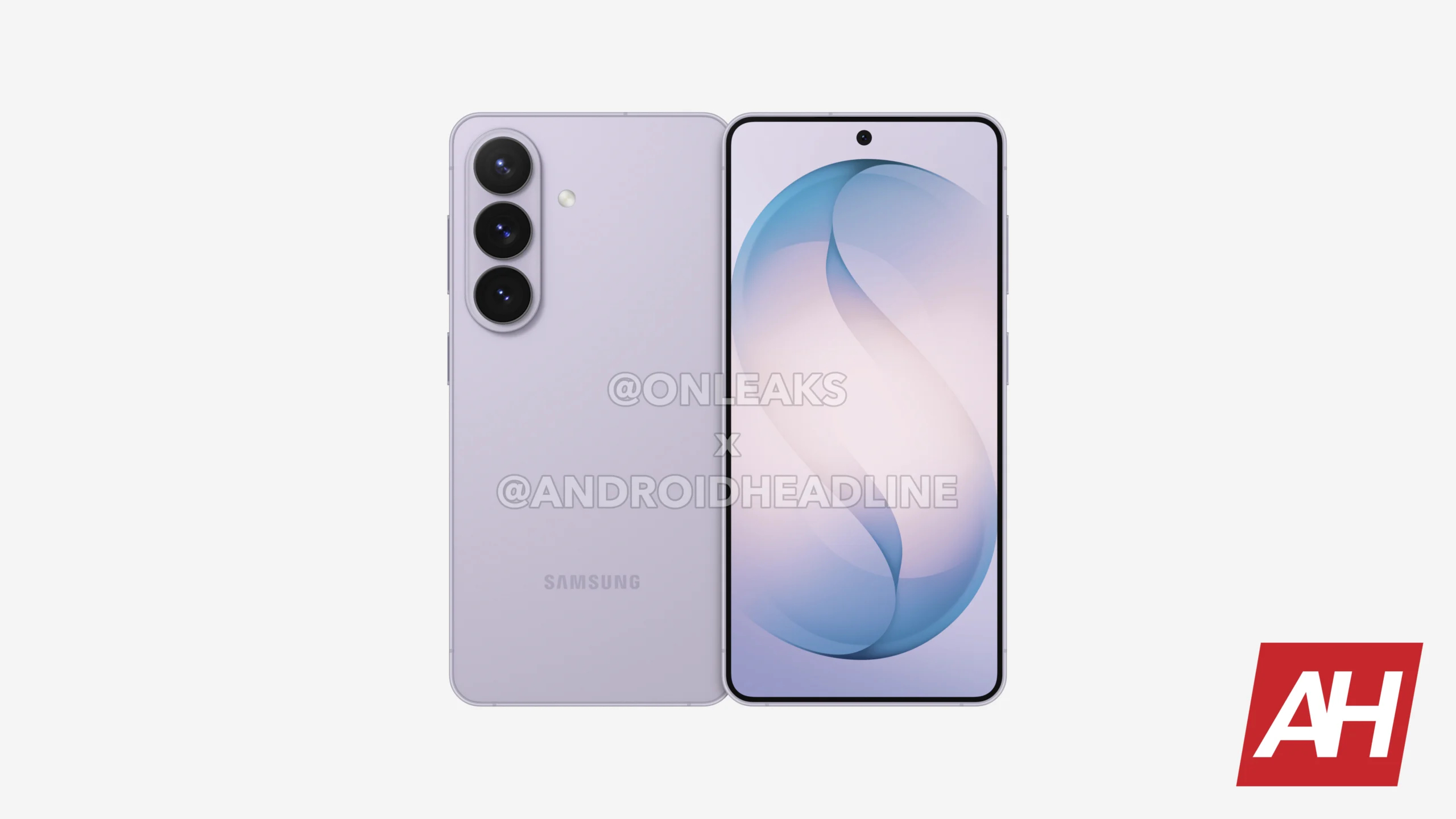
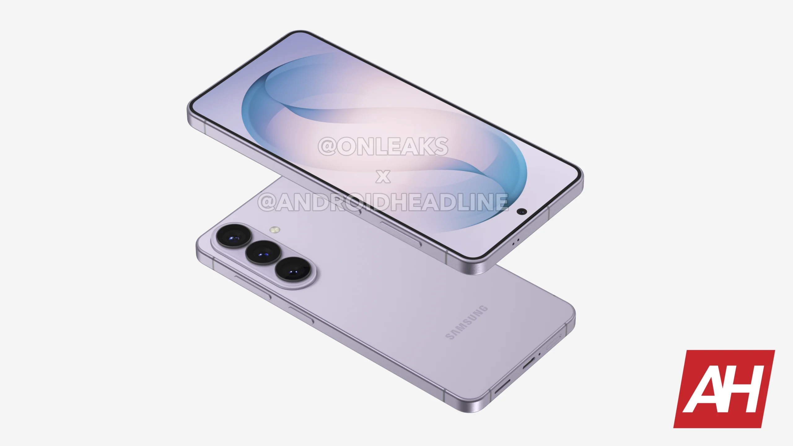
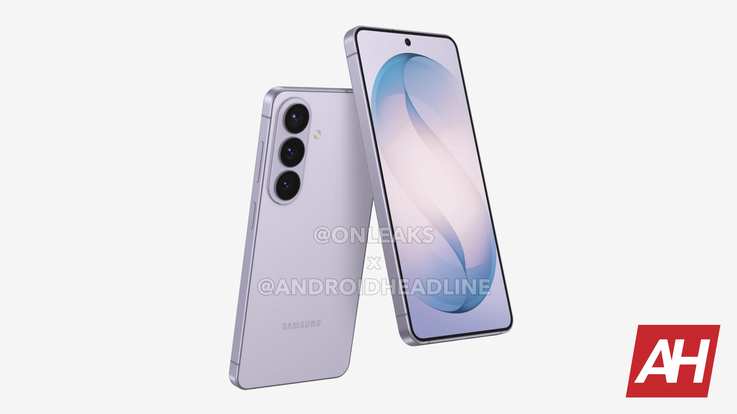
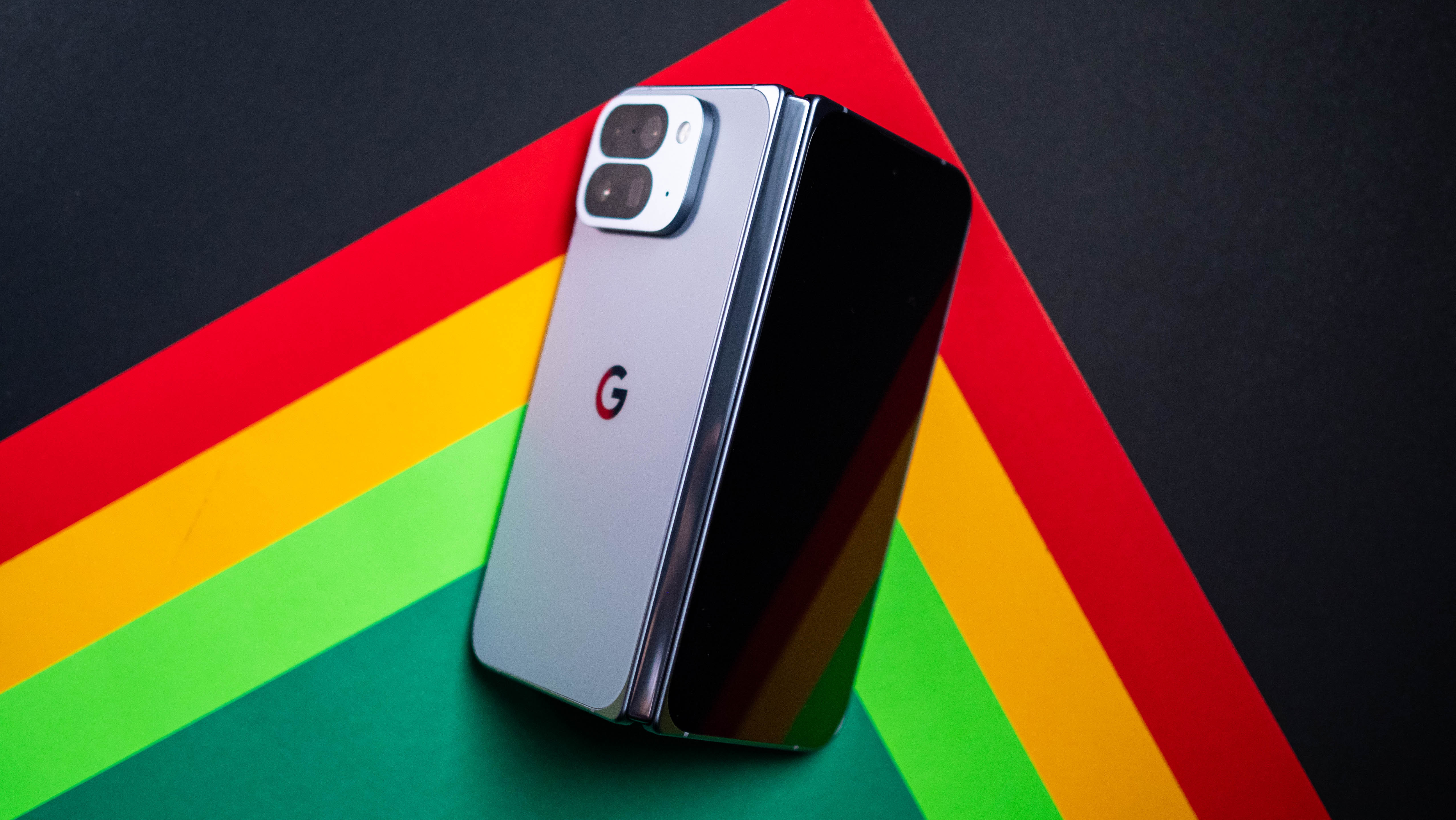
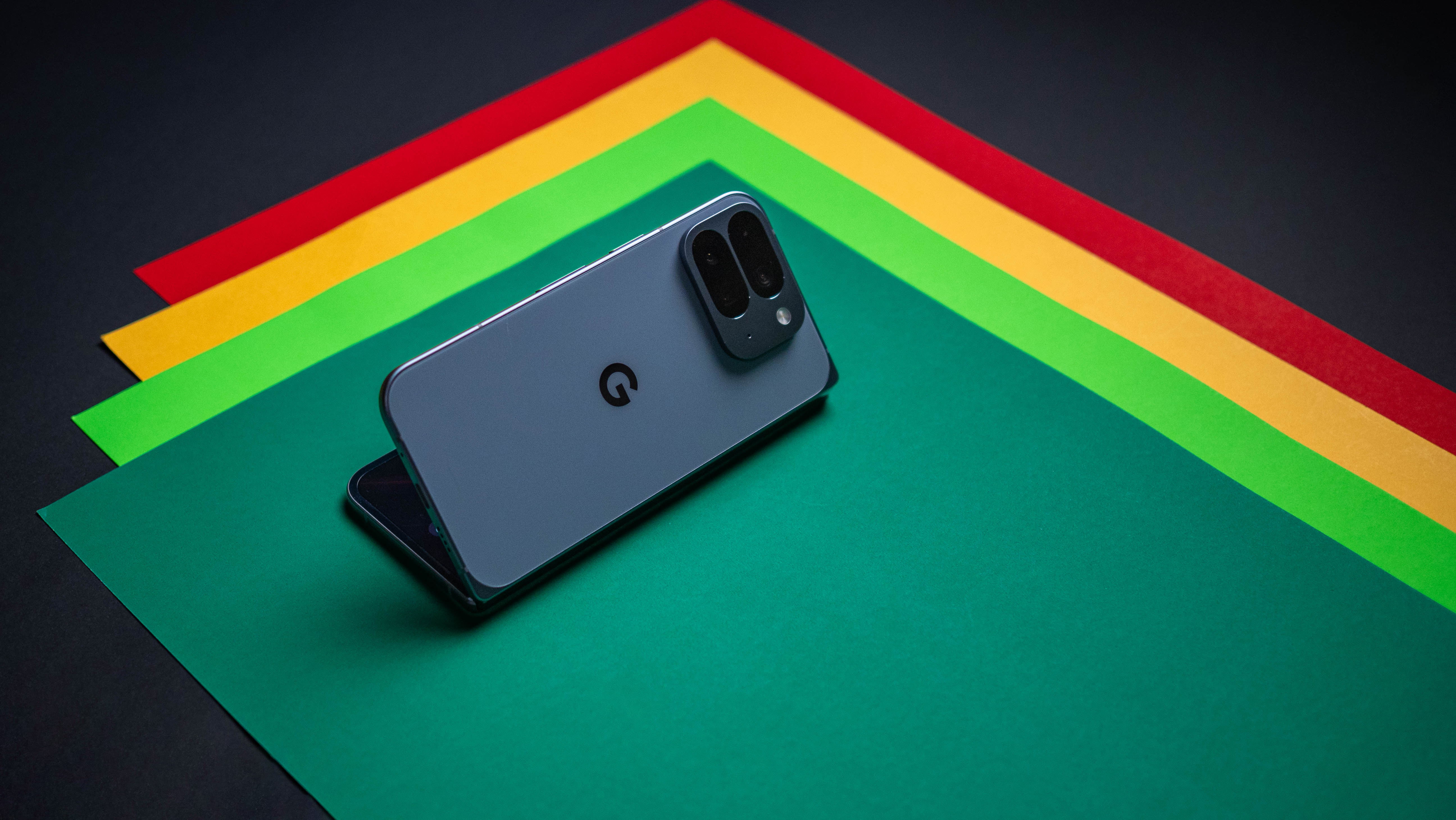
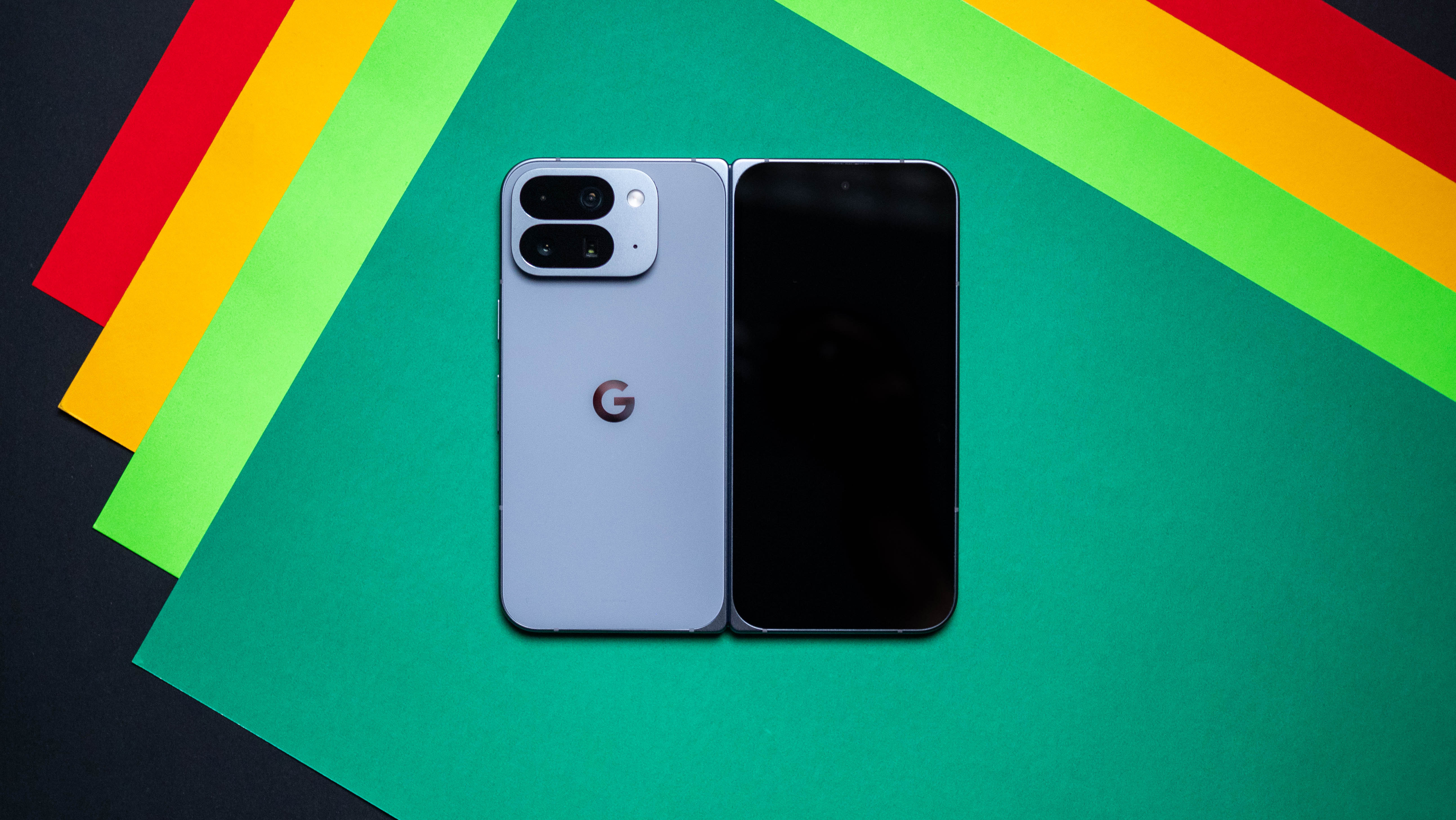
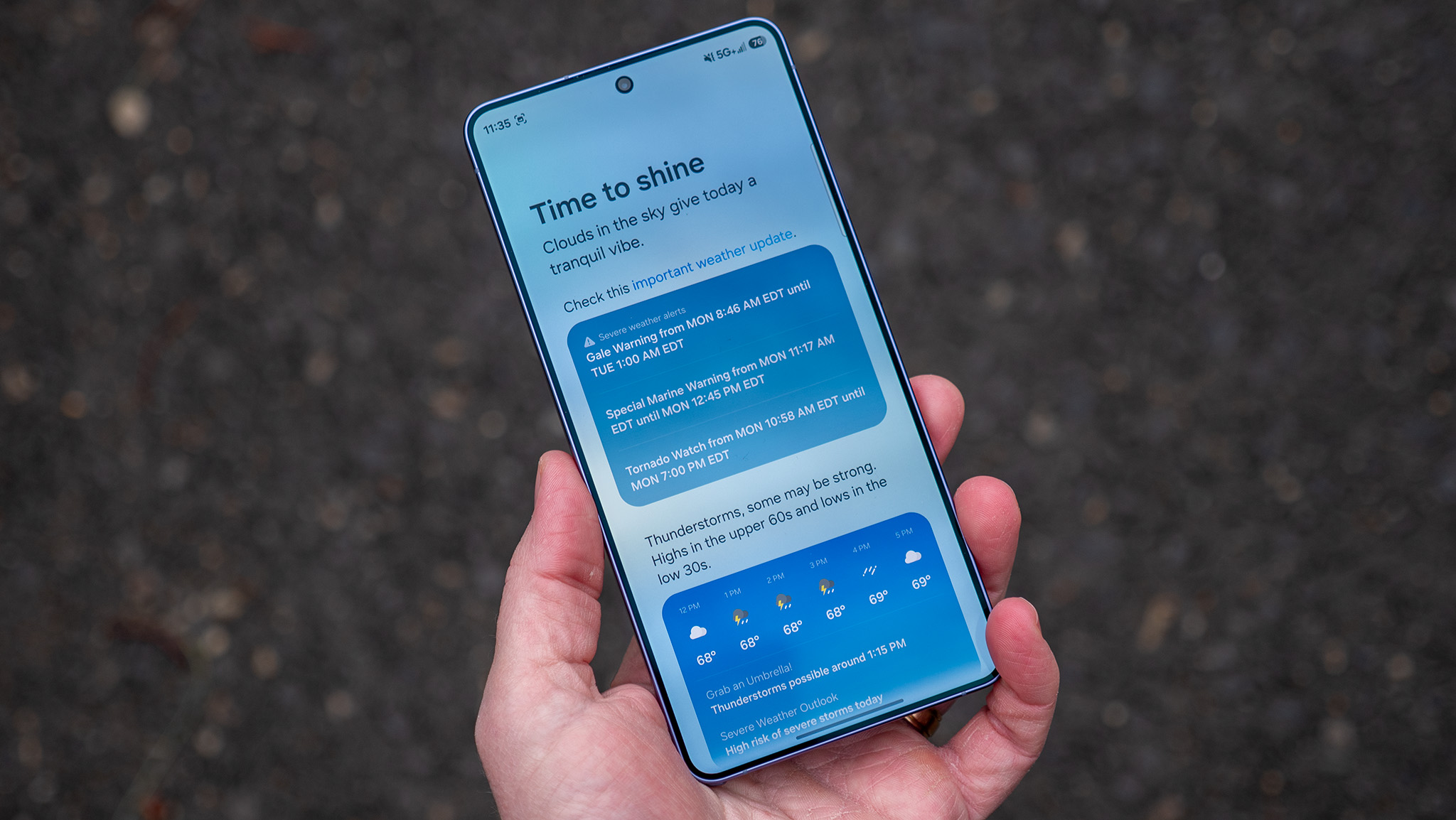
The Galaxy S27 is expected to retain almost the same design and dimensions as the current Galaxy S26.
The Galaxy S27 Pro could share the Galaxy S27 Ultra's new iPhone-like horizontal camera plateau design.
Leaked renders suggest the smaller Galaxy S27 Pro won't feature an S Pen slot, unlike the Galaxy S27 Ultra.
Following the Galaxy S27 Ultra renders leak, we're now finally starting to see the base Galaxy S27 and Galaxy S27 Pro as well.
Over the past few days, we've seen several leaks surrounding the Galaxy S27 Ultra's new design. Samsung appears to be moving away from its familiar vertical camera layout in favor of an iPhone-like horizontal camera plateau, with two prominent camera lenses on the left and a vertical pill-shaped module next to them.
From everything we've seen so far, it's hard not to notice the inspiration from Apple's iPhone 17 Pro lineup.
And now, we're starting to get a look at the Galaxy S27 and Galaxy S27 Pro as well.
Renders of the base Galaxy S27 were shared by OnLeaks in collaboration with Android Headlines, and unfortunately, it looks like Samsung isn't changing much from the Galaxy S26.
The phone still features three vertically arranged cameras inside a raised camera island in the top-left corner, with an overall design that looks extremely similar to its predecessor. Even the dimensions are reportedly more or less identical. This seemingly confirms that Samsung is keeping its new design exclusive to the more expensive models.
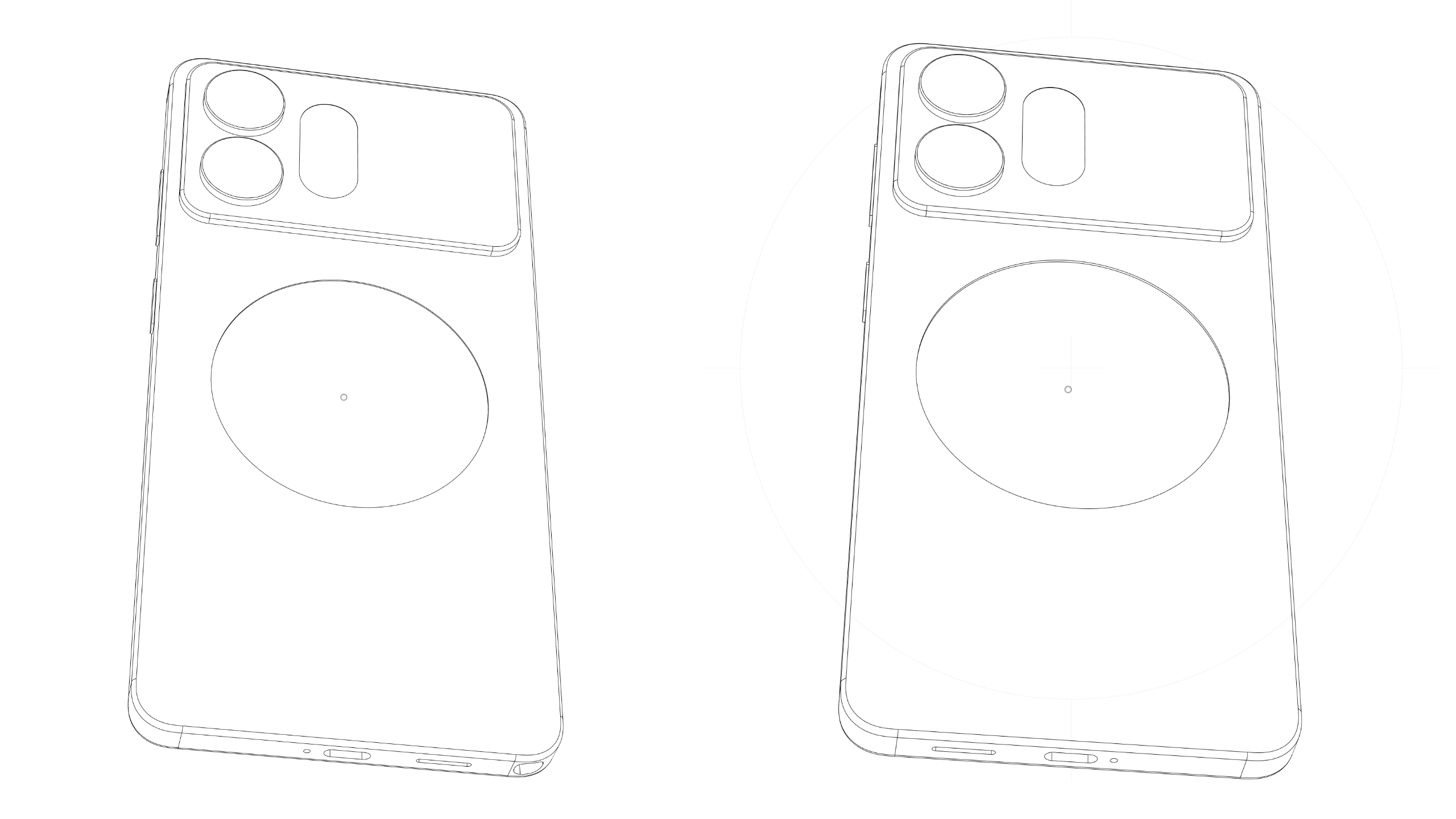
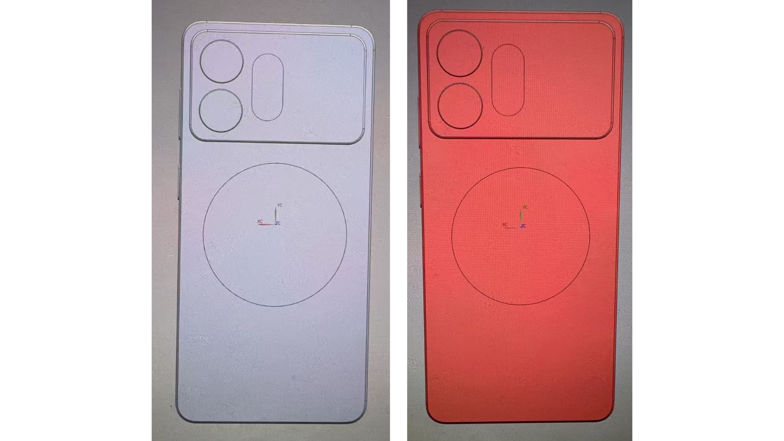
And that theory has gained even more weight thanks to a separate Galaxy S27 Pro leak from Ice Universe on X. The leaker shared outline renders comparing the Galaxy S27 Ultra and Galaxy S27 Pro, showing that the two phones will reportedly share a very similar design.
Samsung Galaxy S27 Ultra (left) vs. Galaxy S27 Pro (right) (Image credit: Ice Universe/X)
That isn't entirely surprising, since the Galaxy S27 Pro is expected to share several design elements and specifications with the Ultra. However, the renders also appear to confirm one major difference: the smaller Pro model won't come with an S Pen.
There's no S Pen slot visible on the Galaxy S27 Pro, and Samsung will also reportedly reposition the speaker grille and microphone on the smaller model.
In a separate post, Ice Universe also claimed that the Galaxy S27 Ultra will feature a more rounded frame than the Galaxy S26 Ultra, which should make the larger phone feel more natural and comfortable in the hand.
Overall, these Galaxy S27 and Galaxy S27 Pro leaks seem to clear up one major question about Samsung's 2027 lineup. The new horizontal camera design will apparently remain exclusive to the Galaxy S27 Pro and Ultra, while the regular Galaxy S27 and Galaxy S27 Plus will stick with Samsung's more familiar design.
from Latest from Android Central https://ift.tt/zpHI8nk
via IFTTT
Samsung is reportedly rolling out its August 2026 security update late this month, including an important fix.
Users on X highlight a Samsung official's notice online, stating a fix for the Galaxy S26 Ultra's red screen or "red stain" issue is in this update.
Galaxy S26 Ultra users overseas noticed this problem when the device is at maximum brightness, often resulting in a red band or stain across their screen.
No, you didn't miss it. Samsung is just now rolling out its August security update for stable Galaxy S26 users, and with it comes a long-awaited bug fix.
Late this week, SamMobile spotted the August 2026 security update rolling out for Galaxy S26 users overseas. The update is reportedly rolling out for users in South Korea first, which is typical for Samsung. Users on its Korean community forum pointed this development out, posting a screenshot of the patch hitting their S26. The publication highlights a hefty number of fixes involved in this August patch, but we're putting that on hold.
SamMobile and Tarun Vats on X state this patch will likely hold the long-awaited fix for the red screen or red tint issue that's plagued the Galaxy S26 Ultra. A Samsung official has started informing Korean users that a fix is now rolling out.
As for what the security patch fixes, Samsung's changelog states it's rolling out seven "Critical" and 30 "High" level fixes. Among them, the notes state there's a fix that could let malicious attackers "cause device inoperability" on a Galaxy device. Several fixes for the Samsung Contacts app are rolling out, alongside a fix to stop hackers from accessing a Galaxy phone's SIM card. Once again, Google has not listed its extensive changelog for Framework fixes and more on the Android Security Bulletin.
Fixing some struggles
(Image credit: Derrek Lee / Android Central)
Android Central's Take
Fixes are always good. If you have an S26 Ultra, keep an eye out. The patch is in Korea for now, but should make its way onto U.S. phones late (late) in August, and likely into September. Now, regarding the Privacy Display... I like this feature. My thing is, I'll wait a bit until it's better. Hopefully, it's better on the S27 Ultra, and I mean better to the point that Samsung can solve the screen being dimmer than previous models.
It was in July that reports about a red screen/red stain on the Galaxy S26 Ultra surfaced. Users in Korea noticed this issue when the phone produced bright colors or when at maximum brightness. The area of redness varied. Some users noticed it appeared vertically on their S26 Ultra, while others reported wide strips across the display. What was a bummer was Samsung's investigation.
According to its discovery, the S26 Ultra's "new technology" was to blame. The only "new tech" to hit the Ultra this year, especially its display, was the Privacy Display. This tech is purely software, which is why we needed a patch to fix it. The good thing is that it seems that this issue should be fixed as of this week (keep your eyes out for the patch).
But the Privacy Display, while useful and incredibly attractive, isn't all rainbows and sunshine. After the device launched, a report quickly surfaced, stating the Galaxy S26 Ultra's screen isn't as bright because of the Privacy Display. Compared to the S25 Ultra, the S26 Ultra is noticeably darker.
from Latest from Android Central https://ift.tt/ZT6px5C
via IFTTT
The Pixel 11 Pro brings the same features as the 11 Pro XL in a smaller size, and it's great to hold and use. You get the best of Google's software, along with new cameras, and Qi 2.2 integration.
Google
Pixel 9 Pro
Still great
The Pixel 9 Pro is still a great choice in 2026. The design looks just as good as the Pixel 11 Pro, the fundamentals are unchanged, and you get standout software.
Google Pixel 11 Pro vs. Pixel 9 Pro: Design and display
(Image credit: Shruti Shekar / Android Central)
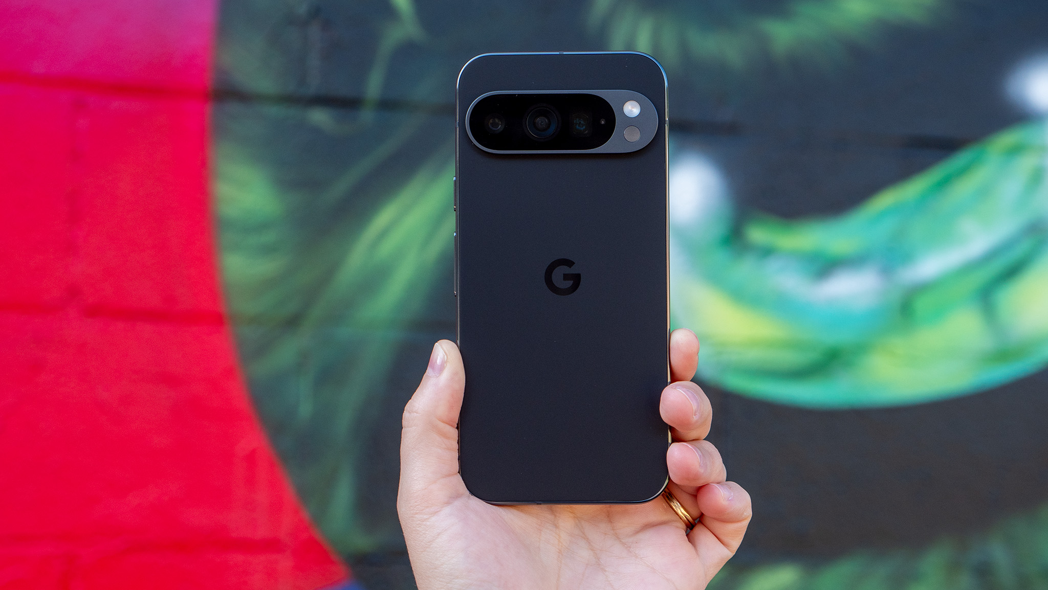
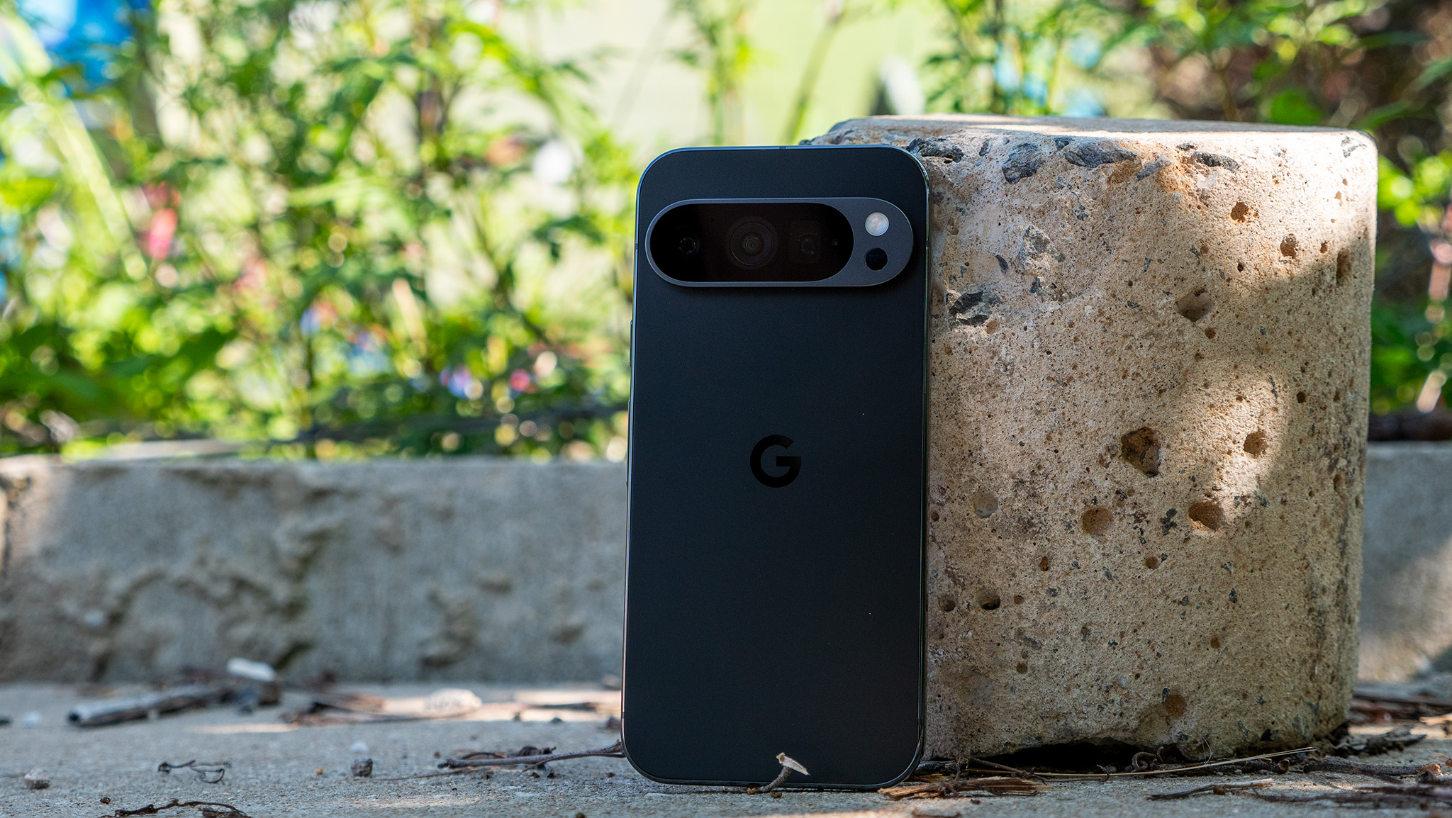
It wasn't until I dug out the Pixel 9 Pro that I realized just how little has changed with Google's phones in the last two years. The Pixel 9 Pro has nearly identical dimensions to the Pixel 11 Pro, and while the latter is 5g heavier, that isn't immediately noticeable.
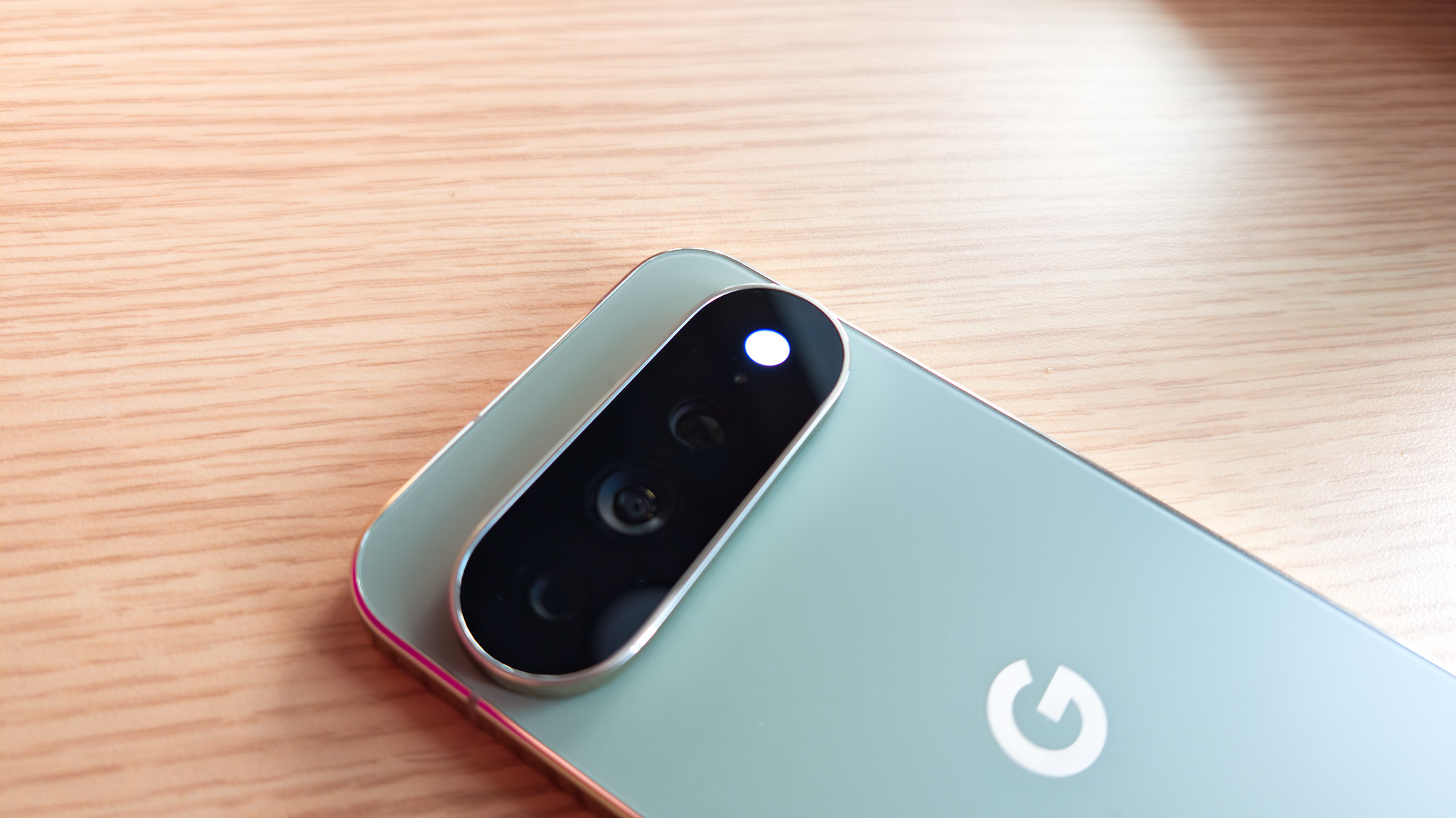
In fact, other than the new design around the camera bar, there isn't an easy way to distinguish both phones — they're that similar. This is a good thing, as it solidifies Google's visual identity and ensures models are consistent between generations.
(Image credit: Nicholas Sutrich / Android Central)
To give you a little bit of contrast, there aren't any design similarities between last year's Find X8 Ultra and the 2026 Find X9 Ultra; they could be made by different brands. While a constantly-changing design is interesting in its own way — I have no idea what the Find X10 will look like — that isn't an issue with Pixels; Google clearly has its design language dialed in, and it isn't going to change that anytime soon.
Anyway, the Pixel 11 Pro is a standout small flagship, and the Pixel 9 Pro is the same. I like the smaller design, and while I inevitably gravitate to larger phones, there's no denying that there's an audience that wants a smaller device with high-end internals, and other than the 6.3-inch panel size and smaller battery, the Pro devices are unchanged from their Pro XL siblings.
The 6.3-inch OLED panel is great in its own right; both phones have good color vibrancy and class-leading brightness figures. The only difference is that the 11 Pro gets brighter in outdoor use, but other than that, they're identical. Also, both devices get IP68 dust and water resistance, and they're built to last.
Google Pixel 11 Pro vs. Pixel 9 Pro: Hardware and cameras
(Image credit: Shruti Shekar / Android Central)
The Tensor G6 powering the Pixel 11 Pro is faster and does a better job overall, but it's still not set up for any intensive gaming, and at this point, it's clear that it just isn't a priority for Google. That said, it is reliable in everyday use, and the device itself has good fluidity. The same is true on the Pixel 9 Pro as well, and I still don't see any issues with the device in regular tasks.
Similarly, battery life is about the same, but the 11 Pro gets Qi 2.2 integration, going up to 25W — the 9 Pro is limited to standard 12W Qi charging. Connectivity is the same on both devices, and while the 11 Pro is using a new modem, I don't see much of a difference in daily use.
Category
Google Pixel 11 Pro
Google Pixel 9 Pro
Operating System
Android 17, seven years of software updates
Android 17, seven years of software updates (five left)
Display
6.3-inch 120Hz LTPO OLED, 2856x1280, Corning Gorilla Glass Victus 2, HDR10+, 3600 nits max
6.3-inch 120Hz LTPO OLED, 2856x1280, Corning Gorilla Glass Victus 2, HDR10+, 3000 nits max
Chipset
Google Tensor G6, 3nm TSMC
Google Tensor G4, 4nm Samsung
RAM
12GB/16GB
16GB
Storage
256GB/512GB/1TB UFS 4.0
128GB/256GB/512GB/1TB UFS 3.1
Rear cameras
Main: New 50MP f/1.7, OIS
Tele: 48MP f/2.8, OIS, 5x zoom
Wide: 48MP f/1.7 wide-angle
Main: 50MP f/1.7, OIS
Tele: 48MP f/2.8, OIS, 5x zoom
Wide: 48MP f/1.7 wide-angle
Front camera
42MP, f/2.2
42MP, f/2.2
Battery
4850mAh
4700mAh
Charging
30W wired, USB PD 3.0 PPS
25W Qi 2.2 Pixelsnap wireless
27W wired, USB PD 3.0 PPS
12W Qi wireless
Connectivity
Wi-Fi 7, Bluetooth 6, NFC, Dual-band GPS, 5G mmWave (NA only), 5G Sub-6 (global), LTE
Wi-Fi 7, Bluetooth 5.3, NFC, Dual-band GPS, 5G mmWave (NA only), 5G Sub-6 (global), LTE
Ingress protection
IP68 dust and water resistance
IP68 dust and water resistance
Dimensions
152.7 x 71.9 x 8.4mm
152.8 x 72 x 8.5mm
Weight
204g
199g
Colors
Canyon, Fog, Olive, Obsidian
Porcelain, Hazel, Rose Quartz, Obsidian
The Pixel 11 Pro has a new camera, and it takes slightly better photos and videos. But like previous years, the best features are software-related: Camera Looks lets you change the tonality of the photos to a significant degree, and I like the feature quite a bit. There's also Magic Capture, which automatically takes the best photo while shooting a video, and it makes a lot of sense if you have kids that are constantly moving.
Google Pixel 11 Pro vs. Pixel 9 Pro: Which should you buy?
(Image credit: Nicholas Sutrich / Android Central)
There is a lot to like in the Pixel 11 Pro, and the new software features go a long way in differentiating the phone. That said, Google is likely to bring most of these to older Pixels — including the Pixel 9 Pro — so you're not really missing out on much there.
Other than that, I don't see many differences to the Pixel 9 Pro. It's still a fabulous phone two years after its launch, and if you're using the device, there's no reason to get the Pixel 11 Pro.
Google
Pixel 11 Pro
Small but mighty
The Pixel 11 Pro is Google's latest phone, and while it has a new camera and software tricks, it doesn't do enough to justify an upgrade — not when the Pixel 9 Pro is still going strong.
Google
Pixel 9 Pro
Still great
I like the Pixel 9 Pro a lot, and considering the phone was built to last the better part of a decade, there's no reason to upgrade just yet. It's getting regular software updates, the hardware is still great, and the cameras hold their own in 2026.
from Latest from Android Central https://ift.tt/OvxafjS
via IFTTT
Nothing OS 5.0 is here and combines a redesigned interface, deeper customization, smoother performance, and upgraded Essential AI tools.
Transparent widgets, wallpaper-adaptive icon colors, the new Geist typeface, and refreshed system icons give Nothing OS a more cohesive look.
Nothing OS 5.0 Open Beta begins for the Phone (3), with a stable release expected in mid-October and more devices joining the beta later.
Nothing is giving its software a substantial refresh with Nothing OS 5.0, a major update built on Android 17. The latest software zeroes in on everyday interactions, blending a redesigned visual system with more customization, smoother performance, and more powerful Essential AI tools.
The update is all about giving you more control and a smoother experience. The home screen gets a brand new theme with transparent widgets and a search bar that adds some depth, while app icons can now pull subtle color tints from your wallpaper to match your vibe.
There’s a new system typeface, Geist, which is cleaner and easier to scan, and refreshed icons across the status bar, Settings, Camera, and Gallery. The Gallery also includes new options for sorting and filtering to help you organize photos.
You also get more ways to make the phone yours. The lock screen has two new clock faces: the whimsical “Gooey” and the hardware-inspired "Micrographics." Please note the Micrographics clockface and the new home screen theme are still in development and will not be available in the Open Beta yet — they will be part of the general release starting October.
The Glyph Interface now comes in an app, so all the features and sounds are in one place. There is also a new Glyph Timer widget and the Away Time widget that helps you monitor your digital habits by telling you how long you've been away from your phone.
(Image credit: Nicholas Sutrich / Android Central)
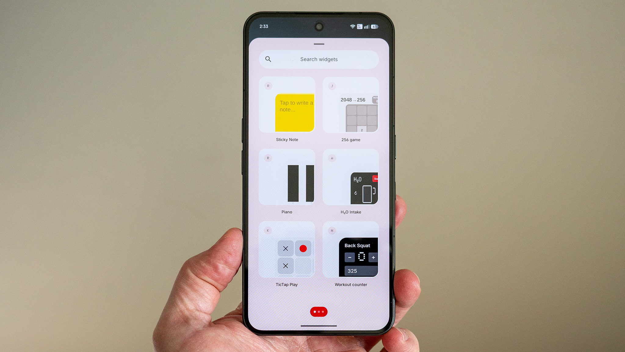
Nothing is also doubling down on its Essential AI tools. Essential Voice is faster, real-time transcriptions are better, and with the Ear (3), you can record audio directly from the Super Mic on the case. Smart Collections can suggest and organize content for you automatically. And for a fun twist, you can now create Essential Apps right on your phone; just tell it what you want in plain language and it’ll build it for you.
Since it runs on Android 17, you get the latest features of the platform as well. That includes the capability to split out the notifications and Quick Settings panels and an enhanced Quick Share that works across iOS and Android via QR code. The update also brings new privacy indicators, expanded dark theme support, and a redesigned Recents menu.
The Nothing OS 5.0 Open Beta program starts today for the Phone (3), with a stable release expected in mid-October. Other devices will be included in the beta program later.
from Latest from Android Central https://ift.tt/Z3QGisp
via IFTTT
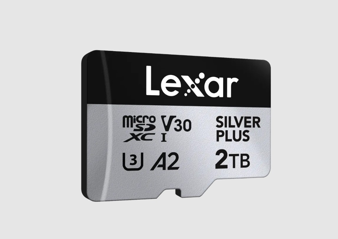
There hasn't been much in the way of innovation when it comes to MicroSD cards, but the standard continues to be dominant in cameras, handheld consoles, and just about any accessory that needs external storage.
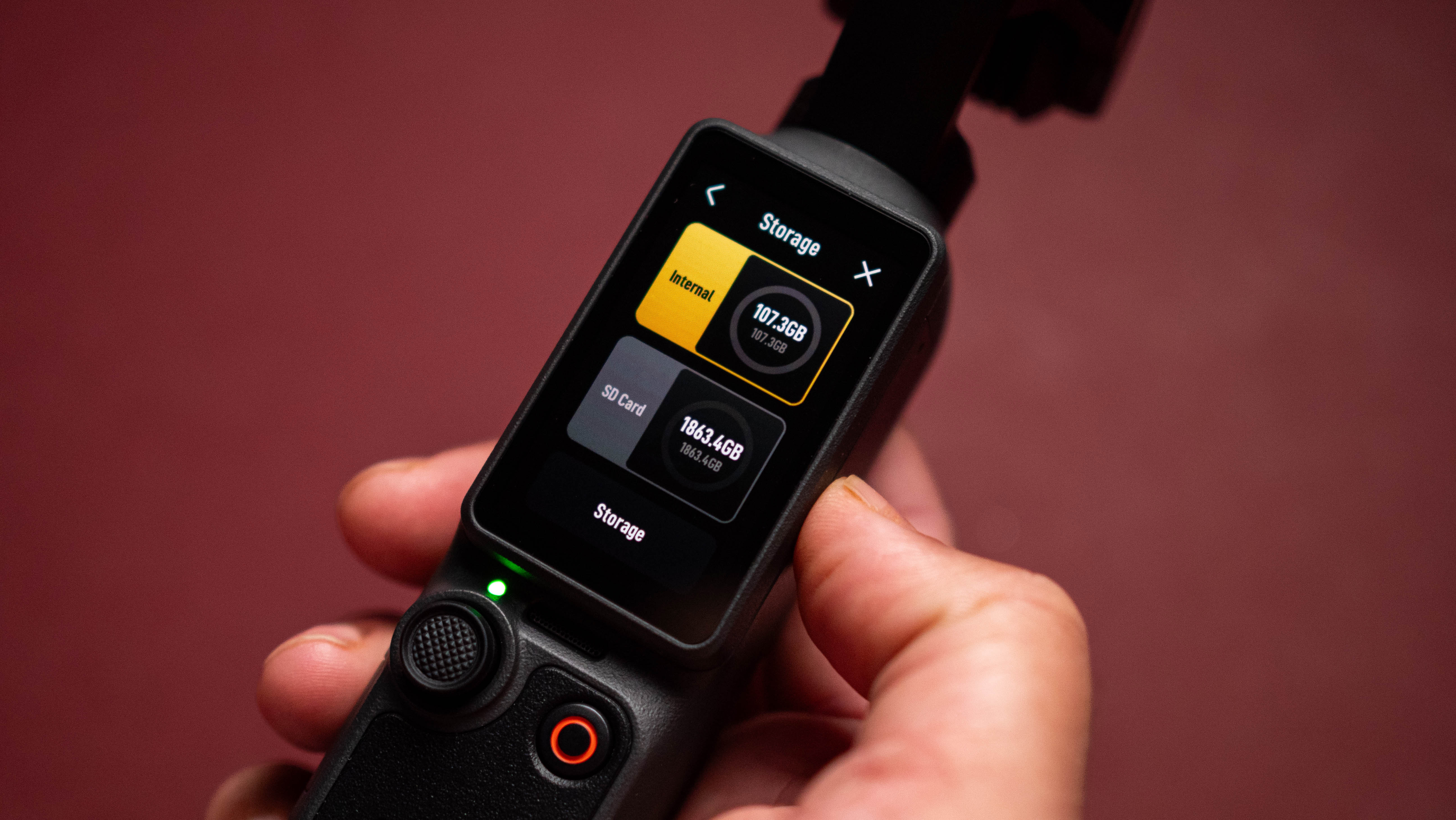
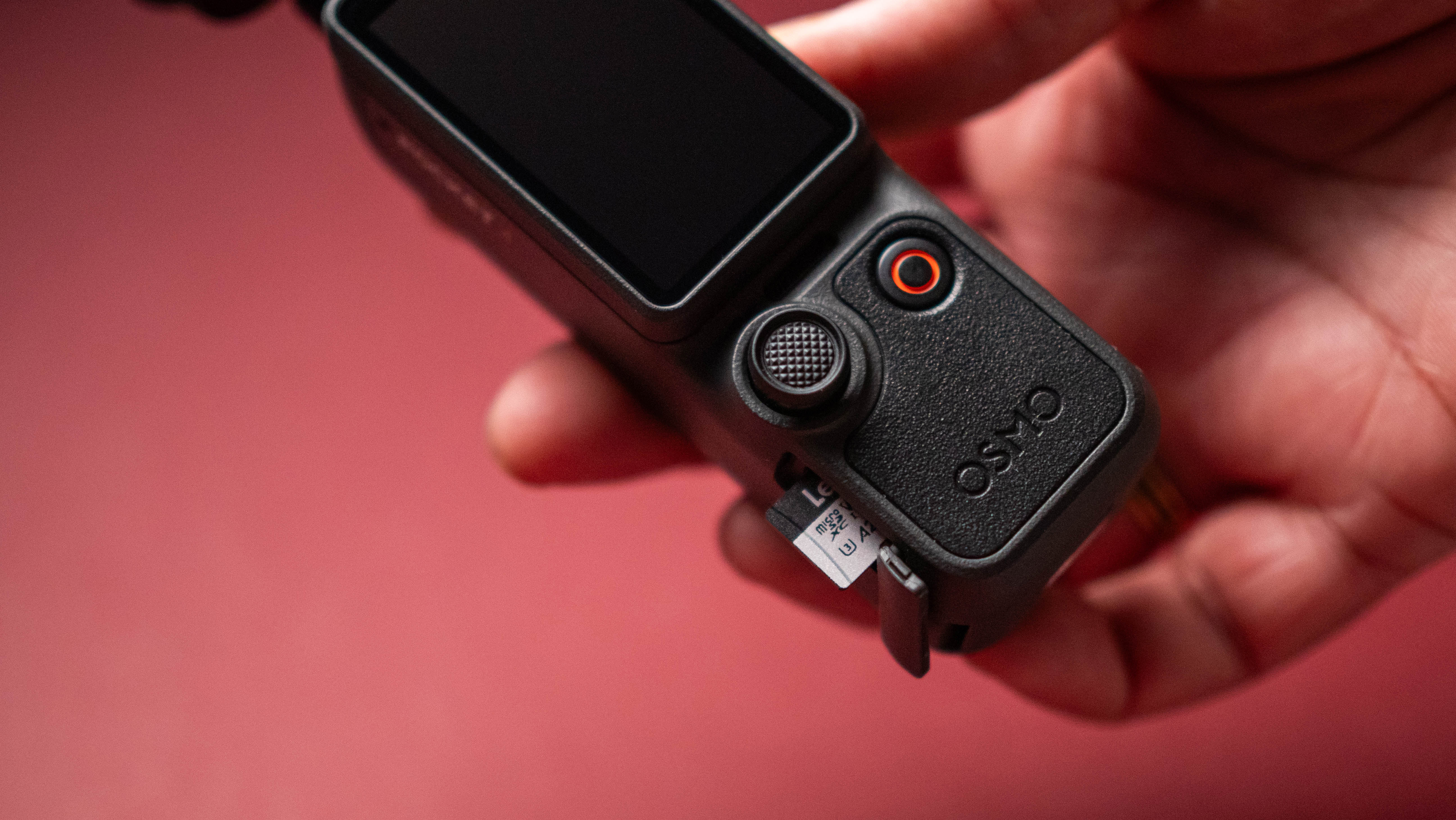
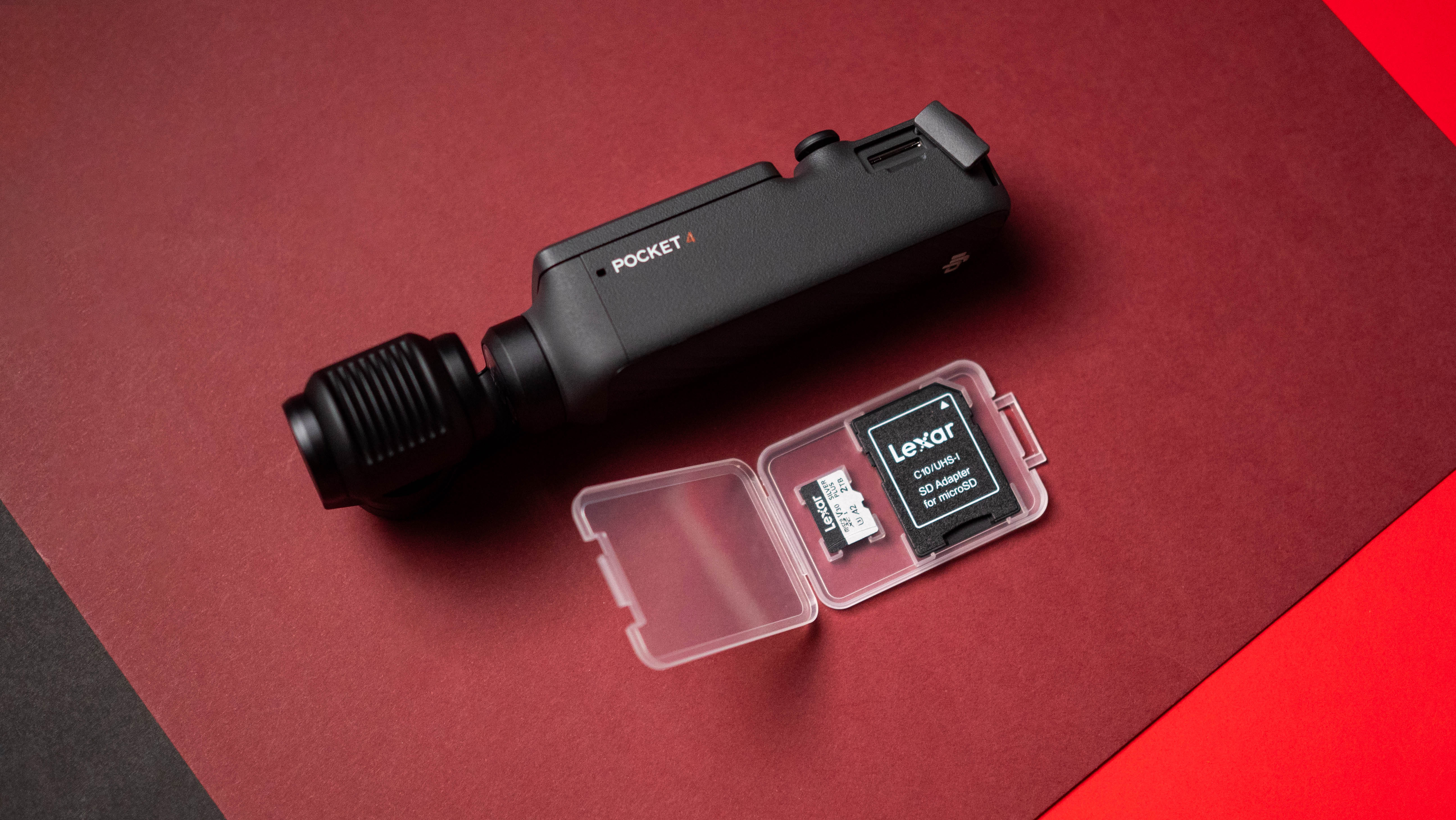
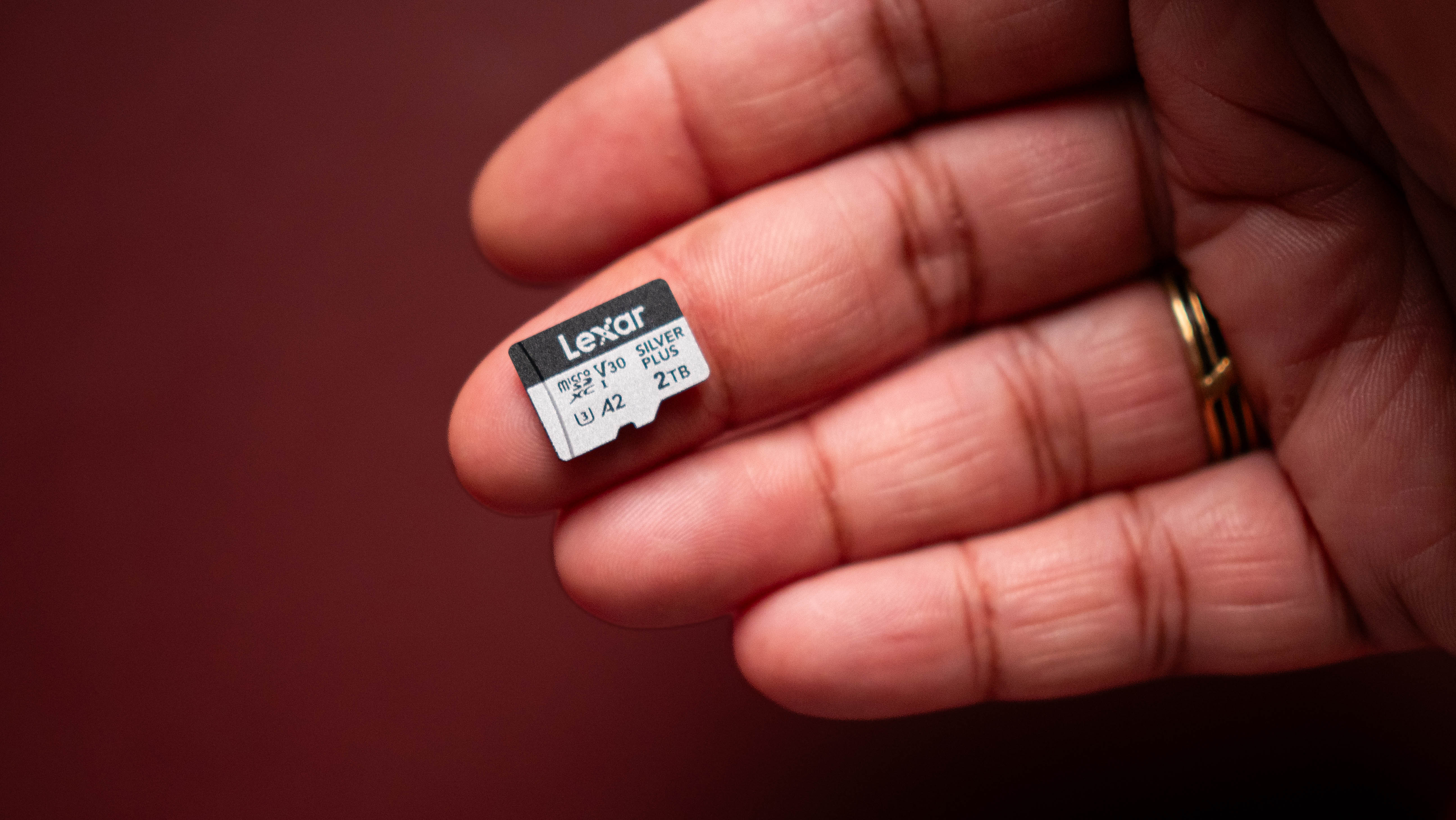
I have a dozen or so MicroSD cards in active use across security cameras, action cameras, digital music players, hobbyist SBCs like the Pi 4 and Pi 5, and two handheld consoles. Most of these are the usual A2 class cards ranging from 64GB to 512GB, but I wanted something with higher storage to use with my DJI Osmo Pocket 4P and Pocket 4.
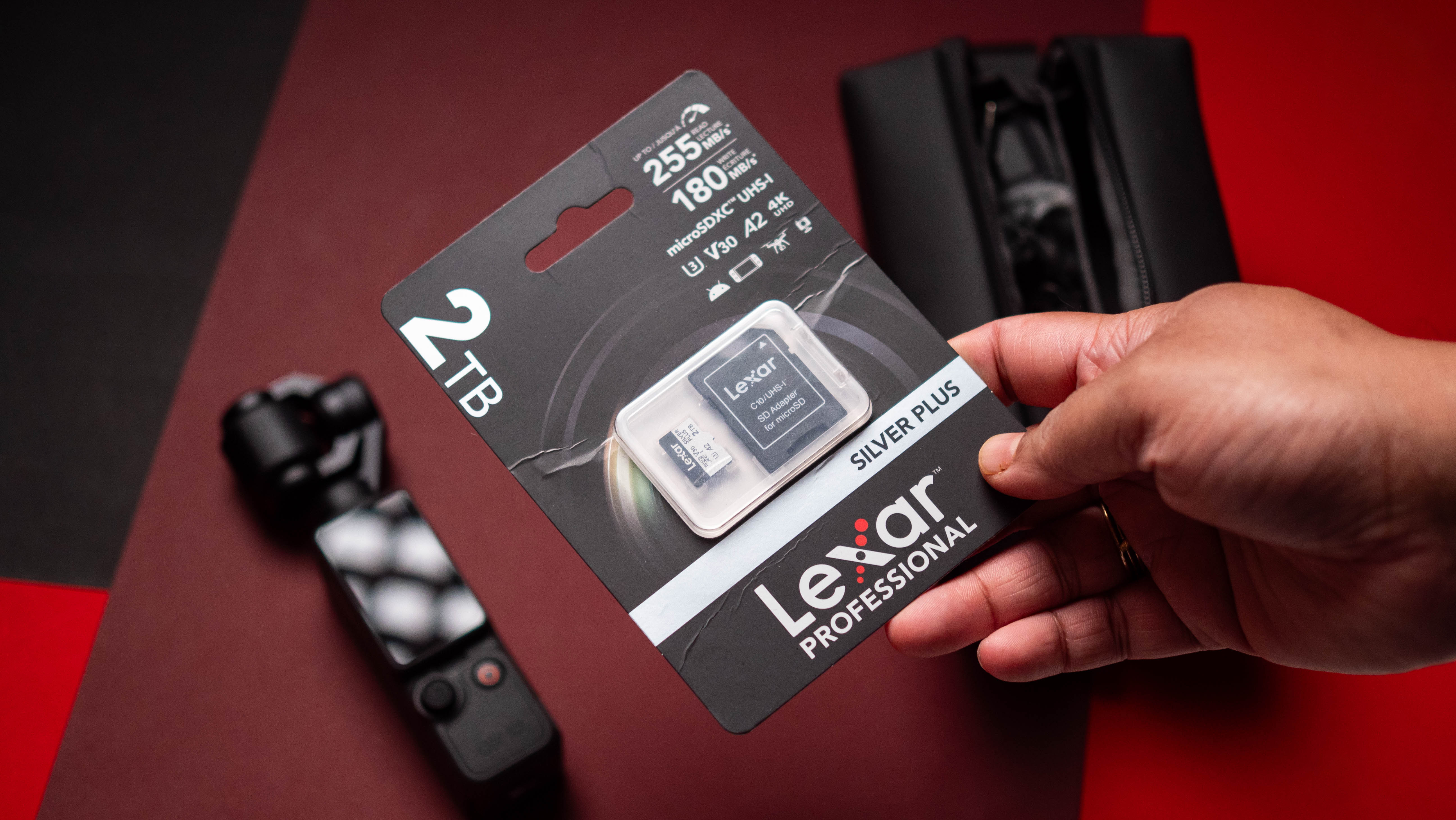
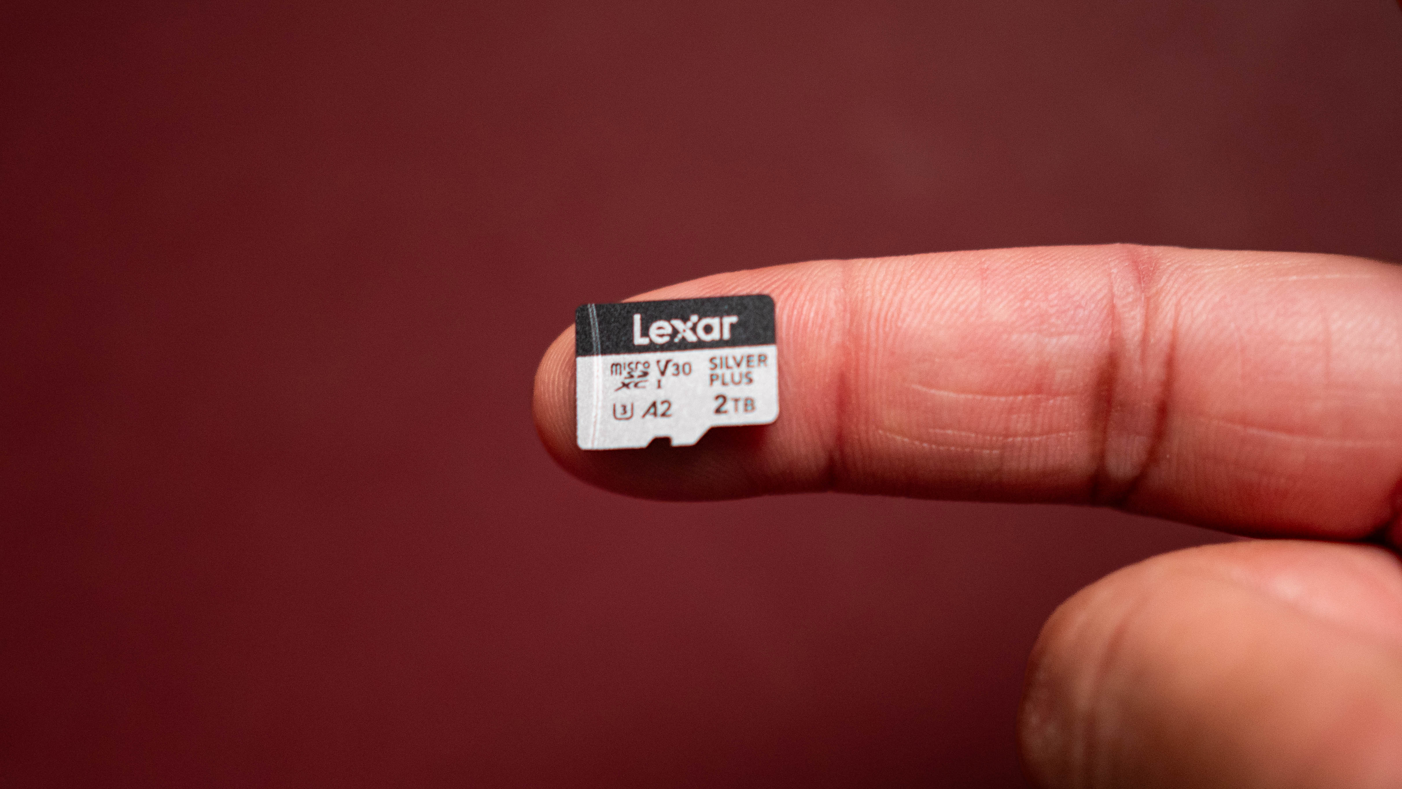
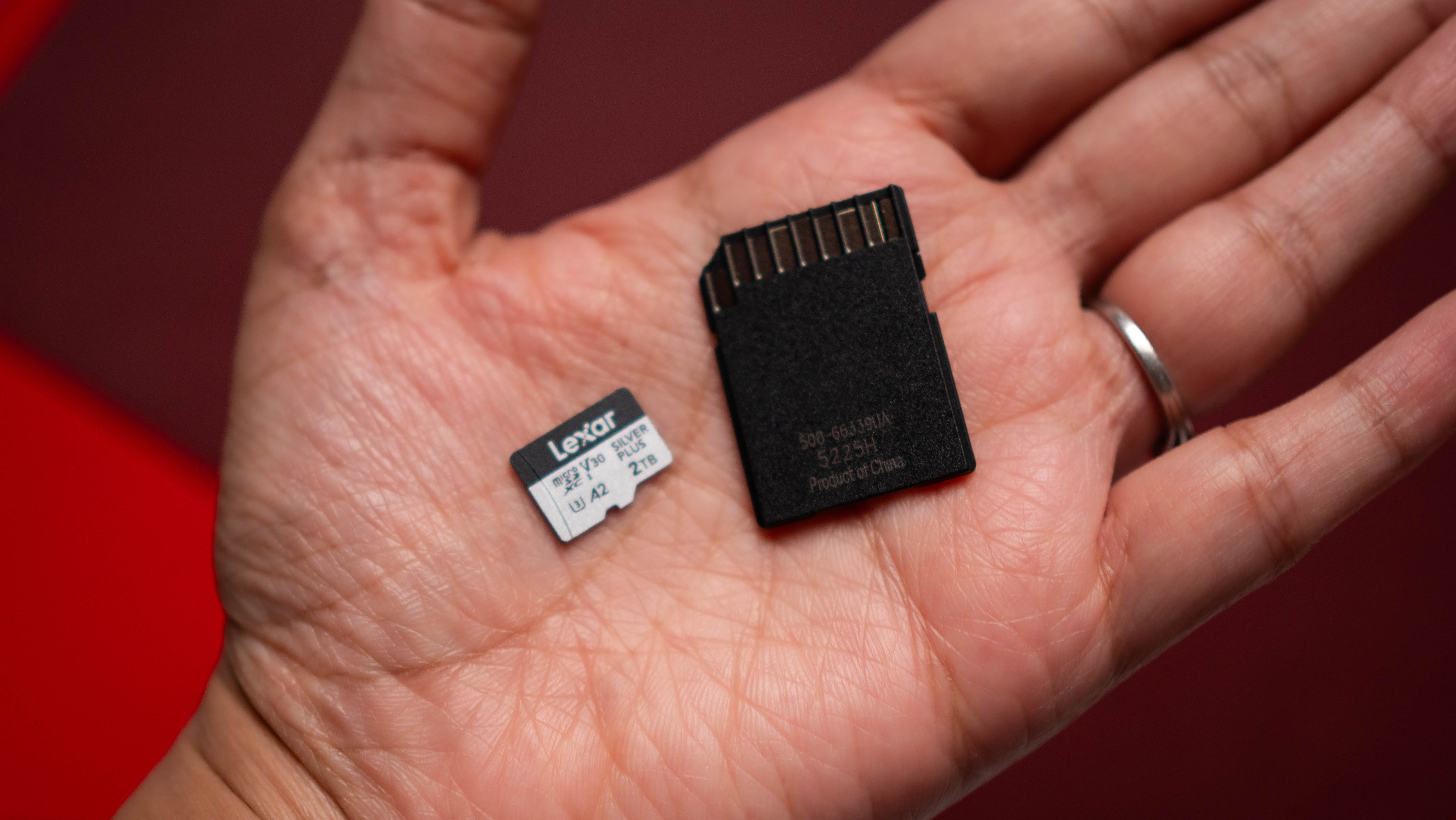
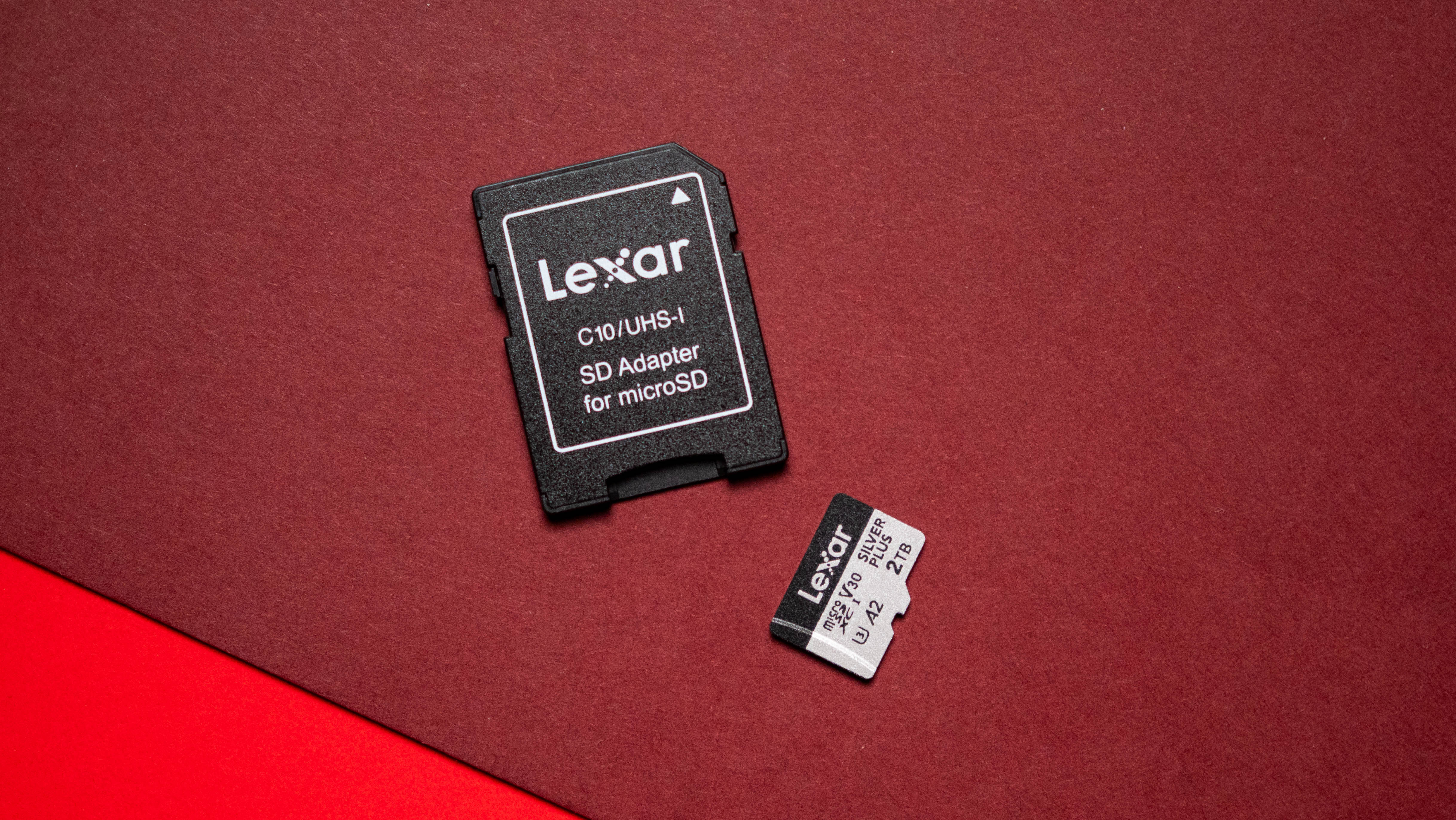
That's where Lexar comes into the picture. The Silver Plus range of MicroSD cards debuted at the end of April 2026, and what immediately caught my attention was the storage sizes. Available from 128GB all the way to 2TB (the model I'm testing), this isn't your average MicroSD card. I used Lexar's SO-DIMM memory modules and internal SSDs in the past, so I was interested in taking a look at the 2TB MicroSD card.
After three months of usage involving dozens of hours of 4K footage shot via the Osmo Pocket 4P and hundreds of photos taken with the OM-D E-M1 Mark III, it's clear that the Silver Plus is a standout MicroSD card. The 2TB model I'm using retails for well over $500, but the 1TB model is available for $239, and I think it is the sweet spot if you're looking to extend storage of your camera or handheld console. There's also a much more modest 128GB variant that costs $49, and the 256GB model is $74.
The Silver Plus is a V30 card, which means you're guaranteed to get at least 30MB/s sustained writes when shooting videos. You also get U3, which is 30MB/s minimum writes, A2, and a UHS-I interface. This is all standard stuff these days, but where the Silver Plus goes above and beyond is the ruggedness: it is IPX7 water-resistant, shockproof, x-ray-proof, magnetic-proof, and resistant to vibrations. Basically, it is built to handle any scenario, and you get a limited lifetime warranty.
Where the 2TB Silver Plus truly shines is video footage. I used it to shoot 4K120 and 8K30 footage, and it didn't prove a bottleneck while storing footage to the device. It is great to use with a drone or handheld gimbal camera like the Osmo Pocket 4P, and I got close to the touted 255MB/s reads and 189MB/s writes while testing it on Windows.
It's great that MicroSD cards can now store up to 2TB of storage. I remember it wasn't too long ago that I was excited about the debut of 128GB MicroSD cards (I got my hands on a few of these at a Best Buy shortly after they launched), and to have 2TB of storage on MicroSD is pretty cool.
While SD cards don't get quite as fast as external SSDs, they're much more portable, and if you're a professional who shoots photos and videos outdoors or want the best MicroSD card to use with your camera or handheld console, the Silver Plus is an easy recommendation.
Lexar
Professional SILVER PLUS microSDXC UHS-I Card
Lexar's Silver Plus MicroSD card has all the storage you'll need, encased in a design that's guaranteed to last.
from Latest from Android Central https://ift.tt/K1QXBEg
via IFTTT
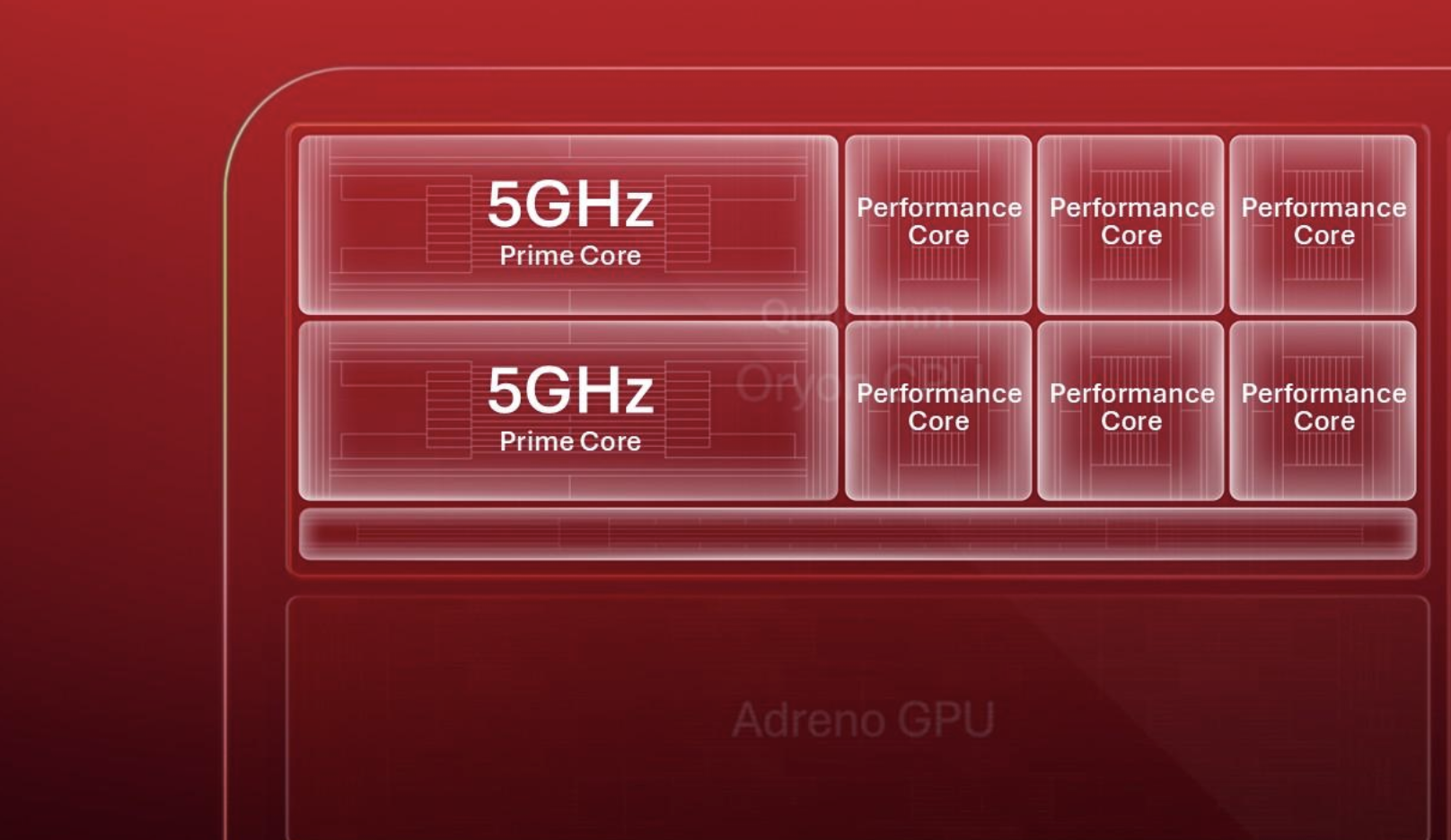
Qualcomm's next-generation Oryon CPU will reach clock speeds of up to a whopping 5GHz.
The new Oryon CPU uses a fully custom design, giving Qualcomm greater control over performance and efficiency.
Qualcomm's new FlexCache lets CPU cores dynamically share cache, helping improve gaming and multitasking performance.
Qualcomm is expected to unveil two new Snapdragon 8 Elite chipsets at its Snapdragon Summit in September.
Ahead of the Snapdragon Summit next month, Qualcomm has shared more details about its next-generation Oryon CPU, sharing that it will be capable of reaching a whopping 5GHz clock speed.
Smartphone chipsets have become ridiculously powerful over the past few years. Apple continues to push its A-series chips forward, while Qualcomm's Snapdragon flagships have steadily brought desktop-level performance to Android phones.
Of course, we can't say the same about everyone (looking at you, Tensor G6). Now, Qualcomm looks ready to push things even further with its next-generation Oryon CPU.
Qualcomm hasn't revealed its full next-generation Snapdragon platform just yet, but says the new Oryon CPU uses a fully custom design, with the company controlling everything from the microarchitecture to the entire CPU subsystem. According to Qualcomm, that level of control is one of the reasons it can push clock speeds all the way up to 5GHz.
But Qualcomm says higher clock speeds aren't the only reason for the performance gains. The company is also focusing heavily on IPC (instructions per clock), which determines how much work the CPU can complete per clock cycle. Improvements here should translate into better performance across everyday tasks, from opening apps and browsing the web to more demanding workloads.
(Image credit: Qualcomm)
Qualcomm has also introduced Oryon FlexCache, a new cache architecture that allows different CPU cores to access the same dynamically allocated cache pool. Instead of assigning a fixed amount of cache to individual cores, FlexCache allows the Prime cores to access the entire available pool whenever a workload needs it.
The company says this should particularly help with workloads that constantly move between different CPU cores. In gaming, for example, better access to local cache could help stabilize frame rates and reduce stutters, while the same architecture should also help with heavier multitasking.
Qualcomm still hasn't revealed the complete details of its next Snapdragon flagship platform. The company has already teased that we'll see two Snapdragon 8 Elite chips at Snapdragon Summit 2026, though, so we should learn much more about both chipsets soon.
Snapdragon Summit 2026 is scheduled to take place from September 22 through September 24 in Hawaii.
from Latest from Android Central https://ift.tt/98JMrFE
via IFTTT
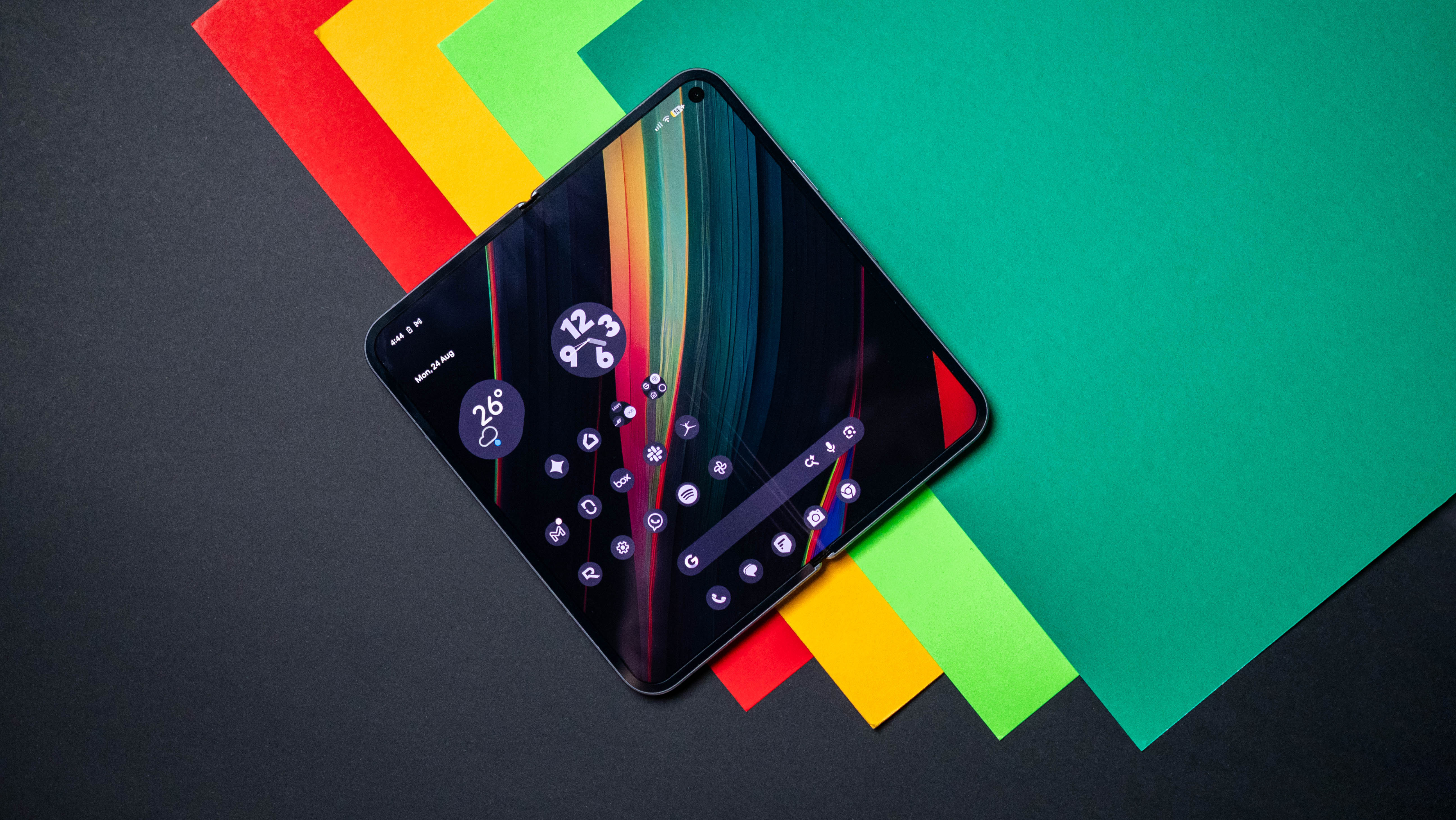
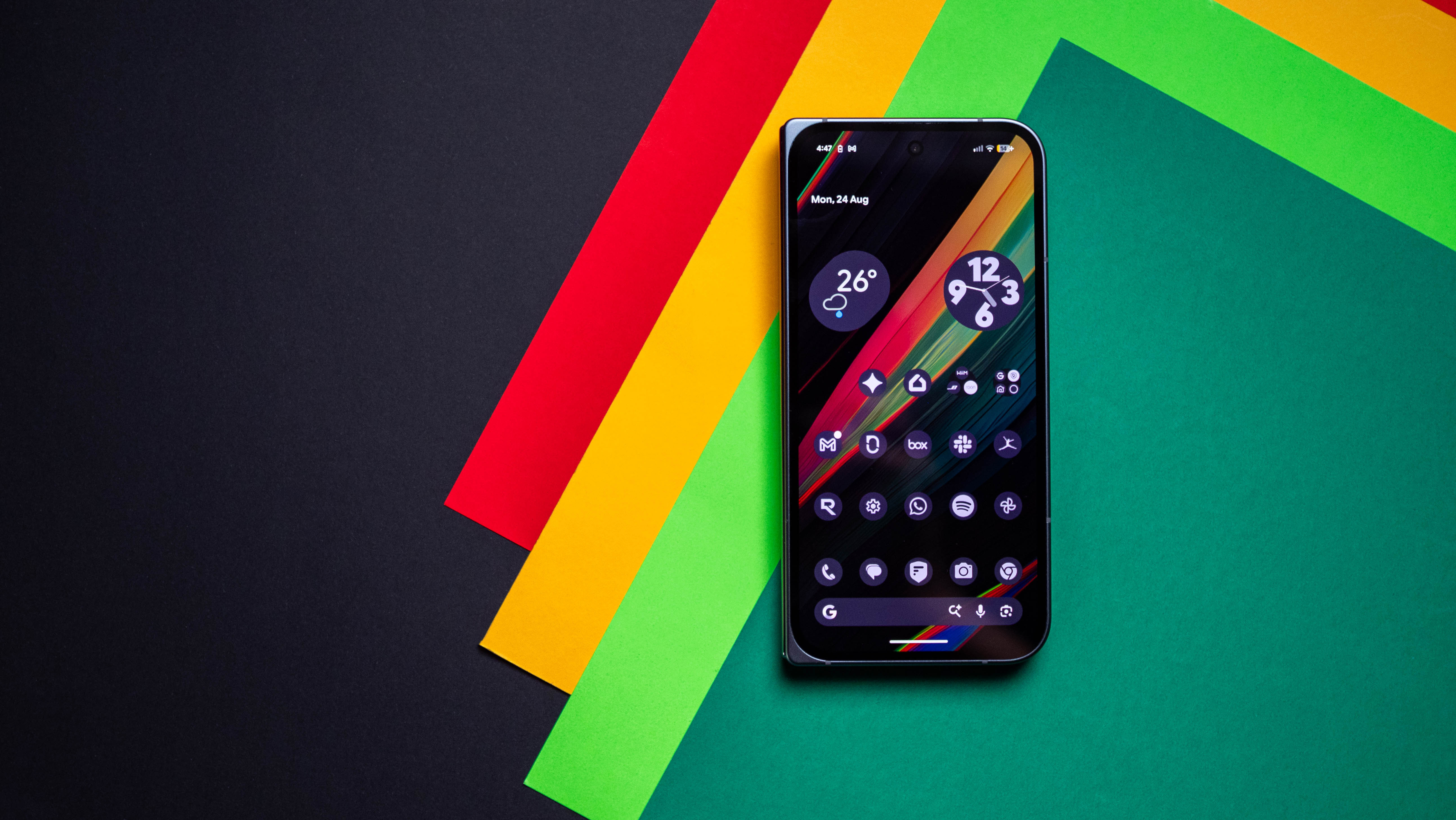
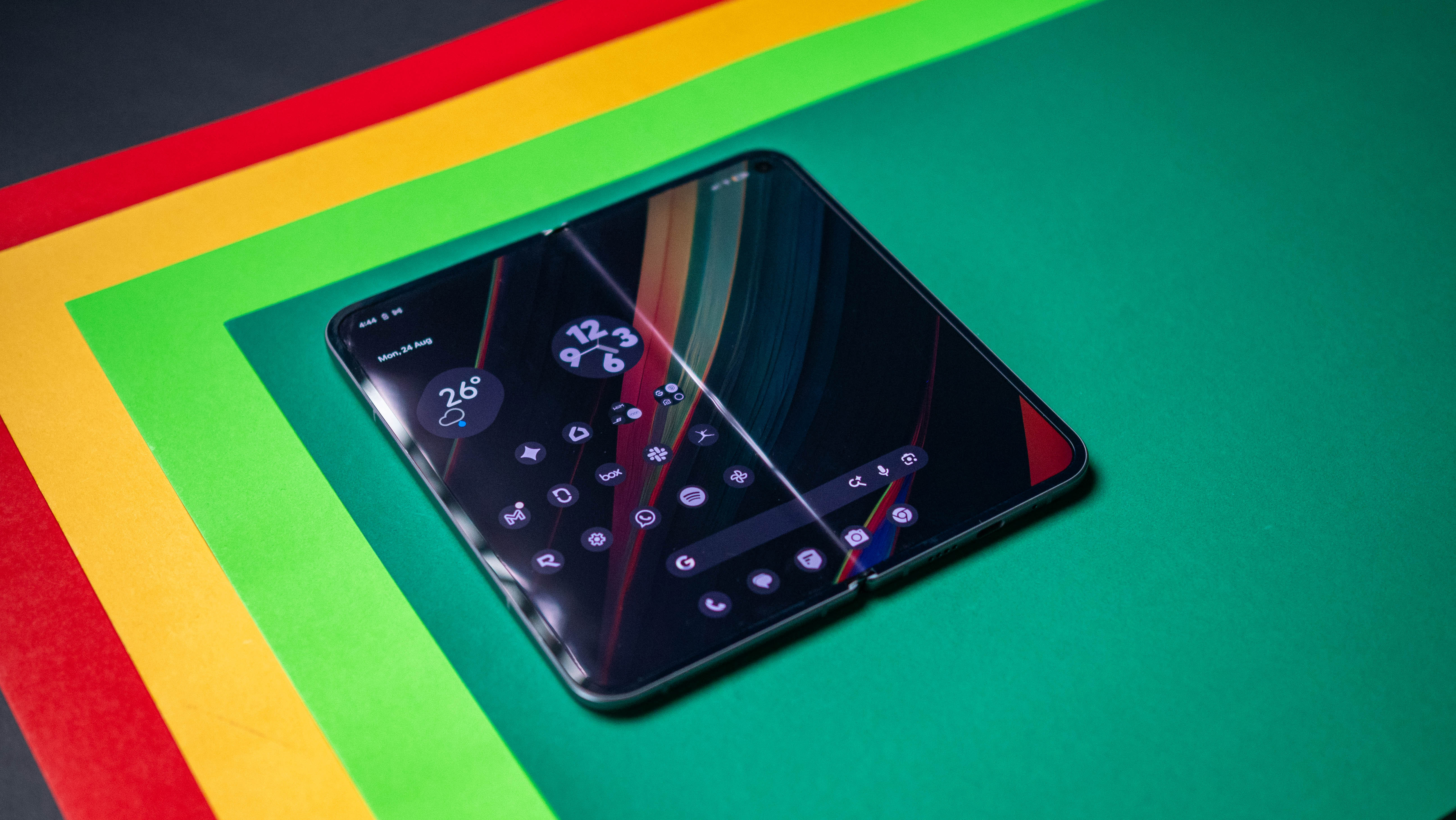
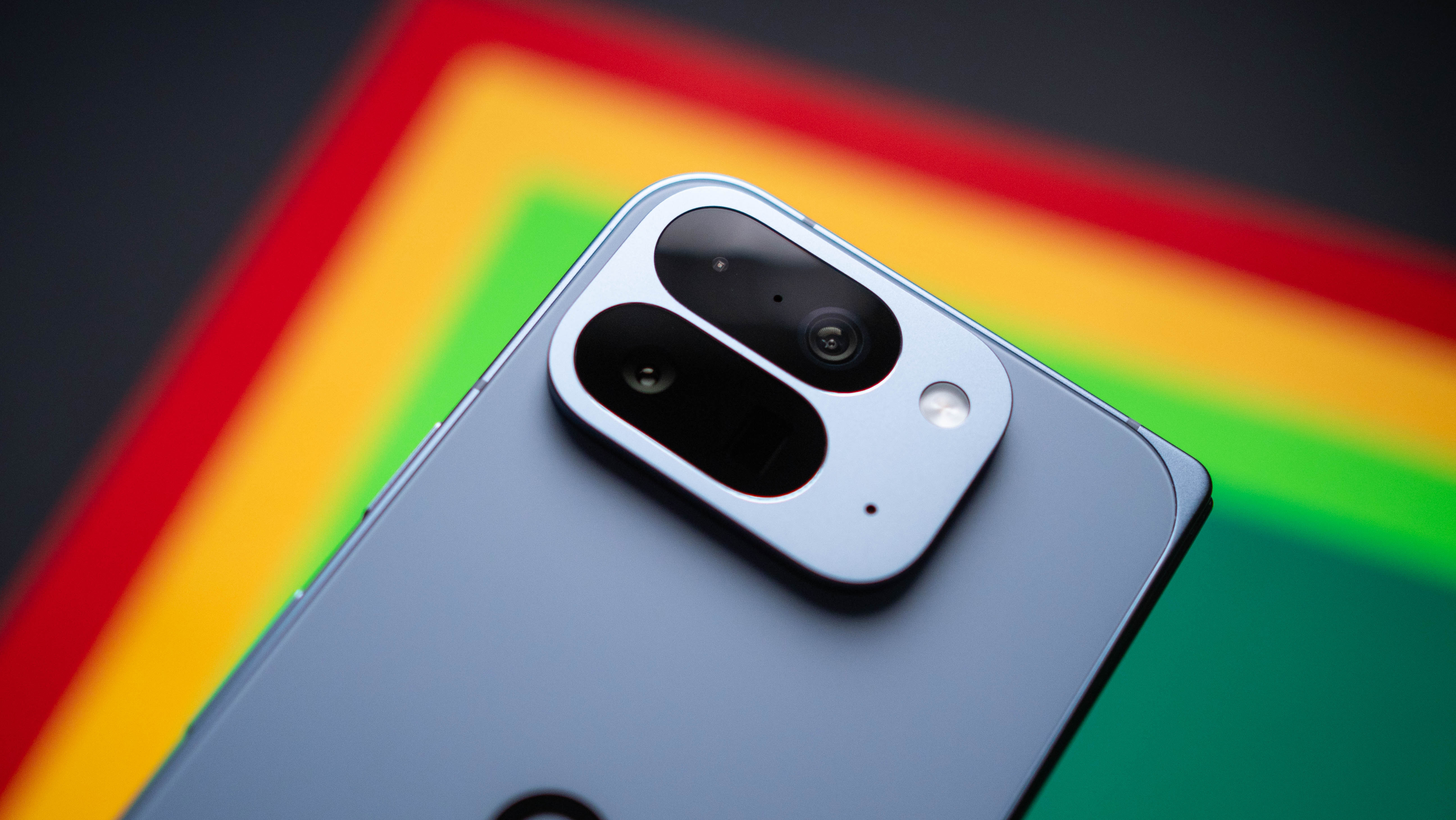
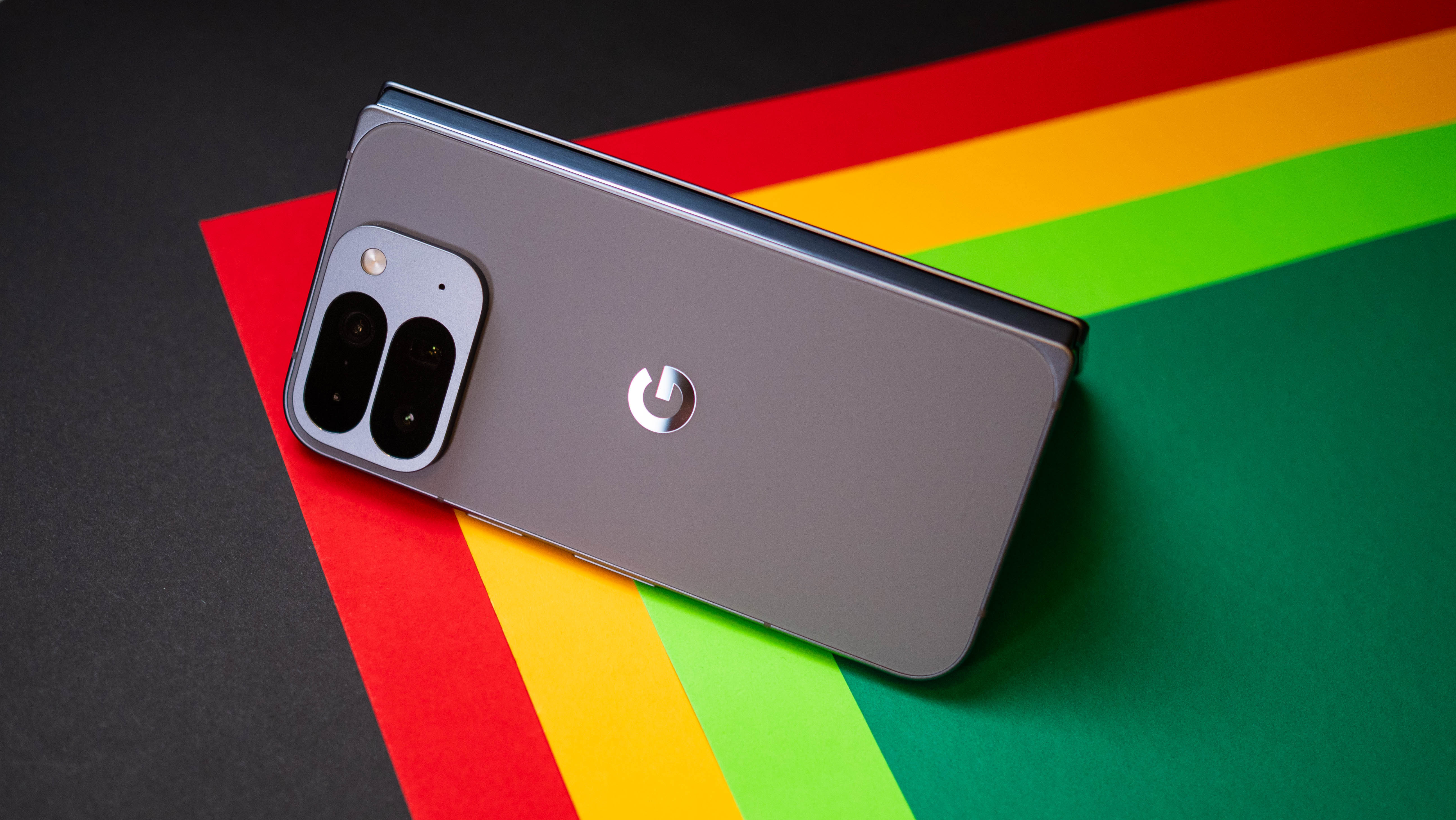
It took me a while to like the Pixel 10 Pro Fold; I didn't like that Google basically retained the same feature-set as the Pixel 9 Pro Fold and just added a bigger battery and IP68 ingress protection. At 258g, the Pixel 10 Pro Fold is one of the heaviest foldables — only my Huawei Mate XT is heavier, and that's basically a tablet that folds down to a phone.
The heft notwithstanding, the Pixel 10 Pro Fold has other issues: the cameras are underwhelming compared to the Vivo X Fold 5 and Galaxy Z Fold 8 Ultra, battery life is average, and cellular connectivity isn't quite as stable as I'd like. But having used the foldable on and off for the better part of a year now, I will say that it is much better to use than its specs would suggest, and the software continues to be among the best around.
Google's software is why I used the Pixel 10 Pro Fold instead of other foldables. I like the bright colors and customizability that's available in Material You, and Google does a great job with the interface in general, delivering a clean UI without any clutter. And with the 10 Pro Fold, Google optimized the software a little better, and there's better fluidity than in previous generations, which makes a noticeable difference when navigating the interface.
Magic Cue is one of my favorite additions, and I like that it pulls up any contextual detail without me having to dig for it. Whether that's sharing waybill details when calling DHL about recent deliveries or surfacing reservation details, it is genuinely useful. Google does a good job bringing most Gemini features to other phones, but there are a few exclusive to Pixels, like Magic Cue.
The software has gotten better with Android 17, and Bubbles multitasking is easily my favorite feature. It's annoying that it won't be coming to other phones, but the floating windows mode makes it easy to maximize the real estate of the 8-inch inner panel, and I use it constantly. Other foldables do a great job with multitasking in general — ColorOS' Open Canvas is the gold standard — and while Google should have stolen the feature, it's good to see some progress in this area.
I also like the size of the cover screen; the 6.4-inch panel is slightly wider than its predecessor, and it's the ideal size. While Google had its share of screen-related issues in the past, I didn't see any problems with the outer or inner panels in the year I used the Pixel 10 Pro Fold. Both panels are among the brightest in the category, and they have good color vibrancy.
After a year of unfolds, the crease hasn't deformed, and the hinge articulation is just as smooth as the day I set up the device. A lot of that has to do with IP68 dust and water resistance. While I didn't submerge the foldable in water, dust ingress is a constant problem on these devices, and thankfully, I didn't have to worry about that in the slightest.
With plenty of tuning updates over the course of the year, the cameras on the Pixel 10 Pro Fold still don't pass muster. It has been a regular source of frustration with the foldable, and in a year where other brands made huge strides in this area — the X Fold 5 and Find N6 have outstanding cameras — the 10 Pro Fold is distinctly second-best.
I carry two phones, and for most of the last 12 months, the secondary phone was the iPhone 17 Pro, so I had an alternative whenever I needed to take photos. That doesn't make it any less annoying that a $1,799 foldable can't take reliable photos or videos.
The 10 Pro Fold is heavy enough as it is, so I didn't bother with a case. The foldable took its share of tumbles, but it is unscathed. There are some scratches that have accumulated over the course of the year, but on the whole, the Gorilla Glass Victus 2 protection did its job. If anything, I don't put a case on any phone that has Victus 2, and it's proven to be reliable — at least in the way I use my devices.
While I didn't think much of the design, the rounded corners definitely make a difference. They make holding the 10 Pro Fold a little easier, and there's enough thickness at the sides to open the inner screen. This is an issue on the Galaxy Z Fold 7 and the Z Fold 8 Ultra, and not just because they're thinner — the X Fold 5 and Find N6 are just as easy to unlock as the 10 Pro Fold. I'm chalking it up to the way Samsung designs its foldables.
I'll admit that the Pixel 10 Pro Fold doesn't have the best internals. It's continually annoying that Google prioritizes other areas like the TPU instead of CPU and GPU performance, and this means the Tensor G5 isn't suited for playing demanding games.
That said, it held up a lot better than I imagined. While I test visually-intensive games as part of a review, I don't play high-end games on my phone all that much, and the ones I actually play the most — Balatro, Ball x Pit, and CloverPit — run without any issues. There is some overheating with gaming sessions lasting over an hour, but that's the case with every foldable, and not unique to the Pixel 10 Pro Fold.
Another bugbear is connectivity. The Exynos modem that Google went with isn't as good at maintaining a signal, so I frequently saw cellular connectivity issues while at home.
The single biggest annoyance with the Pixel 10 Pro Fold proved to be the cameras. Other than that, the foldable was better than I imagined. Thankfully, I didn't run into many software bugs; outside of Magic Cue getting disabled by an update, I didn't notice any problems. I know that's an outlier considering the thousands of messages on Google's troubleshooting pages, but it hasn't been much of an issue in my usage.
While I enjoyed using the Pixel 10 Pro Fold, I wouldn't necessarily recommend the foldable. There isn't a single feature that truly stands out, and while that's not a bad thing, it doesn't make for an exciting phone.
Look, I generally prefer Google's software and don't mind some of the annoyances that come along the way, but it may not be what you're looking for in a device that costs over $1,700 — particularly when there are better all-round choices available.
If you're a Pixel fan and are considering a foldable, I'd suggest getting the 11 Pro Fold; I'm switching to it now, and it addresses a lot of the 10 Pro Fold's issues around imaging. And if you don't have a brand allegiance and just want to try out a book-style foldable, the Moto Razr Fold continues to be fabulous.
from Latest from Android Central https://ift.tt/wtmO5Nq
via IFTTT
Samsung and Corning are reportedly developing self-healing display glass for the upcoming Galaxy S27 Ultra.
The new Gorilla Armor could recover from everyday micro-scratches instead of focusing purely on scratch resistance.
Self-healing tech isn't entirely new, but the Galaxy S27 Ultra could bring it to a flagship phone's front display.
The Galaxy S27 Ultra is also rumored to feature a major redesign with an iPhone 17 Pro-like horizontal camera plateau.
Rumors and leaks surrounding the Samsung Galaxy S27 series are starting to pick up, and the latest one claims Samsung could be working on a self-healing display for the Galaxy S27 Ultra.
Samsung already introduced a major display upgrade with the Galaxy S26 Ultra, adding its Privacy Display technology that prevents people around you from easily seeing what's on your screen. With the Galaxy S27 Ultra, though, Samsung could be preparing another major upgrade, this time allowing the display to recover from minor scratches on its own.
According to leaker Schrödinger on X, Samsung and Corning are reportedly working on a new self-healing surface for the next generation of Gorilla Armor. The goal, according to the post, is to create a display that can recover from a certain level of everyday micro-scratches over time.
🚨 EXCLUSIVE | GALAXY S27 ULTRASamsung and Corning are reportedly working on a new self-healing surface coating for the next generation of Gorilla Armor.The goal is reportedly to allow the surface to recover from certain levels of everyday micro-scratching, rather than simply…August 21, 2026
Instead of simply making the glass harder and more scratch-resistant, Samsung and Corning could take a different approach. According to the leak, the surface itself may be slightly softer than the tempered glass we're used to, but would gain the ability to recover from smaller scratches on its own.
If the technology works as intended, Samsung could essentially move Gorilla Armor from focusing purely on scratch resistance to scratch recovery.
The leaker doesn't reveal much more about how the technology works or how far along Samsung and Corning are in its development. However, the feature is explicitly said to be intended for the Galaxy S27 Ultra, meaning we could potentially see it debut within the next six months.
(Image credit: Nicholas Sutrich / Android Central)
This wouldn't be the first time we've seen self-healing technology on a smartphone. More than a decade ago, LG introduced the LG G Flex 2 with a self-healing back panel that could recover from smaller scratches. But we haven't really seen the idea make its way to the front display of a mainstream flagship, which could make Samsung's implementation particularly interesting.
There have been a few other Galaxy S27 Ultra leaks recently as well, including one suggesting a major redesign that looks eerily similar to Apple's iPhone 17 Pro lineup. Samsung could reportedly ditch its familiar vertical camera arrangement for a horizontal camera plateau stretching across the back, with two large camera lenses on the left and a pill-shaped module next to them.
Of course, nothing is set in stone just yet. The Galaxy S27 Ultra is still months away, and plenty could change before launch. But with leaks now starting to pick up, we're finally getting a better idea of what Samsung might have planned for its next flagship.
from Latest from Android Central https://ift.tt/b8SQWqs
via IFTTT
PocketBook is ditching its classic wider designs for a tall, 5.84-inch e-reader that fits in your pocket.
The PocketBook Q features a 5.84-inch E Ink Carta 1300 display with 788 × 1576 resolution and 300 DPI, packed into a 154 × 75.8 × 6.5mm body weighing just 130g.
It has physical page-turn buttons that pair with a Linux-based OS that skips notifications, feeds, and scrolling-focused apps.
PocketBook is stepping away from the classic, wider reader designs that we typically see across its lineup. The Swiss brand is announcing the PocketBook Q, a small device that ditches traditional ebook proportions for a tall, phone-like shape.
The PocketBook Q is set to debut at IFA 2026 in Berlin, shrinking everything down to a 5.84-inch E Ink Carta 1300 screen — that's 788 × 1576 resolution at a crisp 300 DPI — packed into a body measuring 154mm x 75.8mm x 6.5mm and weighing just 130g. For reference, that's lighter than the 131g PocketBook Mini of 2013 and thinner than just about any e-reader the company ever made.
Inside is a RockChip RK3566 processor, 1GB of RAM, 32GB of internal storage, and a 1550mAh battery that PocketBook says will see you through well over a month of reading. The storage, in particular, is double what is on offer in the PocketBook Era, giving the tiny reader plenty of space for e-books, comics, and audio without making the device any bigger.
So why the phone format? The company is actually pushing the one-handed use. There are actual page-turn buttons on the side, so it feels more like flipping a page than swiping a screen.
The Linux-based OS is simple: no notifications, no feeds, and no apps to keep you scrolling. There are only books, audiobooks, and a text-to-speech feature that reads any text file aloud using natural-sounding voices.
PocketBook says the e-reader’s adaptive SMARTlight adjusts brightness and color temperature throughout the day.
The Q supports 25 ebook formats natively — EPUB, PDF, MOBI, AZW, CBR, you name it — and Adobe DRM and LCP for library borrowing via the pre-installed PocketBook x Libby app. It features dual-band Wi-Fi, Bluetooth 5.0 for headphones, and USB-C with OTG support. It has an IPX4 water resistance, so it’ll survive a splash, though you probably shouldn't take it swimming.
Do people want an e-reader in the shape of a phone? PocketBook is betting the answer is yes — enough to price it at €235/$175 and release it this fall.
from Latest from Android Central https://ift.tt/4X6uomi
via IFTTT
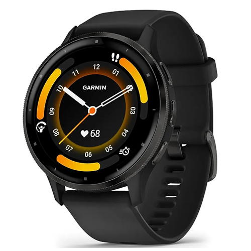
Garmin has been producing industry-leading fitness smartwatches for years, but major discounts on the wearables can be difficult to find outside of major sale events. This is particularly true if you're looking at the brand's popular Venu and Forerunner series of watches, which is why I was pleasantly surprised to see Amazon carve a record-smashing 34% off the price of the Garmin Venu 3 this week.
This iconic fitness watch once topped our list of the best Garmin watches money can buy, but three years after launch, is the Venu 3 still worth it? It largely depends on what you're looking for in a wearable. Let's break it down.
Despite its slightly-advanced age, the Garmin Venu 3 still impresses with great battery life, comprehensive health tracking, and a vibrant AMOLED display. Grab the Venu 3 from Amazon today and you'll score 34% off your purchase. That's the biggest discount that the fitness watch has ever received. View Deal
The Venu 3 is the predecessor to Garmin's Venu 4, which is currently sitting at the top spot in our guide to the best fitness watches of 2026. Shockingly, the last gen model actually surpasses the Venu 4 in a few areas, with better battery life (up to 14 days) and a lighter polymer casing. You also get the same accurate health sensors with both models, stainless steel bezels, and nearly-identical designs.
Furthermore, the Garmin Venu 3 boasts a ton of comprehensive health and fitness monitoring features (including ECG), NFC and GLONASS GPS tracking, and a built-in microphone for calls. All good stuff, so what's the catch?
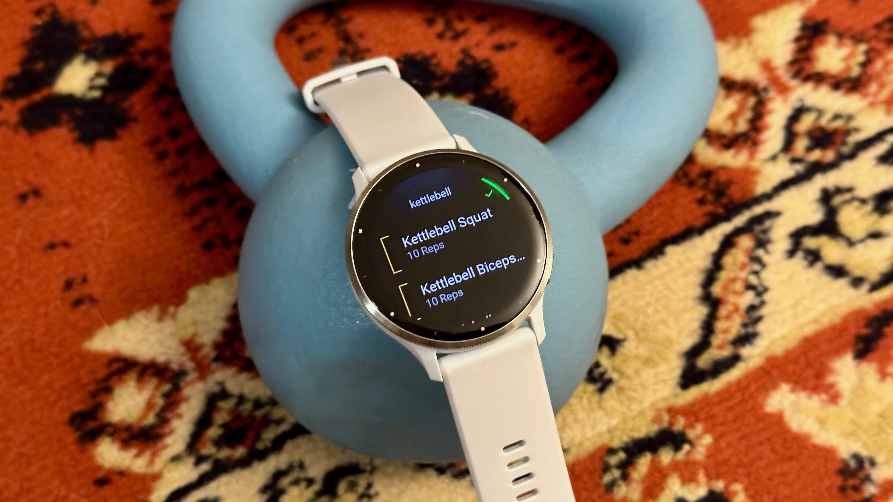
Well, if you're accustomed to a newer fitness watch, the Venu 3 can feel a bit lacking in the software department. You get all of the Garmin basics, such as Body Battery, VO2 Max, and 30 pre-installed sports modes, but you miss out on newer additions like Fitness Coach, Health Status, and Sleep Alignment. The Garmin Venu 3 also doesn't have the built-in flashlight or dual-band GPS.
(Image credit: Michael Hicks / Android Central)
That being said, with the current Amazon discount, the Garmin Venu 3 is a whopping $205 cheaper than the Venu 4. If you're a self-guided athlete who doesn't need all of the latest software features, the Venu 3 is a reliable fitness watch at an exceptional price. It'd also make an excellent entry-level watch for someone who's just now getting into tracking their fitness.
For folks who want the latest and greatest in fitness-tracking technology, however, you may want to wait. After all, the Garmin Venu 4 is sure to get a hefty discount of its own one of these days, right?
from Latest from Android Central https://ift.tt/1Slqt3Z
via IFTTT
When I heard that the Galaxy Watch 9 would be powered by the Snapdragon Wear Elite, I was excited about the prospect of a proper flagship Qualcomm chip on a smartwatch. That’s not to say recent chips have been bad, but it finally feels like Qualcomm is putting its best foot forward- enough that Samsung is finally willing to ditch its own Exynos chips.
However, after testing the Galaxy Watch 9, I've questioned whether a premium smartwatch chip of this caliber is really necessary. Sure, performance is great, but I haven’t exactly struggled to use smartwatches powered by Qualcomm’s last two chipsets. And in the pursuit of power, the Galaxy Watch 9 seems to suffer in one major area, which makes me think Google had the right idea after all with the Pixel Watch 5.
A smartwatch comfortable enough to sleep with
(Image credit: Derrek Lee / Android Central)
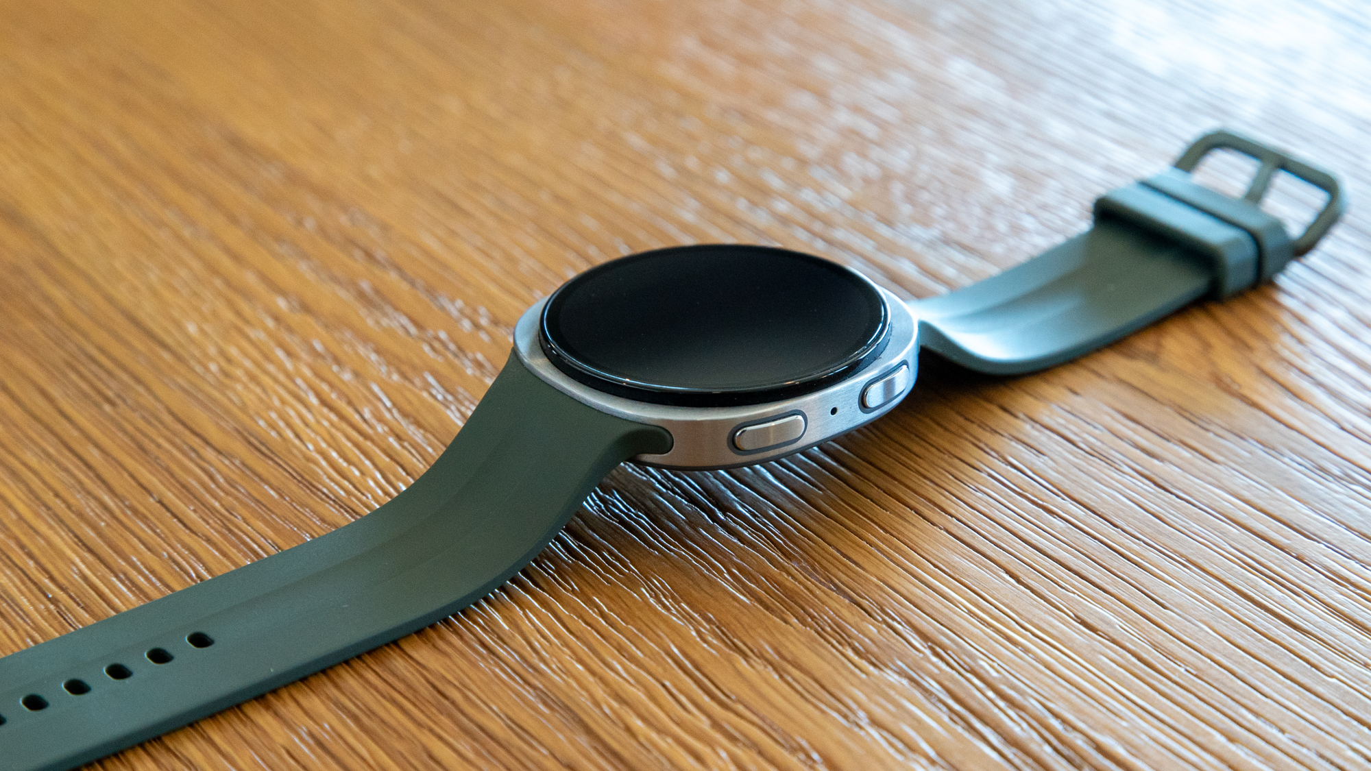
The Galaxy Watch 9 continues a trend it started with the Watch 8, with a thin, lightweight design that's pretty much identical to its predecessor. It has a circular display encased in a square-ish and feather-light aluminum chassis, making it probably the most comfortable smartwatch I've used.
At just over 34g, it's not quite as light as something like the Fitbit Air or Garmin Cirqa, but it's more than comfortable enough to wear while sleeping. That's important because many of the Galaxy Watch 9's health-tracking features count on the ability to monitor your sleep.
Beyond the watch case, the proprietary Galaxy Watch 9 sport band is light and flexible, allowing it to sit relatively flat on a surface and more flush with your wrist, which should help with health and fitness tracking.
More scores, more to keep track of
(Image credit: Derrek Lee / Android Central)
The Galaxy Watch 9 builds on Samsung's previous smartwatches and features pretty much all the major health-monitoring capabilities you could want in a smartwatch, including newer ones like Blood Pressure Trends.
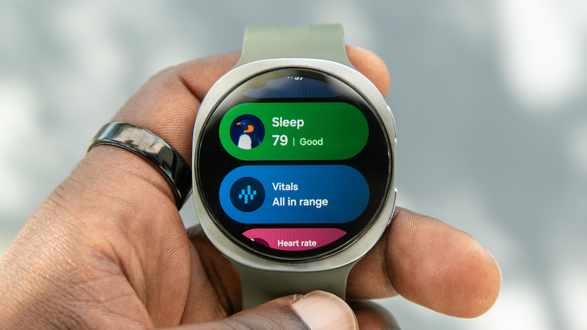
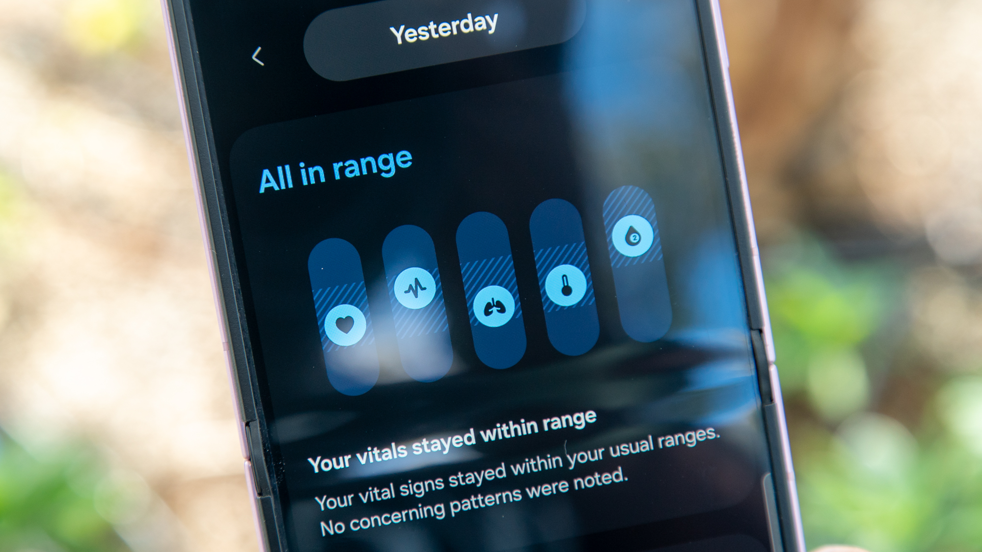
In addition to a Sleep score and Energy score, the watch now provides a look at my Vitals, a new, easy-to-understand view of my major health metrics as I sleep, allowing me to check if anything is off-kilter and find ways to address it.
(Image credit: Derrek Lee / Android Central)
(Image credit: Derrek Lee / Android Central)
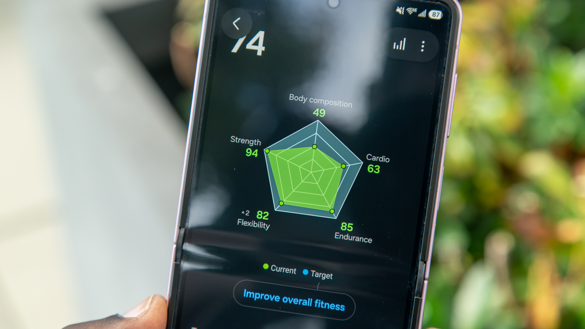
As I track my activities with the Galaxy Watch 9, I can also check my Fitness Index, a set of five scores that measure my physical fitness. It's an interesting concept, but this is probably one of the more confusing features, and it's hard to know exactly how to improve any given score, such as Flexibility or Endurance.
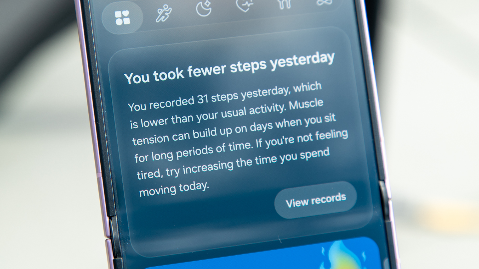
But this confusion is kind of a theme in the upgraded Samsung Health app and in Samsung's overall approach to health and fitness tracking. There is a ton of information to keep track of and a lot of different scores, but much of it feels disparate, with little way to make it useful. There are also features I just can't even take advantage of, like Heart Health, which requires Blood Pressure tracking (I don't have a cuff to calibrate with).
That's not to say more information is bad, but it's definitely a bit overwhelming.
Derrek Lee / Android CentralDerrek Lee / Android CentralDerrek Lee / Android CentralDerrek Lee / Android CentralDerrek Lee / Android Central
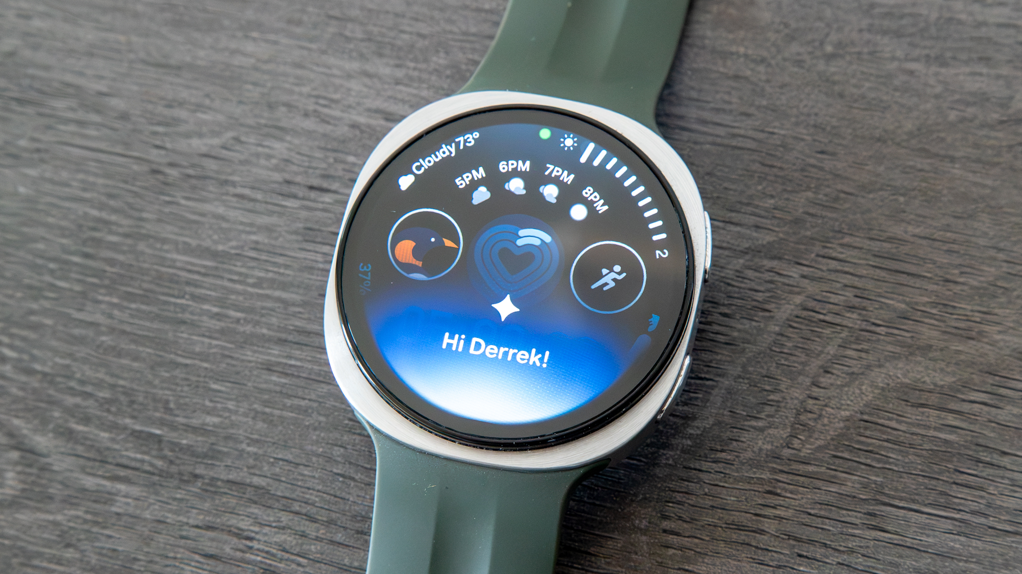
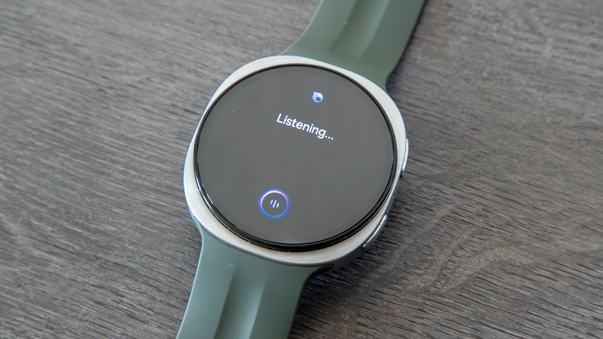
The Samsung Health app does provide occasional notices, including a large banner on the Home tab. But it feels like it's leading towards an AI health assistant that just isn't there (yet). That said, I can always ask Gemini or Bixby to show me certain metrics, such as my Sleep or Energy scores, in addition to their usual functions.
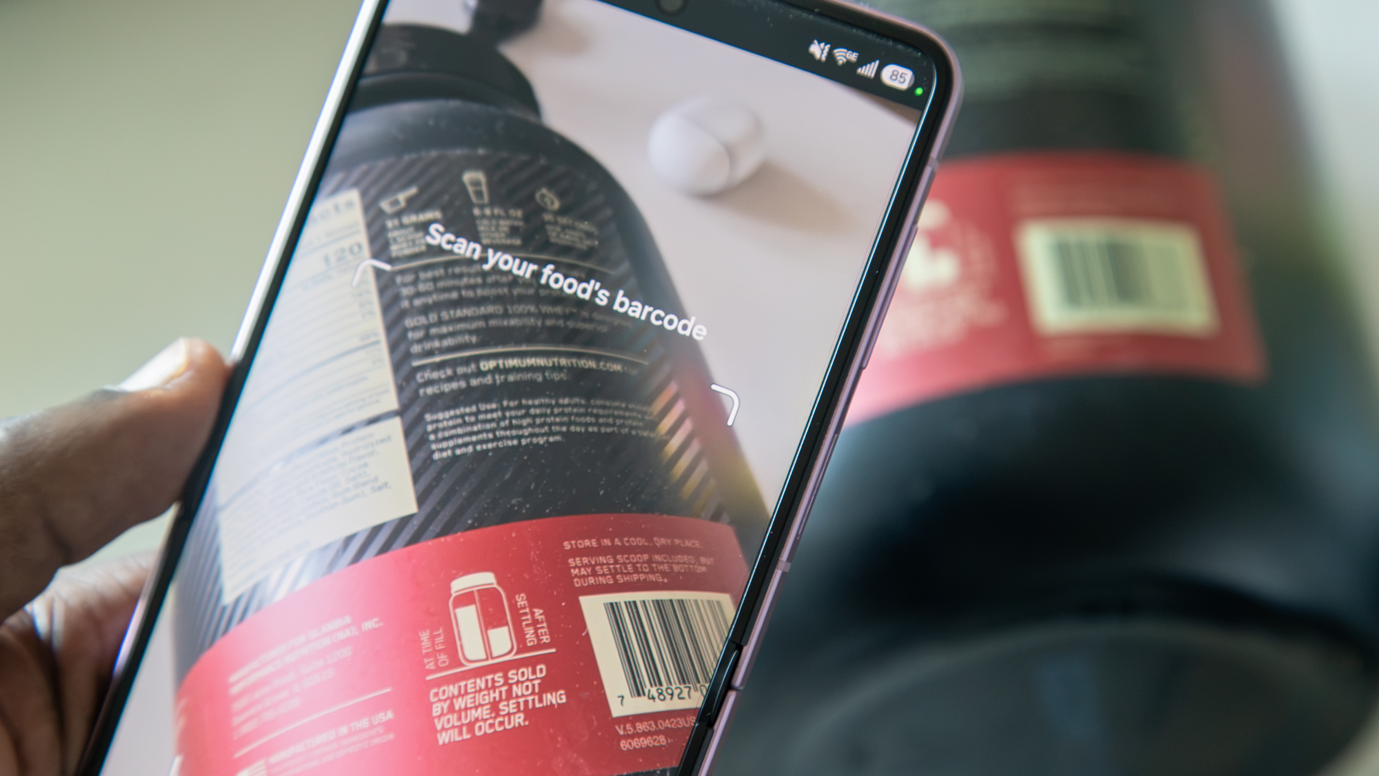
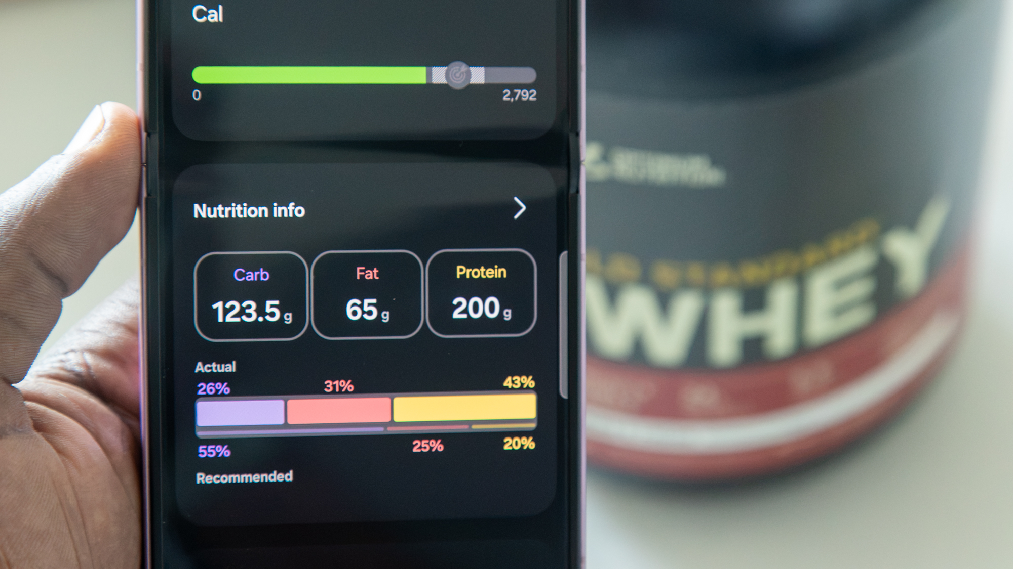
I also like the new layout of the Samsung Health Android app, and the ability to log food makes me want to stop using MyFitnessPal, especially with Antioxidant Index providing more metabolic context. The Watch is also great at workout tracking, automatically detecting exercises like Pilates and providing pretty accurate GPS data for runs.
The price of thinness
(Image credit: Derrek Lee / Android Central)
Unfortunately, the Galaxy Watch 9's thin profile has one major downside: battery life. Samsung squeezed a 445mAh battery into the larger 44mm model, but unfortunately, the watch doesn't last more than a day. In fact, during my testing, the Galaxy Watch 9 barely lasts through the day, and I often have to charge it before bed.
This is with the AOD turned off and Raise Wrist to Wake turned on, while using the watch sparingly throughout the day to check notifications, update apps, and occasionally chat with Gemini. I also monitor my sleep each night, track at least one workout per day, and let the watch automatically track activities like walking, running, and more.
I had been using the Pixel Watch 4 for so long that I forgot what it's like to have a smartwatch that can't last a full day (let alone two).
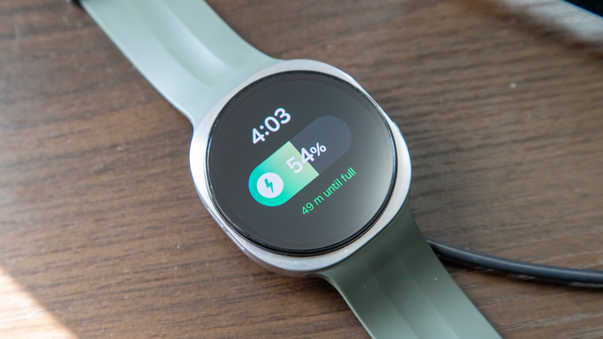
And to make matters worse, charging is incredibly slow. Going from empty to 100% takes well over an hour, to the point where I get tired of waiting for it to fully charge because, frankly, I have places to be.
You can likely get more battery life out of it by disabling certain features, but I feel like this sort of defeats the purpose of having a "smart" watch.
Should you buy the Galaxy Watch 9?
(Image credit: Derrek Lee / Android Central)
The Galaxy Watch 9 has a lot going for it, including great performance, a comfortable design, and a UI that's easier to navigate with gestures. It also has a bevy of health and fitness features that can feel a bit overwhelming, but ultimately are there to give you all the information you need to lead a healthier lifestyle.
That said, I wonder whether the watch could have benefited from a larger battery or a less "Elite" chipset to improve battery life, as the frequent charging kind of ruins the entire experience. I also think Samsung's health and fitness tracking needs the kind of AI overhaul we saw with Google Health to make all its information feel useful.
Still, the Galaxy Watch 9 isn't a bad smartwatch if you need something to track your sleep, runs, or workouts, so long as you remember to charge it frequently.
from Latest from Android Central https://ift.tt/kzyhH07
via IFTTT
Early Galaxy S27 Ultra leaks point to a major redesign with a horizontal camera plateau similar to the iPhone 17 Pro.
Samsung could finally bring native Qi2 support to the Galaxy S27 Ultra, with magnets seemingly visible in leaked renders.
The Galaxy S27 Ultra could reportedly launch in two sizes, potentially giving buyers a smaller Ultra option for the first time.
With the Galaxy Z Fold 8 series out of the way, attention is now turning toward Samsung's next flagship smartphone lineup. And if the latest round of leaks is anything to go by, the Galaxy S27 Ultra could be getting a major redesign that looks a lot like Apple's latest iPhones.
For the past few years, Samsung has stuck with a vertical camera layout across its Galaxy S lineup. In fact, the company has been criticized several times for shipping very similar-looking Galaxy S Ultra phones year after year. It now looks like Samsung is finally planning to move away from that design, but perhaps not in the direction everyone expected.
The leaked design shows a horizontal camera plateau across the back, similar to the latest iPhones, with two large camera rings and an elongated section that will likely house the remaining cameras and LED flash.
(Image credit: X/SonnyDickson)
It's pretty clear where Samsung may be taking some design inspiration from this time around. On the bright side, though, the leaked renders also appear to show a Qi2 magnetic ring on the back, suggesting Samsung could finally build native Qi2 support directly into the Galaxy S27 Ultra.
The leaks also suggest Samsung could offer the Galaxy S27 Ultra in two different sizes, something we've heard rumored previously. If true, that could mean we're finally getting a more compact version of Samsung's Ultra flagship alongside the larger model.
Of course, we're still months away from the Galaxy S27 series launch, and plenty could change before Samsung makes anything official. But these early leaks certainly suggest Samsung is preparing a pretty major design shake-up, even if the inspiration appears to be coming straight from Cupertino.
What do you think of the rumored design? Let us know in the comments below.
from Latest from Android Central https://ift.tt/PdUfXne
via IFTTT
Motorola may have kickstarted the modern flip phone, but Samsung popularized it, and for years the Galaxy Z Flip series was the standard for a stylish, pocketable foldable. Now that the Galaxy Z Flip 8 is out, it arrives at a tumultuous time for both flip phones and smartphones in general.
On the plus side, the Galaxy Z Flip 8 undercuts and is, in some ways, the better buy than Motorola’s Razr Ultra 2026, something I never thought I would say. And despite rumors suggesting the Flip 8 may be the last of its kind from Samsung, it receives some notable changes that I think even Motorola can learn from.
However, with the price increase, few actual hardware upgrades, and the launch of the very compelling Galaxy Z Fold 8, it’s becoming harder to justify buying the Galaxy Z Flip 8.
If it ain't broke...
(Image credit: Derrek Lee / Android Central)
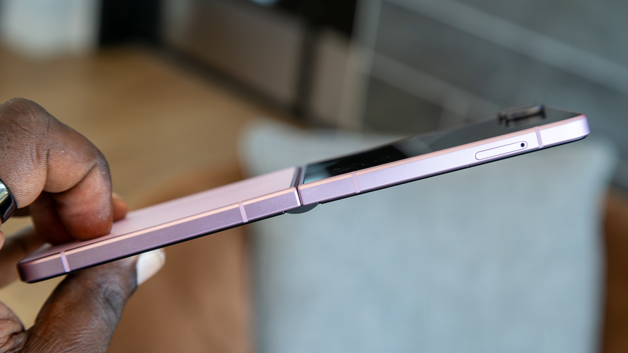
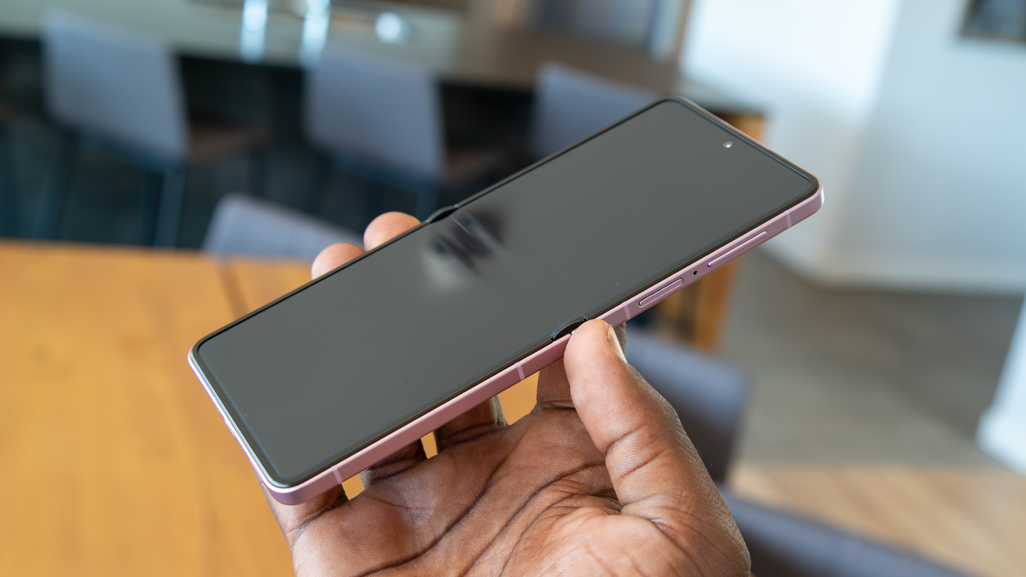
I didn't get to use the Galaxy Z Flip 7, but I was jealous of its thin profile, especially when compared to the Razr Ultra 2025. The Galaxy Z Flip 8 goes further with an even thinner chassis, and it's noticeably lighter than the Razr Ultra 2026. It's pretty impressive, especially since flip phones become quite thick when folded in half, so this goes a long way towards making it truly pocketable.
That said, that thinness comes at a bit of a price: the battery is much smaller than the Razr's, clocking in at just 4,300mAh. That's unchanged from its predecessor, and while it can get me through a day, I haven't been able to squeeze much more out of it. Also unchanged is the charging speed, which, at 25W, feels quite slow for a $1,200 smartphone.
Derrek Lee / Android CentralDerrek Lee / Android CentralDerrek Lee / Android CentralDerrek Lee / Android Central
Fortunately, performance is anything but slow, thanks to the beefed-up Snapdragon 8 Elite Gen 5 and 12GB of RAM, which is as snappy as you'd expect. I play Honkai: Star Rail on the highest available settings and the phone doesn't falter. The only thing I notice when doing any heavy gaming is the top half of the phone getting rather warm, but that's nothing new for flip phones, given their limited internal space for things like a copper vapor chamber.
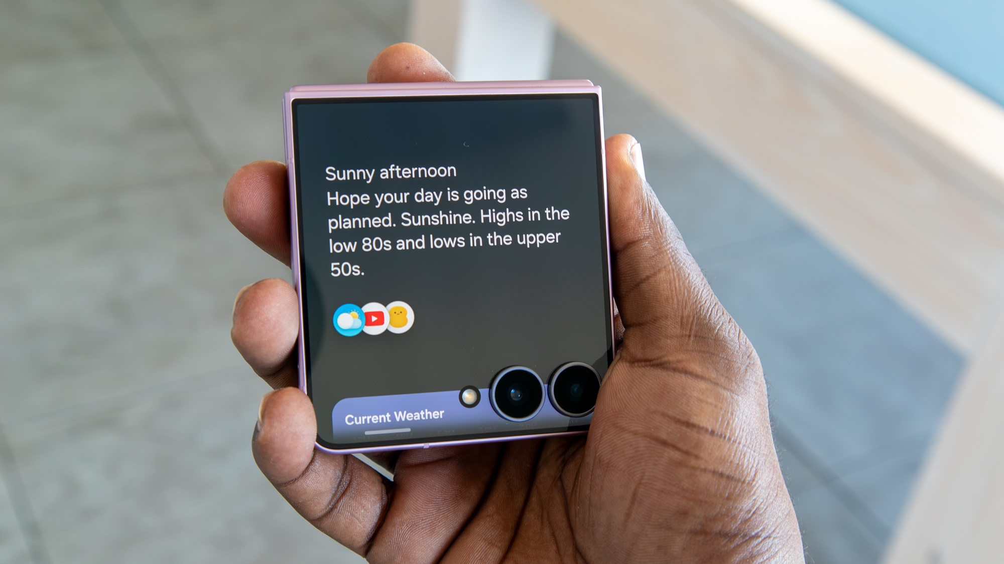
Beyond the overall performance, a benefit of the newer chip is better AI capabilities and access to newer features. Galaxy AI and Gemini Intelligence are found throughout the experience, and features like Now Brief and Now Nudge keep me up to date on my day and make it easier to grab the information or content I need when I need it.
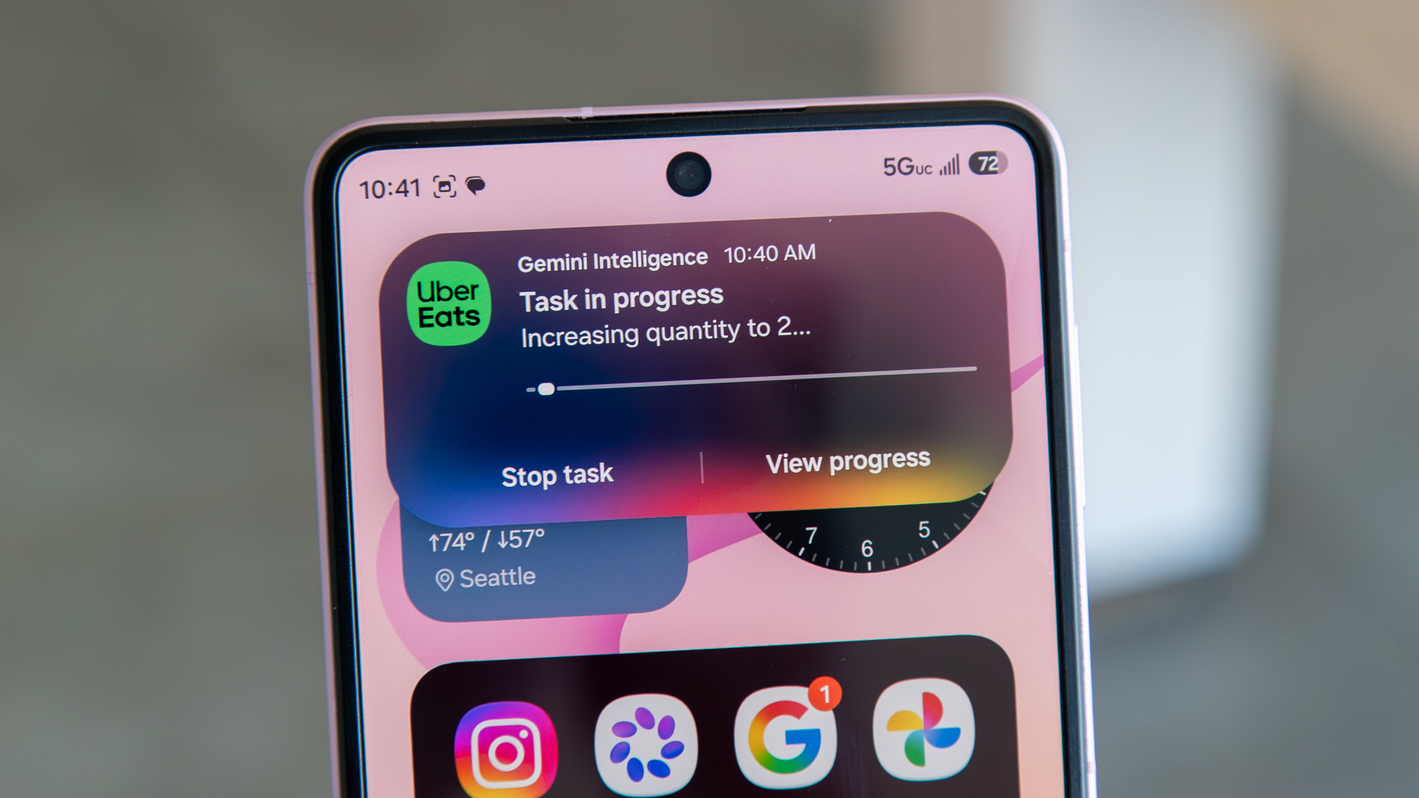
Gemini Screen Automation also supports more apps, though I rarely find much need for it, aside from ordering food when I'm too lazy to open an app myself (is this what we've come to?).
(Image credit: Derrek Lee / Android Central)
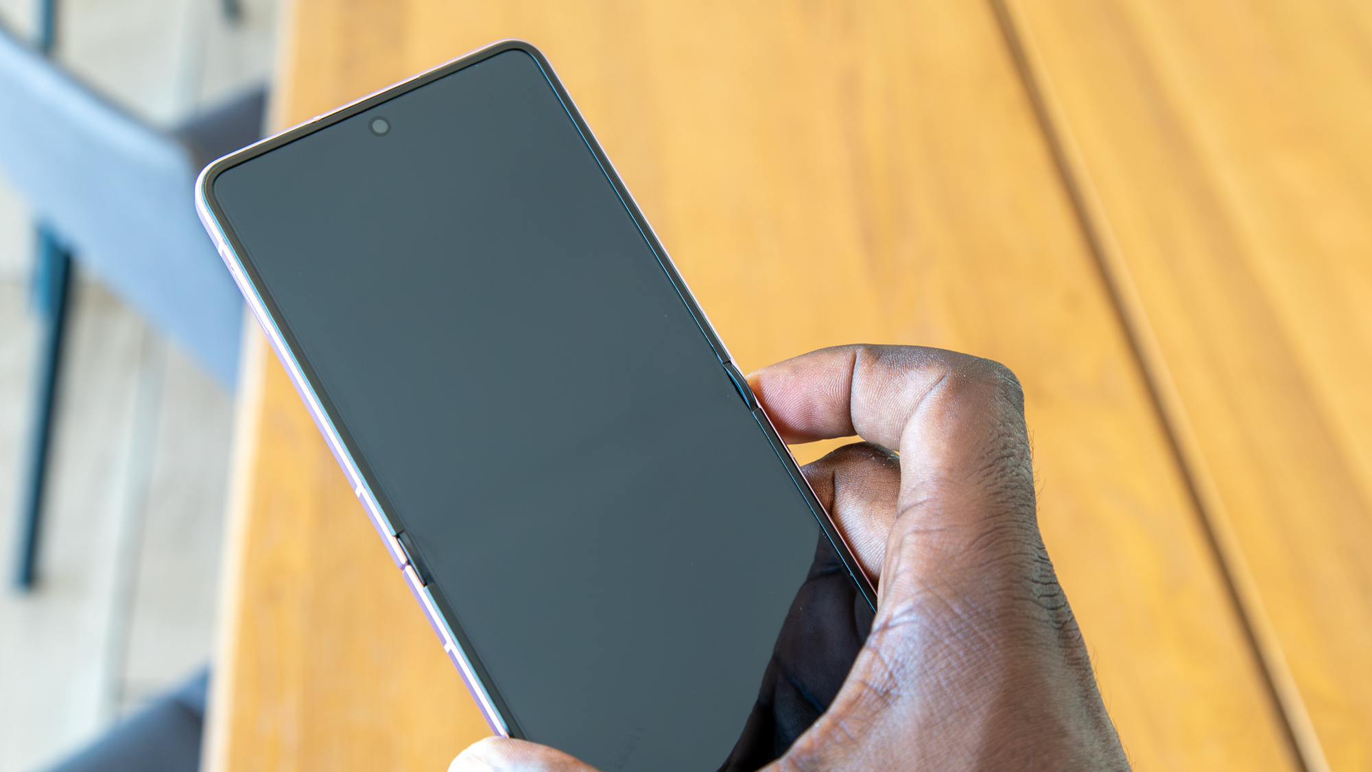
The main display hasn't changed much, and unfortunately Samsung's new Titanium Flex isn't available here, so the crease isn't as inconspicuous as on the Galaxy Z Fold 8. That said, the crease feels very shallow, and dare I say, it feels even better than my Razr Ultra 2026.
(Image credit: Derrek Lee / Android Central)
My only annoyance is that the hinge joint protrudes quite a bit on either end of the screen, which sort of ruins the seamless feel of the display.
That said, the hinge remains relatively stiff, so I can open the Flip 8 to as wide as 45 degrees before it falls back. It's also much easier to flip the phone open with one finger and slam it shut, thanks to the redesigned display bumpers and a more forgiving hinge mechanism.
The cover screen gets (mostly) fixed!
(Image credit: Derrek Lee / Android Central)
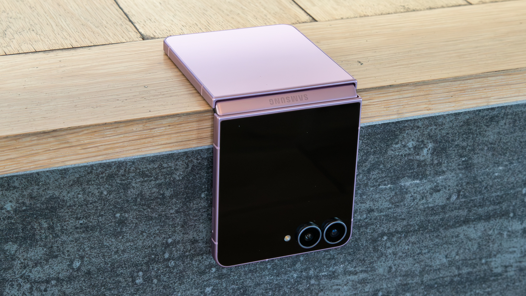
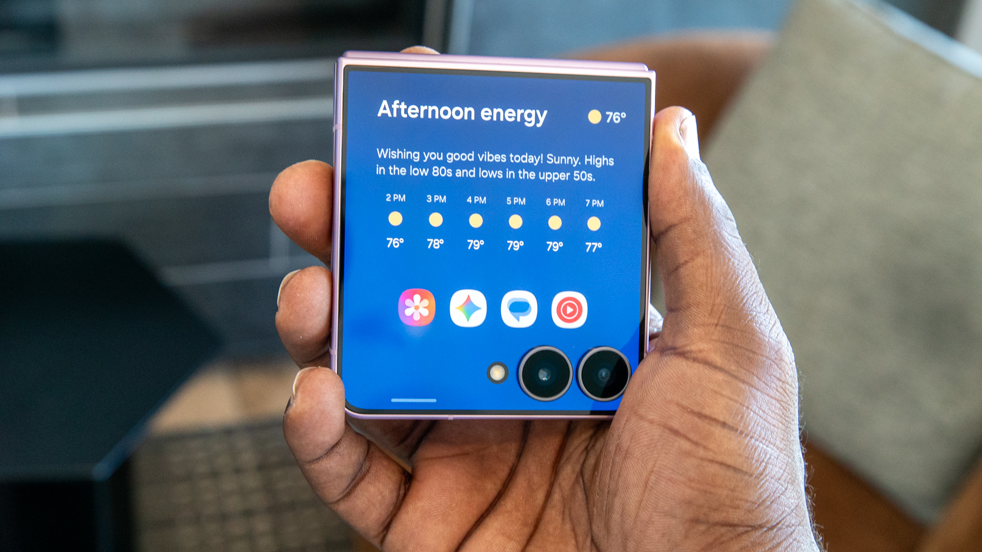
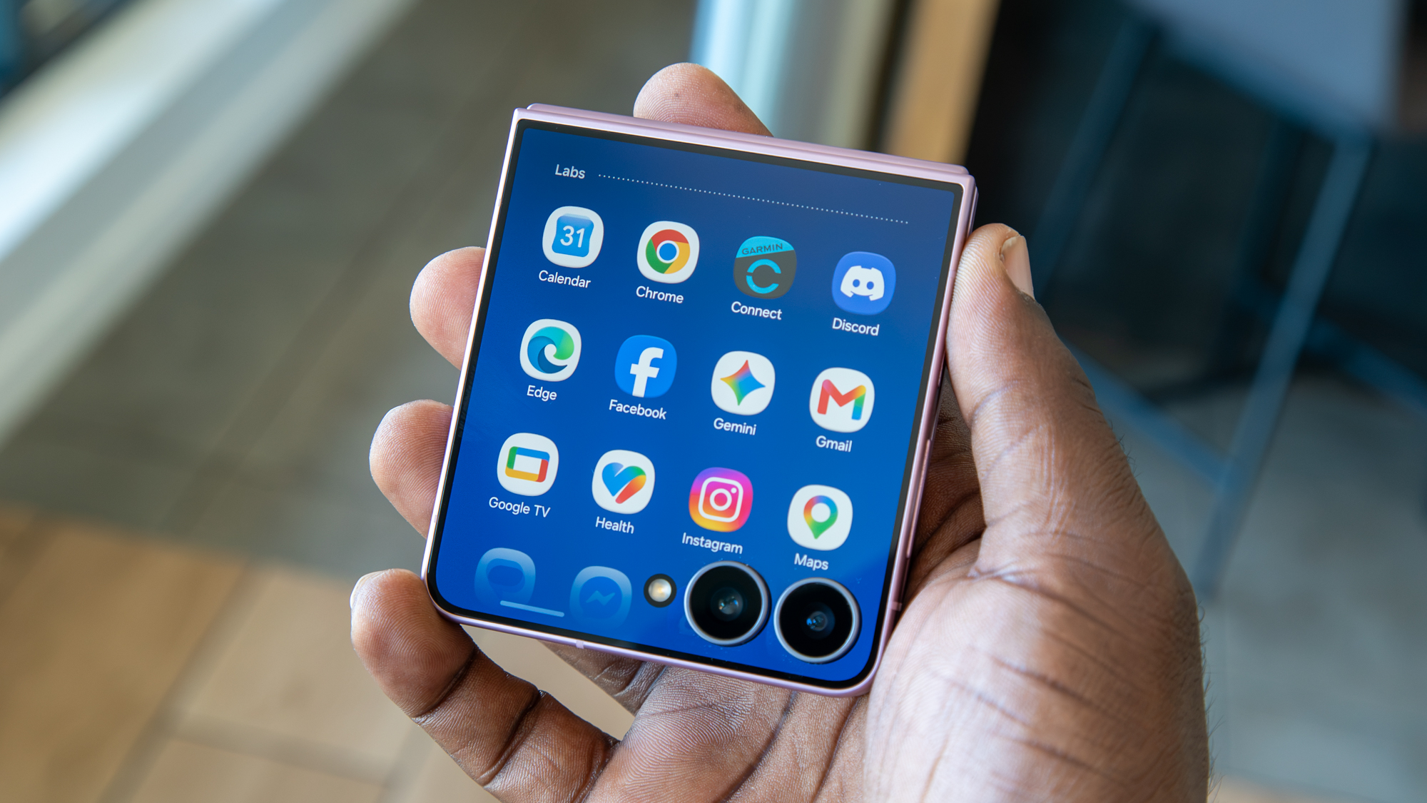
That said, how the main display feels doesn't matter much to me, because most of my time with the Galaxy Z Flip 8 has been spent with the cover screen. Previous versions of Samsung's cover screen that I used felt half-baked, but the company did something new this year by integrating Now Brief into the cover screen and making it the default home screen. It's honestly pretty smart, and it turns the cover screen into a hub for updates on your day and activities.
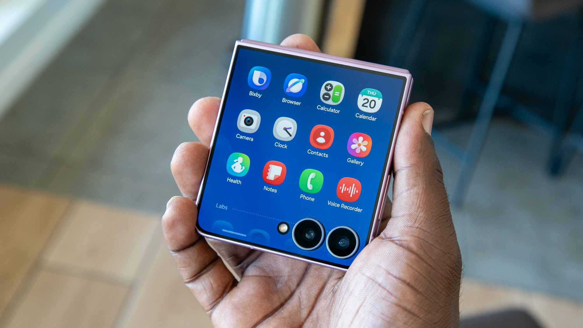
But that's just the start of Samsung's cover screen overhaul. The company revamped the experience so that it acts more like the main UI. That means swiping down enables the Quick Settings menu, while swiping up reveals the app drawer. This differs from previous versions, where apps were available on a separate panel.
Derrek Lee / Android CentralDerrek Lee / Android CentralDerrek Lee / Android Central
What I like about this is that it defaults to Samsung's first-party apps while providing easy access to third-party apps, which are sectioned off underneath. Samsung also makes it easy to access third-party apps, with a button to download the MultiStar module from Good Lock when you first set it up.
I find this new UI quite effective, making the cover screen much more accessible and useful than previous versions. I think Motorola could even take a note from Samsung's revamped UI, as it still keeps its apps on a separate panel.
Plus, any additional panels you create can be filled with app widgets, and some, like Spotify, will take up an entire widget panel. Unfortunately, not every widget is available on the cover screen, but there's a good amount to make them useful.
Derrek Lee / Android CentralDerrek Lee / Android CentralDerrek Lee / Android Central
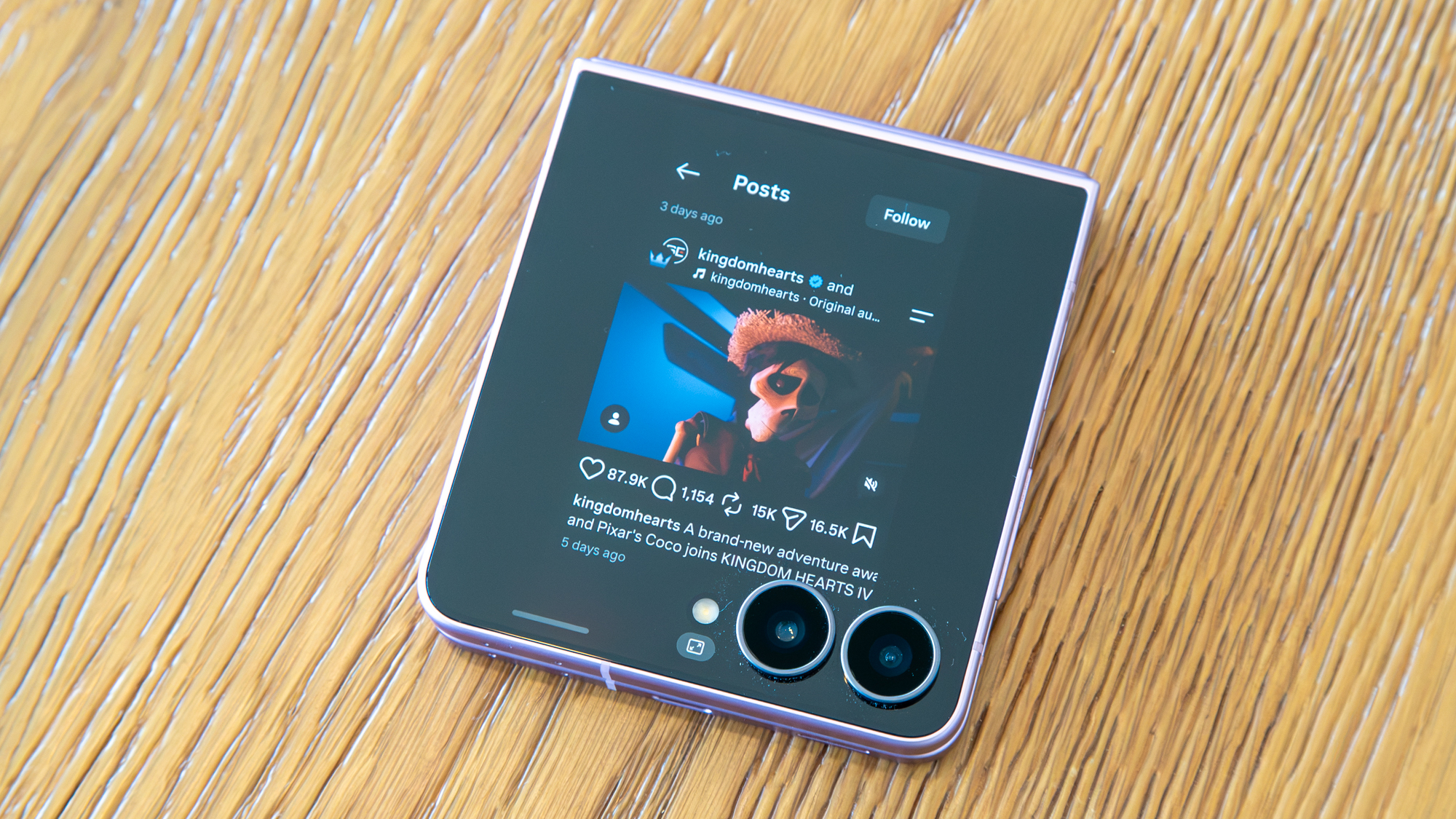
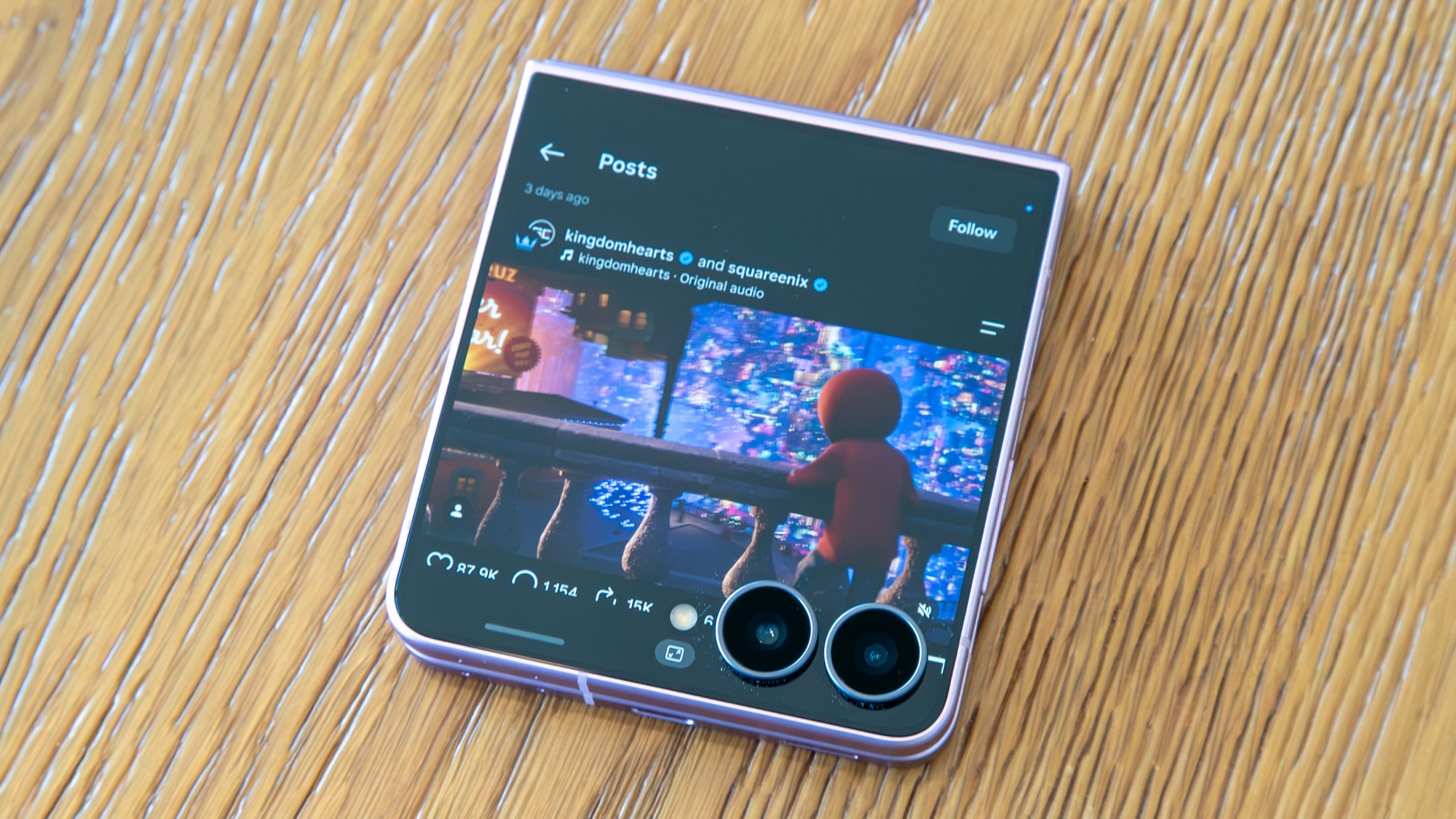
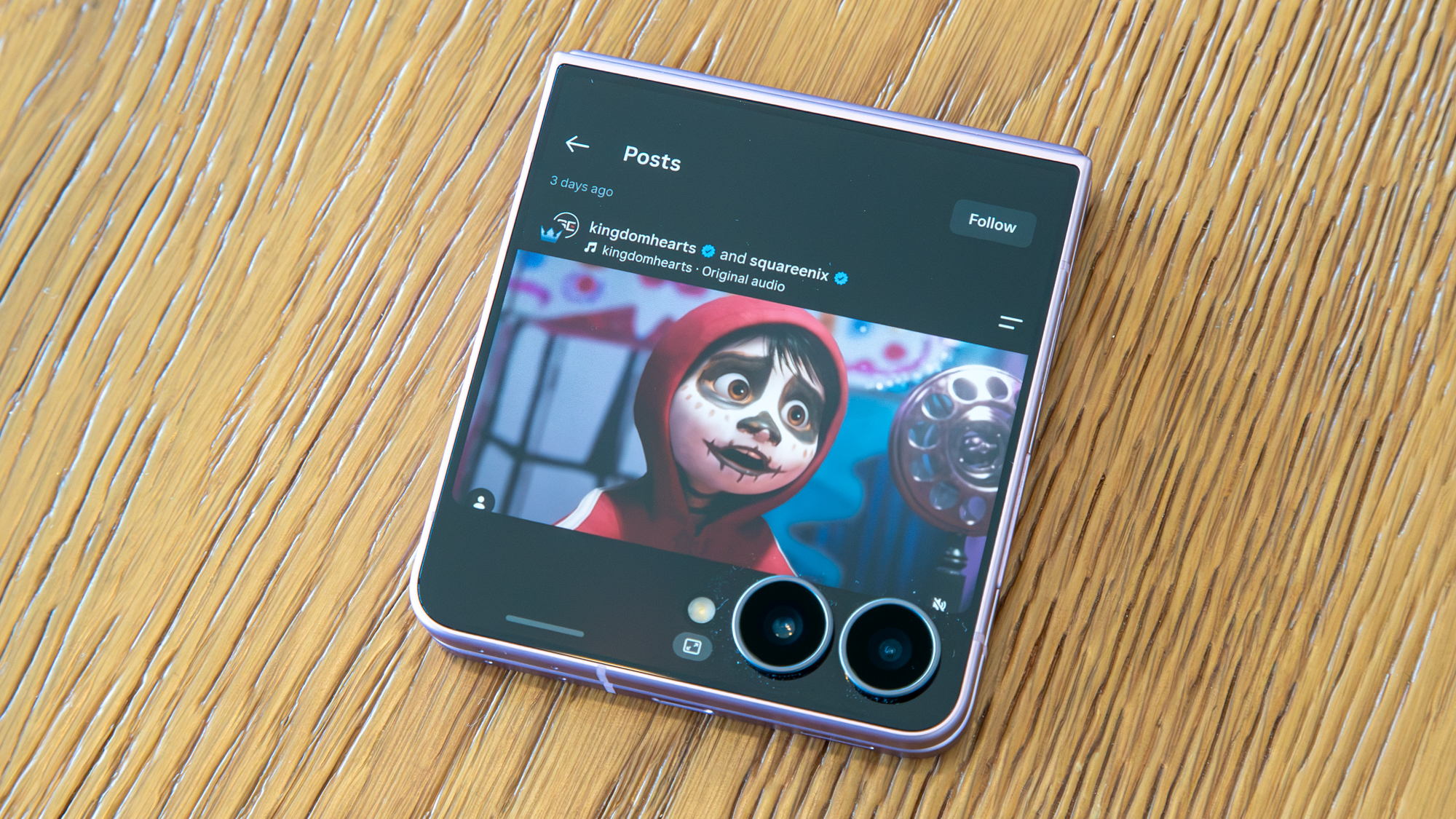
As for using apps, the experience is largely the same, but with some interesting updates. Apps can now open in three different aspect ratios: full screen, cropped up (to avoid the cameras), or in portrait mode for a more full app experience with black bars on either side.
There's a button at the bottom that lets you easily change the app's aspect ratio, which comes in handy depending on the app you're using. The only downside is that, for some reason, the app doesn't stay that way if I switch apps or go back to the home screen and then back to the app, and I find myself constantly switching views.
(Image credit: Derrek Lee / Android Central)
Of course, you can still use the camera with the cover screen for selfies, and you get quick access to photos, videos, and portrait mode. There's also an interesting Flip Shot feature that I didn't understand at first, but I think it's meant to add a little razzle-dazzle to your mirror selfies by displaying various graphics on the cover screen. And since I take a lot of mirror selfies with the camera preview on, this could be a good way to show off the Z Flip 8.
But as for the actual cameras, they're largely the same, and image quality is good but not spectacular. In good lighting, photos look fine, and the cameras even do a good job of freezing time, so you can be sure your dog photos should come out well enough. The downside is that you can't get too close to your subjects, as there's no Macro Mode, unlike on the Razr Ultra.
Derrek Lee / Android CentralDerrek Lee / Android CentralDerrek Lee / Android CentralDerrek Lee / Android CentralDerrek Lee / Android CentralDerrek Lee / Android CentralDerrek Lee / Android CentralDerrek Lee / Android CentralDerrek Lee / Android CentralDerrek Lee / Android CentralDerrek Lee / Android CentralDerrek Lee / Android CentralDerrek Lee / Android CentralDerrek Lee / Android CentralDerrek Lee / Android CentralDerrek Lee / Android CentralDerrek Lee / Android Central
I also love the My FanCam feature, which can take any video and reframe it to focus on one subject, such as your kid or a friend. It's easily one of the best editing features Samsung has released in recent years, and a great way to make social-media-ready clips.
Should you buy the Samsung Galaxy Z Flip 8?
(Image credit: Derrek Lee / Android Central)
On the outside, the Galaxy Z Flip 8 is a minor update from its predecessor. A new chipset and smaller chassis are welcome changes, although I wish the battery and cameras had been upgraded.
The software is the star of the show, and Samsung's One UI continues to be more useful, whether you're using the main display or cover screen. That said, for $100 more than the Galaxy Z Flip 7, I'm not sure it's worth spending this much on a phone that Samsung seems largely uninterested in these days.
The Galaxy Z Flip 8 is good, but it's not $1,200 good. If you can find a discount, however, I would say go for it, or grab the Motorola Razr Ultra 2026 if you can find a good enough deal.
from Latest from Android Central https://ift.tt/xRJrjey
via IFTTT