LightBlog

lundi 1 novembre 2021

Samsung Galaxy Watch 4 & Watch 4 Classic review: Just in time

Samsung nails the fundamentals with its new Google-powered smartwatches.

If you're hoping for a "this changes everything" moment from the Samsung Galaxy Watch 4, a deep exhale after years of pent-up frustration, this isn't it. It's not the electric shock that's going to revive the dying patient. It's not even the much-needed coat of paint after years of neglect.

But it is the next best thing: the coming together of two capable but flawed parties trying in earnest to solve an intractable problem.

We're obviously talking about Wear OS 3, which is the long-awaited culmination of Google's protracted attempt to fish its wearables platform out of the bowl, belly-up since it began to flounder in 2016 or so. But we're also talking about Samsung's wearable line, which hasn't changed much since the original Galaxy Watch debuted in 2018.

When Google and Samsung co-announced their partnership in May, the former yielded some control of its OS to the Korean company, and the latter committed to replacing Tizen with Wear OS on all future smartwatches. Still, it wasn't clear whether it would yield positive results for the entire industry or just, well, Samsung.

And while the writing is still on the wall about the halo effect of Wear OS 3 for Google's existing partners, Samsung's smartwatches do benefit from some Google touches, though not as much as you think, while ultimately delivering the best Android smartwatch experience you can find today.

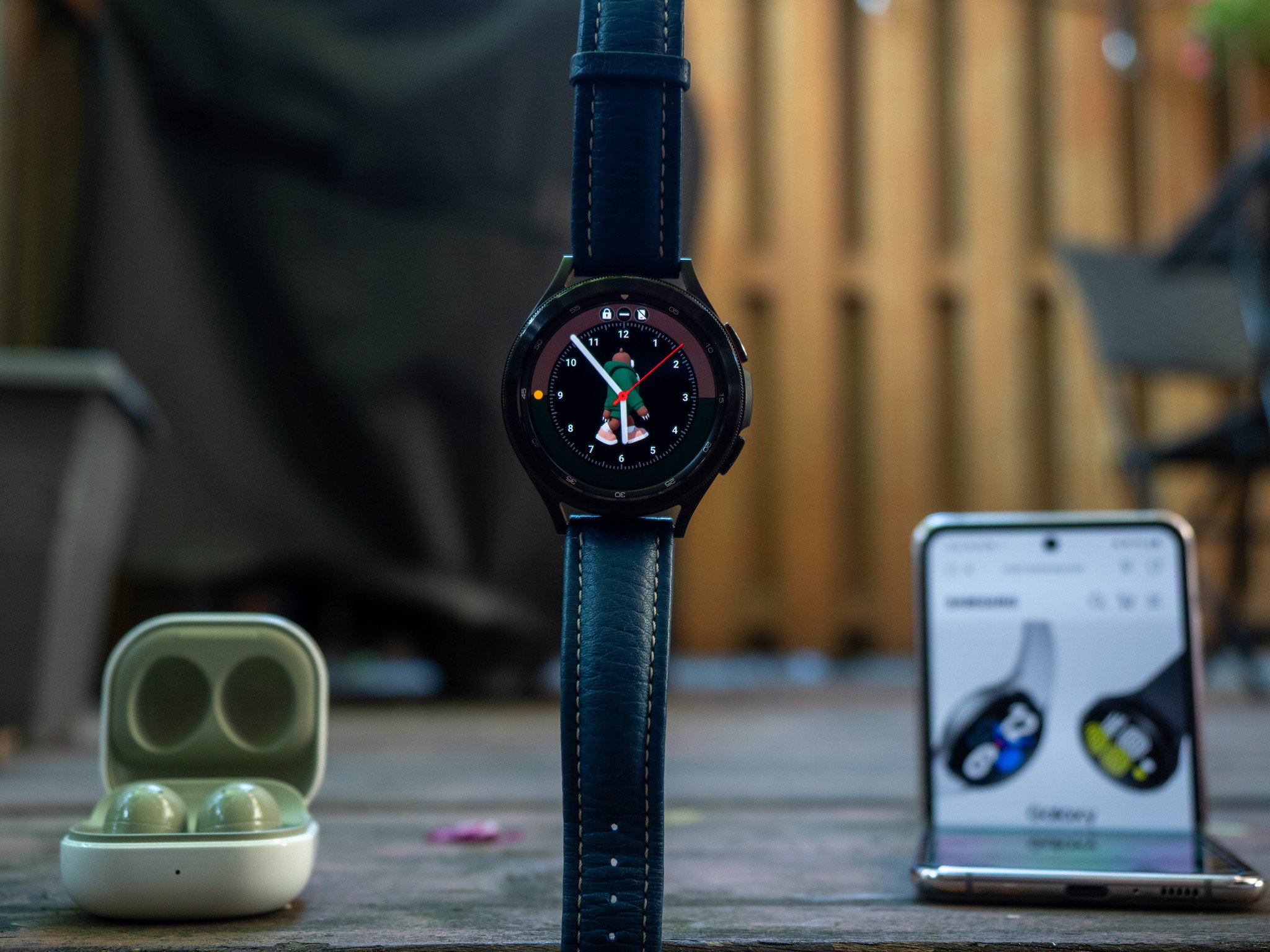
Samsung Galaxy Watch 4

Bottom line: The cheaper of the two Galaxy Watch models this year, the Galaxy Watch 4 has everything you want from a fitness smartwatch but lacks the stainless steel heft and rotating bezel of the more expensive Watch 4 Classic. But if you want the green colorway, which is lovely, the Watch 4 is your only option.

The Good

  • Accessible price
  • Excellent performance and battery life
  • Comprehensive health tracking features
  • Wear OS 3 offers access to Google services
  • Included band is comfortable

The Bad

  • Capacitive gesture navigation is finicky
  • Occasional tension between Samsung and Google services

From $250 at Samsung

Stainless steel

Samsung Galaxy Watch 4 Classic
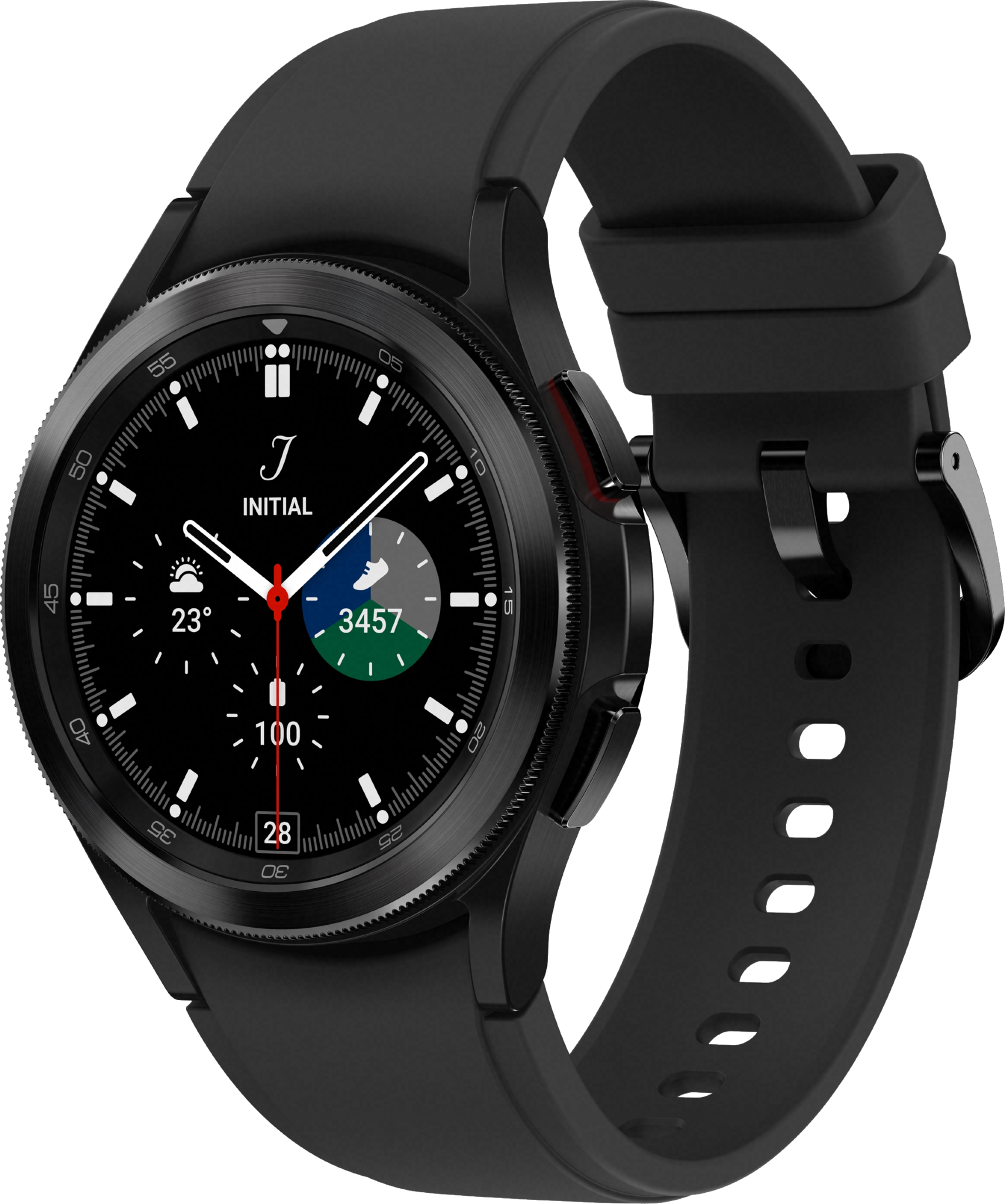
Bottom line: The Galaxy Watch 4 Classic is the true flagship of the Samsung wearable lineup this year with a stainless steel build and rotating bezel, plus all the great performance, health tracking, and longevity of the Galaxy Watch 4.

The Good

  • Excellent performance
  • Comprehensive health tracking features
  • Wear OS 3 offers access to Google services
  • Included band is comfortable

The Bad

  • Occasional tension between Samsung and Google services

From $350 at Samsung

Samsung Galaxy Watch 4: Price and availability
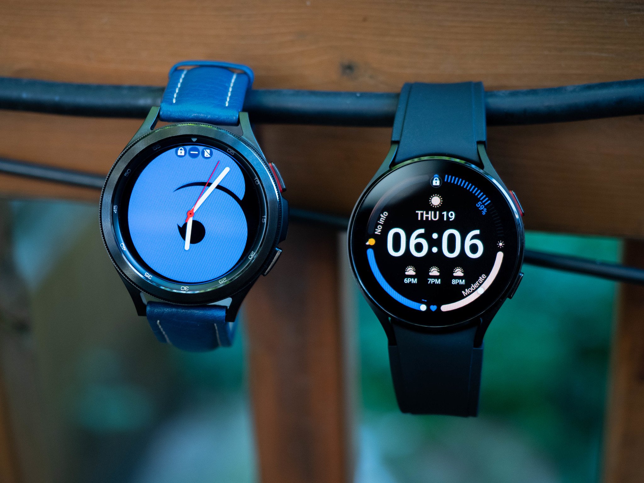
Announced on August 11 and released August 27, the Samsung Galaxy Watch 4 and 4 Classic are available starting at $250 and $350, respectively, from Samsung.com and several popular retailers, including Amazon, Best Buy, and Walmart. Since launch, prices have adjusted some, and both watches can be found for $30 less at Amazon and Best Buy.

While both units come in different sizes — 40mm and 44mm for the Watch 4, 42mm and 46mm for the Watch 4 Classic — in person, the extra 2mm on the Classic is obtained through the rotating bezel, which, along with its stainless steel construction, is the primary design differentiator over the cheaper Watch 4.

If you're buying the larger version of the aluminum Watch 4, do yourself a favor and get the green one.

Made of lighter aluminum, the Watch 4 comes in four colors: Pink Gold (40mm only), Silver, Black, and Green (44mm only). The Watch 4 Classic is limited to the more muted Silver or Black options in both sizes.

The Galaxy Watch 4 comes in some great color choices, including the new Maison Kitsuné edition for $400 and the Galaxy Watch 4 Classic Thome Browne edition priced at $800.

While smaller sizes start at $250 and $350, upgrading to the larger options adds $30 — $280 and $380 — while including LTE capabilities adds yet another $50 on top of that. The most expensive model, the 46mm Watch 4 Classic with LTE, sets you back $430.

Samsung Galaxy Watch 4: Hardware and design
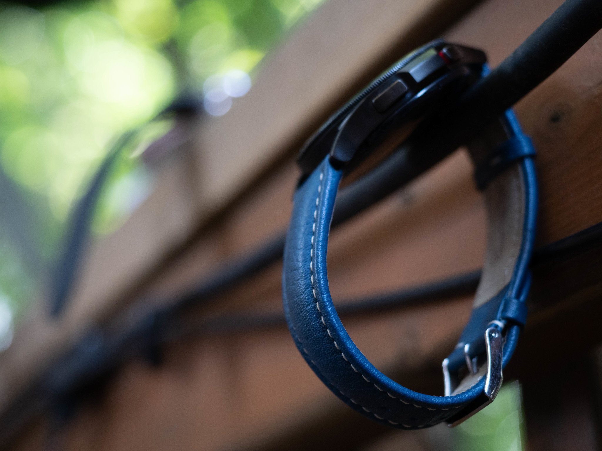
Given Samsung's iterative approach to hardware design over the past few years, it's no surprise that the Watch 4 looks like the Watch 2 Active and the Watch 4 Classic looks like the Watch 3. The names might be confusing, but there's a continuity here that I appreciate.

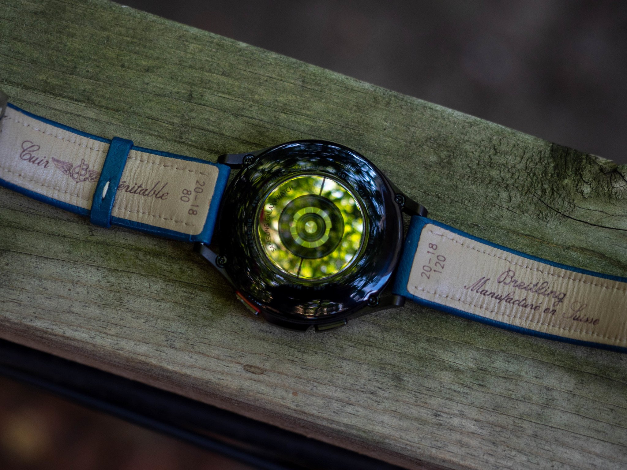
I reviewed the larger versions of both watches, and each of them comes with 20mm sport bands made of fluoroelastomer, a synthesized rubber that's generally comfortable and doesn't irritate the skin. (For some reason, the Classic comes with a ridged sport band with a traditional watch clasp, while the cheaper Watch 4 comes with a straighter band that terminates in the kind of loop clasp Apple popularized with the Apple Watch.) The good news is that, unlike the Apple Watch, the lugs support any quick-release watch strap, and I got to work replacing the sport band on the Classic with a lovely blue leather band from an old Victorinox I still wear from time to time.

Samsung Galaxy Watch 4 vs. Watch 4 Classic Specifications

Samsung Galaxy Watch 4 Samsung Galaxy Watch 4 Classic
Size 44.4 x 43.3 x 9.8mm
40.4 x 39.3 x 9.8mm
45.5 x 45.5 x 11.0mm
41.5 x 41.5 x 11.2mm
Weight 30.3g (44mm)
25.9g (40mm)
52g (44mm)
46.5g (40mm)
Display Super AMOLED 1.4-inch (330ppi)
Super AMOLED 1.2-inch (330ppi)
Super AMOLED 1.4-inch (330ppi)
Super AMOLED 1.2-inch (330ppi)
Material Aluminum case Stainless steel case
Operating System Wear OS Powered by Samsung Wear OS Powered by Samsung
Processor Exynos W920 (5nm) Exynos W920 (5nm)
Memory 1.5GB RAM
16GB storage
1.5GB RAM
16GB storage
Battery 361mAh
247mAh
361mAh
247mAh
Sensors Accelerometer
Barometer
Gyro
Geomagnetic
Light
BioActive Sensor (heart rate)
ECG
BIA
Accelerometer
Barometer
Gyro
Geomagnetic
Light
BioActive Sensor (heart rate)
ECG
BIA
Connectivity LTE
Bluetooth 5.0
Wi-Fi
NFC
GPS
LTE
Bluetooth 5.0
Wi-Fi
NFC
GPS
Durability 5ATM
IP68
MIL-STD-810G
5ATM
IP68
MIL-STD-810G
Colors Green
Black
Silver
Pink Gold
Black
Silver
Band size 20mm
20mm
20mm
20mm

.

The protruding lugs look fantastic paired with a traditional band, but the fact that they curve down and inwards puts a pretty sizeable gap between the watch's side and your wrist, a necessary sleight of hand to ensure the watch's bulbous 3-in-1 health sensor makes solid contact with your wrist.

The digital crown has its virtues, but there's still nothing like using Samsung's rotating bezel to navigate around Wear OS.

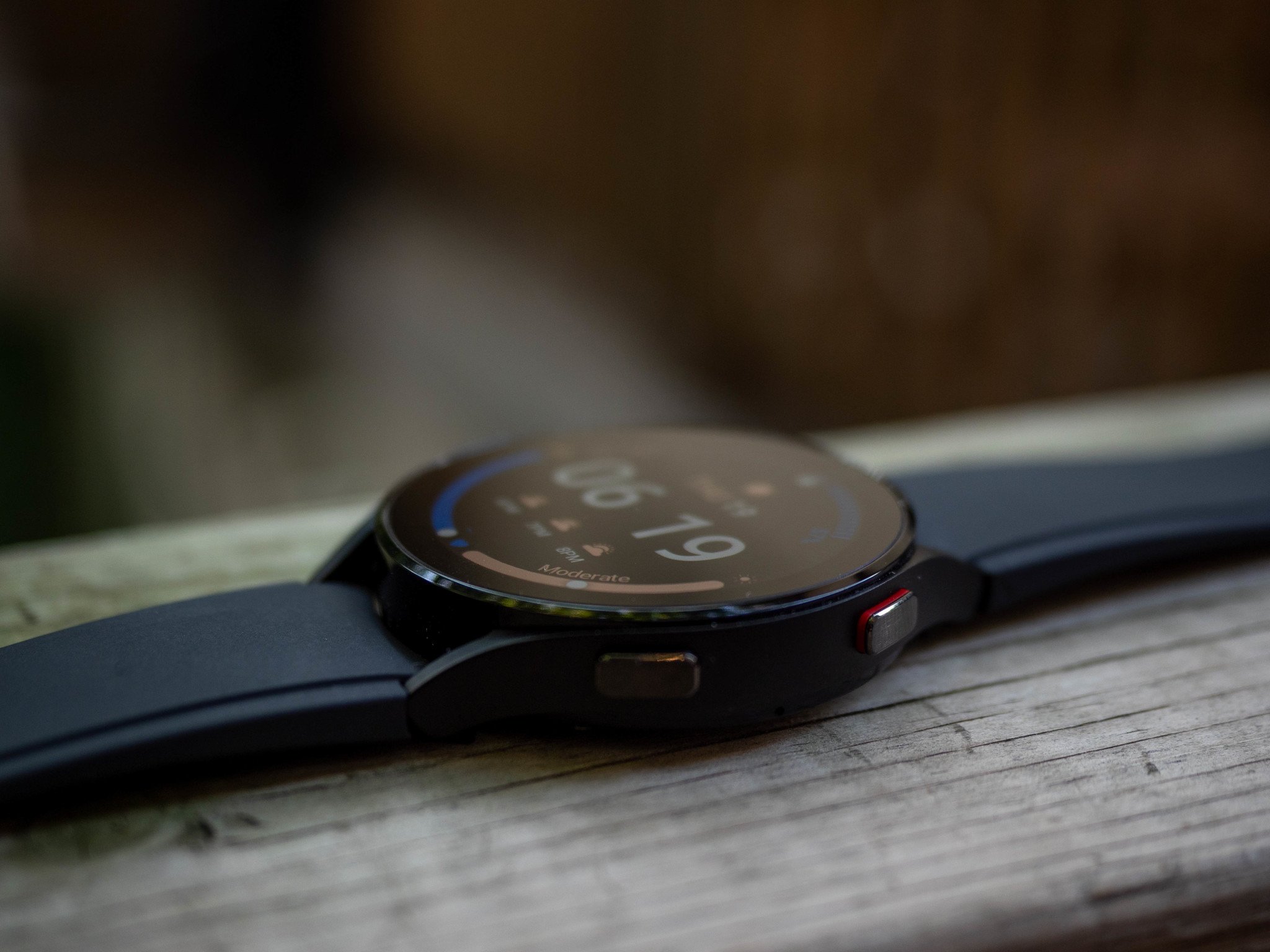
If you can spring for the more expensive Classic model, go for it. While the stainless steel makes it a bit heavier than the Watch 4's aluminum, the tradeoff is worth it for the rotating bezel; there just isn't anything else like it. I love a good rotating crown, but there's something just so satisfying about whizzing through notifications, tiles, and menus without tapping the display at all. The Watch 4 uses a hack of sorts, one that debuted on the Watch 2 Active, to emulate the same thing — it dedicates a portion of the OLED display's edge for gesture navigation — but it's finicky and can still block content.

The OLED display on each watch is, as usual, pretty great — Samsung doesn't mess around in this regard. But I was kind of surprised to see that, in addition to making each panel slightly brighter, which improves direct sunlight visibility, both sizes are sharper than their predecessors. In fact, the larger Watch 4 and 4 Classic, which share the same 1.4-inch panels, are nearly twice as sharp as the Watch 3 and Watch 2 Active, which translates into more legible text at smaller sizes and less aliasing around images.
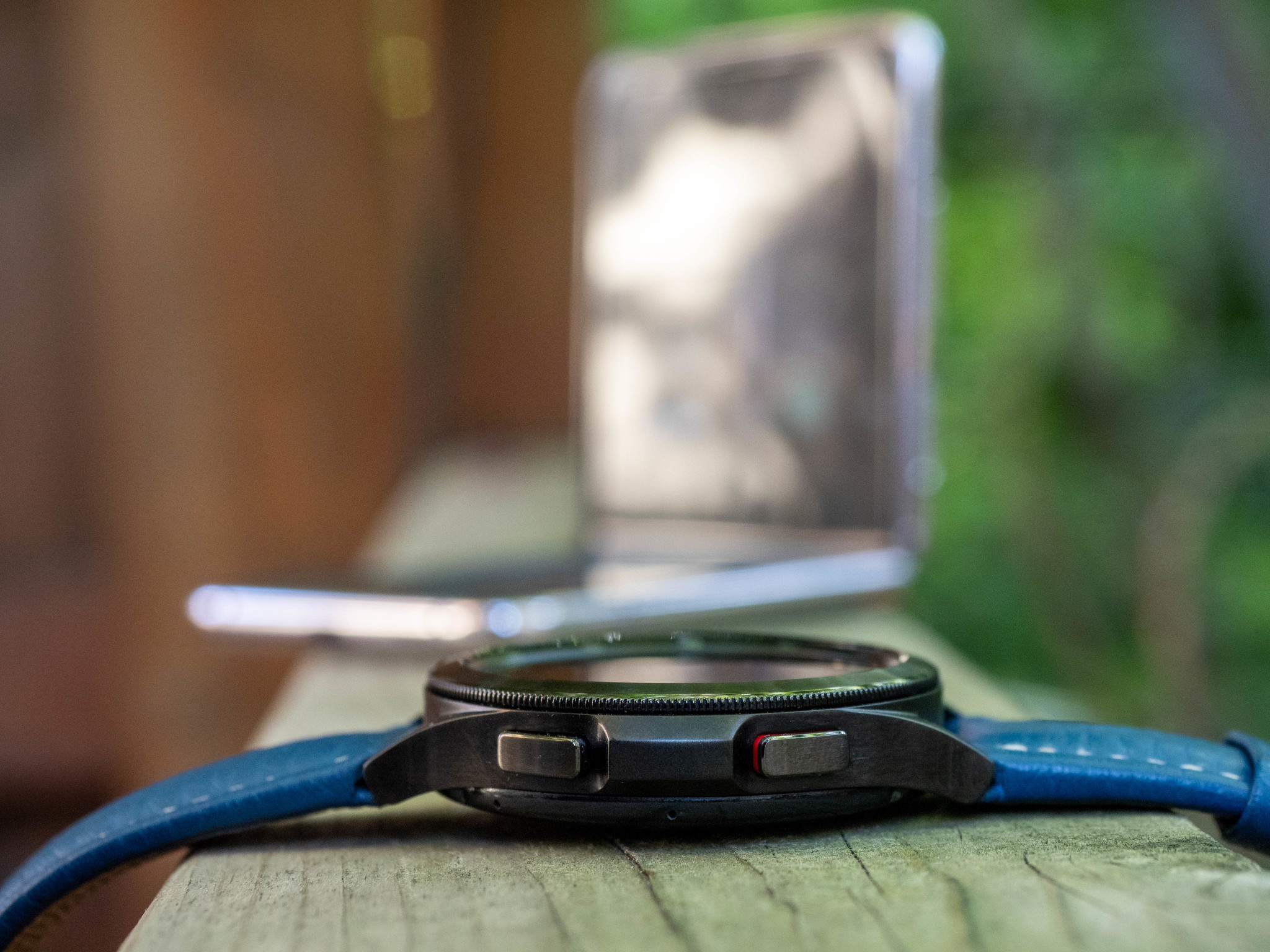
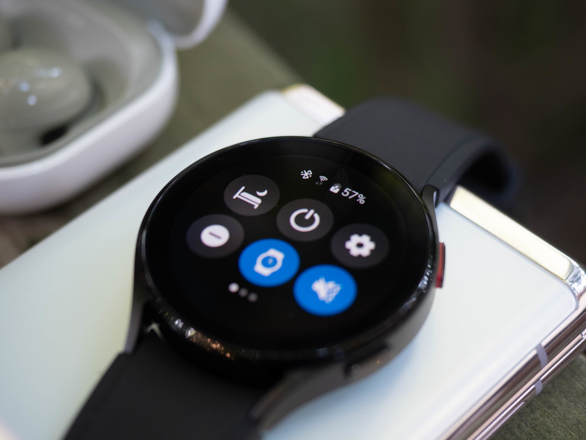
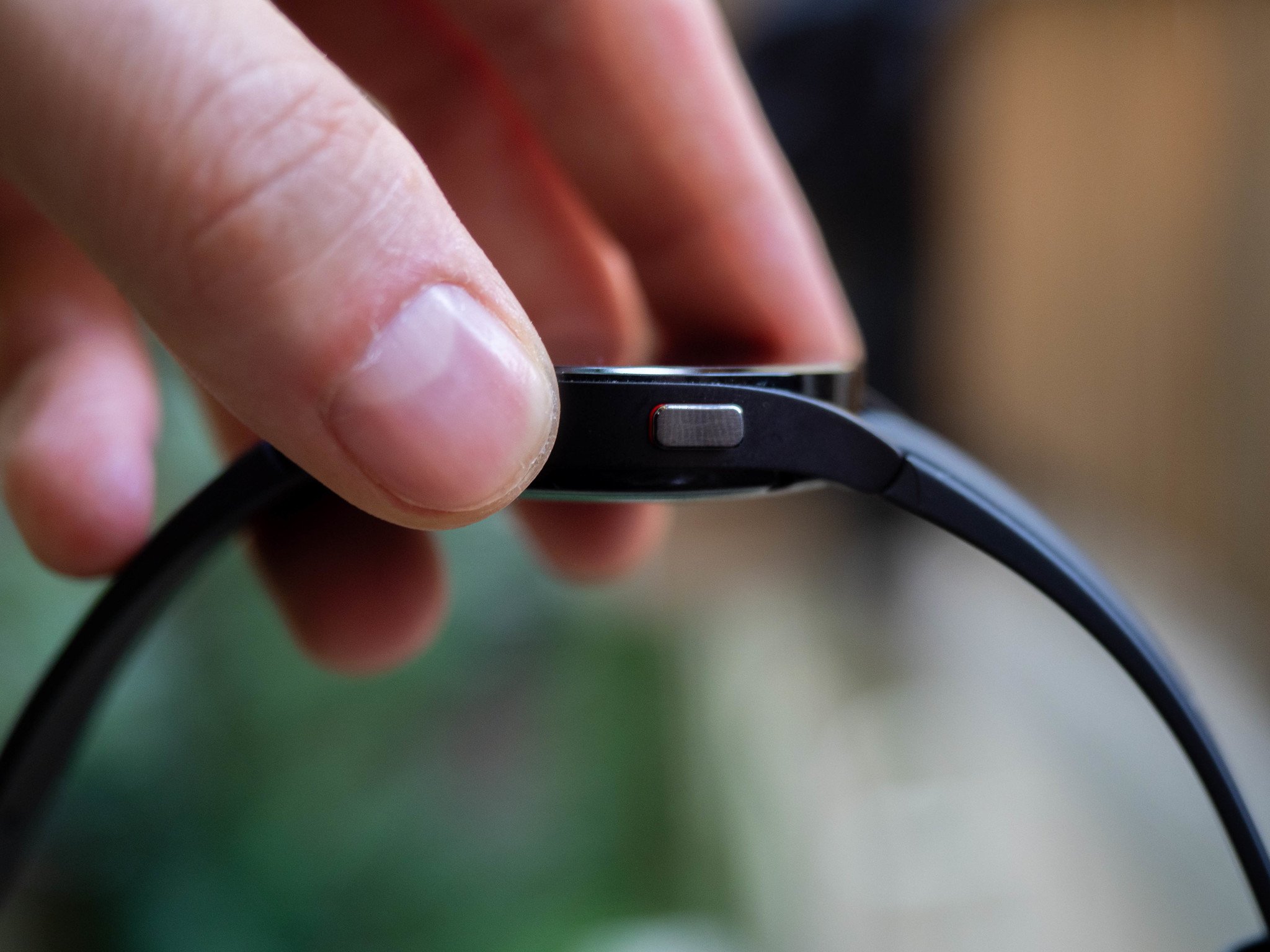
The side of each watch has two buttons that pull triple duty depending on the situation. A single press of the top button always goes home; the same action on the bottom button returns to the previous screen (which is often home because most apps aren't that deep). Holding the top button activates Bixby or the power menu; holding the bottom always brings up Samsung Pay.

Samsung also improved the haptics in the Galaxy Watch 4 series, but they're still not as good as the Apple Watch.

Each button also has electrodes that pair with the BioActive sensor to pulse mild electrical signals through your body to produce ECG or BIA readings, which is why at least compared to the Galaxy Watch 3, they look more utilitarian than the traditional chronometer style of last year's watch.

I'm also impressed by the haptic motor inside the Watch 4 this year. Samsung's previous smartwatches were known for buzzy and sloppy vibrations, but Samsung's included a higher-quality linear motor on the Watch 4 that, while not used nearly as well utilized as on the Apple Watch, is much easier to endure buzzing against your wrist dozens of times a day.

Samsung Galaxy Watch 4: Software and performance
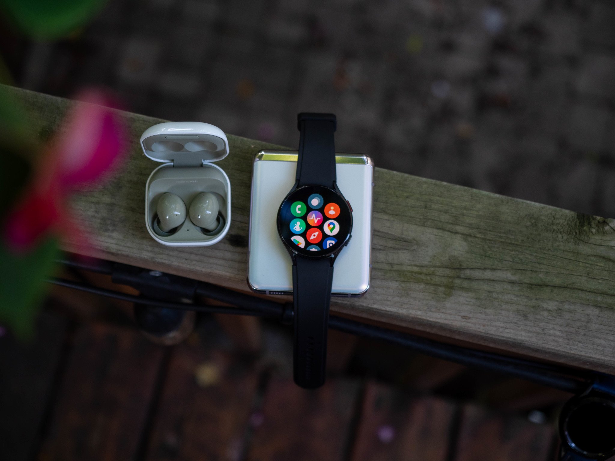
I think there are two primary things people want to know about the Galaxy Watch 4 and, separately, about Wear OS 3: does Samsung's watch platform benefit from its transition to Wear OS, and is Wear OS as a whole considerably better than it used to be?

The first I can answer confidently: yes. Samsung has tried to recreate as much of its Tizen-based UI flow as possible, so existing users won't feel alienated while benefiting from access to the Play Store and some general Wear OS niceties. Notifications still live on the far left of the navigation, with older ones accruing further and further from the main watch face. The quick settings menu still lives at the top, and app "tiles" comprise the real estate to the right of the home screen, just as they did on Tizen. The main functional difference between Tizen and Wear OS 3 is the inclusion of a launcher at the bottom of the workflow, an app cloud very similar to the Apple Watch, and every bit as frustrating to use.
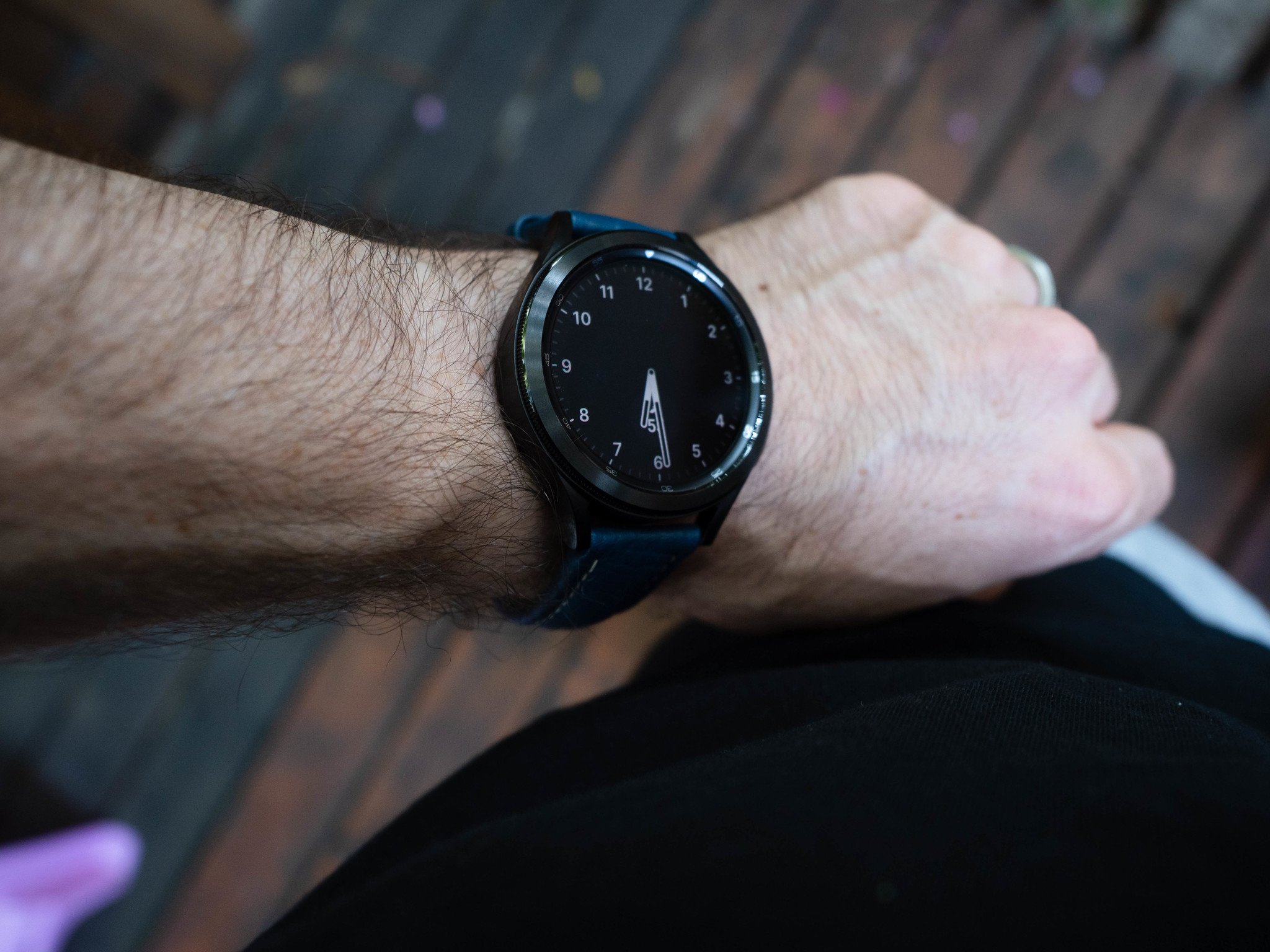
I encourage you not to overthink Wear OS on the Galaxy Watch; as I said initially, this isn't the massive reinvention many people wanted or were expecting. Instead, it is very much Samsung's existing wearable experience with access to Google's apps and the admittedly limited selection of Wear OS apps on the Play Store. You also gain better notifications than on Tizen, since Wear OS is so closely tied to Android's core notification framework, but the real upgrades are being able to open Google Maps for turn-by-turn navigation or use Google Keep to check off groceries from a shopping list as you wander through the chips aisle (I see you, and I support your decisions).

Don't overthink Wear OS on the Galaxy Watch; it feels very much like Tizen but with access to Google apps and services.

You also get, or at least will get when they're released, updated versions of Spotify, Strava, Calm, and others that either didn't exist on Samsung's existing platform or were severely underdeveloped. Samsung is betting that developers are more likely to build a decent Wear OS companion app because it's an extension of an existing Android experience, and Google is hoping (praying) that more developers will be willing to build those apps because millions of Samsung phone owners will be wearing Wear OS watches. We'll see how it will all play out soon enough.
Galaxy Watch 4 owners also benefit from a feature Google recently added to Wear OS called Tiles. Think of Tiles as widgets that live to the right of the watch face providing quick access to information or app actions, checking the weather, starting a timer, or beginning a workout without having to open an app. While the Tile API is still in alpha and isn't available to all developers, Google said during its recent developer conference that it's working with dozens of companies to build Tiles into their Wear OS apps. It's honestly one of the best additions to the platform (though it's also being backported to Wear OS 2).

Another welcome feature of Wear OS is custom watch faces. While the ones included on the Watch 4 are quite lovely and varied, you can download apps like Facer, which lets you pay for premium options from artists and designers, or Pujie Black, where you can design your own.
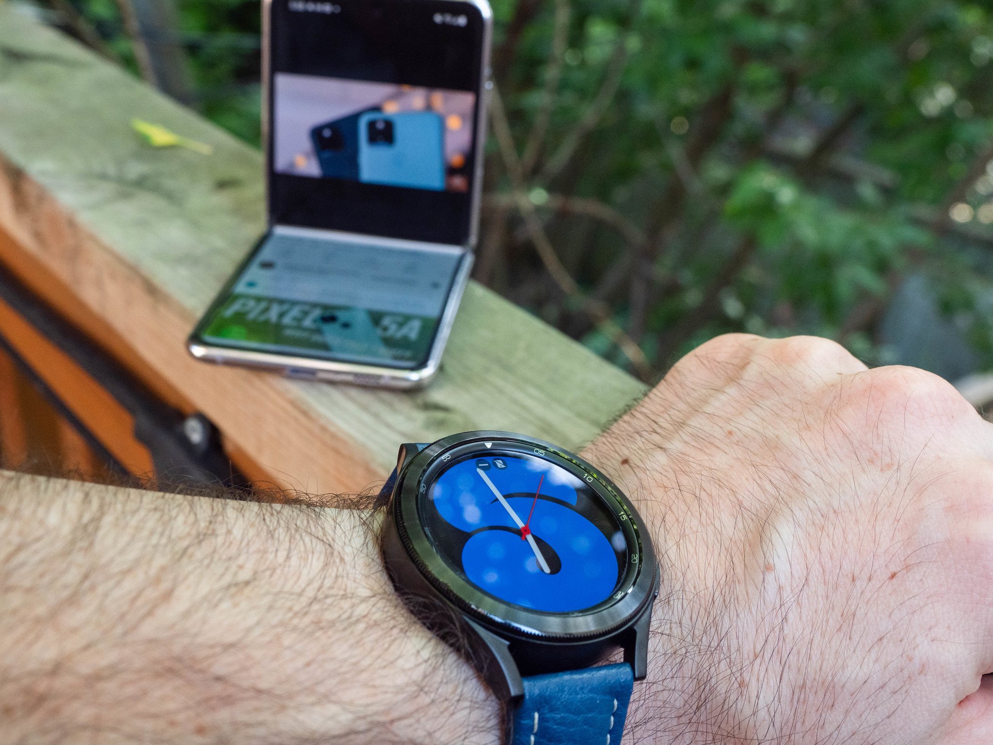
And while this is very much a Samsung-first experience right now, it appears that the company is not blocking potential long-term customization, at least in certain areas. For example, it already acknowledged that Google Assistant would soon be an option to replace Bixby as the default voice assistant. Hidden deep in the settings is the ability to install a custom launcher, much like you can on your phone. You'll also be able to select a new default health services provider, too, which could mean turning shifting from Samsung Health to Google Fit or even Strava or MyFitnessPal when they're updated to support Wear OS 3's new Health Services features.

The good news is that all of this stuff runs really well on the watch. Samsung's W920 SoC is a dual-core chip paired with 1.5GB of RAM and 16GB of storage, and unlike every Wear OS smartwatch I've used — even the most recent ones running Qualcomm's Snapdragon Wear 4100 and 1GB of RAM — I didn't dwell once on the performance. When you ask the watch to do something, it just does it; you're not stuck staring at the insipid circular loading prompt while Qualcomm's decade-old silicon churns before half-heartedly acquiescing.

Samsung Galaxy Watch 4: Battery
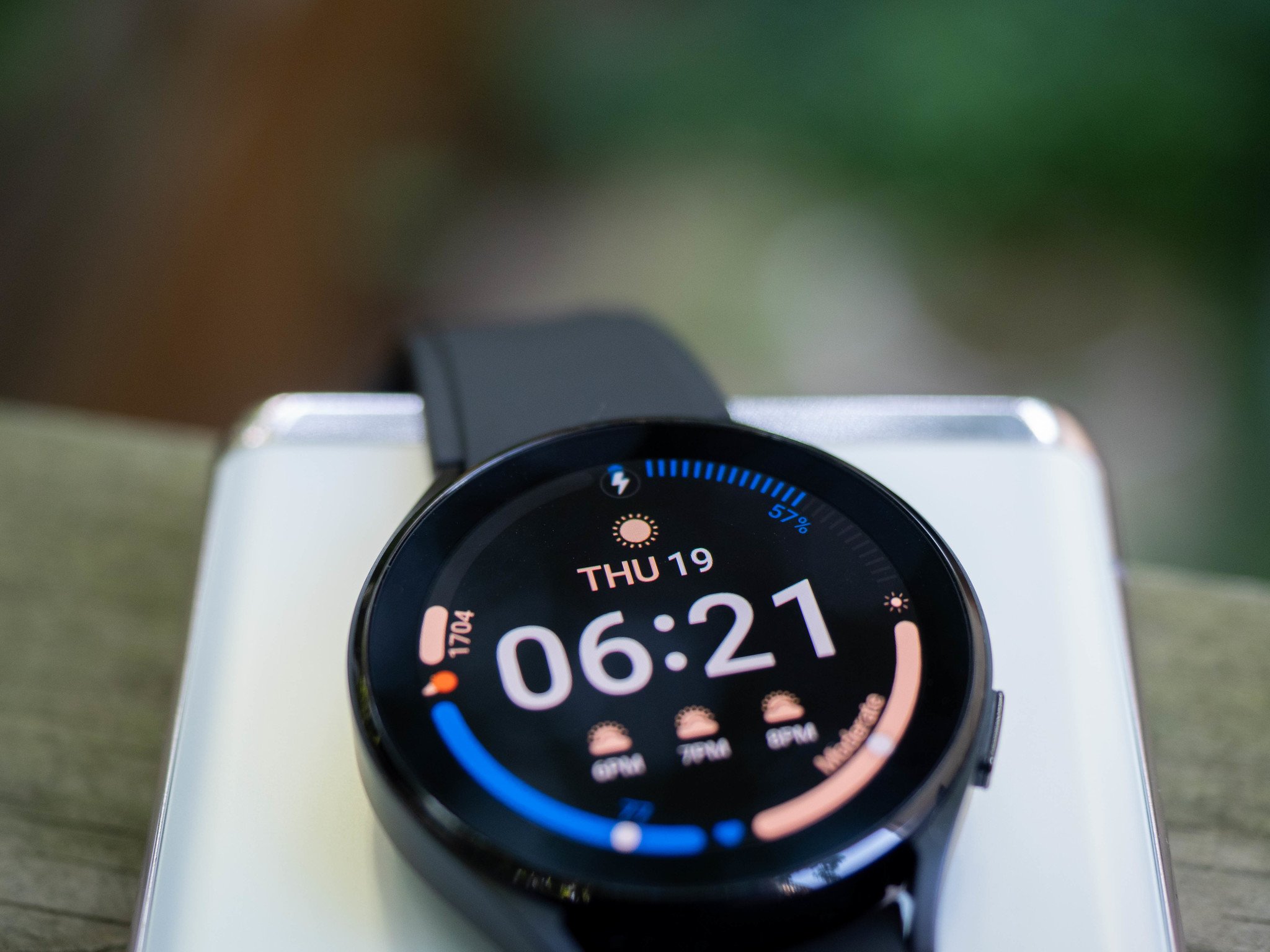
When Samsung announced the Galaxy Watch 4 and 4 Classic, it proudly proclaimed "up to 40 hours of battery life," which appeared to signal that it had solved the age-old problem of Wear OS watches needing to be charged daily. The good news is that the Watch 4 and 4 Classic, at least the larger sizes, do outlast every Mobvoi and Fossil smartwatch I've used over the past year. The bad news is that it's not by much, and certainly not enough to call the Watch 4 a two-day device.

Using the Watch as normal, with the always-on-display disabled but raise- and touch-to-wake enabled, tracking a workout, and regularly checking notifications, the watch lasted a day and a half without issue. Enabling the always-on-display didn't impact battery life that much, but enough to concern me about the next step, which is sleep tracking.

This isn't the multi-day watch you may be hoping for, but you can easily get away with wearing it all day, tracking your sleep, and charging it in the morning.

For three days, I used the watch normally during the day with AOD enabled. Then, I tracked a workout and went to bed wearing it to track sleep. When I woke up, I was in the low double-digits each time. So I put it on the charger while I got ready in the morning, and it had around 50% by the time I had to leave the house to take my kid to school. When I got back from the commute, I charged it up to 100%.

If you're the kind of person who needs a smartwatch to last multiple days, it's going to be tough to do here, but you can and likely will get more than 24 hours from it. The caveat is that I didn't engage the GPS at all, but I heard anecdotally from other people reviewing these devices that, as on other wearables, it destroys the battery.

The battery wouldn't be a concern at all, though, if the Watch 4 charged faster. Unfortunately, it takes nearly two hours to charge from dead to full, which means if you do wear it overnight and charge it while getting ready for work or school, you're only going to bring it up about 25%. So you'll need to buy another charger for the office or, once home, put it back on one to charge. Bottom line: Samsung really needs to improve in this area next time.

Samsung Galaxy Watch 4: Health features
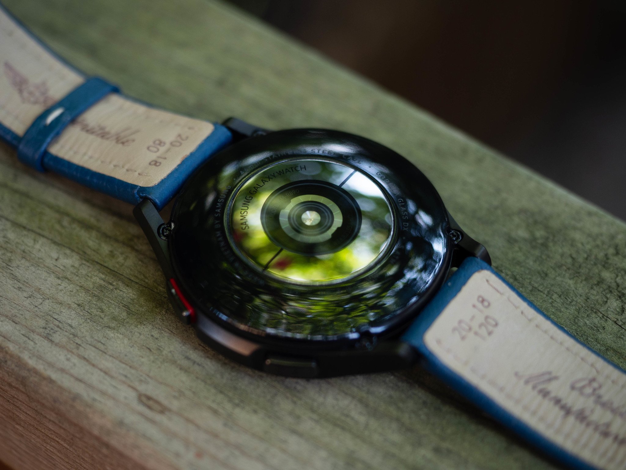
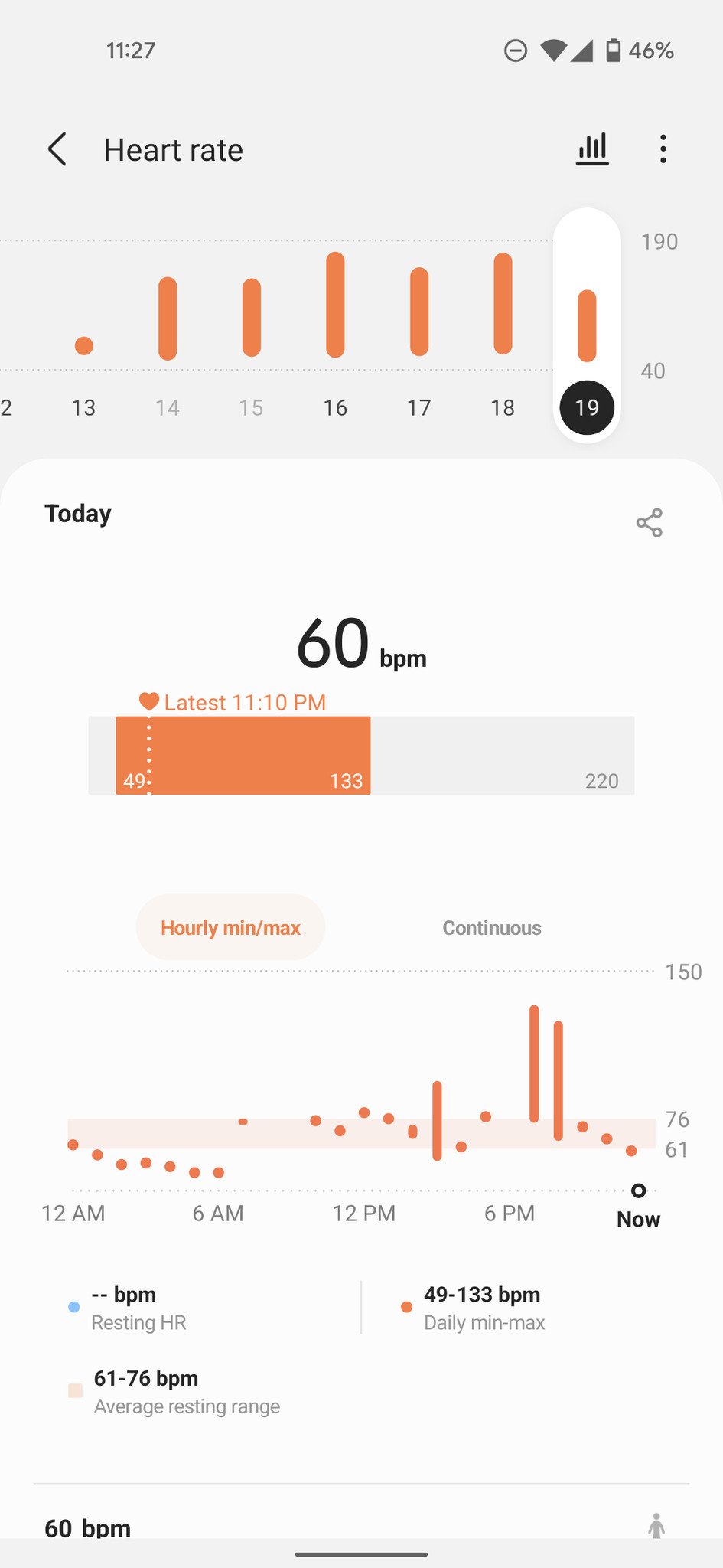
One of the Galaxy Watch 4's primary purposes — any smartwatch's primary purpose these days, for that matter — is tracking health, and Samsung Health pairs pretty nicely with Wear OS. Both variants and all sizes of the Watch 4 series have the same outlay out health features, including a 3-in-1 BioActive sensor that pulls off heart rate, blood pressure, ECG, and Bioelectrical Impedance Analysis (BIA for short), which is new to smartwatches but familiar to anyone with a connected scale.

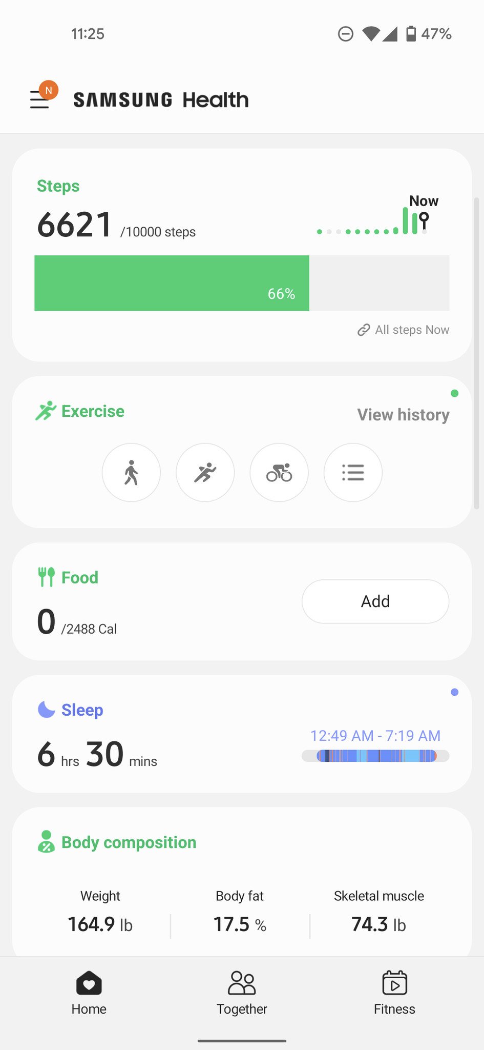
I used the Watch 4 Classic and Watch 4 interchangeably throughout my week testing the series, the former paired to a Galaxy Z Fold 3 and the latter to a Pixel 5, trying to ascertain whether having a Samsung phone is actually an advantage. Aside from the Galaxy Store-exclusive Samsung Health Monitor app, which is required to take ECG readings, all health features, including BIA, can be done on the watch and synced to the Samsung Health app on Android (there's no iOS app this time around).
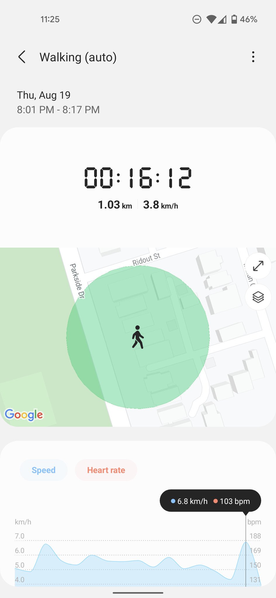
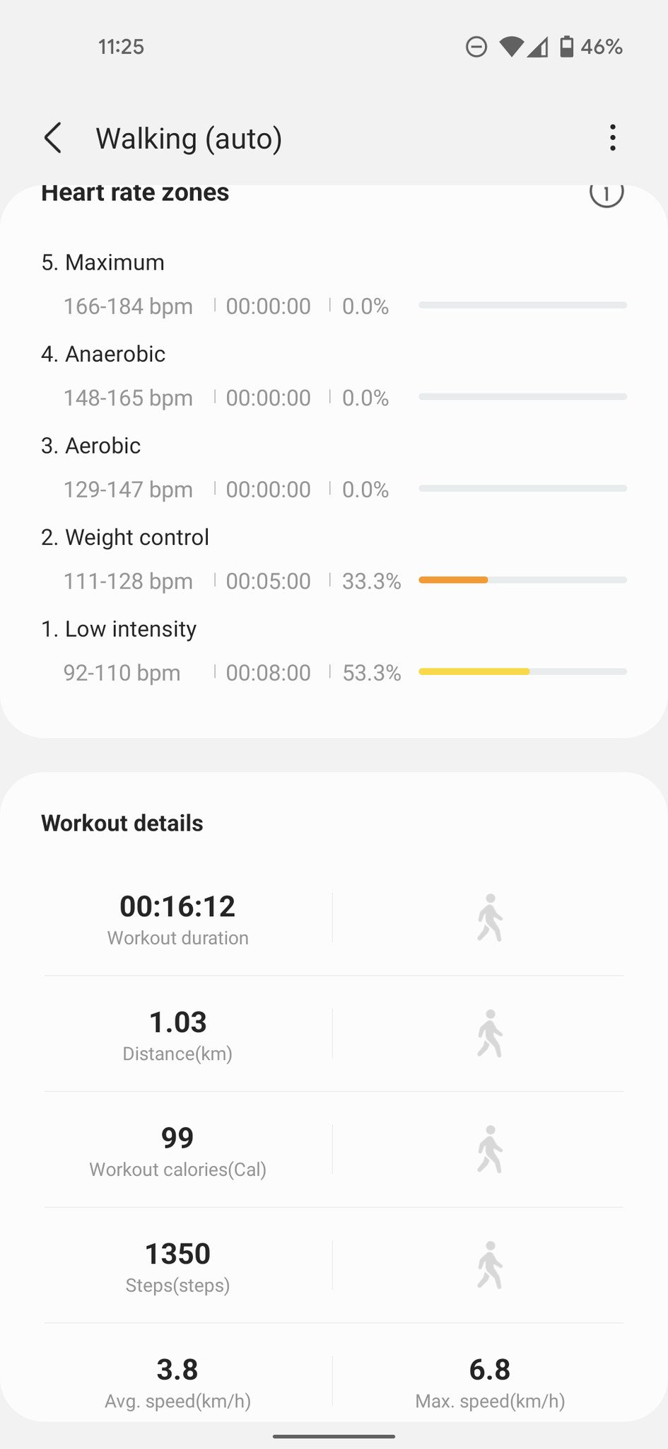
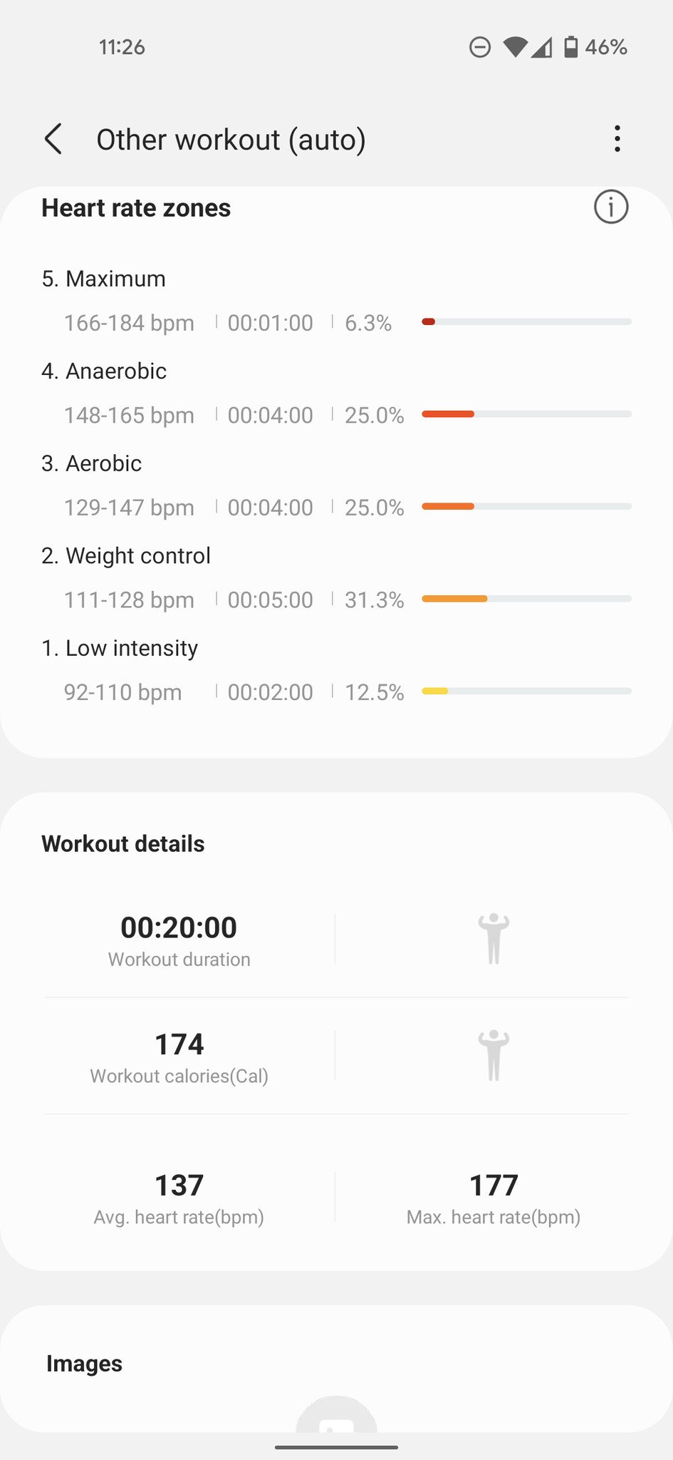
Working out with the Watch 4 is straightforward, especially if you're doing traditional stuff like running, biking, swimming, or rowing, which the watch automatically detects thanks to their distinct movements. Other exercises, like weight training, need to be selected manually, and while there are a lot of individual strength workouts, it still lacks an overarching circuit training option. Of course, if you're a casual exerciser who just wants to track runs or count burned calories during a HIIT session, the Watch 4's sensors appear much more accurate this time around.

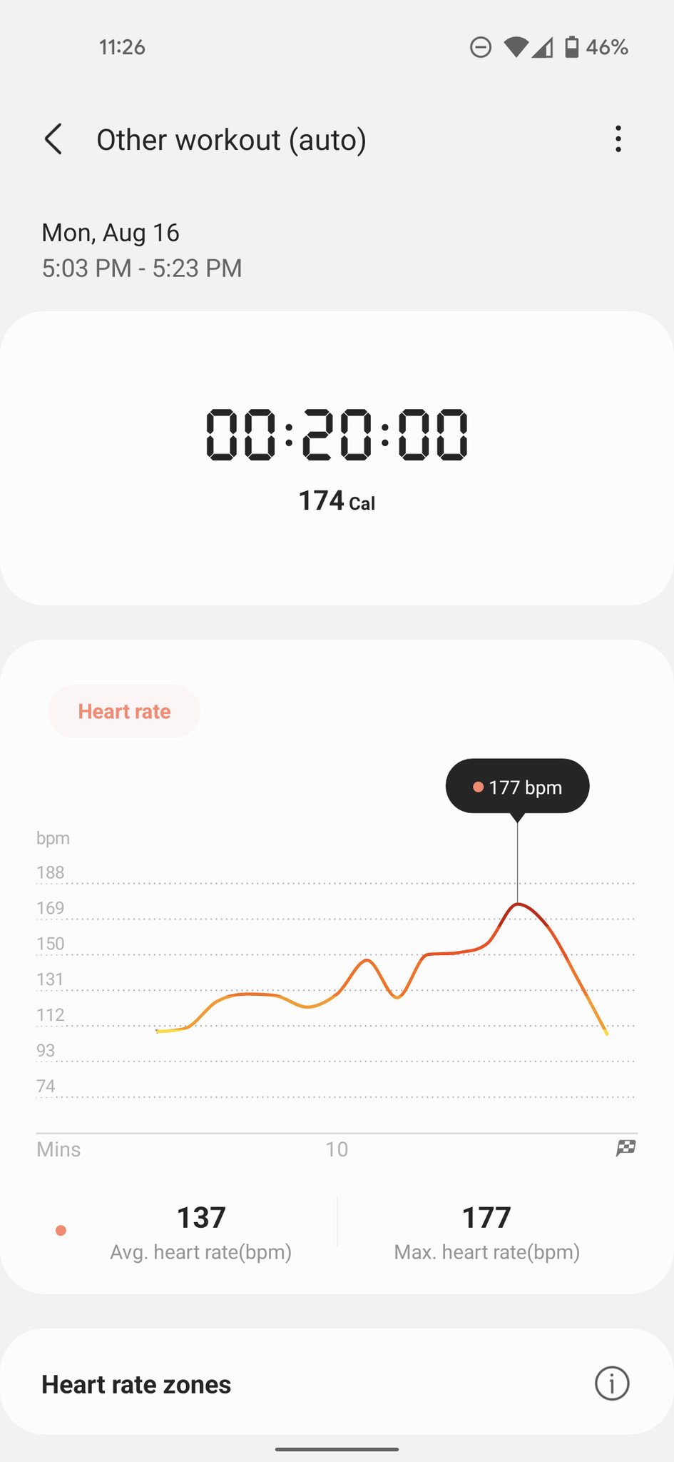
Over three nights, I used the Galaxy Watch 4 on my left wrist and one of an Apple Watch Series 6, Skagen Falster 3, or Fitbit Sense on my right to compare metrics as I did a high-intensity Supernatural VR workout, which I absolutely love and look forward to every day. (Side note: Supernatural uses a smartwatch app to feed live heart rate data into its experience and only makes it for the Apple Watch and Wear OS, so I'm pretty thrilled I'll be able to continue wearing the Watch 4 without having to throw on an Apple Watch every time I want to sweat.) On one night, I wore all four just for kicks and giggles.

I've never been particularly impressed with the sensors in Fossil watches and have had issues with Fitbits in the past, but the numbers I got from the Watch 4 appeared to be within a few BPM of the Apple Watch during every peak and valley. I didn't have the opportunity to test the GPS for its accuracy, though, but I'll update this review once things cool off outside and I can do some outdoor runs.
Samsung Health also includes a social element, which is severely lacking compared to its competitors. While it's still a developing feature waiting for a broader user base, there are only a couple of challenges you can issue to your friends, and they're both step-based. You can't compete for more holistic goals, like calories burned or minutes moved. When you win a challenge, you get no feedback or badges from Samsung to gamify the experience and promote further competition. It may seem like a small thing, but these little UX inclusions are precisely why Fitbit's and Apple's fitness ecosystems are so sticky.

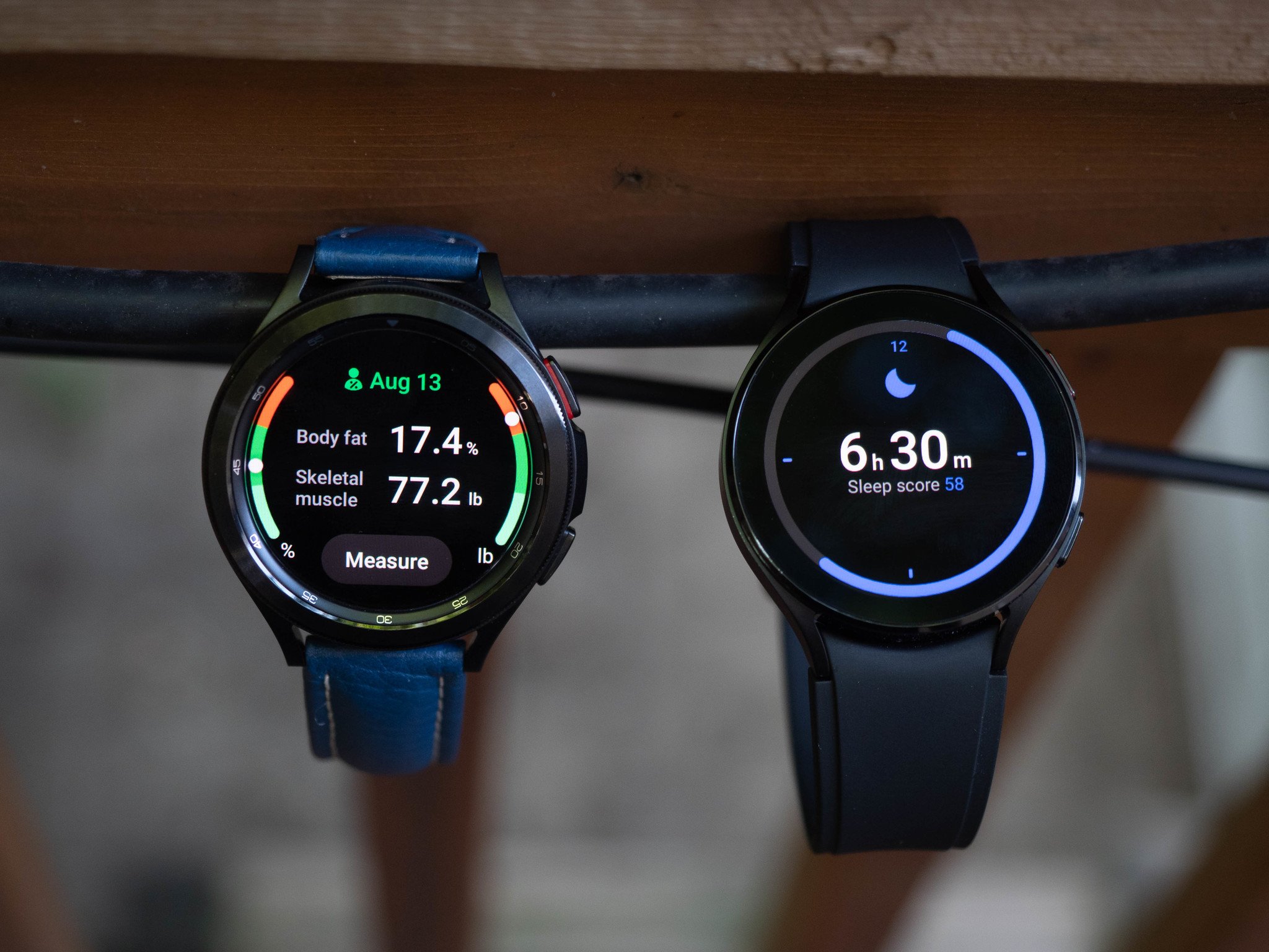
On the topic of BIA, which uses a weak electrical pulse to measure skeletal muscle and fat percentage in the body, I'm less interested in the tool's availability than the reason Samsung felt it was helpful to add it to a smartwatch, to begin with. Most BIA sensors are paired with scales, which first calculate your weight and then use that measurement as a baseline to figure out fat and muscle percentage, along with basal metabolic rate and overall BMI. The Watch 4 requires that you manually enter your weight every time you engage the Body Composition feature as a means of calibration; if you don't have a scale at home, the tool is mainly useless. If you do, it means weighing yourself before adding the extra step of using the BIA sensor.

For people who are into quantitative living, a smart scale, which features larger electrodes that are likely to produce more accurate results, is likely a better option. Wyze sells its smart scale for under $30; the industry-best option by Withings is under $100.
Conversely, the other concern I have is for people who may overuse or even abuse having such ready access to this data. Samsung readily admits that it can't and shouldn't be used for diagnostics, but given that a reading only takes 15 seconds, there's a genuine concern that those tracking weight loss may rely on it for trend data that can easily be manipulated by merely drinking a couple of glasses of water. As someone who struggled with weight loss in the past and used metrics like BMI and fat percentage as a bellwether for my success or failure, I think Samsung needs to do more to educate its users about the Body Composition feature rather than merely absolving itself of responsibility by adding a disclaimer to its press release.

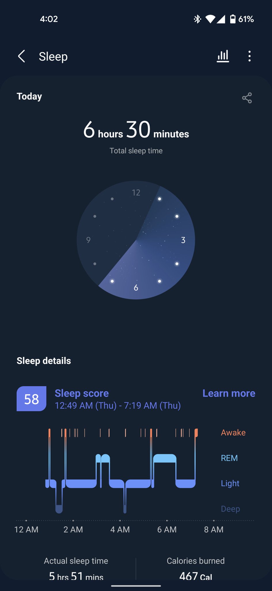
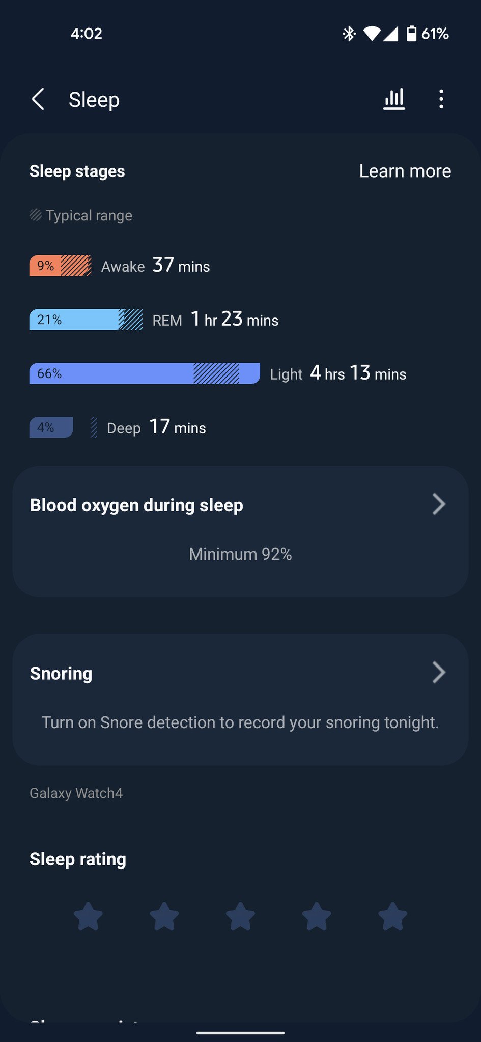
Finally, the Watch 4 series tracks sleep and does it quite well. I wore it to bed a few nights in a row and compared it to the data obtained by my Nest Hub (2nd Gen), which has been passively tracking my sleep for months, and the "time asleep" and "time in bed before sleep" numbers were within a couple minutes of one another. Samsung also tracks the various sleep stages, including Light, Deep, and REM, and offers an overall score that can be tracked over time.

Overall I'm pleased with the Galaxy Watch 4's fitness suite, even if elements of it don't cohere as well as they do on competing platforms. There's a lot of room to improve. Still, I also think being on a platform where newly-invigorated versions of Strava, MyFitnessPal, and others have access to the same sets of data that the Watch 4 generates, much of it richer and more accurate than on previous versions, Samsung's in a good place.

Samsung Galaxy Watch 4: FAQ
Should you buy the Galaxy Watch or the Watch 4 Classic?

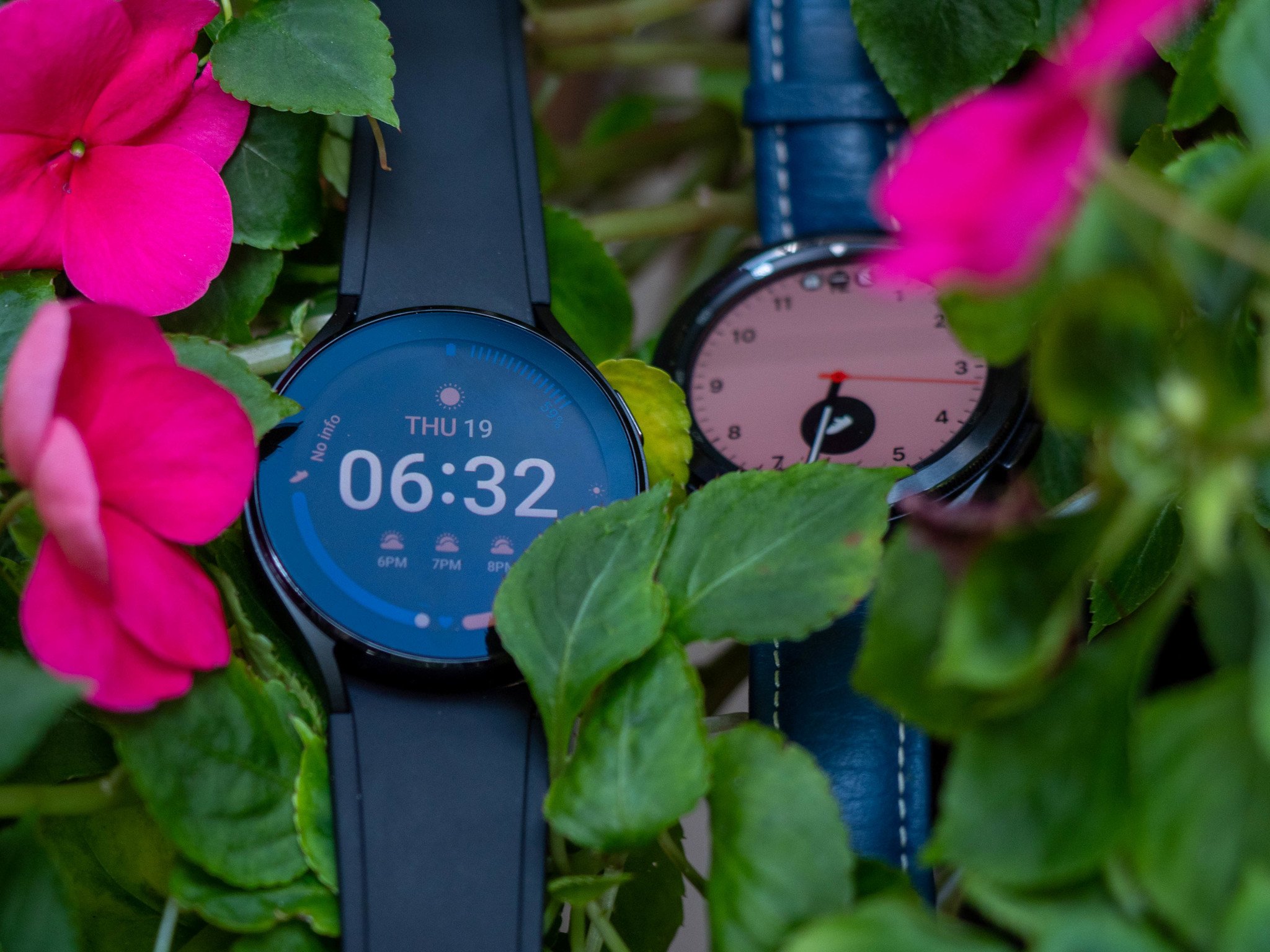
When it comes to the Galaxy Watch 4 vs. Watch 4 Classic, I like the Classic a bit better. There aren't massive differences between it and the 4, but the inclusion of the rotating bezel alone makes navigating through Wear OS 3 considerably more pleasurable. When you're using your watch constantly throughout the day, that little bit of speed increase helps.

Does the Watch 4 support custom watch bands?

Yes, the Watch 4 and Watch 4 Classic both support 20mm bands. The lugs are shaped a little awkwardly, making it a little difficult to install third-party straps, but I haven't had any issues with reliability or comfort once they're installed. Just make sure the band you buy supports quick release.

Can you charge the Watch 4 on any Qi charger?

So Samsung says that the Watch 4 supports WPC-based wireless charging, which technically supports Qi chargers. Unfortunately, the only chargers that will work consistently with the Watch 4, as with previous Galaxy Watches, are the ones sold by Samsung. You have the magnetic puck that comes in the box and Samsung's line of wireless chargers that have a dedicated spot for the watch. While there are some third-party wireless charging stands with dedicated Galaxy watch chargers that do work, they're prone to overheat, which can shut down or completely break your watch if you're not careful.

So, long story short: don't buy a small Qi wireless charger expecting it to work with the watch. If it doesn't have Samsung's name on the box, it probably doesn't work, though if we find any worthwhile replacement chargers, we'll let you know.

What else do you want to know? Additional answers will be added to this FAQ based on your questions in the comments.

Samsung Galaxy Watch 4: Competition
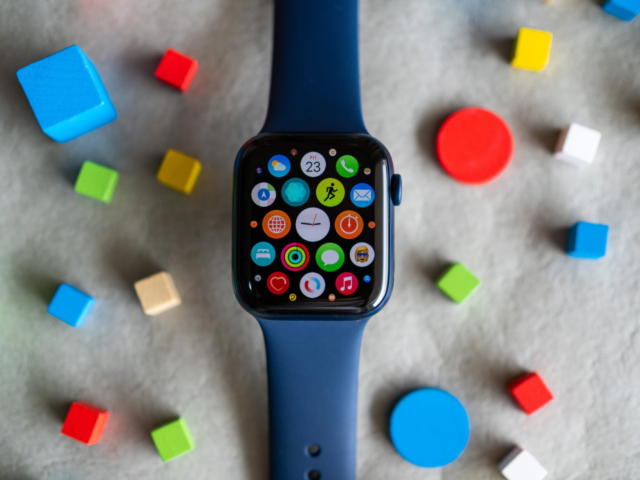
In an interesting twist of fate, the Watch 4 is largely peerless at the moment. So recommending an older, inferior Wear OS watch from a company like Fossil or one of its many subsidiaries, or even Mobvoi's TicWatch Pro 3, which is slated to eventually get the Wear OS 3 upgrade, would be irresponsible at this point. Not only are those watches using much older, less powerful hardware, but the software experience just doesn't add up, and aside from backporting a few features like Tiles, will not continue to be supported.

Of course, there's the Fitbit Sense or Versa 3, which are capable smartwatches on their own, though still geared more towards health tracking than replying to Slack messages on your wrist. Fitbit's app ecosystem is embarrassingly bad, though, so if you're considering one of the company's pricier products, know that you're investing more in the community of loyal users and its robust suite of holistic health and workout tracking.

The Apple Watch Series 6 is the obvious competitor to the Galaxy Watch 4, but a proxy war makes both incompatible with their respective operating systems. The Apple Watch is so inextricably linked to the iPhone that it's difficult to talk about it as a standalone product. And while the Galaxy Watch 4 works with any Android phone, it works best with a Samsung phone. Still, the good news is that no Android user should feel trepidation adding one of these watches to their wrist.

Samsung Galaxy Watch 4: Should you buy it?
You should buy this if ...

  • You have a Samsung smartphone
  • You want the best smartwatch experience on Android
  • You are active and want to track your workouts or sleep

You shouldn't buy this if ...

  • You want a Google-first smartwatch experience
  • You want multi-day battery life
  • You want to challenge your friends to activity contests

If you're looking for a smartwatch on Android right now, I really can't recommend anything other than the Galaxy Watch 4 or Watch 4 Classic. However, they're by no means perfect, and the clunky elements of Wear OS 3 on Samsung's wearables betray a tension between its desire for ecosystem lock-in and its investment, with Google, in furthering an Android-first wearables platform.

Even if you're not a Samsung smartphone user, there's a lot to like here — you can ignore Samsung Pay and use Google Pay, for instance, keep your Bixby interactions to a minimum, and embrace Samsung Health since it's currently far better than Google Fit.

Samsung's hardware design doesn't take a lot of chances, and the cheaper Watch 4 is actually pretty boring, but both watches are well-built, have intuitive controls, and, most importantly, perform like a dream. This is the best Wear OS has ever run.

If you can spring the extra $100 for the Classic, I'd do it, but either way, you're getting the best Android smartwatch available today — even if the previous bar was pretty low.

The cheaper of the two Galaxy Watch models this year, the Galaxy Watch 4 has everything you want from a fitness smartwatch but lacks the stainless steel heft and rotating bezel of the more expensive Watch 4 Classic. But if you want the green colorway, which is lovely, the Watch 4 is your only option.

From $250 at Samsung From $220 at Amazon From $220 at Best Buy

Samsung Galaxy Watch 4 Classic

The Galaxy Watch 4 Classic is the true flagship of the Samsung wearable lineup this year with a stainless steel build and rotating bezel, plus all the great performance, health tracking, and longevity of the Galaxy Watch 4.

From $350 at Samsung From $320 at Amazon From $320 at Samsung

Review Changelog, October 2021

This article was originally published in August 2021. It was updated in October 2021 with the following changes.

  • Updated price and availability section.
  • Included information regarding the Thome Browne Edition
  • Added mention of the new Maison Kitsuné edition.
  • Added a changelog.


from Android Central - Android Forums, News, Reviews, Help and Android Wallpapers https://ift.tt/3j5to7C
via IFTTT

5 reasons to get the regular Pixel 6 instead of the Pixel 6 Pro

For most people, the base model Pixel 6 will be more than enough smartphone.

In years past, Google would launch a regular Pixel phone and an "XL" version — effectively the same phone in two sizes. This year, with the Pixel 6 and Pixel 6 Pro, the divide is more based upon price and what you actually want out of a handset. The Pixel 6 Pro is the all-singing, all-dancing Google flagship, and it's priced as such. But the regular Pixel 6 offers just about all the core features of its big brother, and the $599 starting price is an incredibly tempting proposition for one of the best Android phones around.

In fact, for most people, the less expensive Pixel could be the better buy this year. So if you're not ready to blow almost $900 on the Pro, here are a few reasons why the regular Pixel 6 could be the phone for you.

1. No real difference in performance

All of Google's Pixel 6 phones are powered by the same high-end Tensor processor, produced by the company in partnership with Samsung. That means for general day-to-day performance, you'll have exactly the same horsepower at your disposal with a Pixel 6 as you would with the Pro. So whether you're gaming, casually scrolling through Twitter, or using unique AI features like live translation, the smaller and cheaper phone will perform just as well as its more expensive sibling.

Same Tensor chip, same top-notch performance.

And when it comes to displays, although the Pixel 6 Pro boasts a faster 120Hz refresh rate, we haven't noticed any difference in perceived speed or performance compared to the vanilla Pixel 6. Even using both phones side by side, the regular Pixel 6 still feels like a speedy phone. That's not too surprising given the diminishing returns you often see with the jump from 90 to 120Hz.

2. The same great camera setup — mostly

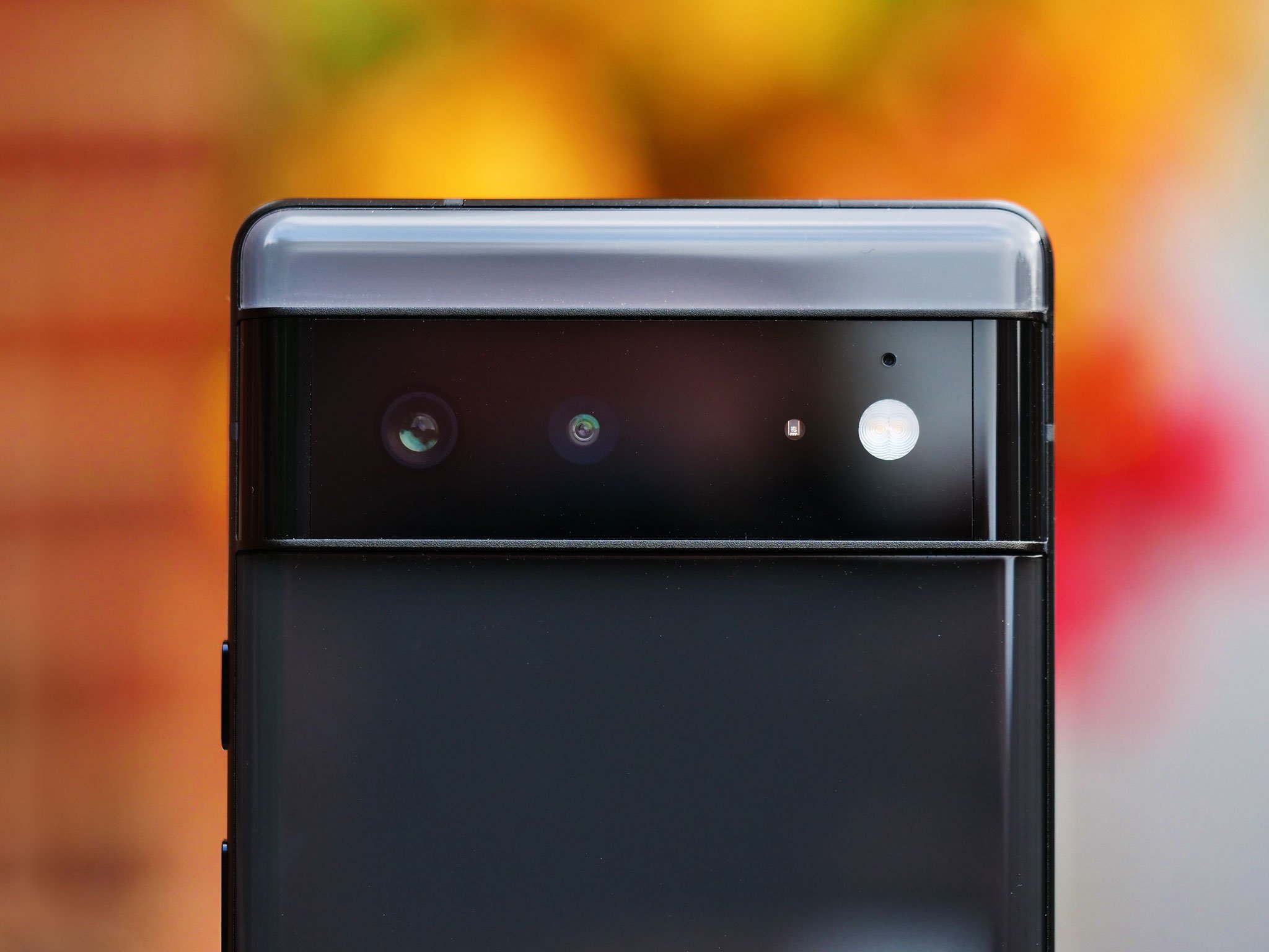
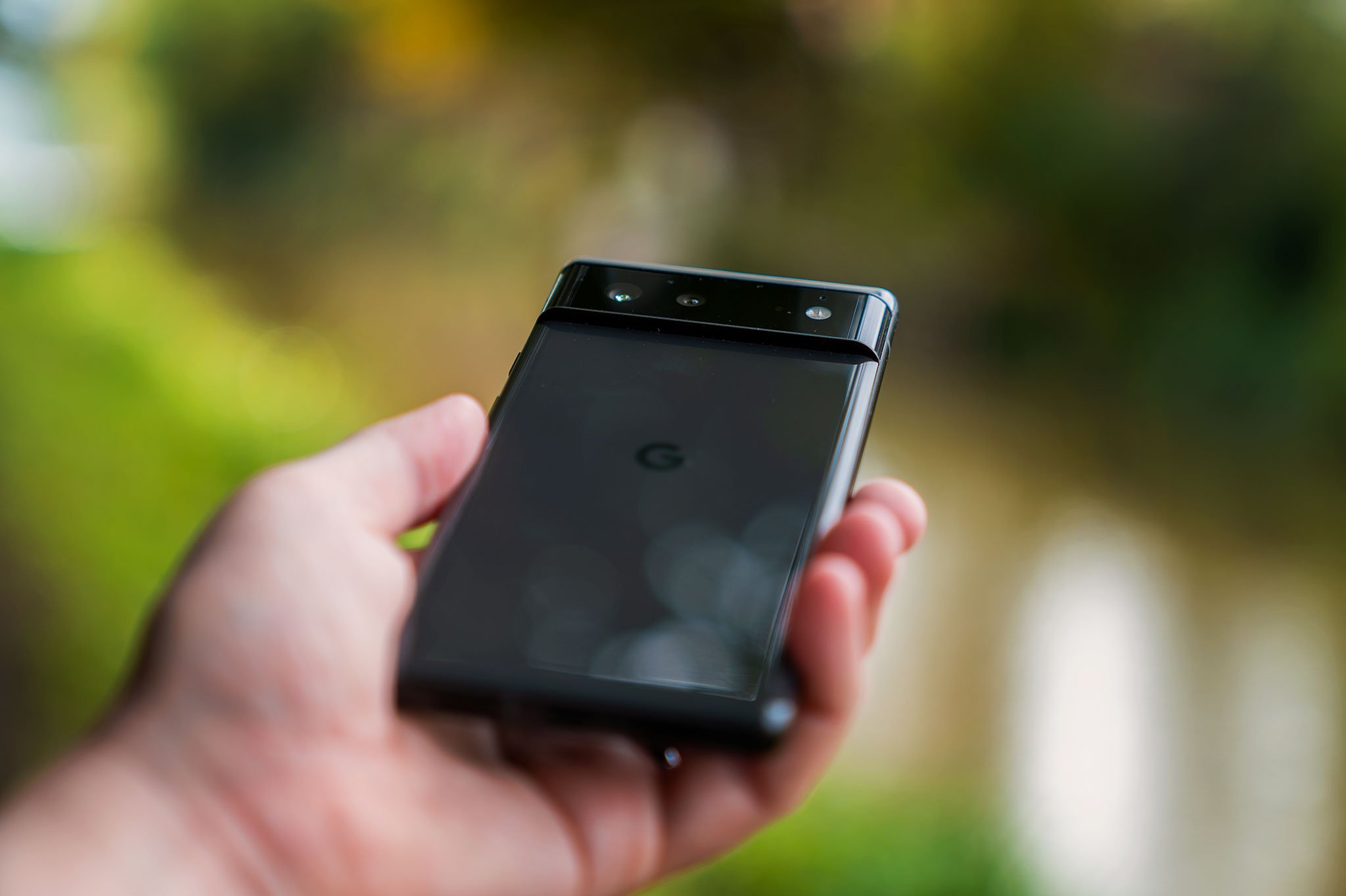
The main trade-off here is the lack of a dedicated telephoto camera compared to the Pixel 6 Pro. And there's an ever-so-slightly weaker front camera without a wide-angle selfie option which is also no great loss for most people. But chances are you can get by without both of these, and the large 50-megapixel main sensor of the Pixel 6 is perfectly capable of taking stunning zoomed shots at 2-3X thanks to its sheer resolution. Plus, for portrait shots, you'll be using the primary sensor anyway, punching in around 2X for background-blurred close-ups.

Otherwise, you're looking at an almost identical camera setup. The Pixel 6 packs the same 50-megapixel main and 12-megapixel ultrawide cameras as the Pro. So you'll take the same amazing photos with both handsets, while benefiting from the same AI-powered photographic features like motion blur and face unblur.

3. A smaller, less slippery form factor

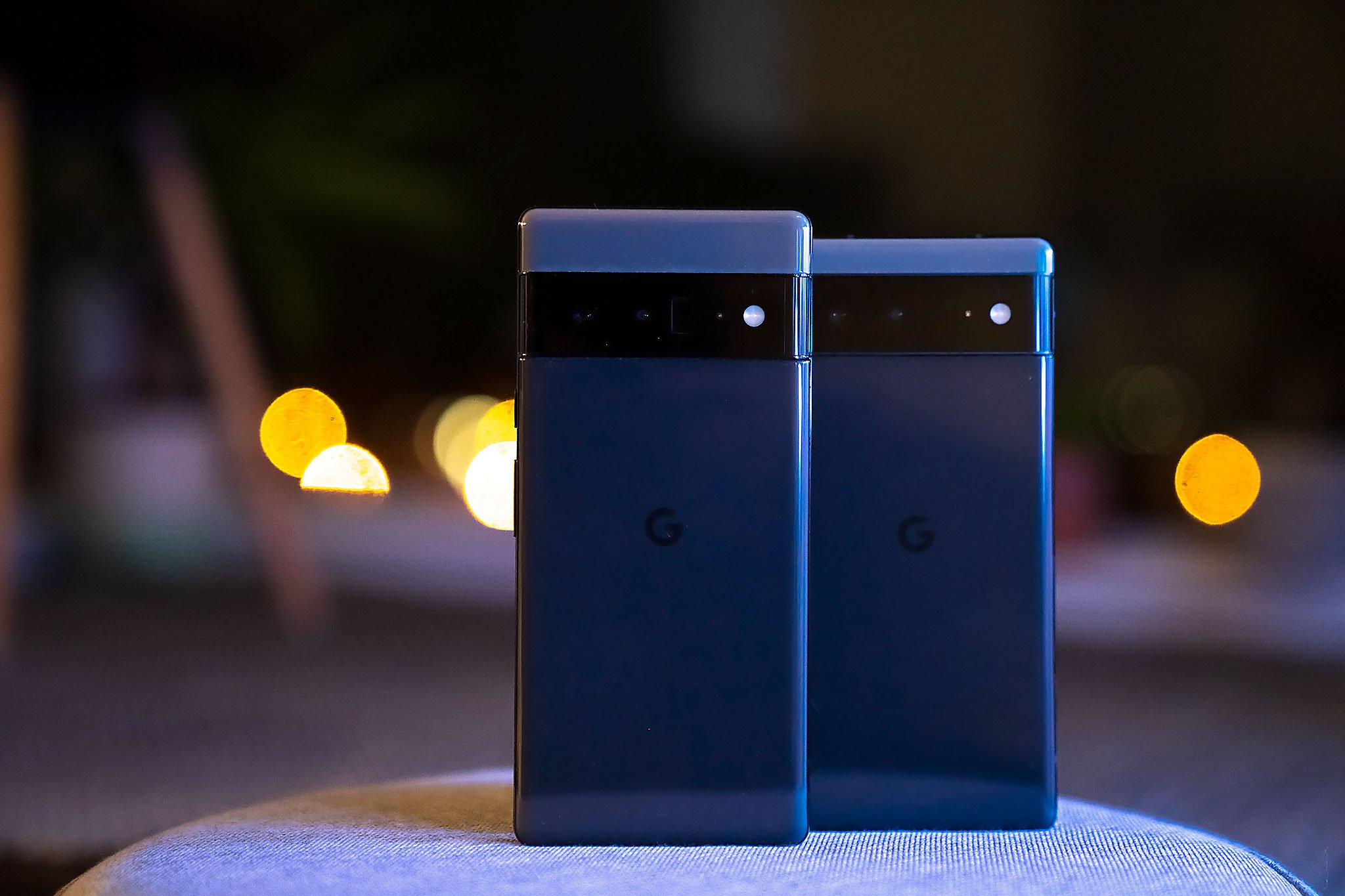
The Pixel 6 isn't exactly small, but it is smaller than the 6 Pro, which is a pretty humongous handset. The difference between a 6.4-inch display and a 6.7-inch display, for some people, will mean the difference between using a phone with relative comfort and struggling with one-handed use throughout its lifespan. Having used both side by side, I can attest that the chunkier side walls and smaller size do indeed make the regular Pixel 6 easier to one hand.

Part of that is down to the use of a flat display in this model. Like all smartphones with curved OLED screens, the Pixel 6 Pro gives you less space to hold onto along the sides, compounding the aforementioned reachability issues. So unless you're a fan of very large phones, the smaller Pixel may be the one for you this year.

4. It's way cheaper

The $300 price difference is half the cost of another Pixel 6.

The $300 price difference between the base model Pixel 6 and Pixel 6 Pro is a sizable chunk of change. On the other hand, it's half the price of the vanilla Pixel 6. Now, the Pixel 6 Pro isn't a bad deal, and in fact, represents way better value than a lot of big-name Android flagships. But considering the hardware similarities between the smaller Pixel 6 and the Pro, I couldn't blame you if you decided the $300 mark-up isn't worth it — especially when so much of the core experience of the big-boy Google phone can also be found on the standard Pixel 6.

Whether you're paying up-front or financing the phone through a carrier service plan, you'll get more bang for your buck with the regular Pixel 6.

5. More color!

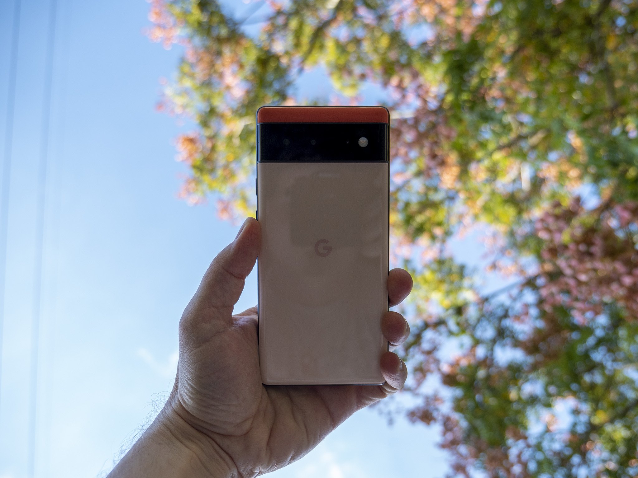
If you're a fan of color in your smartphones, as usual, the smaller Pixel is where it's at. This year, both of the bolder hues are exclusive to the regular Pixel 6, with the Pro offering a pair of more ostentatious color options instead. Of course, black is always an option whichever Pixel you choose, but chances are you'll want one of the more vibrant Pixel 6 variants in "sorta seafoam" or "kinda coral."

If you need color in your life — and your phone — the vanilla Pixel 6 has more a more vibrant palette to choose from.

Smaller phone, big value

Google Pixel 6

Probably the best Android phone for most people

After a hit-and-miss track record, the Pixel 6 is a solid high-end Android phone with plenty of excellent AI-based Googley features and a phenomenal camera setup. For just under $600, it's hard to fault this year's base model Pixel flagship, especially when the Pro costs 300 bucks more.

From $599 at Amazon From $599 at Best Buy From $599 at B&H


from Android Central - Android Forums, News, Reviews, Help and Android Wallpapers https://ift.tt/3GFT18R
via IFTTT
Android 12 review: It's all about you

Google's biggest Android redesign is here, and it is equal parts delightful and divisive.

Android releases have followed a predictable pattern over the last four years: we get a slate of new features, privacy and security fixes, updates to notification management, and if we're lucky, minor changes to the design. Some of those features end up never being used (remember chat bubbles in Android 11?), and most manufacturers ignore Google's design aesthetic and instead use their custom skins.

Android 12 is different. The latest version of Android introduces the biggest visual redesign in Google's history, and it delivers an exhaustive list of new features. Google usually alternates between rolling out new features and making design changes for new Android versions, but this time we're getting both at the same time. The result is the buggiest beta program from Google yet, with even the later Android 12 beta builds featuring phone-breaking bugs.

That said, the new Material You design language gives you a level of customizability that we haven't seen on Pixels, and the new security features are designed to safeguard your privacy. There are a lot of things that Google is doing differently here, so let's find out what Android 12 has in store and when you can try out all the new features on your phone.

Bottom line: Android 12's Material You aesthetic injects a burst of color and bold styling to Google's vision of Android, with a key focus on customization. Combine that with privacy-focused features like recording indicators, much-needed additions like one-handed mode, scrolling screenshots, and a new universal search, and Android 12 is the biggest update from Google yet.

Compatibility: The stable Android 12 build is now available for the Pixels, and you can try it out in beta form on Samsung, Xiaomi, OnePlus, and OPPO phones.

Highlights:

  • Material You takes personalization to a new level
  • New privacy dashboard and recording indicators
  • Notifications get even better
  • On-device search lets you find anything on your phone
  • One-handed mode

Download at Android

Android 12: Availability

After months of beta testing and five public beta builds, the stable version of Android 12 launched alongside the Pixel 6 series and is now available to the Pixels starting with the Pixel 3 series. These are the Pixel devices that are getting the stable Android 12 update:

  • Pixel 3
  • Pixel 3 XL
  • Pixel 3a
  • Pixel 3a XL
  • Pixel 4
  • Pixel 4 XL
  • Pixel 4a
  • Pixel 4a 5G
  • Pixel 5
  • Pixel 5a

Like previous years, the Android 12 beta made its way to the best Android phones from 11 third-party manufacturers, including the likes of Xiaomi, OPPO, Vivo, Nokia, Realme, OnePlus, and ASUS. The third-party beta program is a way to get Android 12 into the hands of users that don't have Pixels, with the initial builds offering a "vanilla" Android interface. That's changing as manufacturers start to integrate Android 12 into their own skins.

Xiaomi has introduced an Android 12-based version of MIUI 12.5, with OnePlus following suit with OxygenOS 12 and OPPO with ColorOS 12. Samsung has already kicked off the One UI 4 beta based on Android 12 for the Galaxy S21 series, and a stable build should be rolling out before the end of the year.

Android 12: What's new

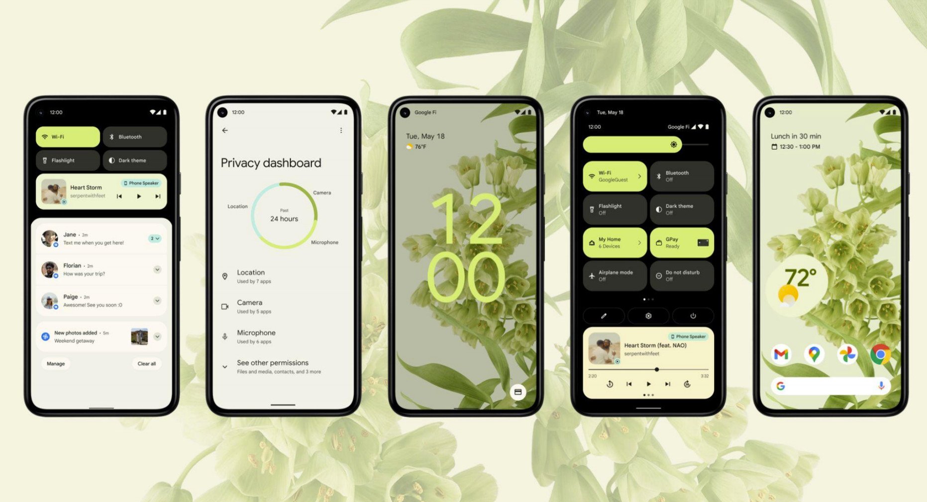
Android 12 introduces the first major design overhaul in over seven years, with Material Design making way for Material You. Google has redesigned the interface to make it much more customizable and easier to personalize, and the changes to the UI combined with the new widgets and settings tiles means Android 12 looks very different from its predecessors.

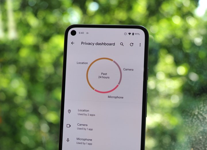
Alongside the new design, we're getting a lot of new features: Android 12 has a local app search mode that lets you search within apps seamlessly, there are important privacy additions with approximate location access, Privacy Dashboard, and recording indicators whenever the phone's mic, location, or camera is being used.

There's also a native one-handed mode and gaming dashboard, the ability to take scrolling screenshots, new Conversations widgets that make it easy to initiate conversations with friends and family, new lock screen shortcuts, and updates to notification management.

In short, Android 12 has a lot of new stuff, but some of the core features — like the Material You design — will be exclusive to the Pixels for now. That said, the key privacy and security features as well as local app search should be making their way to all phones picking up the Android 12 update.

Android 12: First things to do

We've already rounded up the best Android 12 tips to help you get a better understanding of all the new features in Google's latest operating system, and we also have detailed how-to guides to get you started:

Android 12: Material You

With Material You, Google is undertaking its biggest visual refresh over the last seven years. While there have been design changes in that time as Google refined the Android interface, the underlying Material Design aesthetic was unchanged. However, Material You introduces a new paradigm with bold colors and aggressive styling, and the result is that Android 12 looks very different — at least if you're using a Pixel.

Material You introduces a fresh design that's highly customizable.

Google says that Material You follows a "humanistic approach" to design that doesn't "shy away from emotion," offering designs for "every style, accessible for every need, alive and adaptive for every screen." The design aesthetic was created to cater to users' need for more "expressiveness and control," and the playful styling combined with the new color palette makes Material You stand out considerably from earlier versions of Android; the level of personalization you're getting here is remarkable.

The headlining feature in Material You is the color extraction feature that automatically changes the entire system theme based on your phone's background. You can get drastically varying themes just by changing by wallpaper, with Google flexing its machine learning skills to pick out two dominant colors from an image and using that as the basis for the theme. If you don't want to use the colors from the background, you can pick from a selection of "Basic colors" and use that as the default across the UI.

So if you're using a background with red colors, Material You will switch the colors across the system to the same hue. That extends to all parts of the interface, including the lock screen — where there's a large clock that gets the same color as the system theme — widgets, quick settings tiles, toggles, and system apps, including the likes of Gboard.

When Google introduced Material Design seven years ago, it took a long time before updating its first-party apps to the new aesthetic. Thankfully, it's not waiting around with Material You; the Clock, Calculator, and Google Keep have already switched over to the new design, and Google is working on integrating the design into Gmail and other services.

Material You brings fun and quirkiness back to Android — and I love it.

The system-wide font is bolder as well, making it more readable. Google took a page out of Samsung's One UI playbook and introduced large headers for the menus — and unlike OxygenOS 11, it did a thorough job. The large headers push the menu options further down the page, and they extend to the sub-menus as well, making it easier to access the options one-handed.

Google also made it easy to resize elements, and this is particularly noticeable with widgets. Oh, and the animations throughout the interface are smoother and refreshingly playful. Google has been very conservative in terms of Android design thus far, but Material You is about as bold as it gets — and the customization extends to every facet of the interface. The rounded corners and colorful designs with Material You give the interface a fresh new look, and there are enough quirky elements here to make Android 12 fun. That playfulness was missing from earlier versions of Android, and I'm glad that Google isn't taking itself too seriously here.

As is the case with every bold design, the changes introduced with Material You are divisive; not everyone will like the colorful design and the quirky styling. And that's okay; you don't have to use the color picker feature or the other additions. As my colleague Ara Wagoner points out, Material You injects a fresh burst of color into what was becoming a stale design. Google needed to reinvigorate the interface without making it feel cartoonish, and it has managed to do just that.

While Material You brings a lot to the table, I don't see most Android manufacturers switching to the aesthetic. Google isn't even offering that as an option; Material You will be exclusive to the Pixels for now, and it gives Google's phones a distinctive design that was missing from previous iterations.

Android 12: Widgets

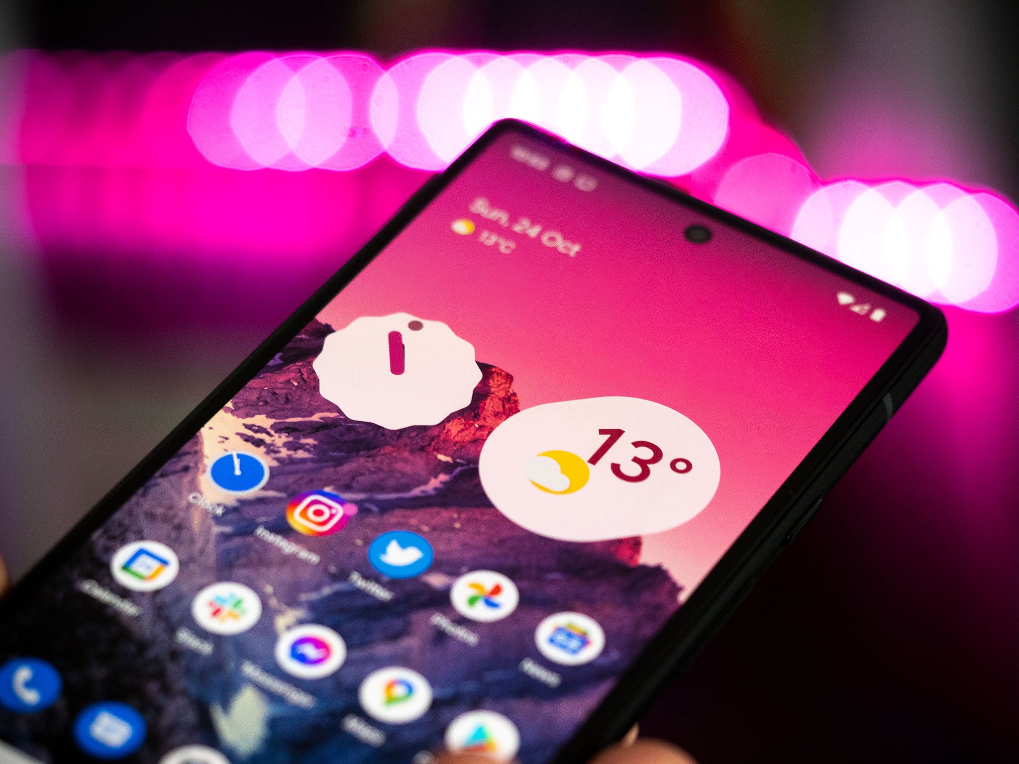
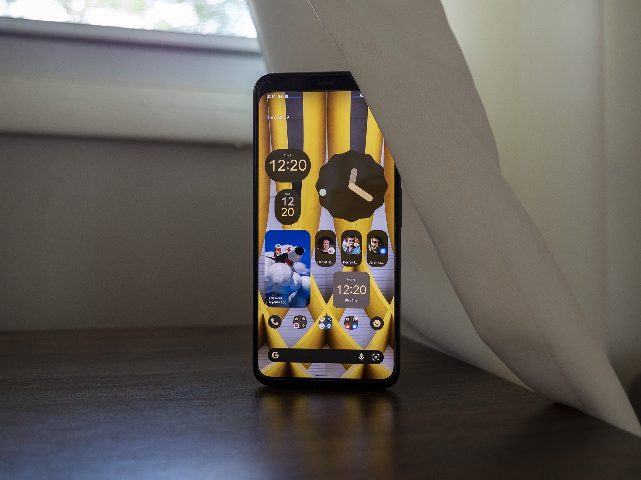
Android widgets fell by the wayside over the last three years, and it wasn't until Apple introduced widgets to iOS 14 that Google started taking them seriously again. Widgets have picked up a much-needed overhaul in Android 12; the clock widget, in particular, looks great, and like everything else in the UI, it changes colors dynamically.

Google finally made Android widgets exciting to use again.

There are four styles for the clock widget: a round analog clock with a revolving dot for the seconds hand, a stacked design with a digital clock, a world clock that shows two time zones side-by-side, and an oblong digital clock. You can easily resize the widgets anywhere on the home screen, and the dynamic colors mean you can play around with the colors and get really cool results.

Google also added a Conversations widget that lets you pin conversations to the home screen. The 2 x 1 widget lets you select contacts that you message often and makes it easier to launch conversations straight from the home screen, and the best part is that it works regardless of the messaging service you use.

Android 12 widgets have rounded corners by default, and they look more modern as a result. They also have faster transitions; there's no delay when you're adding a reminder or creating an event in Google Calendar or when you have to launch the app that's associated with the widget.

Android 12: Quick settings

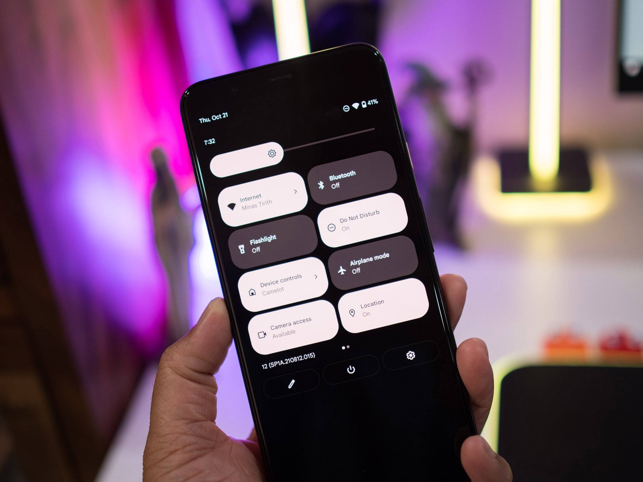
Android 12 brings a radical change to the quick settings tiles. Instead of the usual rounded icons, you'll now see larger rectangular icons that take up a lot of room. The icons and text are now within the individual tiles, and you can access four tiles with a single pull-down and eight tiles with a double-pull action.

I'm not a fan of the fact that there are fewer tiles, but it didn't bother me as much as I thought it would; I use five toggles with any amount of regularity, so it wasn't too difficult to switch to the new format. The large layout makes it easier to access the tiles, and as they use the same dynamic Material You colors as the rest of the interface, they look much more vibrant than before. And as is the case with the rest of Android 12, the tiles have rounded corners.

What I'm not particularly fond of is the width of the brightness slider; it's just too damn big, and the same goes for the volume slider. And because Google doesn't seem to be able to leave the power menu alone, it has removed the smart home dashboard and Google Pay from here and added them as quick settings tiles instead.

I got a lot of use out of the integrated smart home dashboard in the power menu, but Google's data-driven decision-making means features get killed off if they're not widely used. With Android 12, the power button is once again back to being used solely for powering off or restarting your device.

Android 12: Notification management

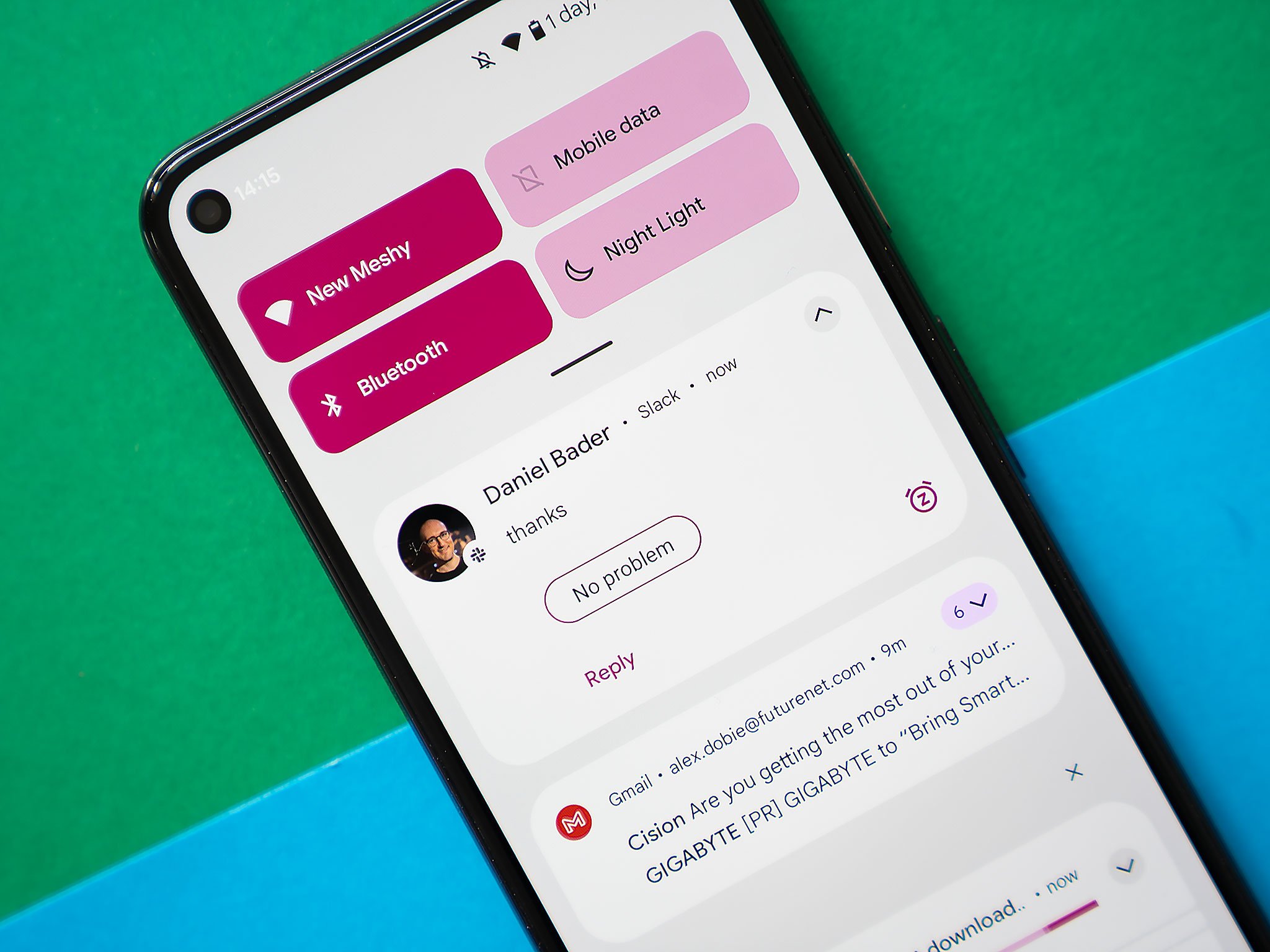
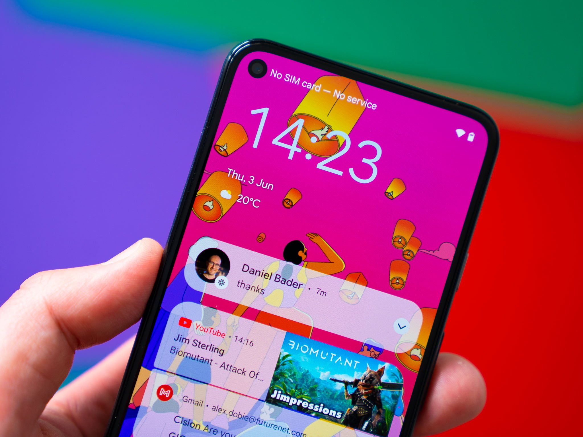
Android 11 introduced the Conversations view that surfaced all one-to-one conversations and messages from friends and family to the top, and while Android 12 doesn't have any big changes in this area, there are a few new additions. The notifications have a cleaner design, and you get the ability to snooze notifications directly from the pane.

Thankfully, the ability to set a reminder from the notification pane is still intact in Android 12. After using the iPhone 13 Pro Max for two weeks, I realized that Android does a much better job in terms of notification management, and Android 12 extends that lead.

Android 12: Privacy and security

Google is putting privacy and security at the forefront of Android 12, and it is rolling out a slate of new features designed to safeguard your data. There's a new Privacy Dashboard, recording indicators for the camera and mic, and tweaks to Bluetooth scanning.

Much like Digital Wellbeing, the Privacy Dashboard gives you a detailed account of all the apps that accessed your location, mic, camera, and other sensitive data. Alongside the dashboard, there's a recording indicator that lights up whenever your camera or mic is in use; so if there's an errant app that accesses the camera or mic in the background, you will know about it immediately.

Android 12 also changes how Bluetooth scanning works for new devices. Previously, whenever you had to pair wireless earbuds or other smart home gear, you had to enable the location access to find devices. But that's not needed in Android 12, so when you're setting up an accessory, you won't have to give it access to your location.

For most of the on-device machine learning features that exist within Android 12, Google is turning to the Private Compute Core. Think of it as a secure zone that sandboxes the data so that no other service can access it.

Finally, you get the option to turn off system-wide access to the camera or mic with a single toggle. You can set up these toggles in the notification shade, and doing so will cut off all access — including for face unlock. Of all the new privacy features, this is the one I like the most; the fact that I can easily turn off camera access throughout Android with a single button is a huge deal. I also like the Privacy Dashboard that's baked into Android 12; other manufacturers have offered a similar feature for a few years now, and it is good to see it being integrated natively into Android.

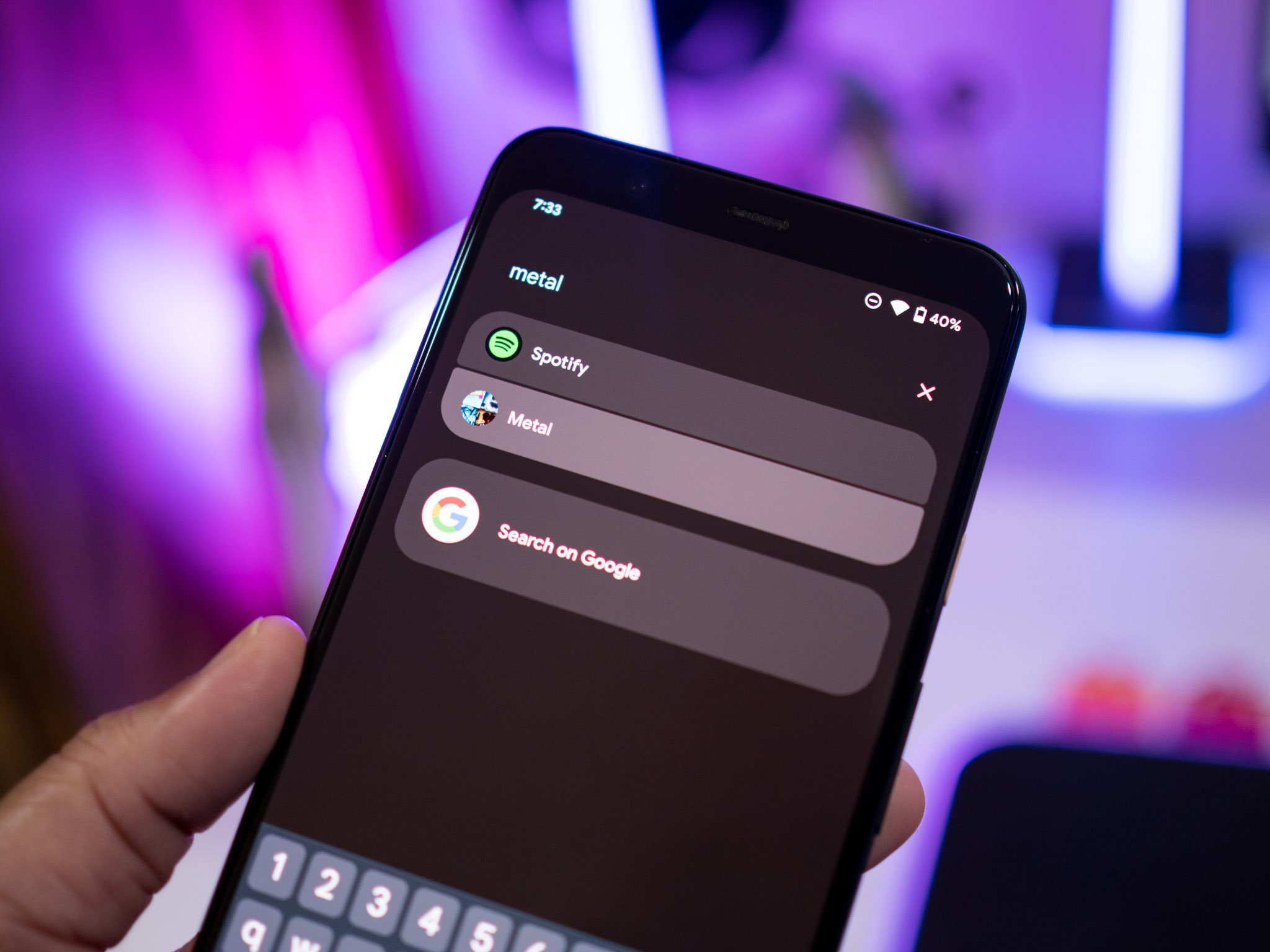
One of my favorite features in Android 12 is AppSearch; it's an on-device search engine that lets you find anything on your phone with the least amount of hassle. It's baked into the search bar in the app drawer, and you can search for a contact, system setting, Spotify playlist, photo taken at a particular location in Google Photos, and so much more.

Instead of digging through my Spotify playlists, I just use AppSearch to quickly pull up the playlist I want to stream and get started. The feature essentially cuts down on the amount of time you spend looking for photos, playlists, or anything else on your phone.

Phones these days are taller and narrower than before, and Google is integrating a one-handed mode into Android 12 to assist with usability. Most phone manufacturers already offer this feature by default, and as we've seen with the screen recorder and scrolling screenshots, Google is adding more and more of these features natively into Android over the last two years.

One-handed mode essentially pulls the screen down to about the halfway point, making it that much easier to access all the on-screen elements. The best part about it is the ease of use; you just swipe down on an app to launch one-handed mode and swipe up to exit. There's also the option of adding a timer to exit the mode, and while other manufacturers usually resort to shrinking the screen to two-thirds of its size, I like the fact that Google emulated iOS here.

Android 12: Game mode

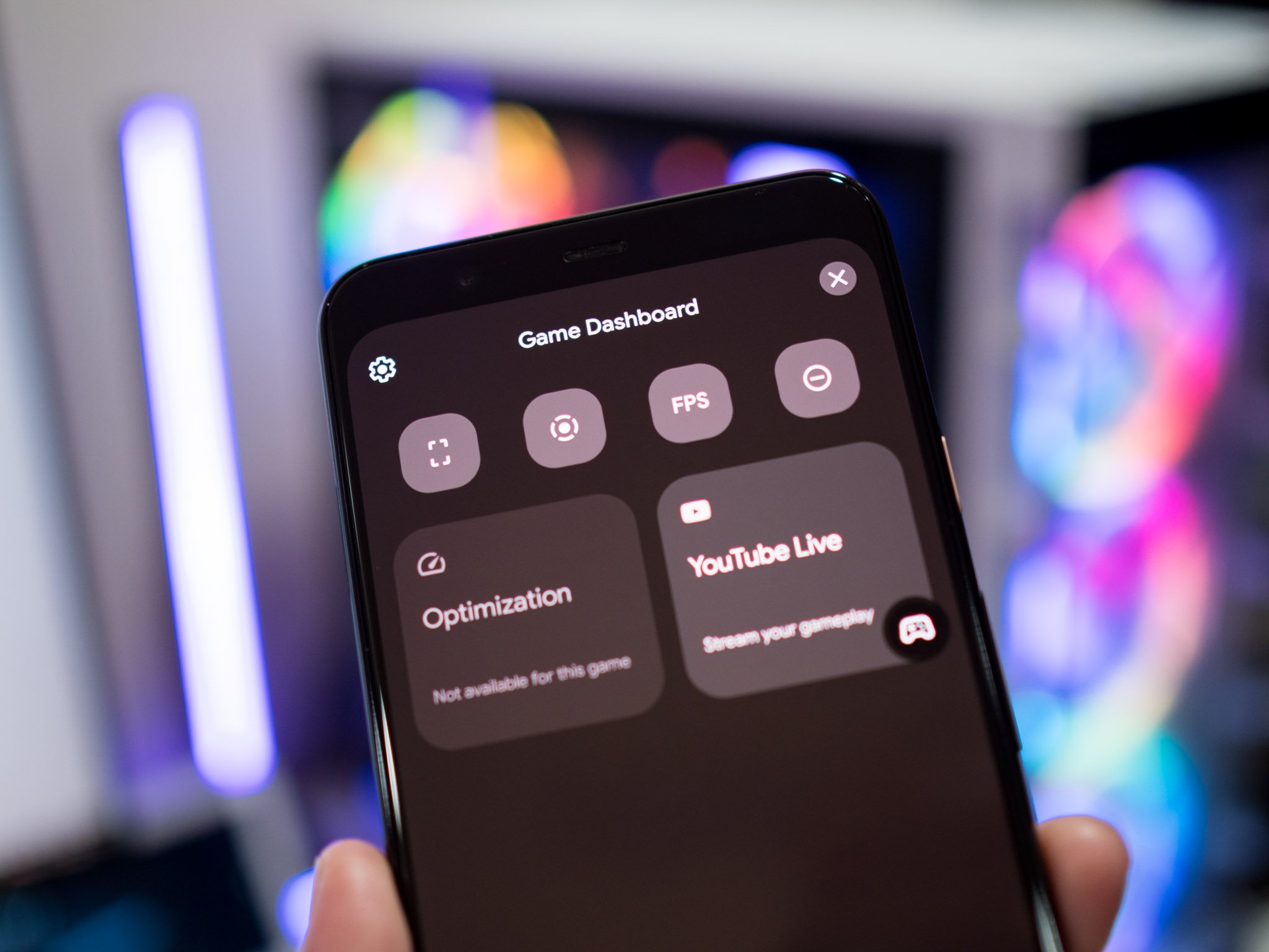
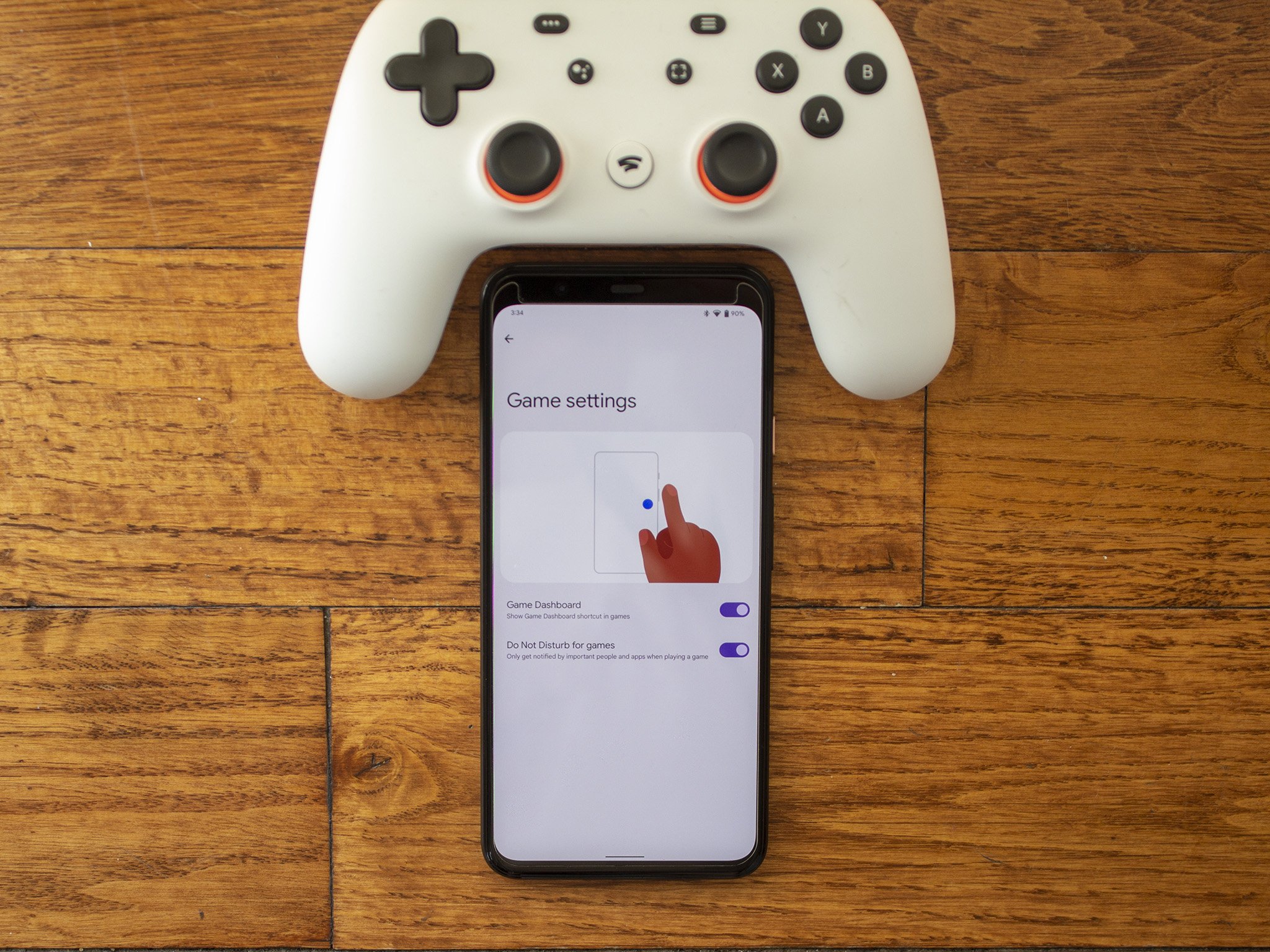
Most Android device makers offer a gaming mode that lets you disable notifications and prioritize network bandwidth for games. There's now a game dashboard, and in usual Google fashion, the feature is located where most users would never bother to look for it. You'll find it in Settings -> Notifications -> Do Not Disturb -> Schedules -> Gaming, and it lets you enable DND when gaming so you don't get distracted by incoming calls or texts when you're in the middle of a game.

You also get the ability to record your game footage, take screenshots, stream directly to YouTube Live, view a real-time fps counter, and optimize the hardware to offer the best visuals. There's another gaming-focused feature that's noteworthy: you now have the option to play a game as it's still downloading, similar to what you'll find on the PS5, Xbox, and Windows.

Android 12: What else is new?

There are a lot of useful additions baked into Android 12, including scrolling screenshots, better link sharing in Chrome, easy Wi-Fi sharing, and more. Here's a rundown of all the new stuff:

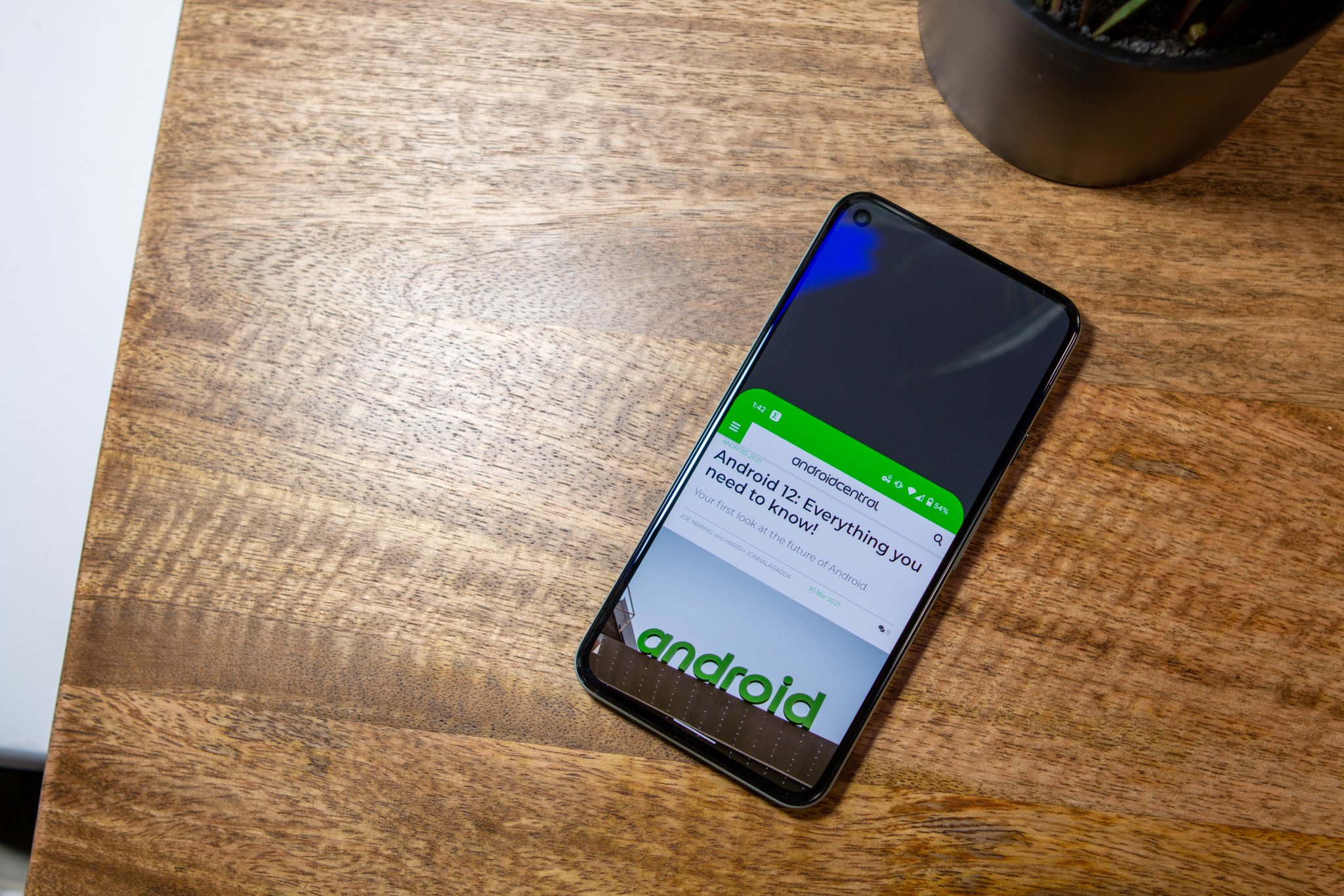
  • Scrolling screenshots: With Android 12, Google is finally introducing the ability to take scrolling screenshots. Most manufacturers have offered this option for some time anyway, and like screen recorder last year, this feature is now baked into Android.
  • Quick Tap: Google has a nifty set of gestures that you can undertake on the back of your Pixel for actions like invoking the Google Assistant, taking a screenshot, or playing and pausing music. This feature isn't available on all Pixels though; you'll need a Pixel 4a or Pixel 5/5a.
  • Chrome link sharing: Android 12 has a slightly easier way to share Chrome links. You'll have to zoom out into the overview pane, and you'll see a large icon to share the link. Google could have found an easier workaround to do this, but if you regularly share links within Chrome, there's now a new way to do so.
  • Auto-rotate: A cool new addition for auto-rotate is an AI-assisted mode that tilts the screen automatically based on your eye movements.
  • Wi-Fi: We got the ability to share Wi-Fi access via QR codes with Android 11, and this year Google is building on that with more options.
  • Clipboard security: We have seen a lot of instances of unauthorized clipboards on Android, and Google is cutting down on that by delivering a notification whenever a service accesses the clipboard in Android 12.
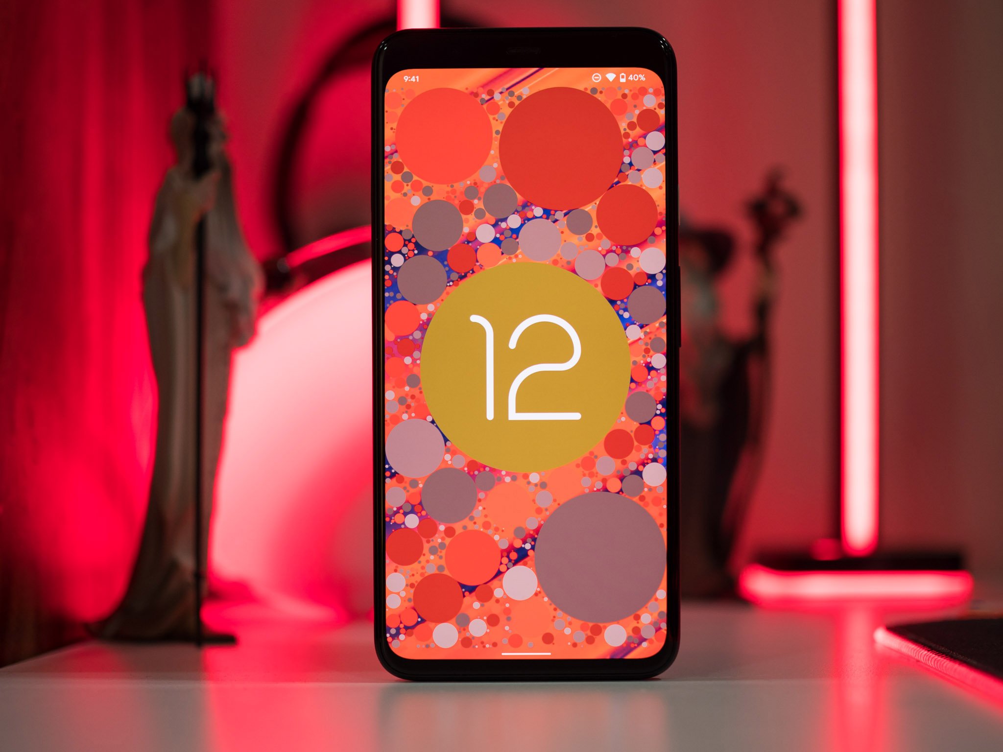
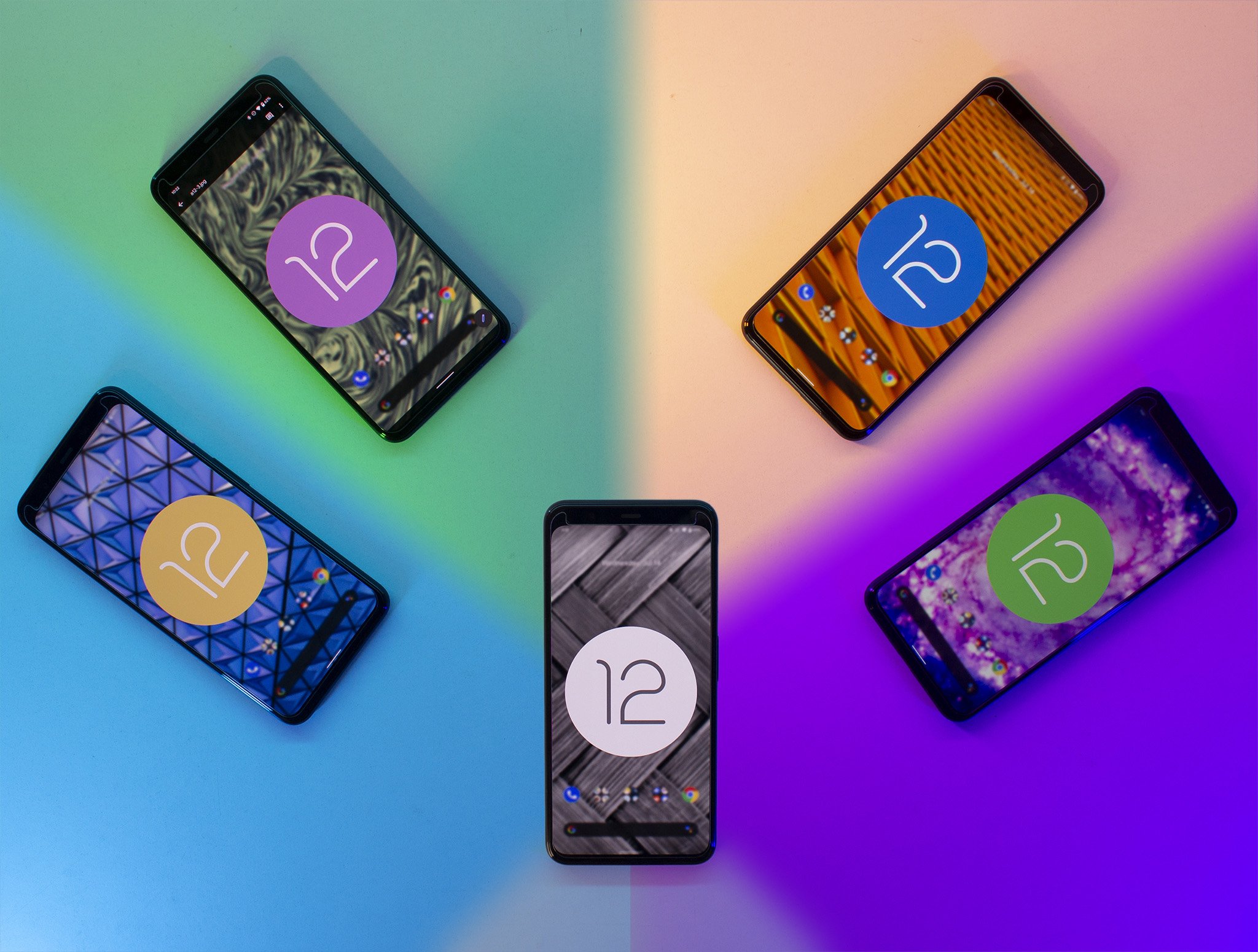
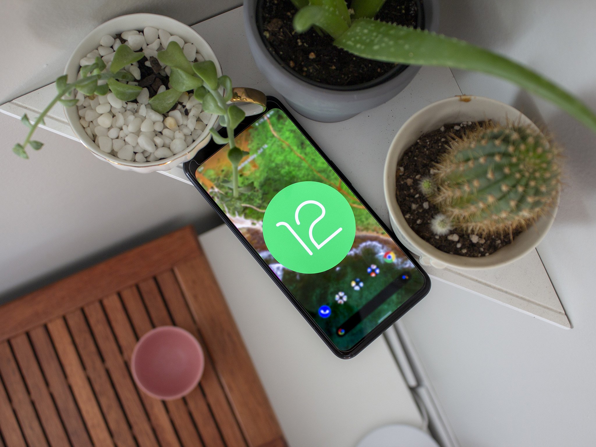
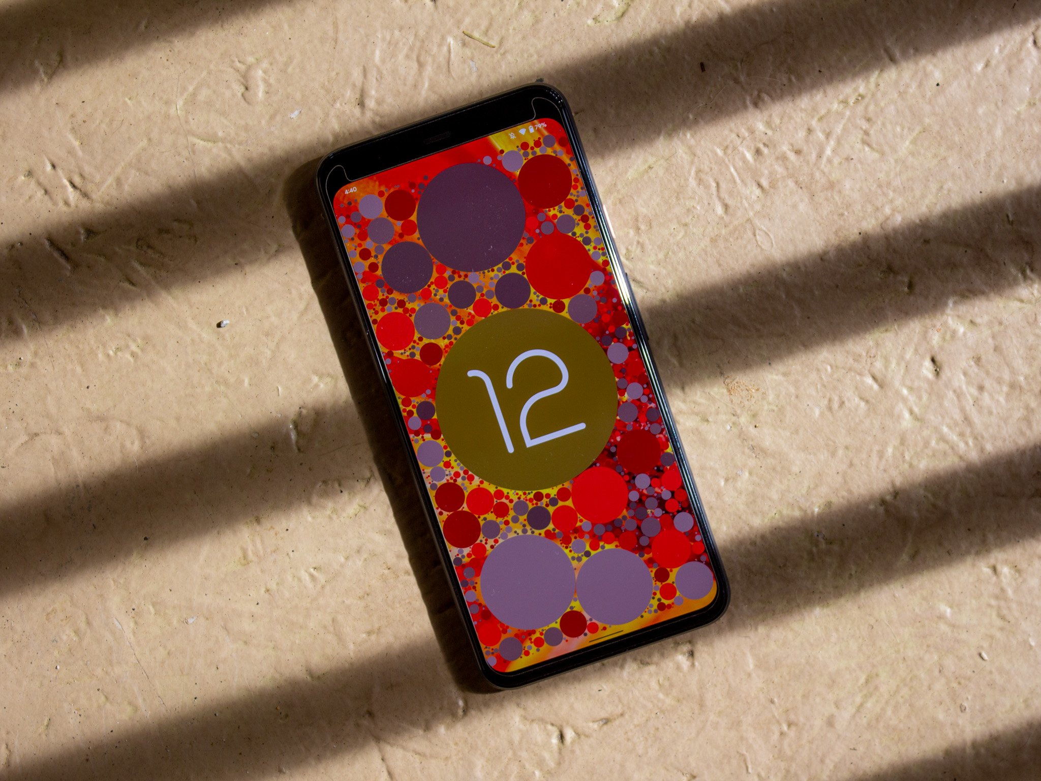
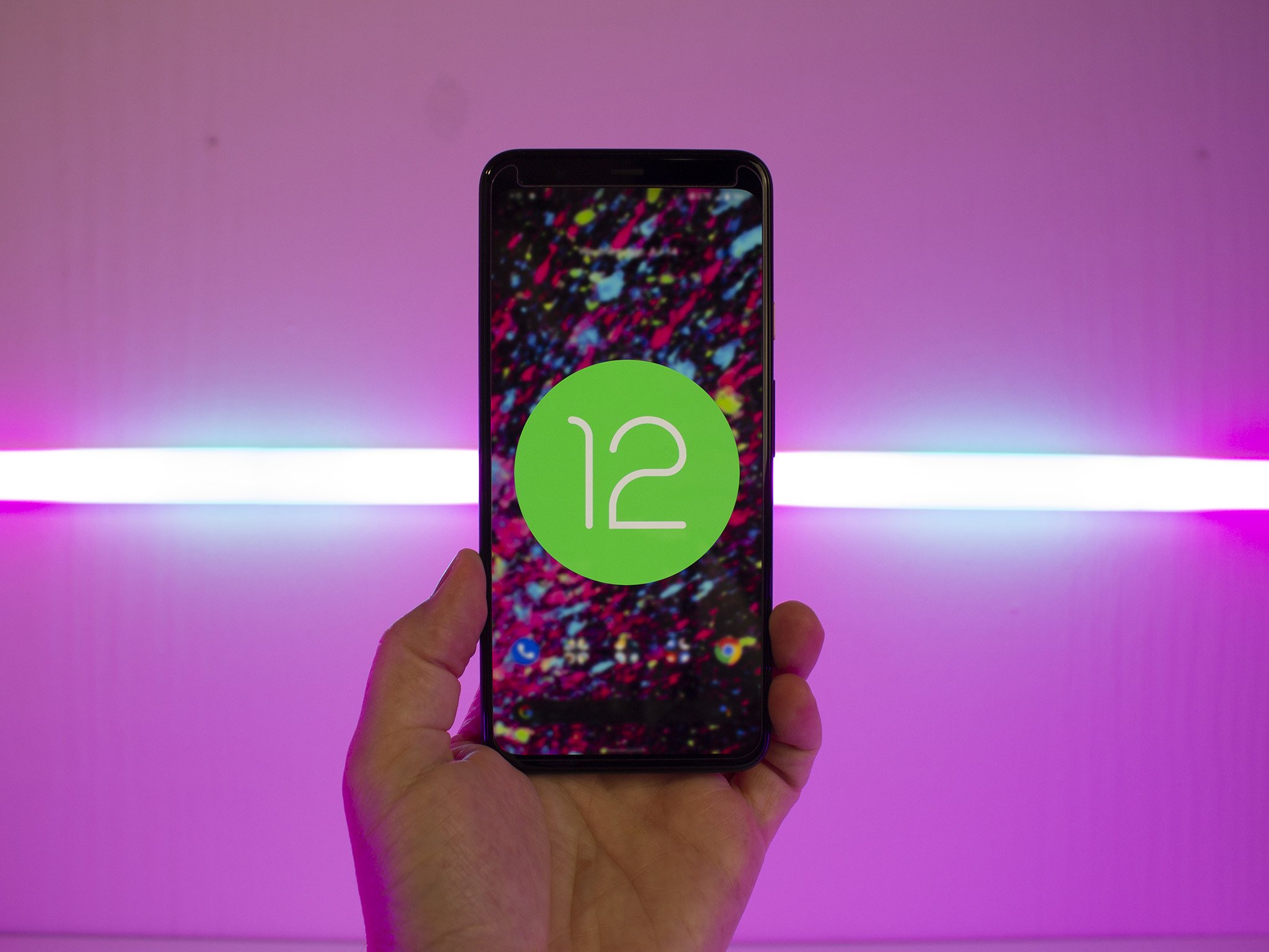
  • Android 12 Easter egg: Google hasn't forgotten the Easter egg with Android 12. Like previous iterations, you'll need to go to the Settings, head to About phone, and hit the Android version number thrice. Doing so will surface a clock widget; set the time to 12, and you'll get the Android 12 logo and a splash of color.

Android 12: Should you wait?

With a boatload of new features and a major redesign, Android 12 was bound to be buggy, and that was a defining theme throughout the betas. Even beta 4 — the build where Android 12 technically hit platform stability — had several bugs and frequent crashes, and while beta 5 fixed a lot of the issues, At A Glance was still broken.

With the stable Android 12 build, Google has finally ironed out all the bugs.

Over the last four months, I encountered a litany of bugs on my Pixels. For example, icons on the home screen vanished all of a sudden on beta 2, password managers refused to work with the first two betas, I had issues with DND automatically switching off, banner notifications not showing up, and the media player went missing from the notification pane.

On that note, I have heard from my sources that all the under-the-hood changes in Android 12 is making it harder for manufacturers to integrate the build into their own skins. We've already seen this with the first One UI 4 beta, which has several phone-breaking bugs and performance issues.

That's also the case with the first public beta of OxygenOS 12, so you should wait and see how they hold up before making the switch on your own device. That said, I didn't run into the same issues on the ColorOS 12 beta that launched a few weeks after its rivals, so it looks like the release candidate build has fixed a lot of the bugs from the earlier releases.

The same is true for the stable build of Android 12. Google has finally sorted out the bugs, and for the first time, Android 12 feels stable, and all the features work as intended. So if you're using a Pixel and are wary of switching over, you can do so now.

Android 12: The bottom line

Android 12 is Google's most ambitious effort yet, and it has managed to deliver on a lot of the key features. The Material You design overhaul delivers a fresh take on what was becoming a boring aesthetic, and the focus on personalization means you now get the ability to set up your phone just the way you want.

Android has always stood for customizability, and with Android 12, Google is giving you powerful tools to change the look and feel of your phone right out of the box. The bold design and colorful styling won't be to everyone's liking, but you can tone down the colors without too much of a hassle.

Security is another key area of focus for Google. We got one-time permissions with Android 11, and Android 12 introduces approximate location access for services that don't need your exact location details, a new privacy dashboard that makes it easy to view what services are accessing your data, and recording indicators for when your phone's camera is being used. These additions go a long way in ensuring no errant services in the background use your data without your knowledge.

Having used Android 12 from the first beta to the latest release candidate, the one takeaway that I have is that this is the first step in a larger design overhaul for Google. When Material Design launched seven years ago, Google took a few years to switch all of its services over to the design aesthetic, and it is doing the same with this generation — albeit much more quickly.

Ultimately, it is great to see Google take a bold stance on design; Material You is bound to be divisive, but it is clear that the search giant sees personalization as a core tenet for its vision of Android. Of course, we'll have to wait and see if other manufacturers include most of the styling elements, but for now, Google finally has a distinct design that stands out from the pack.

Android 12

Bottom line: Android 12 is a landmark update for Google: Material You brings a powerful set of tools aimed at personalization, and you can change the look and feel of the interface to your tastes like never before. You'll also find security and privacy features that give you more control over your phone and stability fixes that make Android run smoother. The design changes may not be to everyone's liking, but this is a big step forward for Google and Android.

Download at Android


from Android Central - Android Forums, News, Reviews, Help and Android Wallpapers https://ift.tt/3sZVeFB
via IFTTT
Everything you need to know about Android 12

Android 12 is out on Pixels, but there's a long journey ahead for Samsung, OnePlus, and the rest.

After about eight months of Android betas, Android 12 officially rolled out to the Android Open Source Project on October 4, then arrived on eligible Pixel phones a few weeks later. But the Android 12 saga is far from over. Samsung, OnePlus, and other smartphone makers are hard at work on their respective Android 12 UI betas, and Google itself is developing a new Android 12L OS, with betas planned through at least February 2022.

Pixel owners will want to know the top Android 12 tips and tricks for their new Android 12 phones. Other Android users are wondering when their phones will get Android 12, and how their specific OS will differ from "stock" Android 12. Android tablet and foldable owners will be wondering how Android 12L will affect their experience. Maybe you're just curious how Material You works.

Whatever you need to know, we're here to help solve all of your Android 12 bugs or answer your questions on Android 12 features.

Android 12: When is my phone getting it?

As of October 19, Android 12 is available on Pixels, from the Pixel 3 through the Pixel 6 and Pixel 6 Pro. Unlike Android launches of the past, 12 has Pixel-exclusive software features that took extra time to perfect, leading to a delay beyond the initial October 4 code launch.

Other manufacturers' Android 12 release date schedules are trickier. Several have released beta schedules, but it's still up in the air when certain phones will get full releases. Android Central sources have told us that the massive scope of Android 12's changes is making it difficult for other companies to incorporate new changes into their own OSs.

Nevertheless, we have the latest info that gives us a vague idea of when to expect various Android 12 skins to arrive.

Samsung

Samsung made the One UI 4 beta available on the Galaxy S21 series in September, adding tools like upgraded home screen widgets, charging limits for battery health, the eSim privacy center, updated security settings, and other tools. In our Samsung One UI 4 Beta review, we were impressed with some changes but found it very buggy and lacking some key features.

Since then, the One UI 4 beta 2 arrived in early October with bug fixes, virtual RAM support, and Samsung's spin on the Material You color extractor tool. Most recently, the One UI 4 beta 3 focused on S21 bug fixes, and Samsung closed the beta to new participants.

Plus, the company has begun to push out One UI 4 on the Galaxy Z foldables. It's likely to appear on other flagship devices like the S20 and Note 20 soon.

We fully expect the Galaxy S21 series to receive the full One UI 4 launch by December 2021, followed by other recent phones in early 2022. You can check our guide on when your Samsung phone will get Android 12 (One UI 4) for more specifics.

OnePlus and OPPO

OxygenOS 12 is on its way. Unlike last year's skin, the latest OnePlus OS will be built from ColorOS 12, the OS created by parent company OPPO. Unsurprisingly, both sets of phones are on a similar release schedule.

Alongside the Android 12 source code release, OnePlus announced the first OxygenOS 12 beta on October 4. That means anyone with the OnePlus 9 or 9 Pro can download the beta now, simply by following our guide on how to install OxygenOS 12.

Unfortunately, our OxygenOS 12 beta review notes how much of its distinct identity has been lost this year. It is nearly identical to ColorOS 12 in many ways, and fans of OnePlus phones may not be as excited to update as in previous years.

Meanwhile, OPPO announced the ColorOS 12 global beta, which is available on the Find X3 Pro globally. Later, Find X2, Reno6 Pro, and Reno6 5G owners will receive the beta in November; older Reno phones in December; and the majority of its eligible lineup will get it in the "first half of 2022."

In our ColorOS 12 beta hands-on, we were impressed with the clean UI, customization tools, and intriguing new features. Given that OxygenOS and ColorOS will merge in 2022 into a single OS, starting with the OnePlus 10 in early 2022, OnePlus phone owners can at least take solace in the fact that their new OS is enjoyable to use.

The other Android 12 skins

Matching up with the other top brands, Xiaomi has already begun its MIUI 12.5 Android 12 beta on the Mi 11, though only in China. We don't know when the beta will come to other Xiaomi, Redmi, and POCO phones. Still, based on last year's Android 11 updates, it's a safe bet that the top flagships will get the final version in December 2021 or January 2022, followed by other phones later.

The Android 12-based Realme UI 3.0 has been officially announced as well. The company will roll out an "early access update" to the Realme GT in October, followed by the Realme GT Master Edition, GT Neo 2 5G, X7 Max, and Realme 8 Pro phones in December. Other eligible phones will receive it throughout the first half of 2022.

Fans of ASUS and gaming phones may be a bit disappointed by the ASUS Android 12 roadmap. Only the Zenfone 8 will get the update in December 2021. The ROG Phone 5 and 5s will receive it sometime in the first three months of 2022, followed by the ROG Phone 3 and ZenFone 7 in the first half of the year. The Zenfone 8 beta will begin soon; ASUS promises to include Google's new features along with updates to battery management and customization.

We don't have hard information on other manufacturers like Nokia and Motorola. Both of these brands have struggled to release speedy updates to Android 11 for many of their older phones. There's no reason to think Android 12 will be any easier or faster to adapt and roll out. Basically, unless you have a true flagship phone from them, you might not see Android 12 arrive until mid-2022.

For more general info on release schedules, check out our guide on when your phone will get Android 12.

Android 12: What is Material You, and is it coming to non-Pixel phones?

Google calls its new visual paradigm Material You. The key highlight here is customization. Google is making it easier than ever to personalize your phone to your tastes, without needing an Android launcher to do so.

The Material You color extraction tool picks colors straight from your phone's wallpaper and applies them throughout your UI. So your notification shade, lock screen, widgets, volume controls, and other elements take on a custom theme that'll change every time your wallpaper does. You can also customize your phone theme manually if you prefer.

Another new feature is themed icons. These convert the icons to a stylized design that incorporates your color theme. Not every app has its own Material You-themed icon, so there's a stark contrast between the two. You may want to make your own Material You adaptive icon pack with Icon Pack Studio instead.

The question on most people's minds is, which phones will receive Material You aside from Pixels? That's still up for debate. You can expect the overall design elements of Android 12 to appear on operating systems that tend to be more "stock" than others, such as Nokia and Motorola. But others will stick to their own design languages or form more of a hybrid UI, cherry-picking aspects of Android 12 to mesh with their own design.

Samsung is a great example of this. Samsung added a Color Theme tool that lets you automatically change the UI color based on your wallpaper, using Google's theming system to great effect. Buttons, icons, and sliders will take on those colors; but Samsung made the color effect more subtle than Google did with its Pixels. And it has different design styles for specific elements like widgets. It's still a Samsung UI despite Google's heavy influence.

In the case of OnePlus, OxygenOS 12's design and code is heavily dependant on ColorOS 12, which itself borrows none of its design from Material You. OPPO didn't have access to Google's coding, so it made its own code for changing UI colors based on your phone's background. And it kept much the same design as ColorOS 11, only subtly incorporating Android 12 design changes to avoid upsetting its users.

We're unclear if other operating systems will have access to the color extractor code (like Samsung did) for their Android 12 skins. Leaked Android 12L code suggested that release would open-source its Material You theming system. Given that 12L has an expected release date in spring 2022, automatic color extraction may not appear on other phones before then; and unless these companies plan to push out their own mid-year updates — which seems unlikely — this aspect of Material You might not appear more widely until Android 13.

Android 12: What are the new privacy features?

Google always uses Android updates to introduce new privacy-focused features, and for Android 12, that's no different. Android 12 ushers in a significant overhaul to privacy at the OS level.

The new Privacy Dashboard helps you to see which apps accessed your camera, mic, or location in the past 24 hours, so nothing slips by you. And app permissions controls continue to be improved and streamlined.

One helpful tool: you can now grant approximate location access to apps in Android 12, giving you the benefit of services tied to your location without giving the app your specific home address.

But the most significant change is that you can now disable the camera or microphone directly from the notification pane, and this setting works system-wide. So even if you've given an app access to the camera, this particular toggle overrides access. If the new recording indicator icon appears showing that an app is recording you, you can swiftly shut off access with a few swipes before using the Privacy Dashboard to shut the problematic app down for good.

Android 12: How have my notification settings changed?

To be frank, this wasn't a major focus point for Google: notifications were more tweaked than changed in Android 12. Adaptive notifications from Android 10 became enhanced notifications but didn't change much beyond the rebranding. And Android 11's Conversations View got an updated design to include large text labels and now lets you snooze notifications directly from the pane.

In addition, there's now a Google Pay toggle that lets you access saved cards with ease, a new Device Controls toggle that replaces the smart home controls section found in Android 11's power menu, and an option to set a reminder directly from a notification.

On the topic of security, developers can now configure notifications on the lock screen to always require user authentication. And Google allegedly tried to make apps open up more quickly when tapping a notification, so opening multiple notifications feels like less of a chore.

Android 12: How do I use the Game Mode?

Google added a new system that makes playing the best Android games more enjoyable. The Android 12 Game Dashboard makes it easier to access tools like Do Not Disturb, screen recording, screenshots, Game Mode APIs, live streaming to YouTube Live, and your current FPS rate using a quick on-screen toggle in-game.

The new Game Mode APIs let you turn on different gaming settings like "battery-saving" or "performance" mode. This will adjust how the game performs, helping you to preserve battery if you're running low or go all out if you're near a charger. Developers will have to enable these, however; you can check your Game Dashboard to see if the option is available.

To access these tools, you'll need to go to Settings -> Notifications -> Do Not Disturb -> Schedules -> Gaming and enable it. You'll then be able to quickly tap a floating icon in your mobile games to access the aforementioned gaming settings.

The other major Android 12 gaming update is "play as you download": when downloading Android games with large file sizes, Android 12 will let you start to play it while only part of the app is downloaded, just as you can on game consoles. It's pretty impressive and great for people with slow wi-fi networks.

Android 12: Are there any other features I should know about?

Android 12 has a lot of smaller updates that are just as important to keep on your radar. For instance, Pixel owners will have noticed the new Android 12 emoji designs. There are 992 emojis up for a new look, many of which were redesigned to be more inclusive of other countries. They'll even change slightly based on whether or not your phone is in light or dark mode. We're curious to see if other Android 12 skins incorporate this.

Many Android phones have the option to take scrolling screenshots, but stock Android never had that option ... until now. It's now easy to take scrollable screenshots in Android 12.

Yet another useful tool? You can use Nearby Share or a QR code to share Wi-Fi credentials in Android 12, so you can get friends or family hooked up without having to slowly read out every letter (or reveal that your password is "password").

One Android 12 feature announced at Google I/O was using your phone as a digital car key. You're supposed to be able to unlock certain cars from BMW and Volvo using Android. We haven't yet seen this feature turn up, however; it's possible the developers needed more time with it.

Android 12L: When will the new Android OS come to foldables and tablets?

Android 12l Scaling

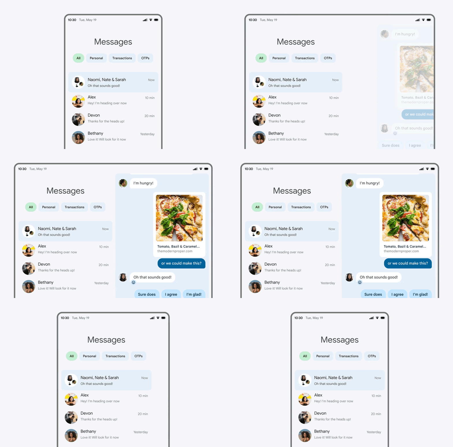
After Android 8.1 Oreo, Android devs did away with X.1 releases, fixing bugs but largely avoiding new feature updates between major releases. However, this year, the Android developers are working on Android 12L, which is designed specifically for Android tablets and foldables.

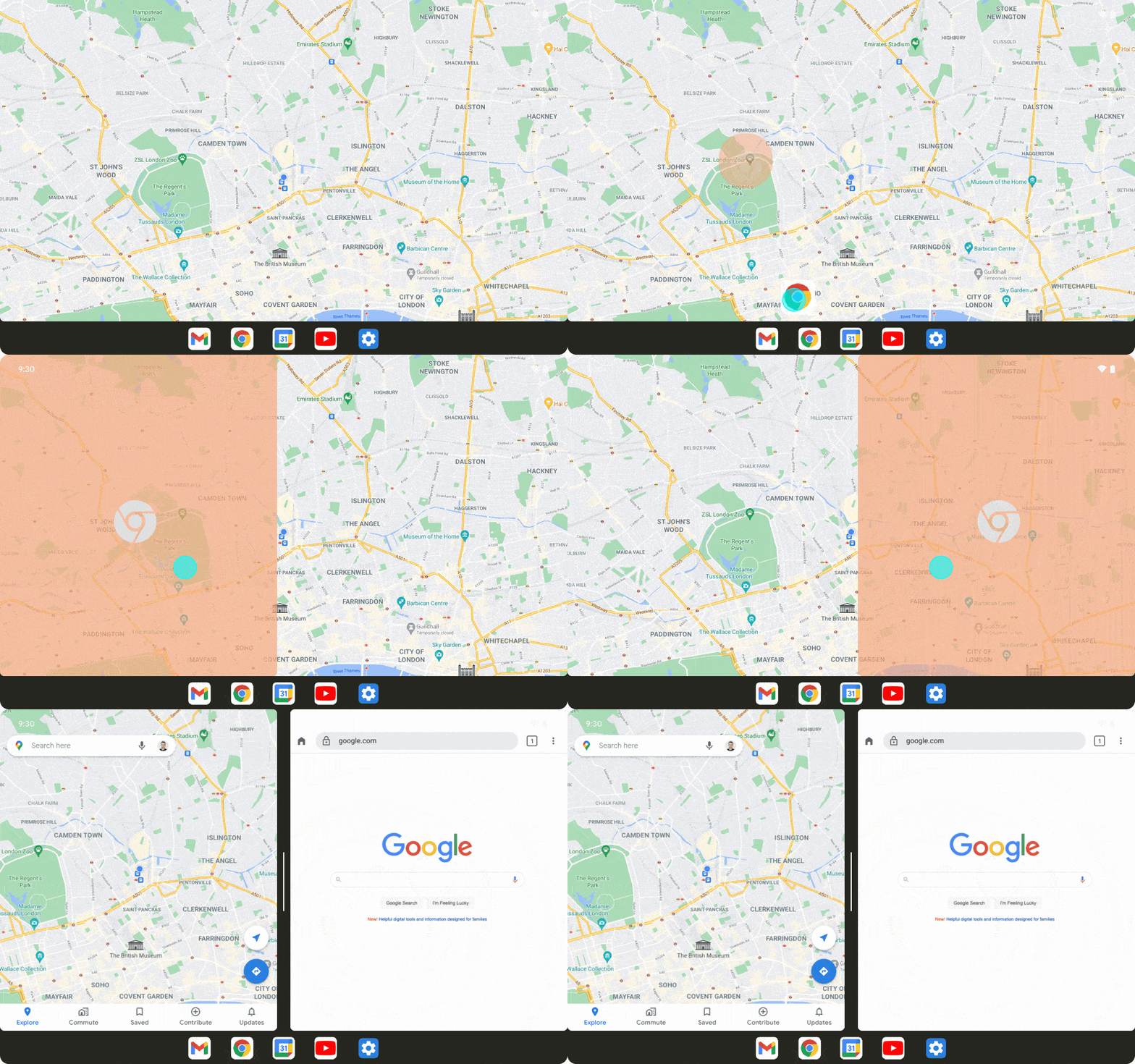
With 12L, Android will take advantage of wider screens and automatically split content in half across the display, as seen in the visual above. You'll also be able to use a task bar (like a computer dock) and drag-and-drop your favorite apps onto one half of the tablet or foldable, then adjust the size of both apps depending on your priorities.

Android 12l Multitasking Task Bar

The Android devs plan to release the final version of the Android 12L in "Q1 2022" alongside the "next wave" of foldable and tablets. In theory, we could see a hypothetical Google Pixel Fold release by March 2022, shortly after the AOSP launch. However, this is merely speculation. We do know these tools will come to the best Android tablets, and Samsung could incorporate some of these tools for its Galaxy Z foldables.


from Android Central - Android Forums, News, Reviews, Help and Android Wallpapers https://ift.tt/3GEo3hu
via IFTTT