Well, that was a hectic three days.
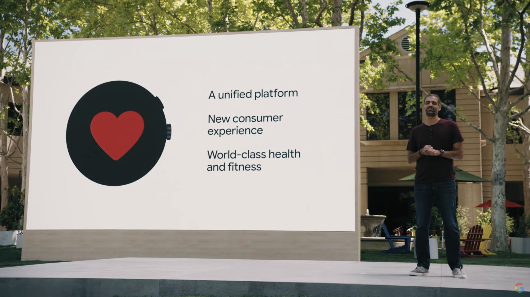
Android 12 and the new Material You design system stole much of the spotlight at Google I/O 2021, alongside Samsung and Google deciding to team up and combine smartwatch platforms in a new, massive update for Google Wear. With this year's developer conference being the most drastic change for Android and its various platforms since 2014 — the year Material Design and Android Wear were first announced — it's no wonder that some things slipped through the cracks because no matter how long you stayed up, you couldn't possibly watch everything, even with dueling Android TVs.
Believe me, I know. We tried.
That said, I love the challenge of finding what others have passed over, and so if you haven't been able to dive through every piece of media coverage, here are the smaller Google I/O announcements you might've missed while the sparkly animations and dynamic colors of Android 12 dazzled the keynote and subsequent sessions.
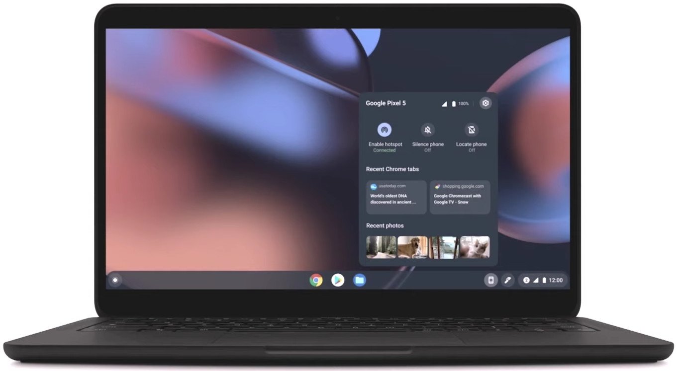
Phone Hub for Chromebooks are getting Photo sharing — but there's a catch
I'll be the first to admit that Chromebooks didn't get as much love at Google I/O as I'd like. Sure, Linux is finally leaving beta after two years, but otherwise the only news we got is that the Android 11 rollout is going to take the rest of the year — it started back in March — and one tiny update for Phone Hub.
Then again, that tiny update is a huge one for people like me that use a Chromebook for work: you'll soon be able to see your recent photos in the Phone hub menu and drag them into documents or web services the same way you currently can with the most recent on-device images in the Tote section.
You'll only see the four most recent images, though, so if you've got dozens to share, Google Photos or Nearby Share will still be your preferred method.
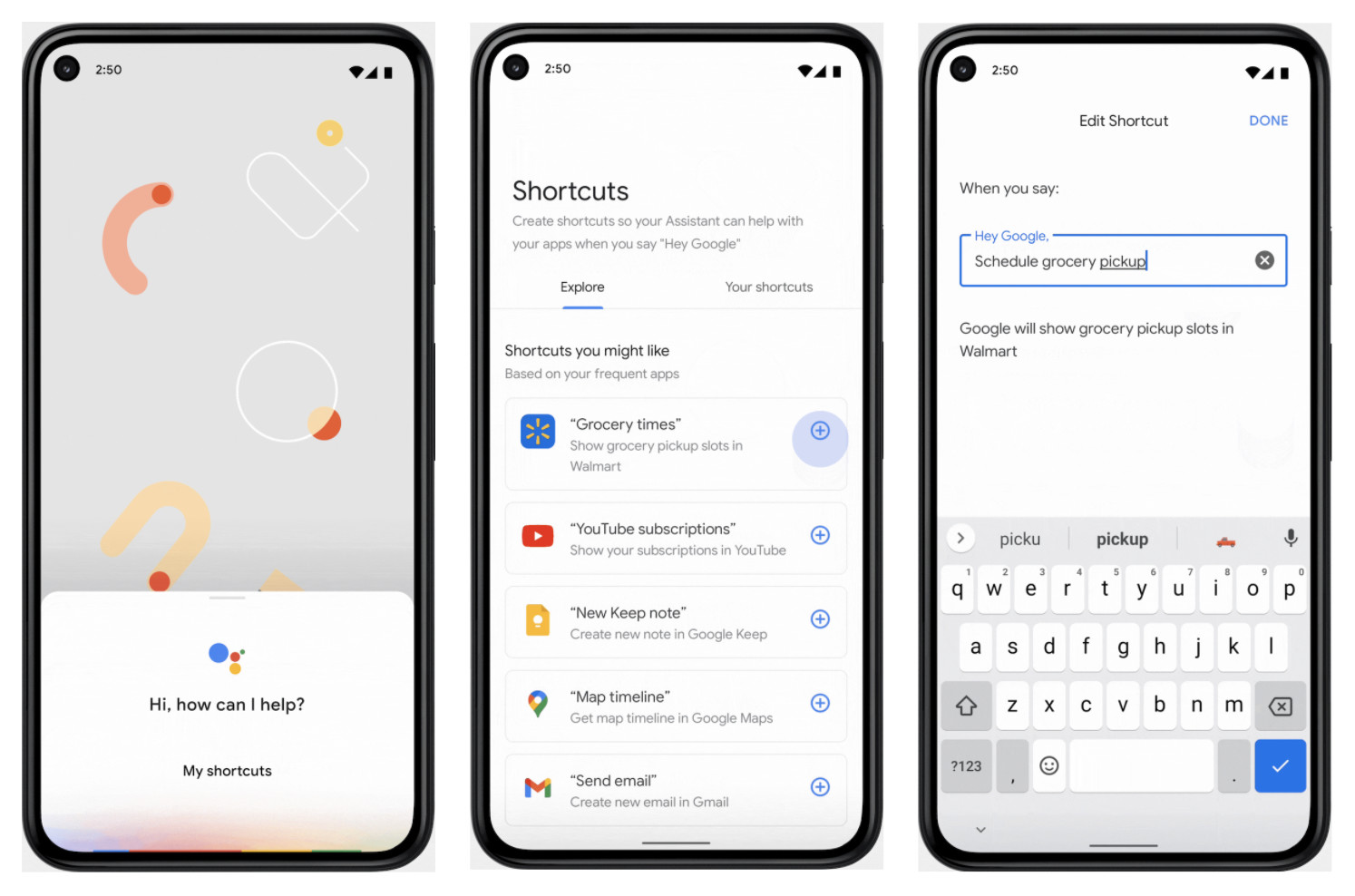
Google Assistant Shortcuts, widgets and chips in Android 12
Google Assistant has long since evolved from a simple AI voice search into a full-blown ecosystem all its own, with its own developer tools. This year saw plenty of small updates but nothing groundbreaking, except that Assistant is now getting in on the widget action alongside Material You.
To make a long story short — too late, I know — the new Capabilities API should make it easier for developers to do multiple things, most notably building new Assistant intents that can surface in your suggestions and adding widgets to Assistant commands and processes so that content is more glance-able and multi-step processes are more streamlined and simplified for use across different platforms.
Assistant wasn't the only one to get Shortcut expansions at I/O; web apps got them, too with the ability to add unread counts and other notification dots to web apps on Android and Chrome OS, as well as the ability to show quick actions, just like Assistant's shortcuts.
Third-party app stores are getting auto-update abilities, at last!
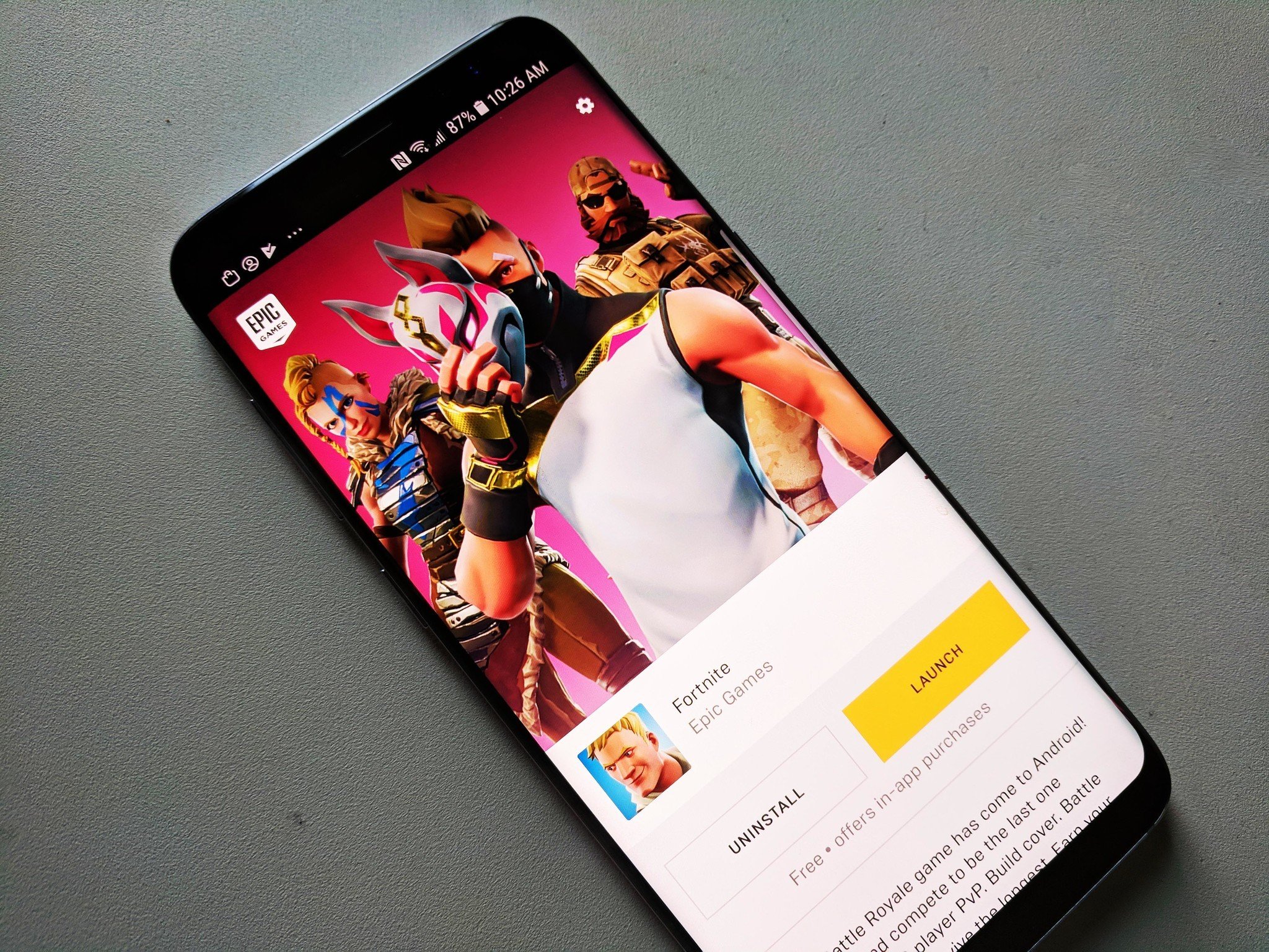
If you use FDroid, the Epic Games Store, or Amazon's app store on anything other than a Fire tablet, you're painfully, painfully aware of this shortcoming any time an app needs to be updated. While Google shaved down the number of warnings and settings hoops you have to jump through when installing apps and app stores outside Google Play, every single app update has to be installed manually.
This is one of the hurdles that Epic complained about in the Epic vs Apple trial, that though Google allows third-party stores, they face significant hassles that in-turn drive users to Google Play instead. New parameters have been added for the Package Installer, paving the way for third-party apps stores to auto-update the apps they installed so long as they meet all four conditions:
- requireUserAction is set to false — meaning that the app says that it doesn't need user action to be updated.
- The app's install target is API 29 (Android 10) or higher.
- The app was originally (or previously) installed by the installing app in question (aka the third-party store).
- The third-party app store declares the UPDATE_PACKAGES_WITHOUT_USER_ACTION permission — saying that it doesn't need user input to run the package installer.
This is a niche feature, to be sure, but for those who prefer open-source app stores like FDroid, Aurora, or Aptoide — and of course for Fortnite users stuck using Epic Games Store — the change is a welcome one.
Assistant can move your movies to the bedroom
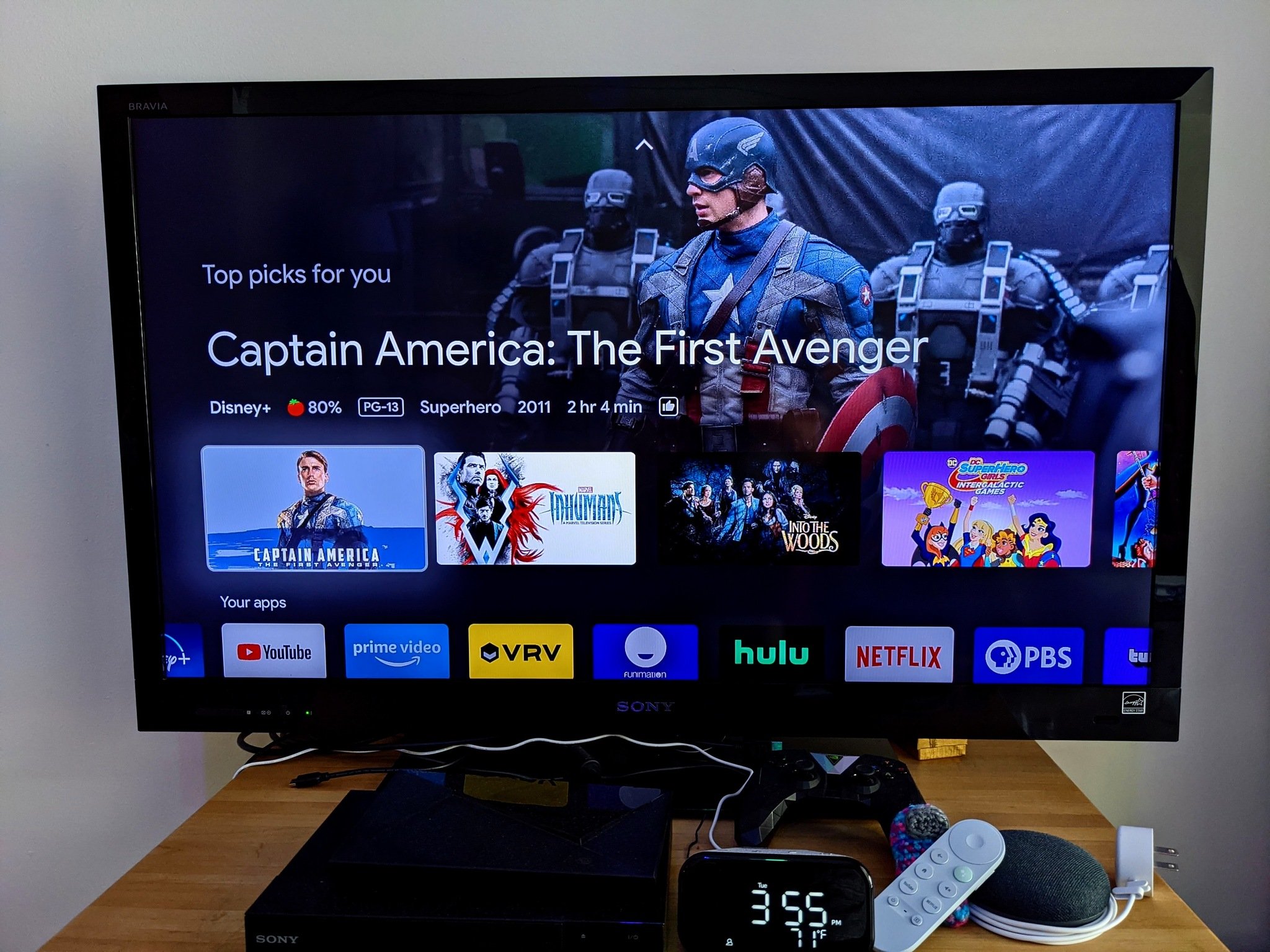
There's a lot to love about the Chromecast with Google TV, but I especially love the Google Assistant integration. Being able to quickly press the button, say "Next" and have YouTube skip to the next song in my Supermix is wonderful — and soon the media controls for Assistant and Google Cast are getting even more upgraded on Android TV/Google TV devices.
Stream Transfer has technically been around since 2019, allowing you to move a Google Cast audio stream from smart speaker to smart speaker, and now it's going coming to Android TV devices. This means that if you're watching Mare of Easttown on the Google TV in the kitchen while you do dishes, you'll be able to hold down the Assistant button and say "Move this video to the bedroom".
Google Cast will send the video playback session to your Google TV in the bedroom, and it'll continue playing in there as you do some stretching and wind down for the night. This announcement was blended into What's new with Android TV, which is a shame because it's a great update that I bet will become a Chromecast with Google TV ad this fall — once it's out and the bugs have been quashed.
Speaking of bugs, while the Google Cast team is in troubleshooting mode, would it kill them to finally get speaker groups to a stable, consistent place?
Eco-friendly and brake-friendly routes in Maps
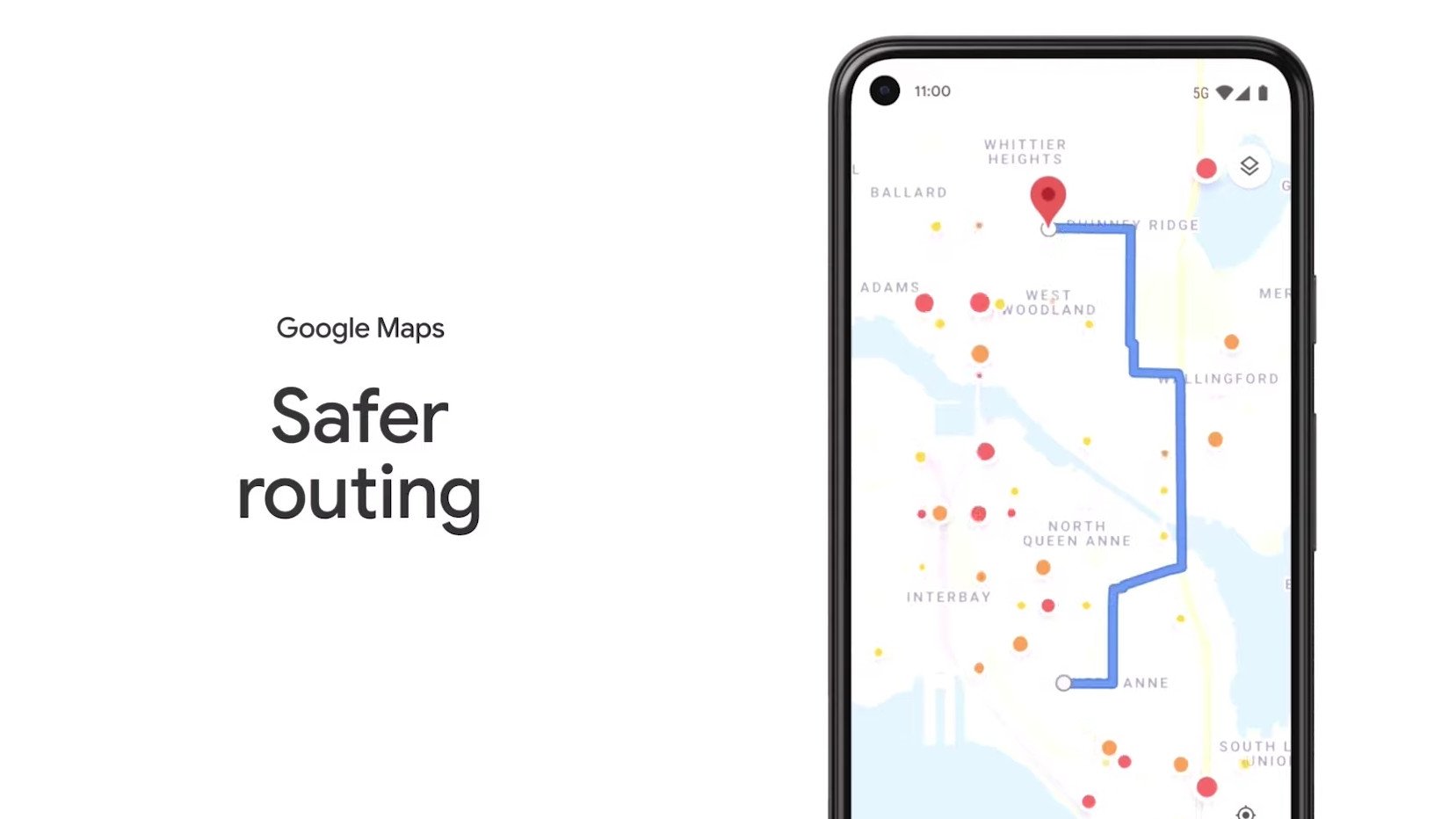
Google Maps has some API upgrades that are going to make navigating your favorite city — or wherever your post-vaccination vacation take you — easier with more detailed crosswalk and streetlight details as well as improved AR StreetView info. It's coming at a great time as a lot of us are preparing to start traveling again, but there are two navigation modes coming for drivers that I'm exceedingly excited about.
Brake-friendly routing will enable you to drive in ways where you are less likely to need hard braking. As a firm believer in light braking to reduce strain on my car and its cargo — and accidents from tailgaters unable to hard break as quickly — I'm happy to see more safety-minded routes that don't take me down some winding backstreets to save three minutes.
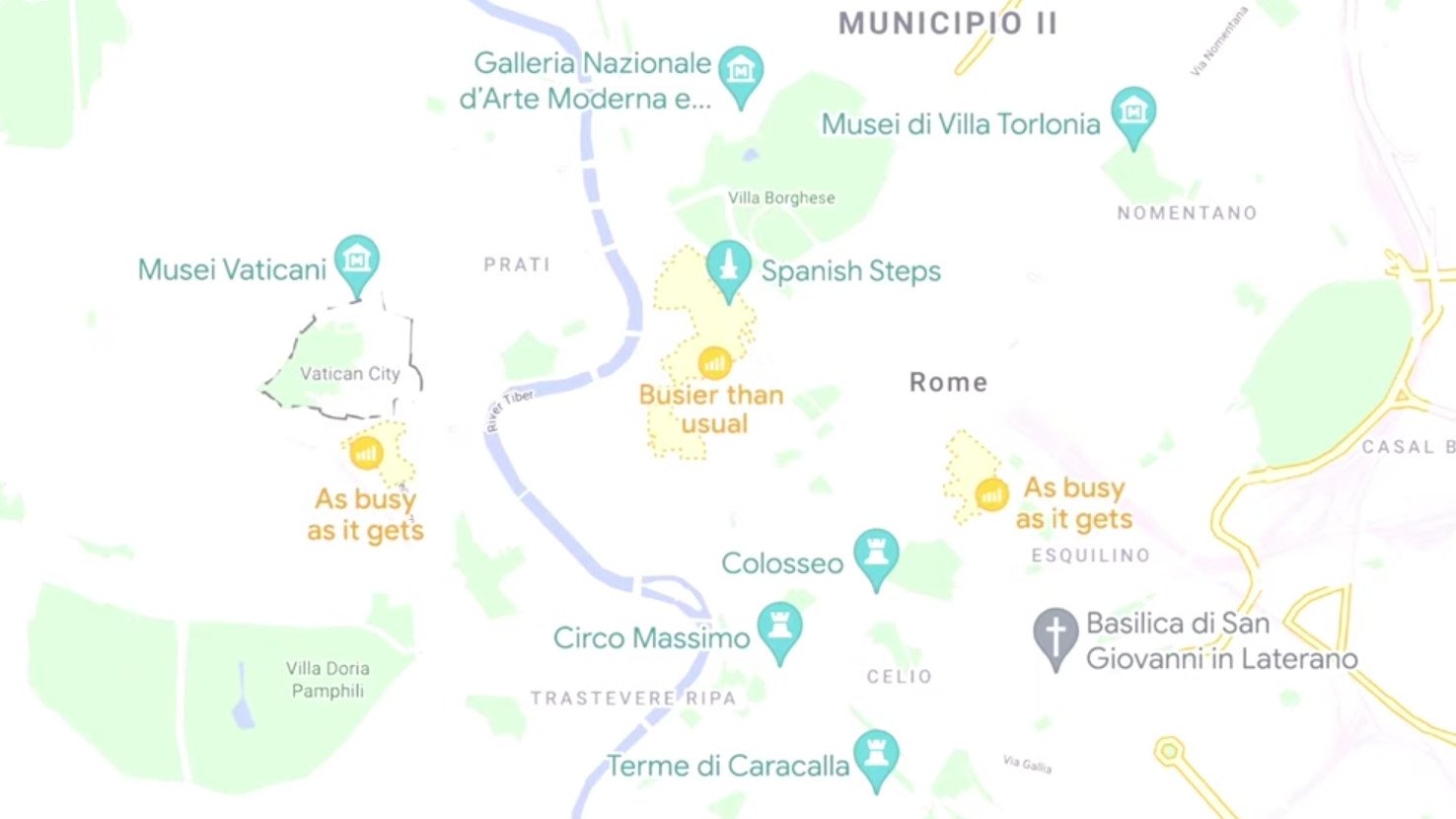
There's also an eco-friendly navigation mode that'll use terrain data to try and determine the method that'll use the least gas — I'll confess, I'll probably need that once a month or so when I forgot to fill on the way home the night before. The other tiny update that'll make a big impact for introverts like me is the "Busyness" view that'll highlight congested and high-traffic areas so that your leisurely weekend excursion isn't turned into a crowded traffic jam.
Rounded corners API will make apps not suck on your curvy phone
Most of the minor visual updates got upstaged by the tidal wave of style known as Material You, but there was one very, very minor update that made me cheer: you know how sometimes things get cut off in the corners of your screen because most of our screens are rounded corners instead of perfectly square?
Yeah, Google finally added Rounded Corner APIs to tell developers just how rounded the corner is and how to keep important elements out of that radius! Finally, no more trying to tap that X to close ads or app menus in the top corner's curve.
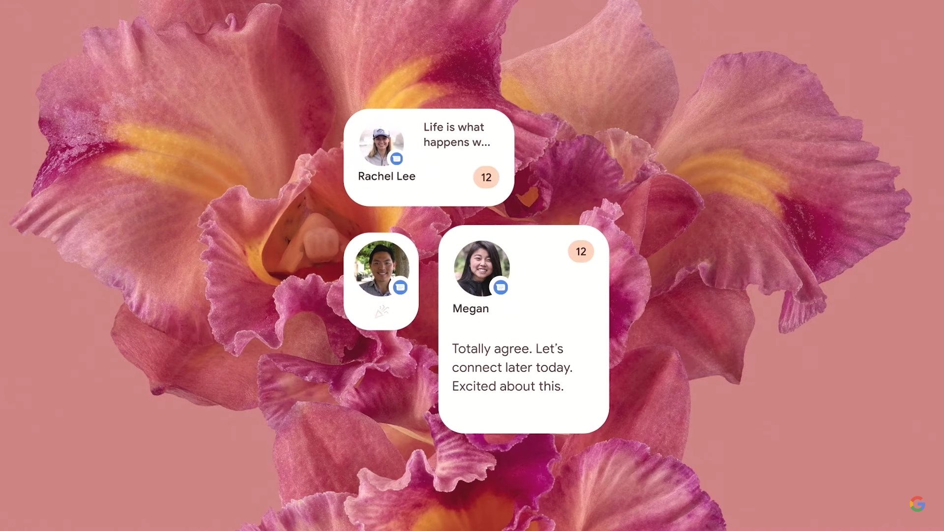
Widgets aren't just getting prettier, they're getting easier to edit and manage on a launcher level
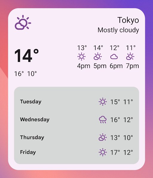
Widgets got a visual overhaul in Android 12 as part of Material You, but it's much more than some new widget shapes and fancy colors. In fact, widgets are getting some very nice upgrades that developers should be implementing whether they're adding in dynamic color support or not.
The first of these changes is a reconfigure button, which will allow users to edit the content or style of a widget without having to delete it and start over (looking at you, Google Keep widget). Being able to swap a notes widget from one list to another, or change a weather app from current conditions to an hourly forecast as a major system approaches allows users more functionality without the pain points of having to drastically reshape your home screen.
Another improvement is that launchers will be able to provide a more uniform look for all widgets — and this will be available whether devs update existing widgets or not. As a downside, this means that transparent widgets aren't explicitly compatible with the new system and might get automatically masked, but on the plus side, if launchers and developers do their jobs, all of your widgets will look consistent and fabulous without having to use KWGT to fake it yourself!
According to the official Android 12 documentation "Widgets in Android 12 have rounded corners."
— Smart Launcher (@SmartLauncher5) May 19, 2021
Good news, if you are using Smart Launcher you can already have rounded widgets! 🤩
Just enable the option Preferences > Widget pages > Rounded widget corners, then add a new widget. pic.twitter.com/ays5oTwPYl
Some third-party launchers like Smart Launcher 5, leader of Best Android Launchers already have support for rounded/squared widgets, so at least this is one Material You that everyone can enjoy, even if dynamic colors are going to be Pixel-exclusive this fall.
Cross-device OTPs are coming (eventually)
There were many small but fun peeks behind the curtain during the What's new in the web platform session, but the one that'll make the biggest difference in my life — and probably in yours — is cross-device one-time-passwords.
Now, don't get me wrong, SMS for two-factor authentication isn't the best method out there because it's less secure than token and physical security key systems. However, since SMS is still the de facto 2FA system most companies use, it'll be nice to not have to go open the notification and manually enter the code every single time.
Cross-device OTP isn't active yet — nor was a timeline mentioned — but it shows asking for a one-time-password in Google Chrome on desktop. A notification appears on your phone to "Tap to verify", and once you do, the phone automatically transfers the OTP code from the phone to the computer to finish logging you in.
Anything that makes two-factor authentication easier to use without compromising security is a win in my book, and this looks like a winner. Give it to me now, please!
Pageless format in Google Docs
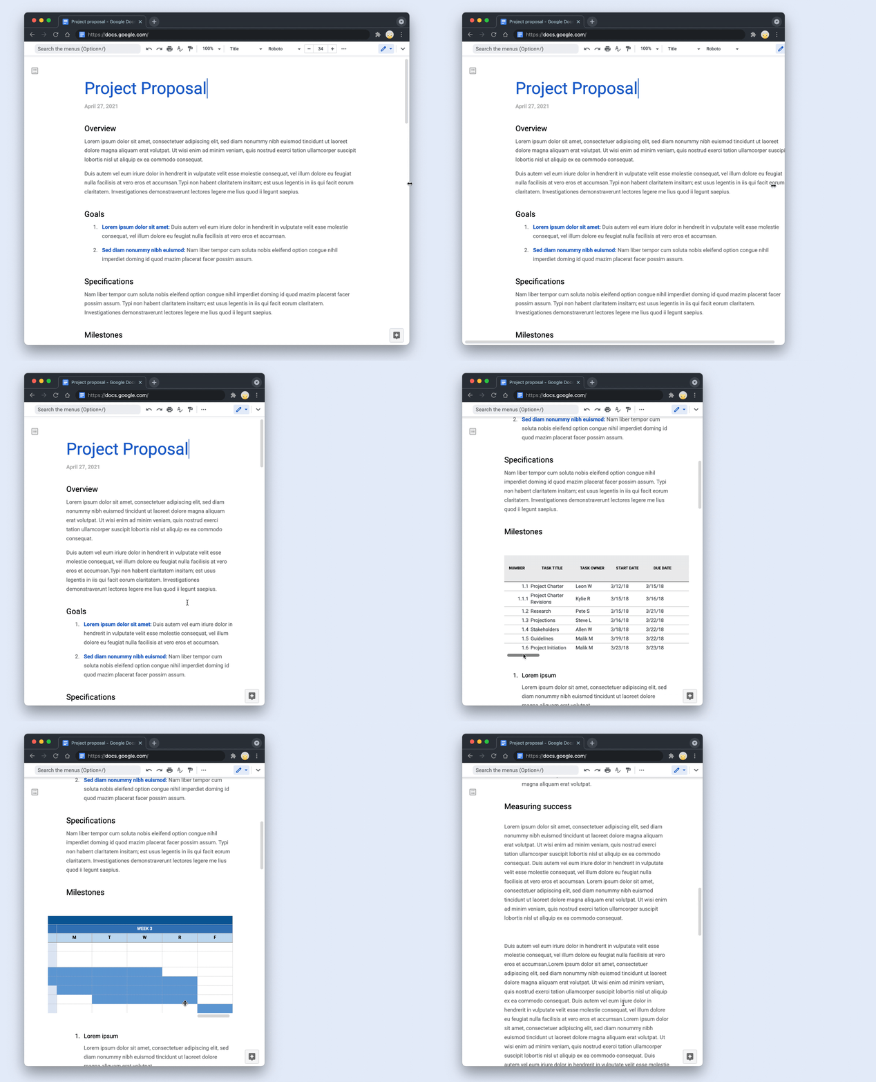
Smart canvas was one of the first things announced on stage during the Google I/O 2021 keynote, but they completely glossed over one of the best parts of this upgrade to Google Docs, Sheets, and Slides: you're finally going to have the option to ditch the tired old Microsoft Word-style page layout in Google Docs!
Pageless formatting means that Docs is going to look and act a lot better when you're split-screening or multi-windowing your way through distance learning or cramming that history assignment the night before it's due. Pageless formatting allows your words and your formatting to adapt more freely to however you need to see and read it in our digital workspace.
They also added a Google Meet button directly into Docs and allowed you to react to documents with an emoji, but pageless formatting is a long-time coming and I'm so happy to see it finally arrive.
What were your favorite Google I/O announcements?
After 72 hours and more YouTube live streams than we can shake our headphones at, Google I/O is officially over, but the fun is only just beginning. We have a whole summer of Android 12 betas ahead of us — yes, Google Pay is working, if that was keeping you from the beta after last year — and we'll see updates to our favorite apps and web services as the APIs for Google's various platforms become more widely implemented and the new Google Assistant, Maps, Cast, and other service features roll out to users.
from Android Central - Android Forums, News, Reviews, Help and Android Wallpapers https://ift.tt/3u7bUdE
via IFTTT

Aucun commentaire:
Enregistrer un commentaire