Chrome OS used to be lightweight and simple, but that doesn't mean it should rely on workarounds and hobbled apps.
There are a lot of great things about Chromebooks: they're competitively priced, even the affordable models run all day on a single charge, and there's not much I'd change about the Chrome OS operating system. Designed to be lightweight and stay out of your way, Chrome OS helps you focus on your work or play while still giving you the productivity and convenience of using Android apps and Linux apps.
New features are arriving all the time, too, like the coming dark theme — that sat near the top of this list for a long, long time — and screen recorder. Even after nine years of slow, continual improvements, though, there are still a few things that make me groan every time I see them. Google gets so much right, but there are still a few wrongs that need righting.
Google needs more proactive standards for Android apps on Chromebooks
The first thing I — and probably more Chromebook users — would fix, is how Android apps look on Chromebooks. Most apps when you open them are either one of three things:
- A small phone-sized window for a small phone-designed app
- A full-screen window for a comically blown-up phone-designed app
- A full-screen window that scales for a Chromebook but still has tons of white space
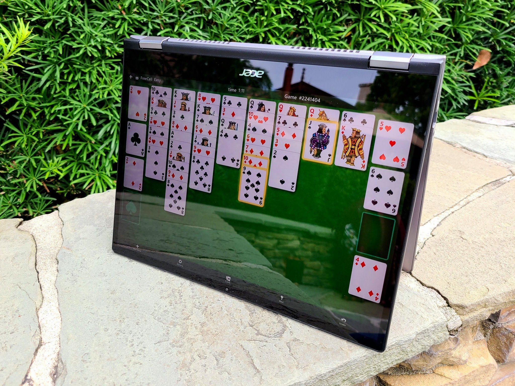
While there are some apps optimized for Android tablets that work pretty well on Chromebooks, the vast majority of the apps we use on Chromebooks today are obviously and laughably mis-scaled phone apps. Four years ago when Android apps were still relatively new on Chromebooks, I could have forgiven this.
Now, it's just a slap in the face to users. Google and Chromebook manufacturers put Android apps front and center when marketing Chromebooks to customers. But when it comes to getting apps optimized for Chromebooks — both in how users navigate and interact with the app and how well the app runs on Chromebook hardware — Google's done practically nothing in years to improve the situation.
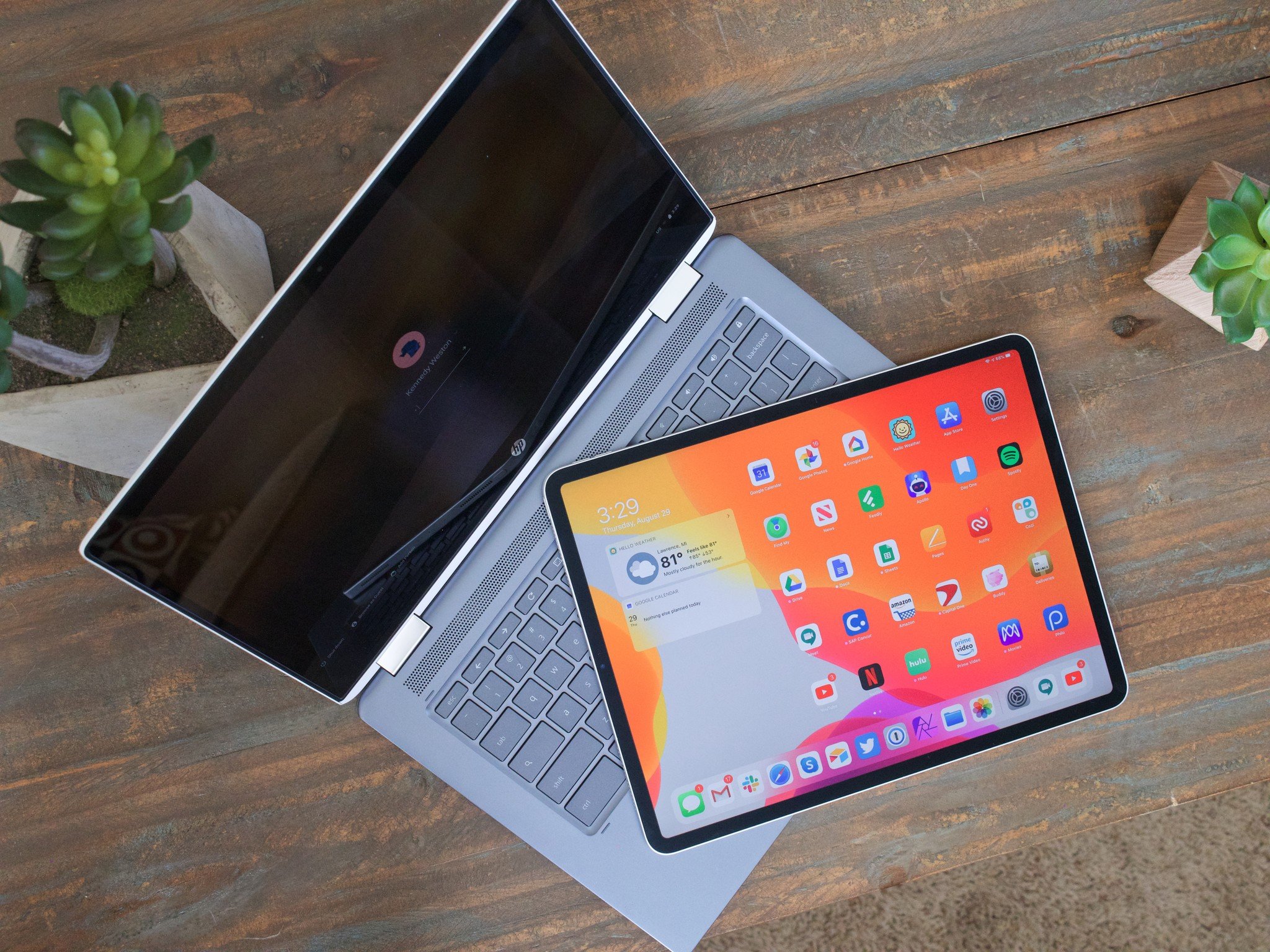
When you compare a Chromebook to an iPad, Chromebook takes the lead whenever you're dealing with the Chrome Browser and a straight web experience. However, the second you bring apps into the mix, Apple takes the lead because of the strict guidelines Apple has and enforces for iPadOS apps.
Google's long been lax when it comes to app standards. It has an entire website devoted to Material Design and better UI design, and even that seldom mentions designing responsive layouts for tablets and the only mention of Chromebooks on the entire site is an outdated device metrics list. The section on Android Developers focuses much more on the functional rather than design, to the detriment of all.
This is the perfect time to make a fresh push to get developers to redesign apps for the multi-window experience on Chromebooks and the ever-shifting experience on foldable phones. But no one can push for it unless Google's willing to start playing hardball.
Simplify permissions and app use for microSD cards
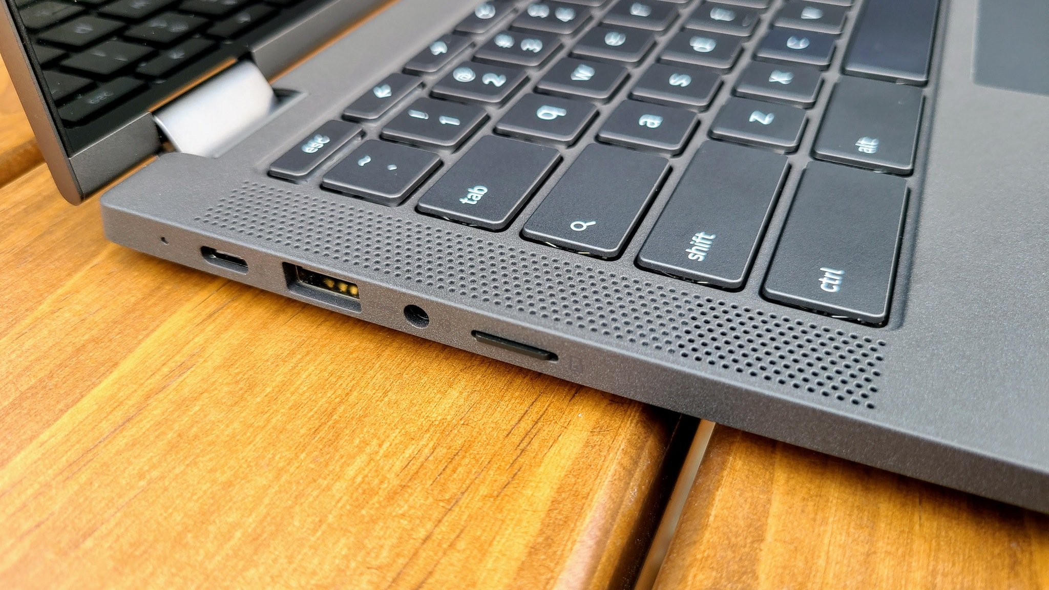
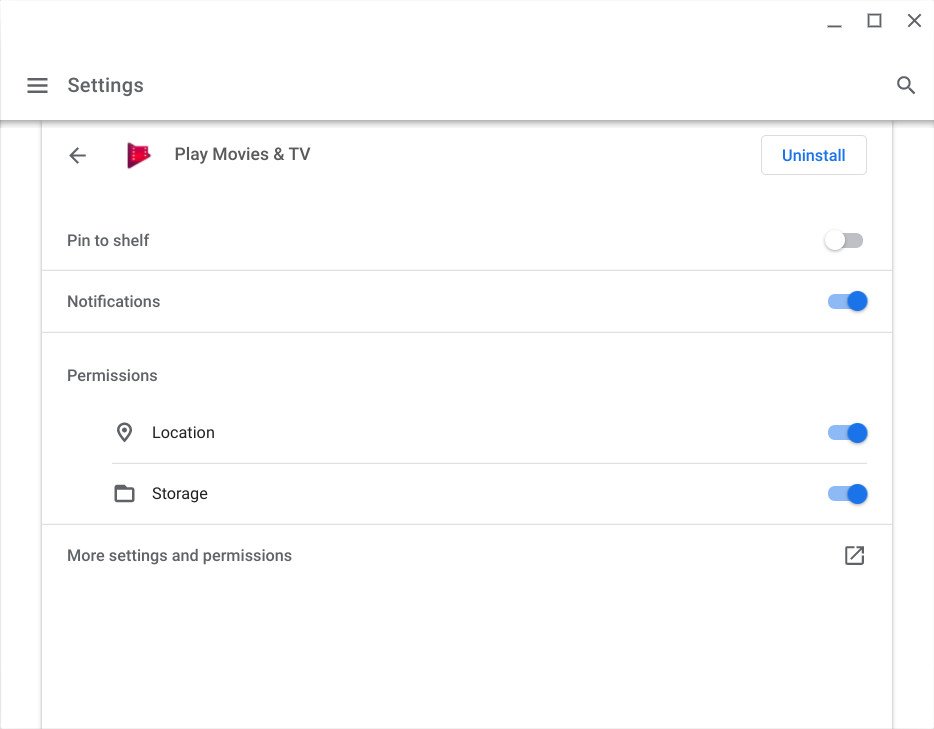
Another infuriating aspect of Android apps on Chromebooks — especially on budget-minded, storage-strapped Chromebooks that dominate the market — is that while you can get a Chromebook to read a microSD card, most apps can't consistently save any app data to them. For instance, I've tried to save videos to a microSD through the Android apps for Disney+ and Google Play Movies, and it errors out on every Chromebook I've tried so far.
Of course, letting an app see the microSD card to begin with requires you going into a Storage management submenu in the Settings app, then going to each individual app in the apps section of Android Settings and turning on the Storage permission, and then rebooting everything to get the microSD card to show up in your desired app.
Oh, and even then, it might not work.
I know this is done for security reasons, but I think we can also agree that this is a ridiculous amount of hoops to jump through. Most Chromebooks sold in the last three years only have 32GB of internal storage to begin with and need a microSD to expand their storage; we shouldn't be punishing users for using external storage.
At the very least, I'd settle for having all the settings to turn on microSD support for each app on a single page rather than being spread out in three different menus.
It's time to overhaul Chrome OS's settings
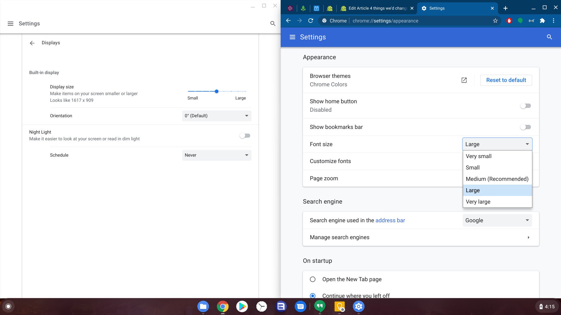
Turning on microSD support isn't the only operation that requires you to hunt through multiple menus to get it working. If you have poor eyesight and want to adjust the screen and font sizes, you have to go to the Display settings in the Settings app, then over to Appearance settings inside Chrome Browser and bounce between the two menus before you find a zoom/font balance that works for you.
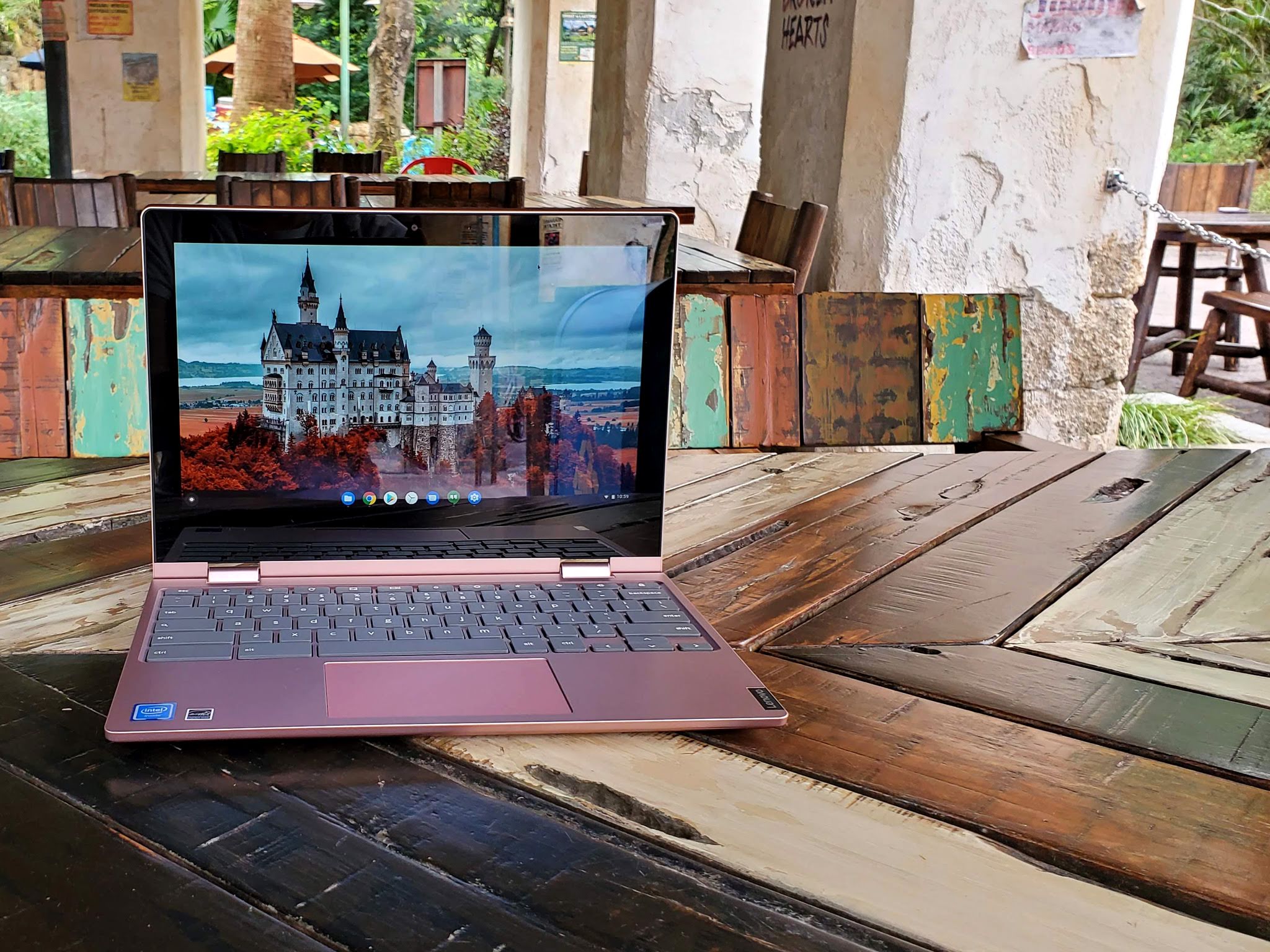
Want to change the look of your Chromebook? Well, first you open the Settings app to change your wallpaper, then you head over to the Chrome Web Store to find your new Chrome theme, then you open a new tab to customize which shortcuts you see and what image displays on a new tab.
As Project Lacros has the Chrome OS team detangling the Chrome Browser from the Chrome OS system, it's also a good time to re-evaluate the Chrome OS settings menu and streamline more complex procedures. Google prides Chrome OS on its simplicity; that should extend to its system settings, too.
Give us home screen widgets
The last thing I'd change is petty, but if even Apple can come around on home screen widgets, then it's time to allow them on Chromebooks, too! Widgets would allow the desktop to be a little more functional than a bare wallpaper alone — as much as I love a good wallpaper.
Wouldn't you like to get a peek at the weather and your next calendar appointment just by minimizing your Chrome window for a moment? How about getting an inspirational quote that changes every few hours to keep you motivated when you close your window to take a break.
Widgets can add just a little bit of functionality and fun to our laptops without letting the screen get too cluttered. Though while they're at it, support for Android icon packs would be nice, too!
What would you change?
I'll admit that I want some significant changes for Chrome OS — particularly in regards to apps — but I know I'm not alone in these frustrations. But what grinds your gears in regards to the Chrome operating system? Do you think it should be easier to install Linux apps? Do you think there should be a manual toggle for tablet mode rather than being tied to the angle of your screen? Should Chrome shortcuts we re-programmable? Share your hopes, dreams, and fury with us in the comments below.
from Android Central - Android Forums, News, Reviews, Help and Android Wallpapers https://ift.tt/3mYxcYx
via IFTTT

Aucun commentaire:
Enregistrer un commentaire