Life, and Motorola, finds a way.
I didn't expect to be saying this, but the Motorola Edge+ is my favorite phone of the year so far. It's probably not the best phone of the year, at least for most people, but that doesn't matter. It's a triumph, not just in spite of its flaws but because of them. This is a phone that owns its quirks, that leans into its differences, and that, for better or worse, puts Motorola back on the map in the flagship space.
But it's also going to prove divisive, the least of which because it's only available on one carrier in the U.S., Verizon. At $999, this is by no means the most expensive phone Motorola has released this year — that title belongs to the thoroughly over-engineered and mediocre RAZR — but it's a true flagship, a brand representative, in the way the DROID was back in 2009, the Moto X was all the way back in 2013, and the Moto Z tried to be back in 2016.
Except that we're in a very different time for smartphones than we were in those cycles, and today's challenges are more subtle and ephemeral: when every phone is at least pretty good, and few companies have the marketing budgets of Apple or Samsung, how exactly does one justify releasing a phone like this one?
For me, it comes down to one word: fun. The Motorola Edge+ is fun to use, which makes me want to use it more.
At a glance
Motorola Edge+

Bottom line: Motorola brings its A-game to the traditional smartphone design space, creating a solid, beautiful, and flawed phone in the process.
Pros
- Beautiful, striking waterfall display with 90Hz refresh rate
- Narrow body makes it easy to use with one hand
- Top-notch specs for mid-2020
- Excellent, day-plus battery life
- Moto Display and Moto Action on a modern phone is revelatory
Cons
- Palm rejection is very bad for a waterfall display
- Camera is good but doesn't hold up to competition
- Some lingering software bugs
- Lacks waterproofing
- Motorola doesn't have a great software update track record
$1000 at Verizon
Motorola Edge+ Performance, Design & Software

| Category |
Motorola Edge+ |
| Operating System |
Android 10 |
| Display |
6.7-inch OLED
Full HD+
90Hz refresh rate |
| Processor |
Qualcomm Snapdragon 865 |
| RAM |
12GB LPDDR5 |
| Storage |
256GB UFS 3.0 |
| Rear Camera 1 |
108MP primary camera
f/1.8
OIS |
| Rear Camera 2 |
16MP ultra-wide & Macro Vision camera
f/2.2
117-degree field-of-view |
| Rear Camera 3 |
8MP
f/2.4
3x optical zoom
OIS |
| Rear Camera 4 |
Time-of-flight sensor |
| Front Camera |
25MP
f/2.0 |
| Battery |
5,000 mAh |
| Charging |
18W wired charging
15W wireless charging
5W wireless power sharing |
| Dimensions |
161.07 x 71.38 x 9.6mm |
| Weight |
203g |
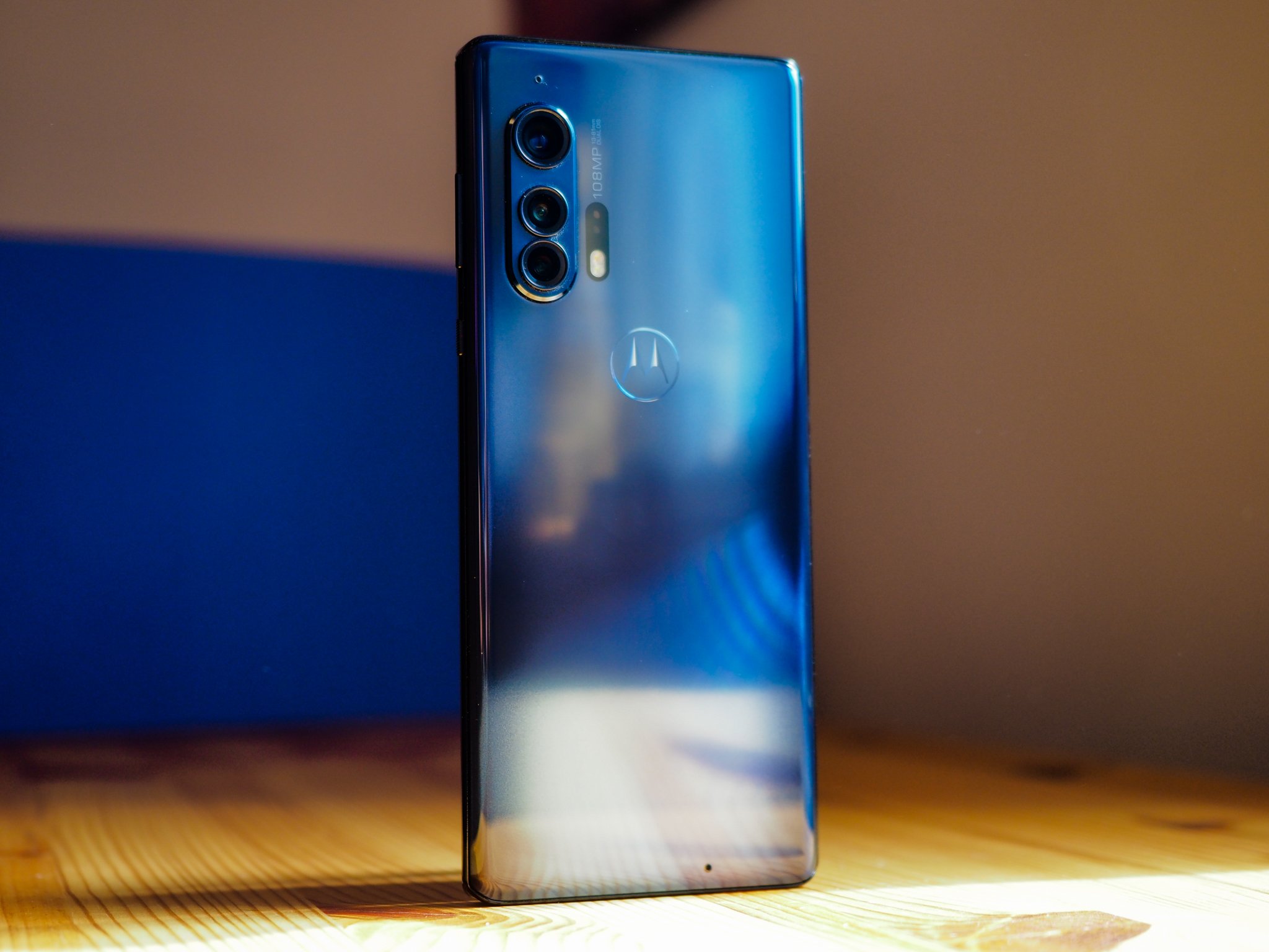
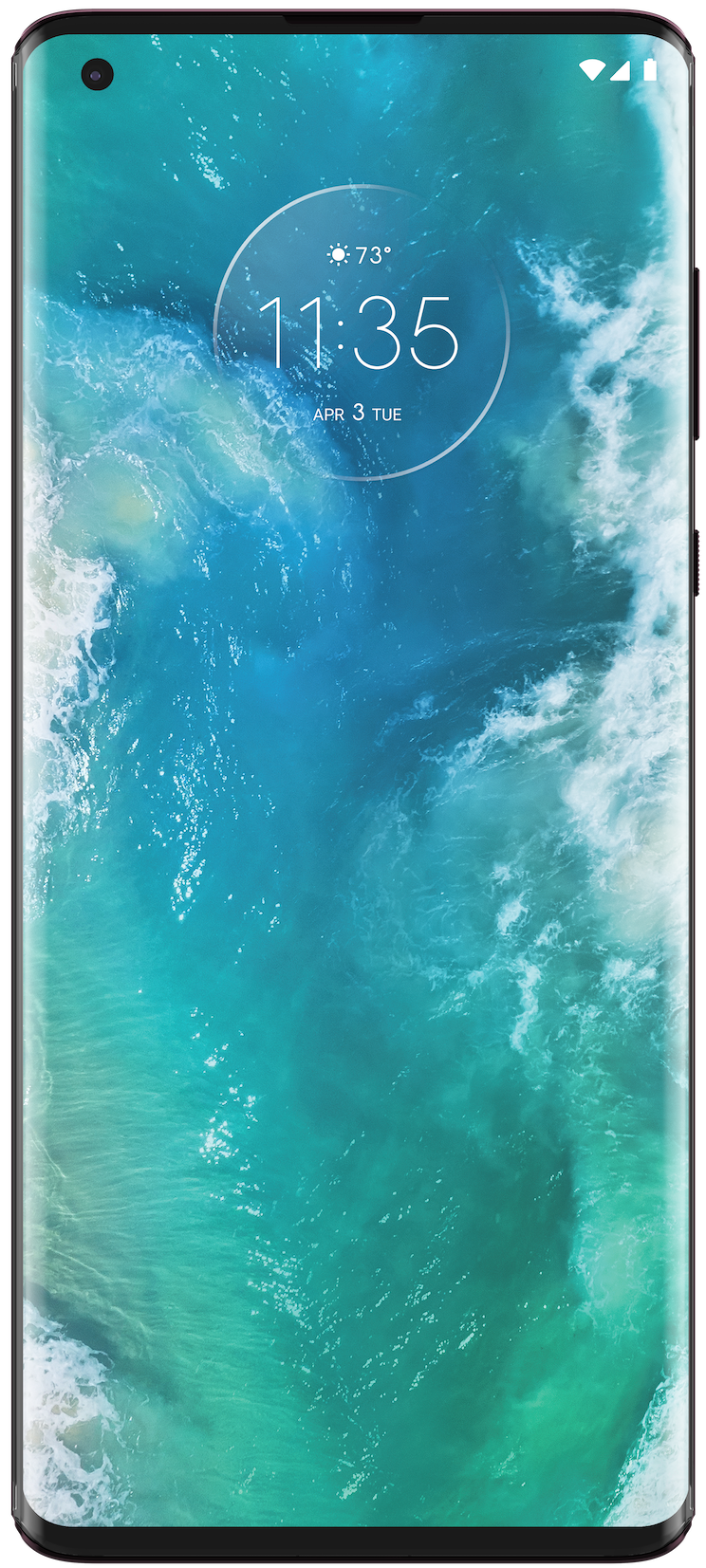
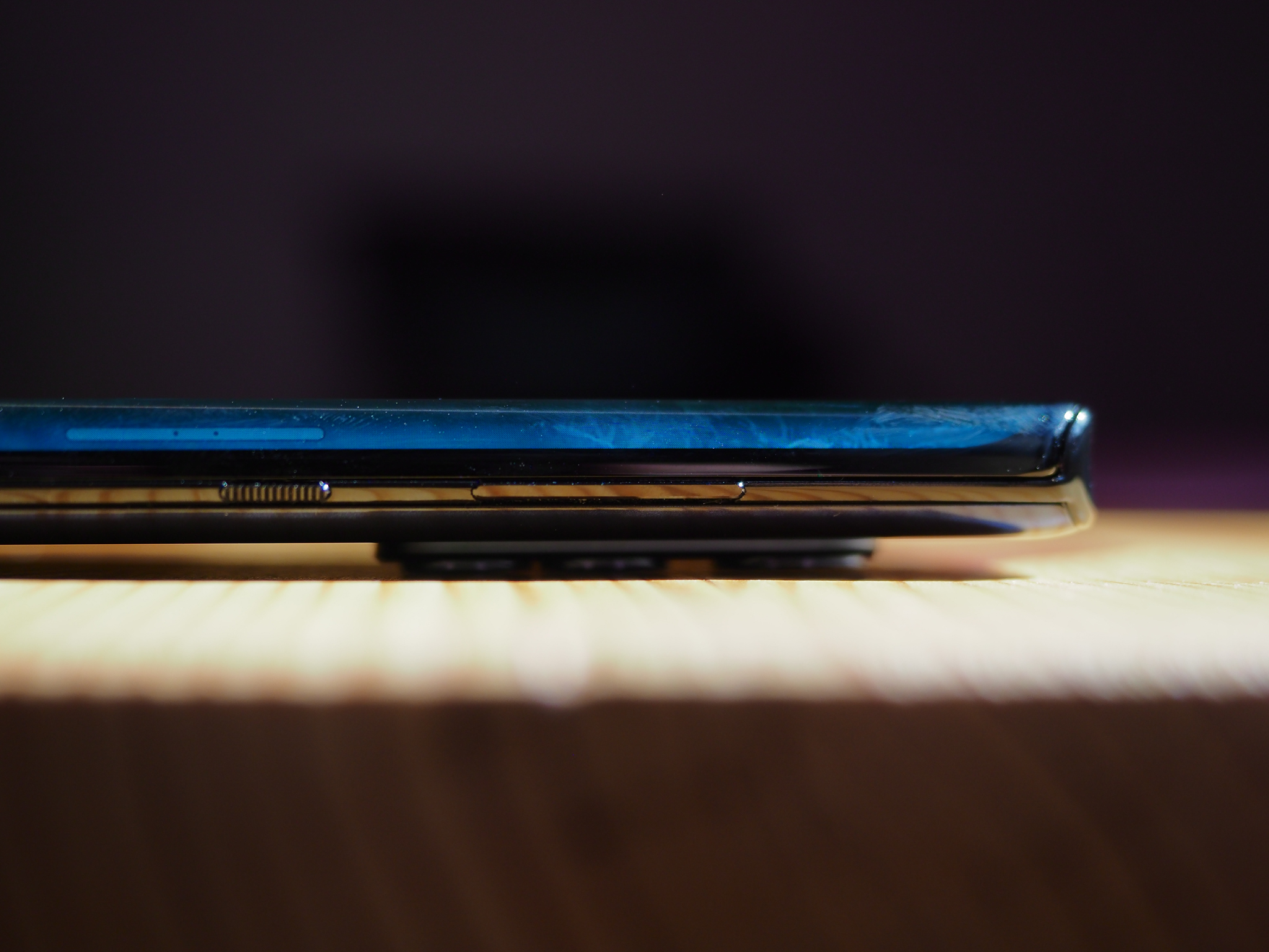
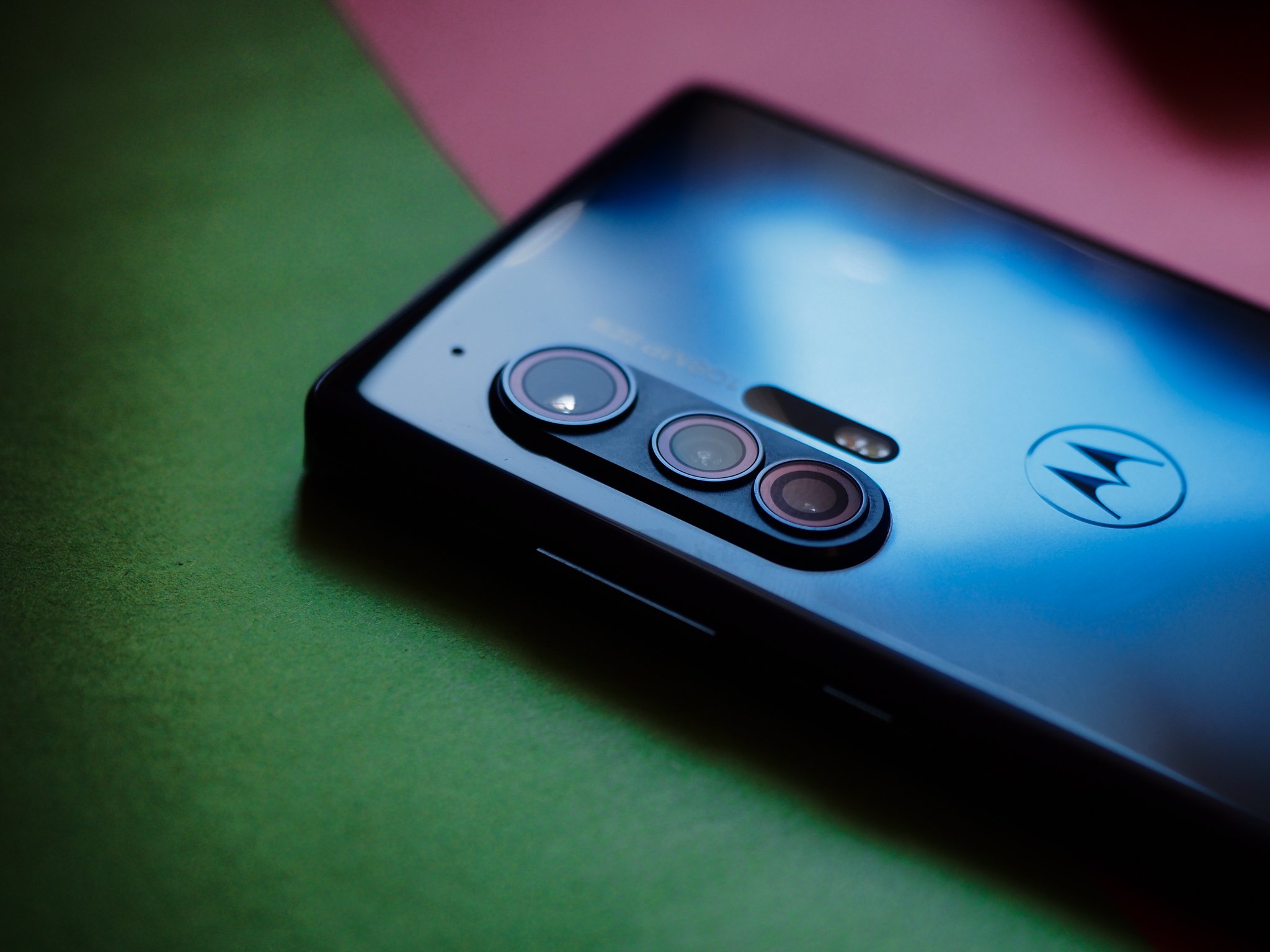
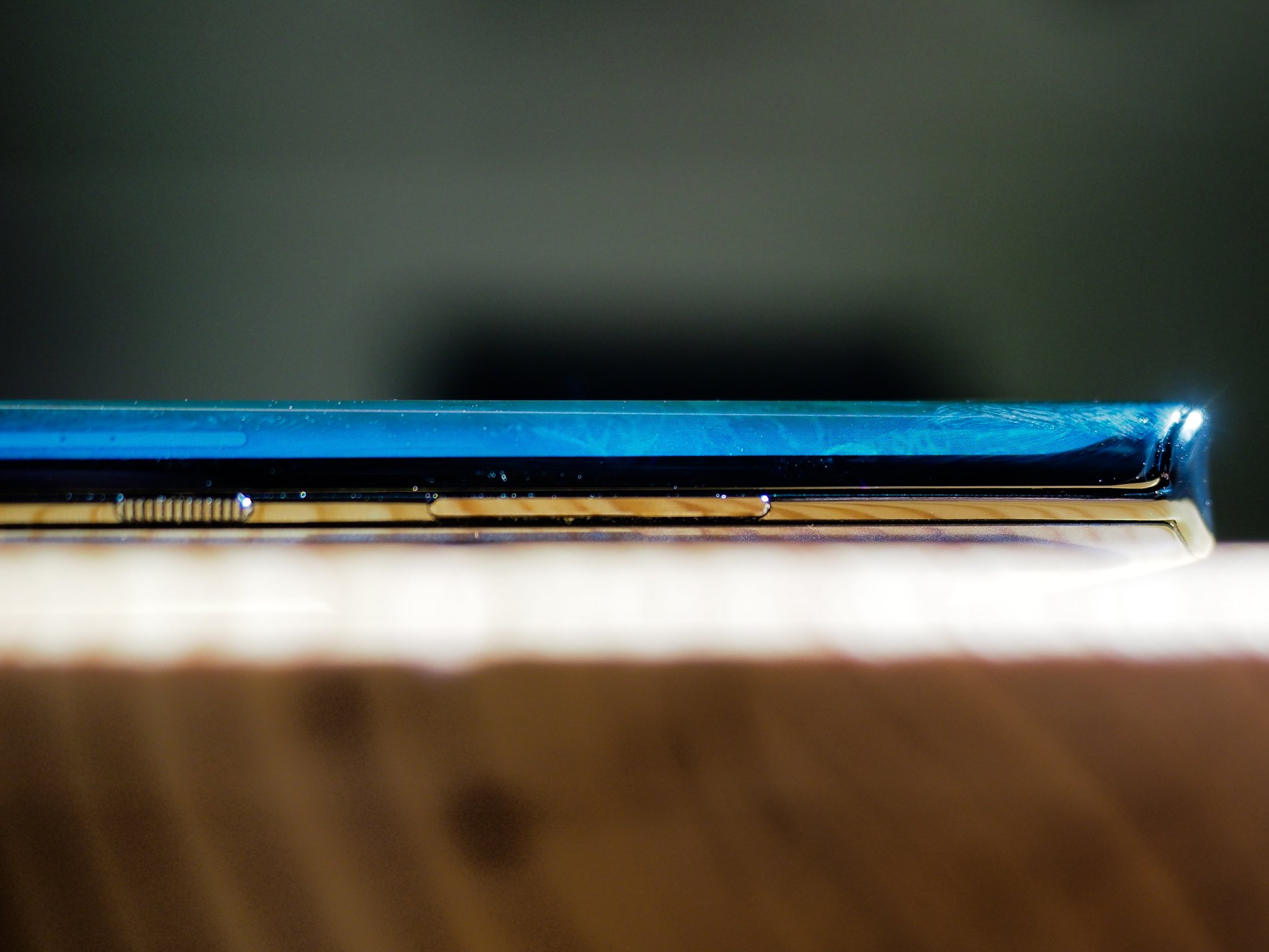
The first and most obvious way the Motorola Edge+ is different than the majority of other smartphones is right there in the name: its edge display. It takes the curved OLEDs that Samsung debuted six years ago and stretches them to nearly-absurd levels, leaving little room for traditional buttons. But Motorola figured it out, placing long stick-like tabs on the right side and giving the power button a nice bit of texture to easily distinguish them.
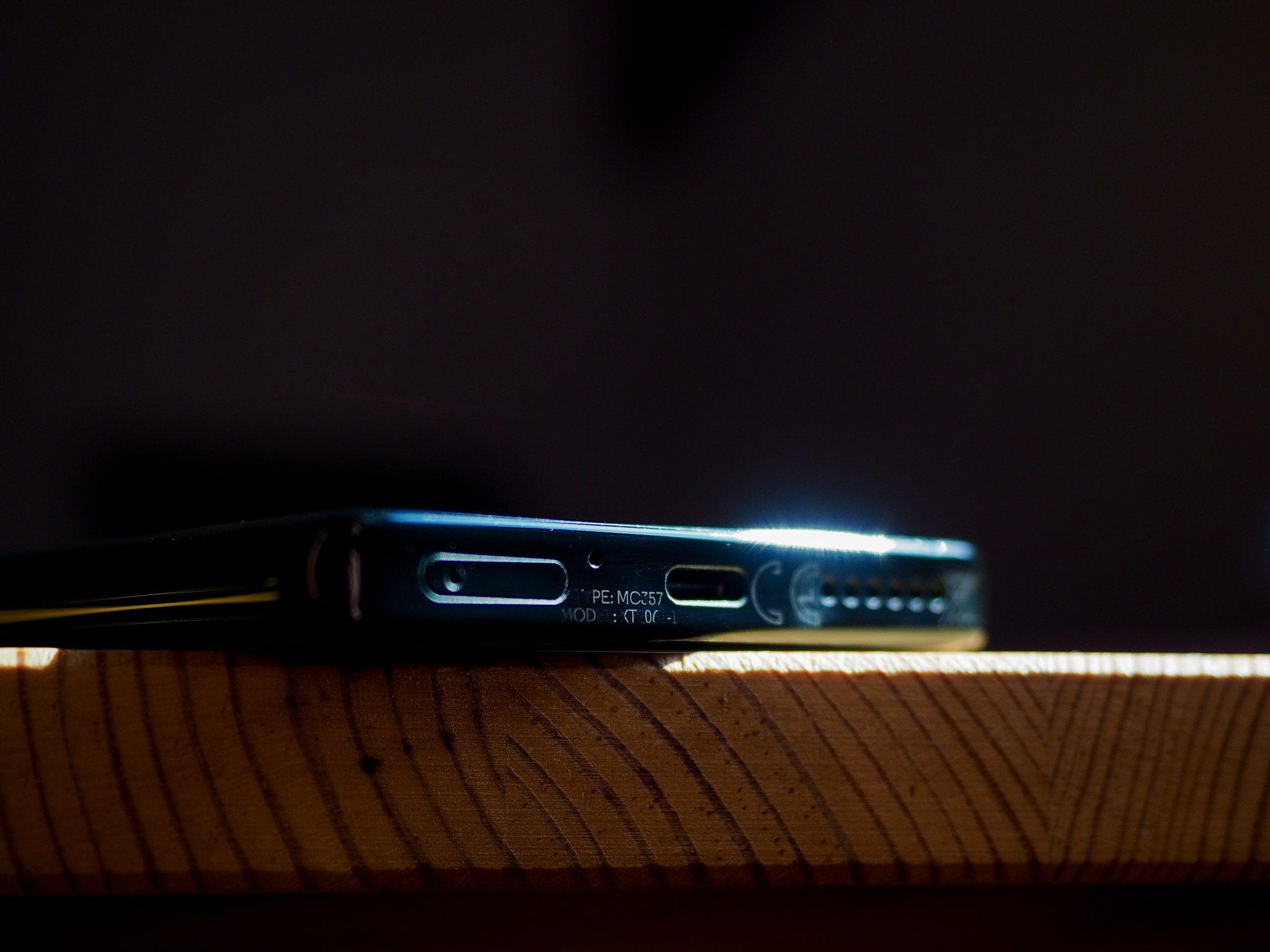
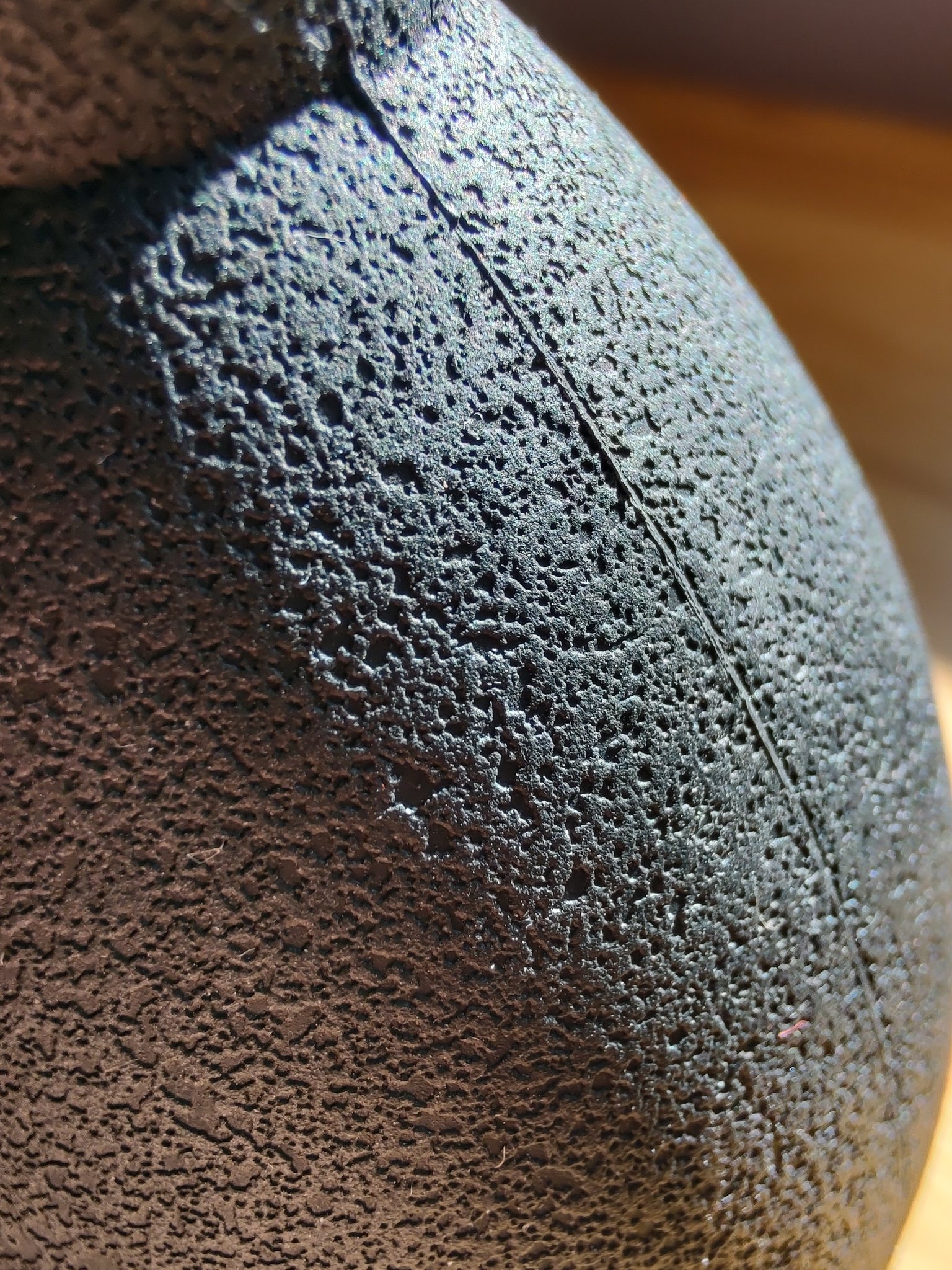
The phone's top and bottom purposefully contrast with the sloped display by laying flat, decked out with a slightly concave interior that adds a bit of cushion for whatever finger's resting on it. The bottom houses the SIM tray and USB-C port, while the top sports what is now a beleaguered legacy, the 3.5mm headphone jack.
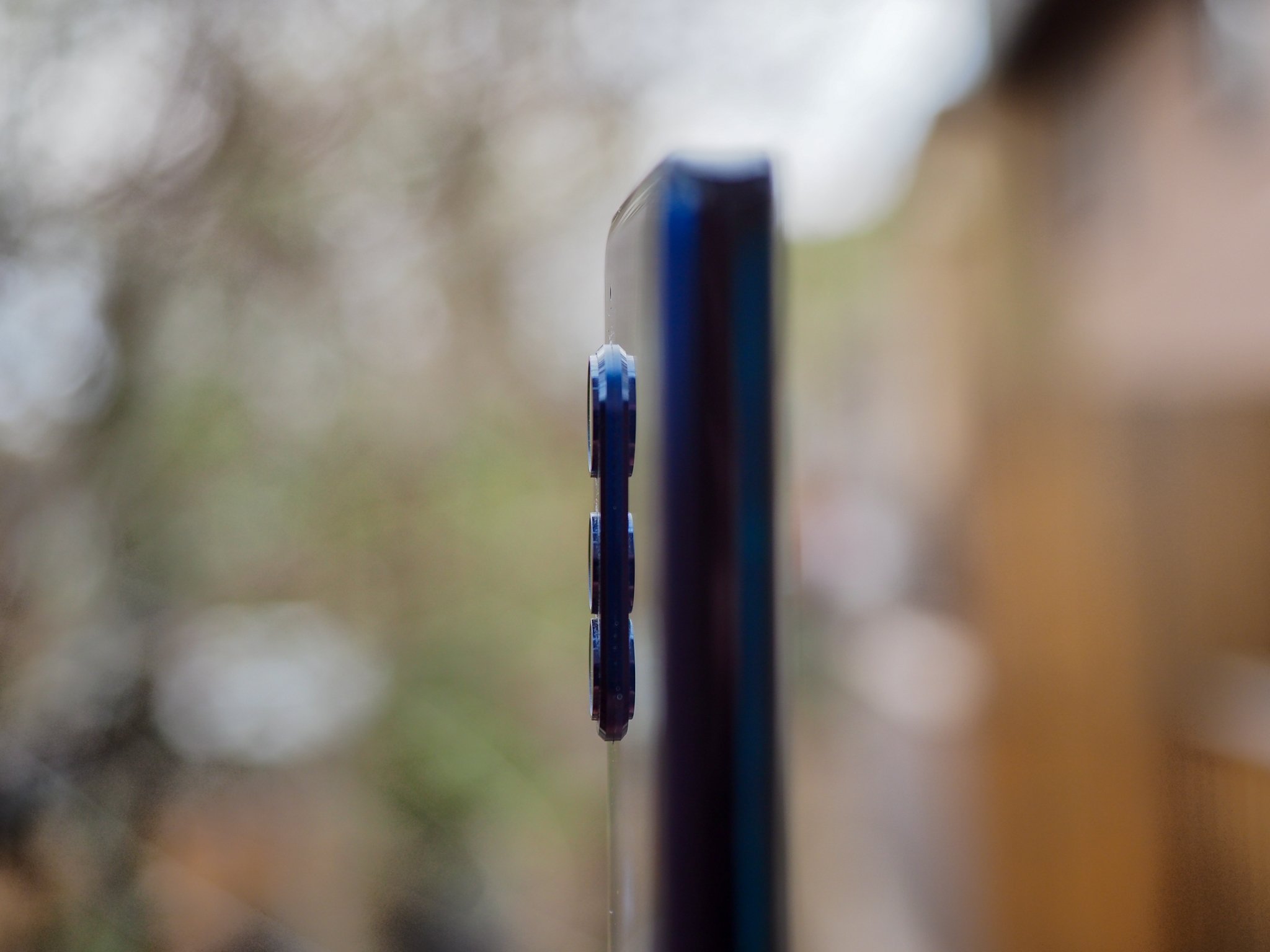
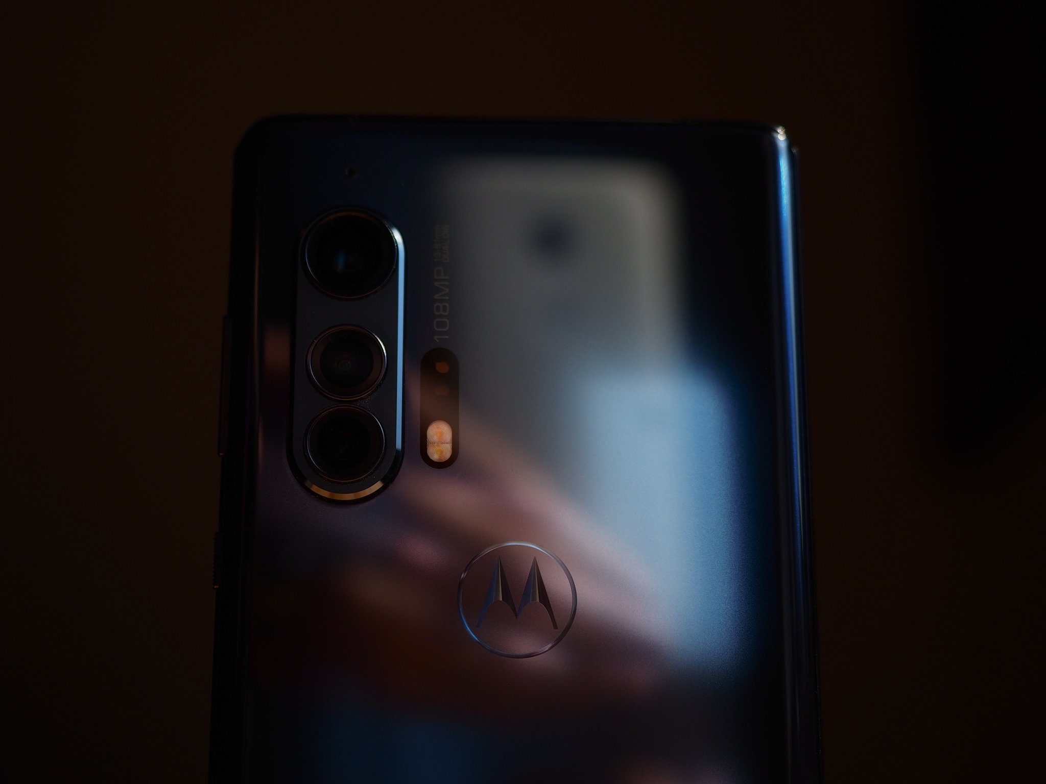
The phone wobbles on a table something fierce, though, owing to the massive left-mounted camera bump. More on that later, but it's a blessing and a curse for this extremely slippery phone — it fell off more than one table, and I had to swap out my bedside charging pad for a stand because it kept falling off the former. In fact, it's so slippery that even in my hand, on a phone call, it felt precarious. Problem is that I don't think the Edge+ would look very good in a case — and every case I've seen for a phone with a waterfall display doesn't work that well, anyway — so I'd recommend just being as gentle as possible with this 203-gram monolith.
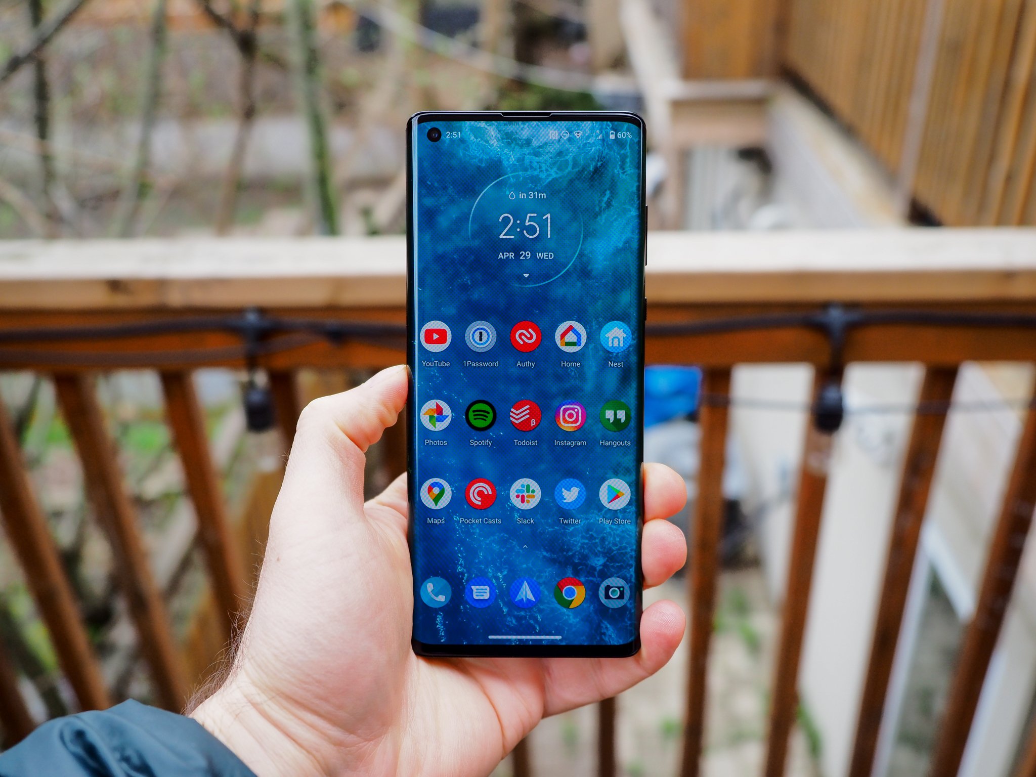
This phone's narrow 71mm body, coupled with its 9.6mm thickness, makes it feel dense in a way few phones do anymore. It also tricks you into perceiving a compactness that isn't really there. When I'd only seen this phone in photos, it appeared highly conventional. After using it for a week, it's anything but.


Motorola has also leaned hard into the sheer numbers that its $1000 cost would suggest: a Snapdragon 865, 12GB of LPDDR5 RAM, 256GB of UFS 3.0 storage, and a 5,000mAh battery. There's also a really good in-display fingerprint sensor — based on my digging, it's the same one that's found in the OnePlus 8 Pro and Huawei P40 Pro — and best-in-class haptics. Typing on this thing is honestly a dream.
This is one of the smoothest, most enjoyable Android experiences you can find outside a Pixel.
So it's no surprise that the Edge+ blazes through Android 10, aided by a 90Hz refresh rate no one should mourn for its lack of three digits. This is a really nice 1080p panel — surely not the best, especially at low brightness, where it crushes blacks — but it's easily visible in direct sunlight, has outstanding touch response, and even with the visual aberrations from the curved edges, is a joy to use. Most of the time.
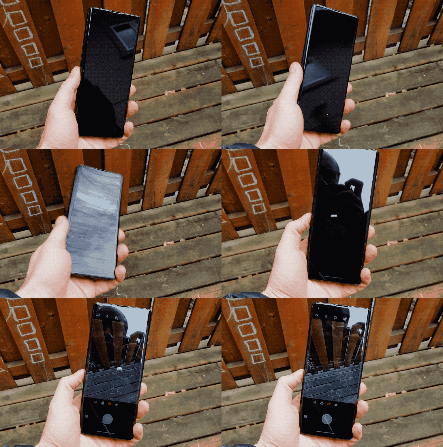
Motorola's done what it can to mitigate aberrant touches on the sides, but by virtue of a few questionable software decisions, it's far from flawless. For instance, merely holding the phone and scrolling through a Twitter feed or a webpage is usually fine, but every once in a while the screen will just stop responding and you'll wonder if the phone locked up or the app crashed. Nope, it's just the fleshy part of your palm making the slightest connection with the very fringe of the edge display registering a touch and preventing your thumb from fulfilling its destiny.

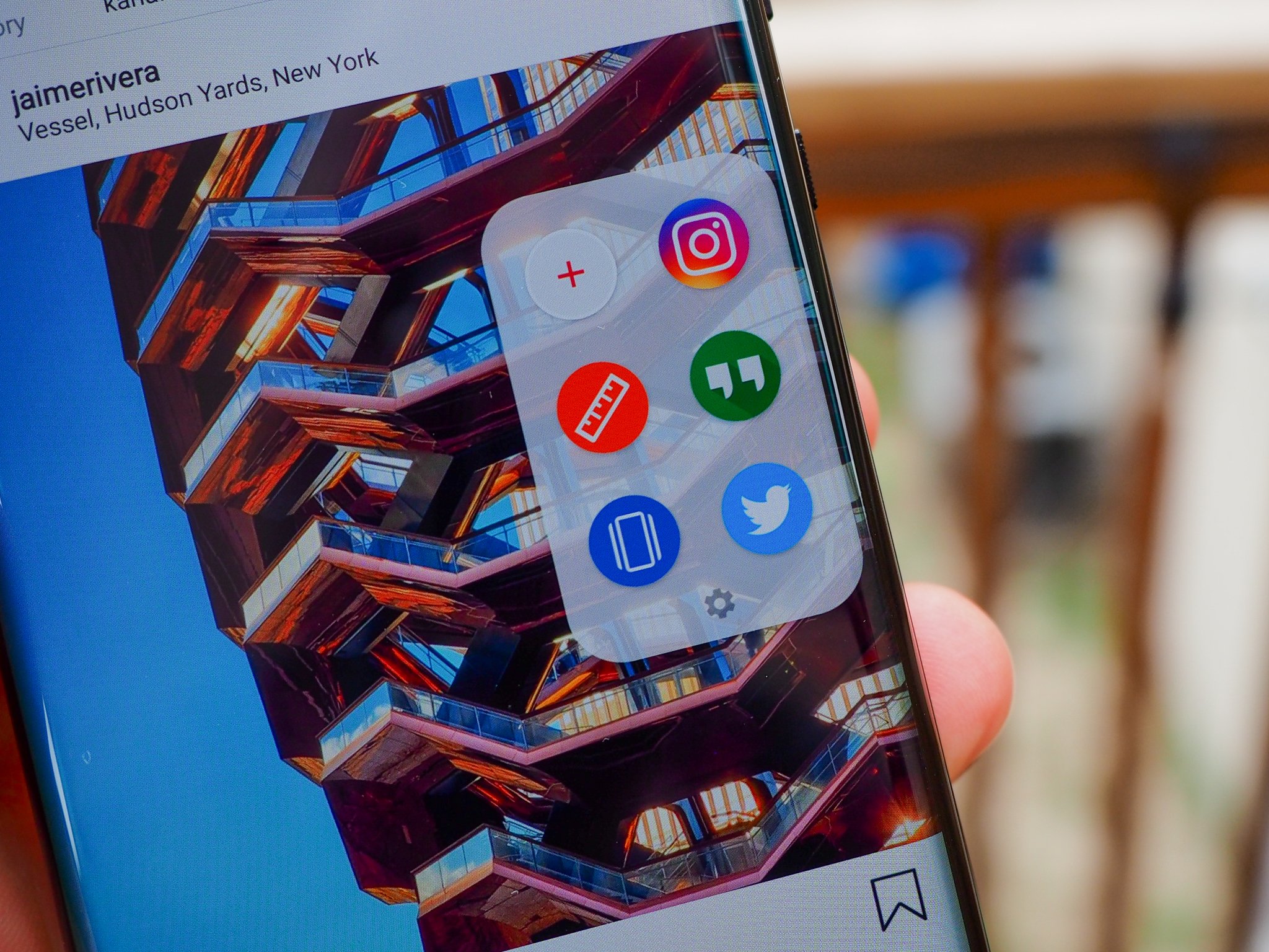
To its credit, Motorola has thought of this problem, and the fix is pretty ingenious. It's called Edge Touch, and when enabled, adds a thin bar to the right (or left) curve, which works as a multi-function button of sorts. By default, double-tapping the bar shrinks the display so it fits within the narrower confines of the non-curved glass. Best of both worlds, right? Except that occasionally, as with the camera app or the launcher, you can't do it; at other times, as with Instagram, it reforms the layout and cuts off text. Most of the time, though, it just makes me wonder what the point of the edge is in the first place.
But then I remember to take advantage of the other Edge Touch features, and my doubts fade away. Swiping down on the tab brings down the notification shade; swiping up, the multitasking drawer. Swiping in brings up a list of six app shortcuts. You can also change the double-tap functionality to quickly switch between the two previous apps.
You can see the difference in screen scaling when the edge display is enabled (left) and when it is disabled (right). Notice the text is cut off and many of the objects are in the wrong position when the edges are disabled.
The edges do serve some purpose. Motorola's Gametime app puts shoulder buttons on the curved portion of the display, letting you map various on-screen controls to two regions — great for first-person shooters or racing games. But it's just two buttons, so most games will still require a hybrid setup. I played some Fortnite, PUBG Mobile, and Asphalt 9 and never felt quite like the shoulder buttons enhanced my gameplay, but with a bit of tweaking I think they'll be useful for some people.
The curves perform one last visual trick, too: like Samsung's configurable edge display, the Edge+ can light up, runway-style, when you receive a notification or a call. It's great when you have your phone on silent but still want to be informed, but unlike on a Samsung phone, neither the colors nor the intensity is configurable.

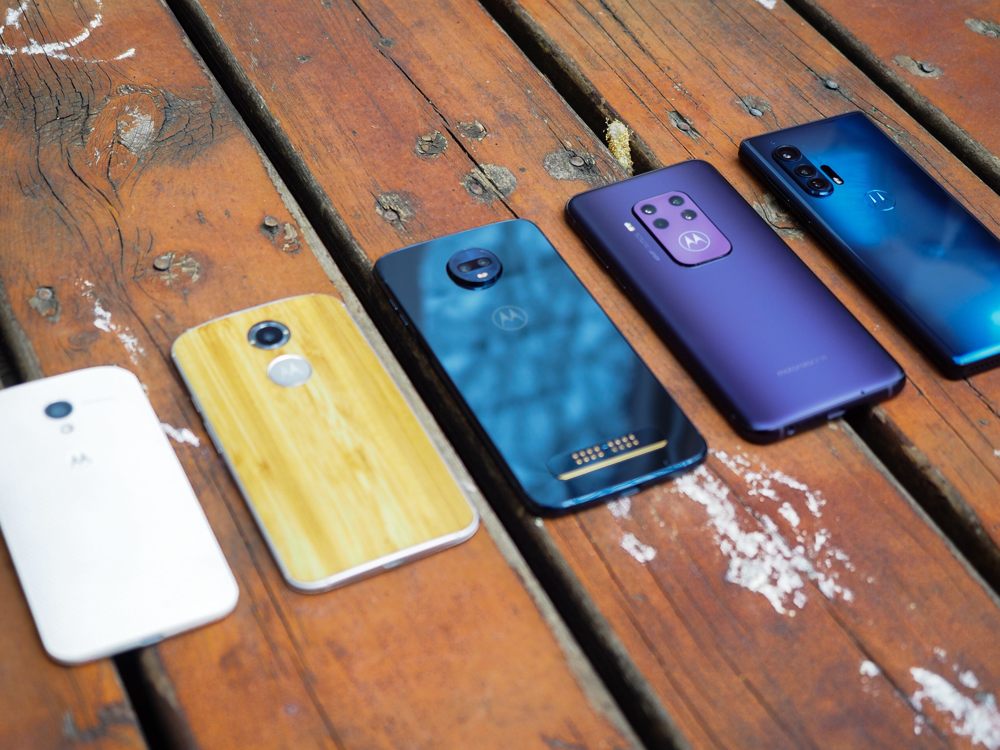
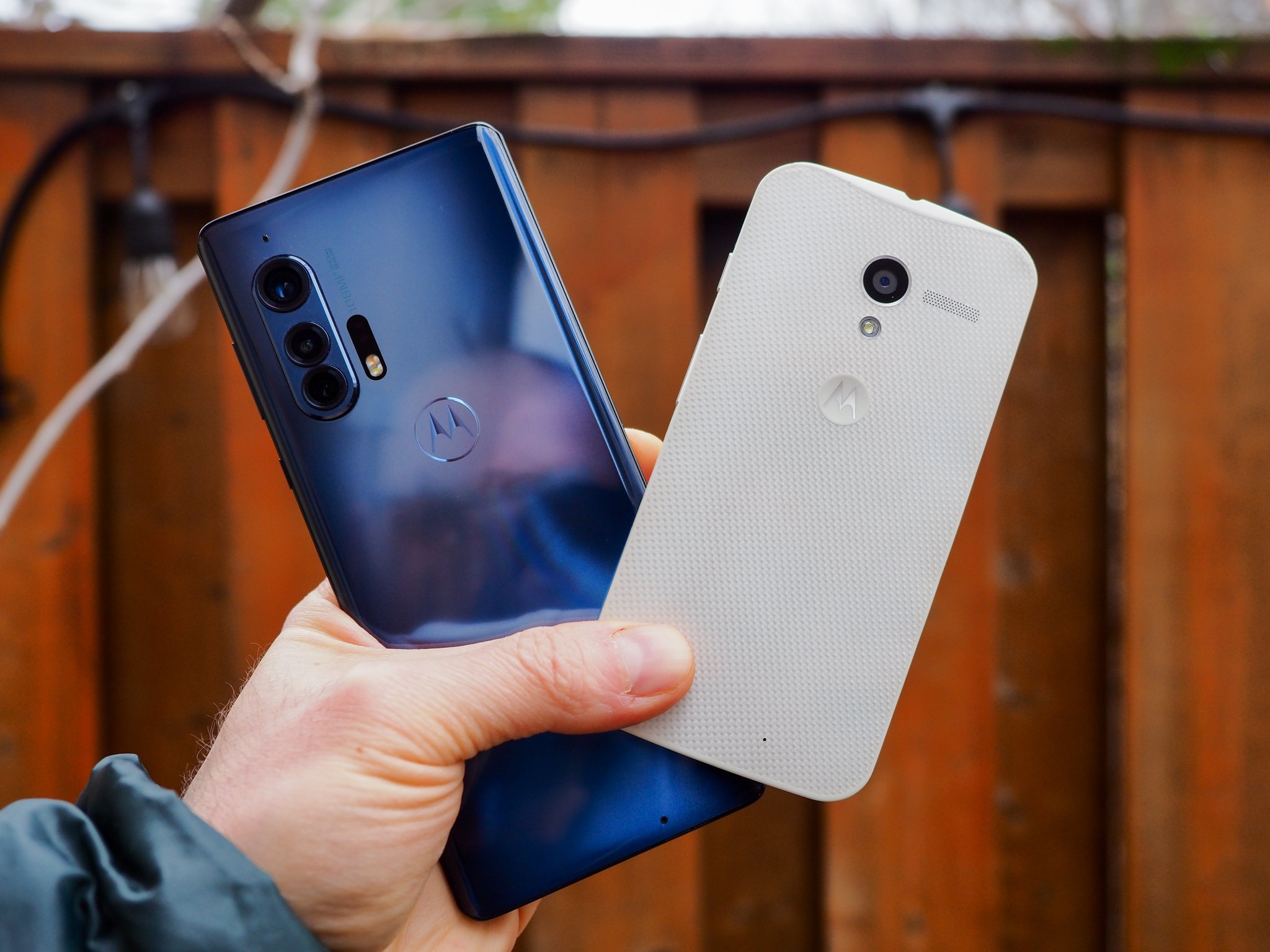
It's really fun looking back at a few years of Motorola design evolution.
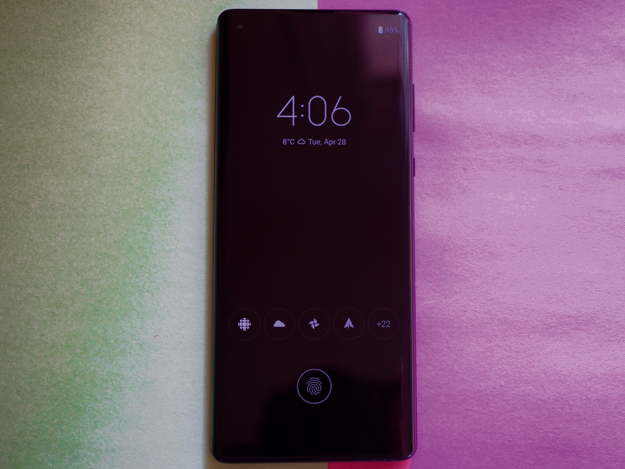
So far I've talked about new Motorola features, but the real reason I was excited to use this phone was for the old standbys, the ones I've been evangelizing going on seven years now. Moto Display is still a game-changing benefit, the marriage of notification triage and always-on-display whose usefulness has not been surpassed, or lessened, since its debut on the original Moto X in 2013. Motorola's made minor tweaks to the formula, and made it easier to respond to notifications quickly, but its endearing success is a testament to how forward-thinking the original design was back in the day.
While the phone lacks the sensors to pick up remote movement — no more waving your hand above the screen to activate — the Edge+ does have a higher-quality proximity sensor, making it trivial to bring your hand close to the screen to quickly check the time or see if you've received a notification.
And like those old Motorola phones, twisting your wrist twice opens the camera, and chop-chopping turns on the flashlight. Most of the time, at least. Gesture inconsistency is but one of a few notable software bugs that lingered on my review unit — another is dismally frustrating auto-brightness — that I'm hoping Motorola squares away before this phone's release in mid-May.

I have lower expectations for this phone's longevity. Motorola claims that the phone will receive two years of bi-monthly security updates and one platform update, which just isn't good enough. Every time I've pushed the company on why it can't promise more than one platform update, it points to the number of app-based updates it's pushing through the Play Store. And while perhaps you could forgive the fact that the $299 Moto G Stylus will only get one update to Android 11 next year, the same isn't true of a $1000 flagship.
Motorola Edge+ Cameras

If Motorola phones have historically had an Achilles' Heel, it's been in the camera department, so I was gratified when I heard the company was pulling no expense in making the Edge+ its best camera yet. And the good news is that it's true — by a mile. The Edge Plus's 108MP primary sensor is mostly fantastic, working with the image signal processor to spit out 27MP — that's quad-binned, for those keeping count — photos.
We saw pixel binning of a similar sort on the Galaxy S20 Ultra, though in that case, Samsung used a sensor that did nona-binning, resulting in 12MP photos. We also know how those turned out — sometimes great, and sometimes pretty disappointing — and that's true here, too.
This is easily the best camera ever put on a Motorola phone — but the bar was pretty low to begin with.
First, the good news: in well-lit situations, the Motorola Edge+ captures beautiful shots, with the organically shallow depth of field naturally afforded by the massive 1/1.3" sensor. This is among the biggest sensors you'll find in a phone right now, and it's able to eke out incredible detail, especially when utilizing all 108 megapixels. In good lighting, this is one of the finest shooters on the market, and that's high praise.
Problems arise when shooting indoors, or in low light, or when engaging portrait mode, where detail is crushed and smoothed out, all in the service of reducing grain, and you're often left with a blotchy mess that's hard to appreciate. This is a conscious decision on Motorola's part, too, since many of the photos I took at night go as high as ISO14000 but there's barely more than a hint of grain. In return, any semblance of detail is obliterated, too. The company's Night Vision mode doesn't salvage any detail, either; it merely succeeds in raising the exposure.
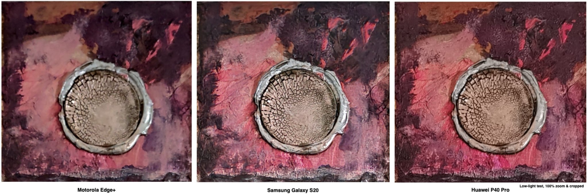
A low-light shootout
Motorola Edge+ (left) | Samsung Galaxy S20+ (center) | Huawei P40 Pro (right) — Above: A very dark room taken without night mode. Below: a very dark room taken with night mode.

You can see from this brief low-light comparison that while the Motorola Edge+ does retain some detail in challenging low-light environments, it doesn't come close to that of the Galaxy S20+ or Huawei P40 Pro in the same environment. The above shot was taken in a nearly pitch dark room, lit only by a nearby computer monitor.
The other two rear cameras are great: the 16MP ultra-wide performs double duty as a macro lens, and I had a lot of fun with both. The 8MP 3x telephoto, too, while outputting fairly soft and "digital"-looking photos, does an admirable job in most situations. Similarly, the 25MP selfie camera captures plenty of detail.

The phone also forgoes the 8K video capture of the Galaxy S20 and LG V60, settling on a less resource-intensive 6K resolution. Video quality is good, and stabilization equally so, though I'm not happy with the lack of a 4K60 mode — that should be standard on every phone released this year, in my opinion.
Overall, I'm impressed with the Edge Plus's cameras. While nowhere near the top of the heap, photos taken by the primary 108MP sensor win far more often than they lose, and it makes it clear that Motorola's phones are no longer good in spite of their cameras, but because of them.
Motorola Edge+ Battery, Audio & 5G

The 5,000mAh battery in the Edge+ lasts two days. That's about as good as you can expect from a modern phone, and I'm not going to write a whole bunch of extra words just to fill up space. If you use your phone like a regular person, you'll probably end the day with just under 50%, like I did, consistently.
And I didn't exclusively use the phone on Wi-Fi, either. I took it out with me on errands, and tried to mimic (within reason) the types of daily routines one would perform when there was no pandemic or quarantine. You know, like six weeks ago.

The one caveat is that I was in an area without Verizon's 5G network, so I wasn't able to test that particular feature — and that's a big one for the company. Motorola told me that the Edge+ should have the fastest 5G performance on the planet right now, as it worked hand-in-hand with Verizon to achieve Ultra Wideband speeds consistently above a gigabit per second.
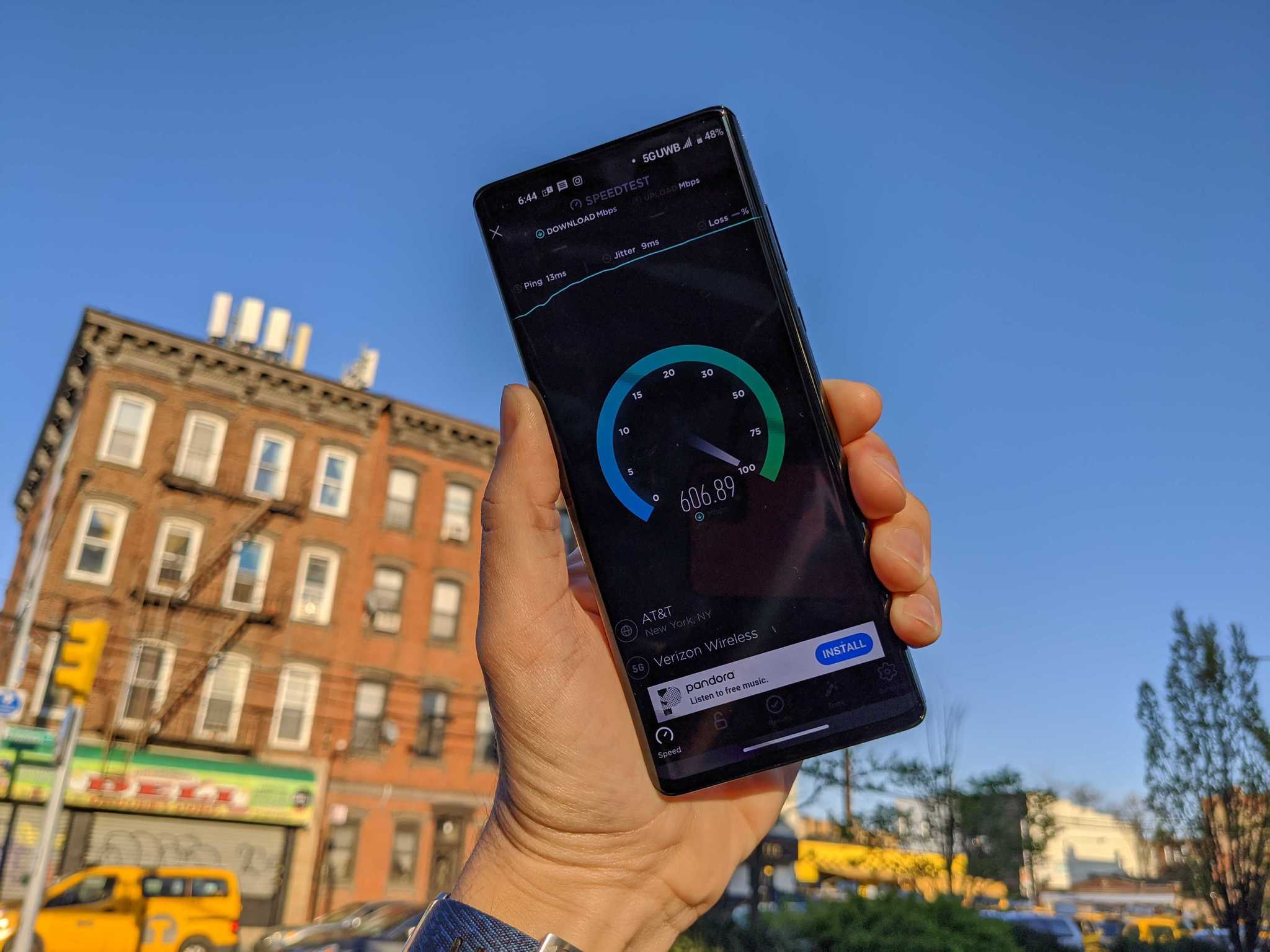
I did ask my friend Michael Fisher to send me a few photos of his 5G tests done in Brooklyn, New York City, and he told me that when in range of a millimeter-wave node, he'd usually get in the range of 600 to 700Mbps, but peaked at 1.2Gbps a few times — far greater speeds than what you'd find on Verizon's LTE network today. If you'll allow me, I'd like to quote directly from Michael's video to convey a practical advantage of having a millimeter-wave 5G connection today:
Testing this phone gave me my first opportunity to actually use [5G] for a practical purpose. See, World of Warships is a big game: about 1.4GB, which took just over three and a half minutes to download over Verizon's 4G network. When I tried the same thing on the 5G node down the street, it came down in a minute and twenty seconds.
Of course, two things to note about that:
- It's still incredibly difficult to find and keep a 5G connection on millimeter-wave even when you're within reach of a tower.
- Verizon's 5G network is still sparsely populated enough that you're statistically unlikely to be within range of it yet.
So while I'd admonish anyone for explicitly seeking out a 5G phone right now, the reality is that if you're buying a high-end phone in the U.S. this year, you're buying a 5G phone (and paying the Snapdragon 865 tax as a result). The good news is that you fall back to Verizon's excellent, and still-speedy LTE network all over the country, and when the company does start spitting out 5G signal in the sub-6Ghz space, the Motorola Edge+ will be ready — it supports every major 5G band right now, making it reliably future proof.

Back to the battery for a moment. While the cell is big, the charging speeds aren't; you're getting 18W wired charging and 15W wireless, along with 5W reverse wireless charging. I wasn't a huge proponent of super-fast charging until I realized just how much time it saves in a crunch; being able to top up a Galaxy S20 at 25W, or a OnePlus 8 Pro at 30W makes a meaningful difference when you're in a hurry.
The Edge+ nails the fundamentals, including a great screen, excellent haptics, awesome sound quality — and a headphone jack.
The good news here, though: a full top-up takes just over 90 minutes from start to finish, and the phone supports standard USB Power Delivery, so most of your existing USB-C to C cables will work just fine (though the in-box adapter is USB-A to C because everything is terrible). The 15W wireless charging is also standard Qi, though there's still a dearth of high-quality pads and stands to choose from.
Finally, audio. Again, this doesn't need much setup: the dual speakers are incredible, among the best you'll find on a phone today. Similarly, there's a headphone jack, which, if you're the kind of person who cares, you'll be happy to know it's here. It's nowhere near the quality of the LG V60's Quad DAC — I spent quite a bit of time comparing the two with a pair of Sennheiser HD6xx headphones — but it's there.

And Motorola does this without sacrificing waterpr — oh, wait, that's not true. Like the company's other phones, there's a nano-coating around the internal components to protect them from damage, but it's not an official IP rating. In fact, here's what Motorola's fine print says about it:
Water-repellent design creates a barrier to help protect against moderate exposure to water, such as accidental spills, splashes or light rain. Not designed to be submersed in water, or exposed to pressurized water, or other liquids; may diminish over time. Not waterproof.
There you go. It's honestly one of the few major knocks against this $1000 phone, mainly because I just don't want to have to worry about it. Now that the OnePlus 8 Pro is IP68-certified, it's difficult to find a flagship phone from any manufacturer that isn't up to the task of getting accidentally dunked in the sink.
Motorola Edge+ So should you get it?

There are two groups of people who should consider this phone: Motorola loyalists, and Verizon customers. For the tiny Venn diagram that creates, buy this as soon as it goes on sale next month.
If you're already a Verizon customer and think the phone looks neat, you should definitely give this a look over the more expensive Galaxy S20+ or slightly cheaper LG V60. It's more striking than the former and less clunky than the latter, and it's easier to use with one hand than both.
If you're not on Verizon but just miss Motorola's unique value proposition, here's what I'll say, because I'm in this boat: how striking do you need your phone to be? Because the Edge+ is stunning to look at and, for the most part, to use. Every time I pick it up, I feel like I'm rekindling a romance — a troubled one, perhaps, but it's true love nonetheless.
4 out of 5
It's also fun, and many of the software affordances, from Moto Display to Edge Touch to Gametime, add considerable value to the experience.
Or maybe I'm just happy to be using a great high-end Motorola phone again. Either way, I'll take it.
Going all the way
Motorola Edge+

Motorola brings its A-game to the traditional smartphone design space, creating a solid, beautiful, and flawed phone in the process.
$1000 at Verizon
